We may earn revenue from the products available on this page and participate in affiliate programs.
What’s the first thing that comes to mind when you picture a Tuscan villa? It’s likely a scene emanating rustic charm: limewashed walls, a few terracotta jugs artfully scattered about, everything washed in muted neutrals.
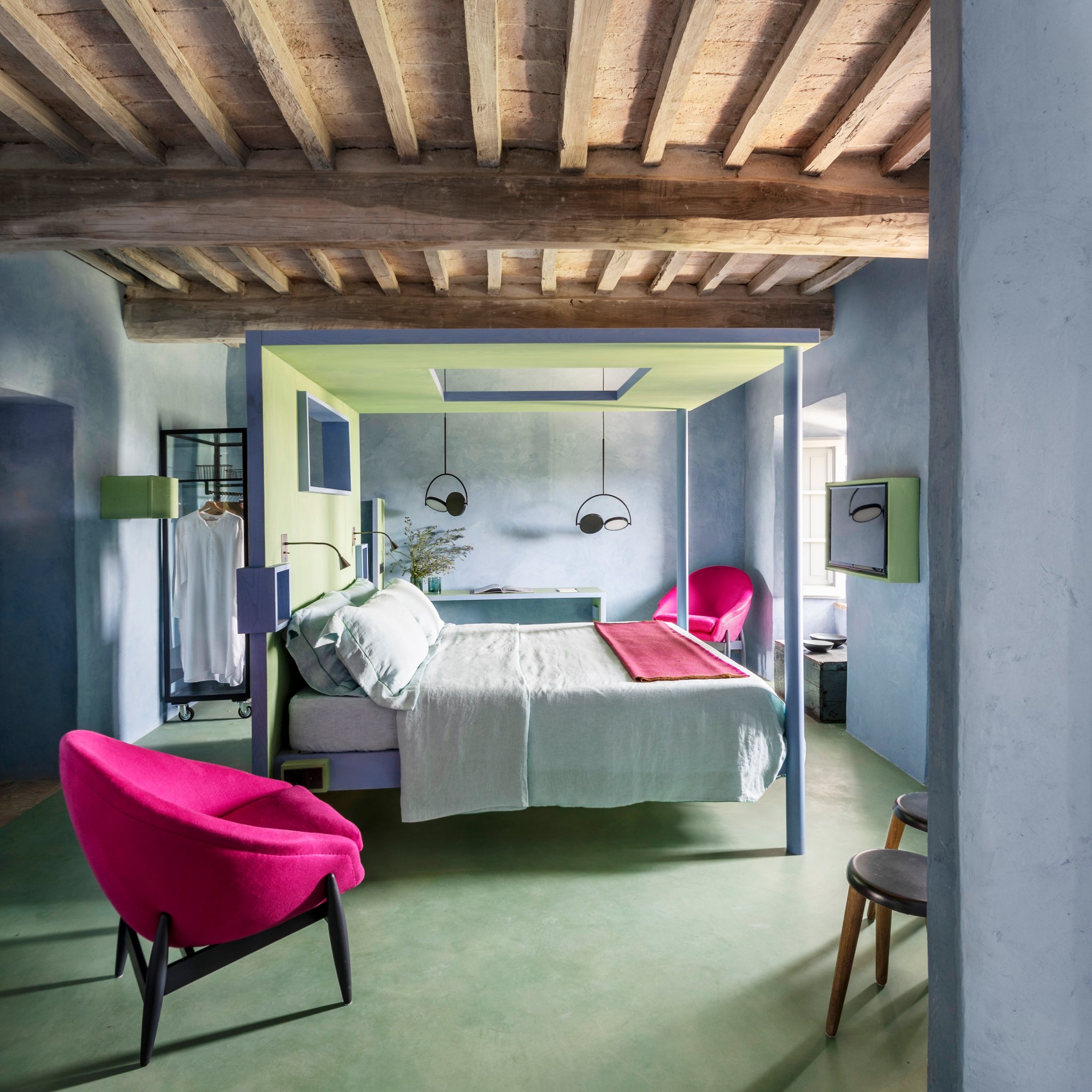
Monteverdi Tuscany is the complete opposite. The hotel, which officially opened in 2012 and just underwent a massive renovation, is brimming with color and contemporary touches that pop against the building’s historic architecture. This is old-meets-new at its finest.
“Immediately, I was aware I had very little to invent,” shares Ilaria Miani, the Rome-based artist and designer whom hotel owner Michael Cioffi enlisted to helm the transformation. “I only had to extend my eye through the window opening to the outside and enjoy the landscape to find my color scheme. I saw the oak forest with the bright greens of its spring sprouts; the pale blue sky silhouetting the Radicofani tower; and the boundless bird’s-eye view on the Val d’Orcia flushing at sunset.”
It’s all very poetic. Inspired by tradition—the Val d’Orcia, which the hotel overlooks, is a UNESCO World Heritage Site—Monteverdi’s suites are both authentic and wholly original, eschewing the typical tourist clichés. They also happen to be a grade-A source of color inspiration for our own spaces. We spoke to Nivara Xaykao, Benjamin Moore’s color marketing and development specialist, to get some insight on how to re-create the hotel’s Technicolor rooms at home.
Go for Contrast

“If you have a lot of natural materials and organic textures in a room, daring colors like spearmint and fuchsia bring a juxtaposition that instantly modernizes it,” explains Xaykao. Dress up a previously simple piece of wood furniture by giving it a lick of paint—a bubblegum pink headboard, perhaps, to mimic the look of this splashy space.
Cool It Down

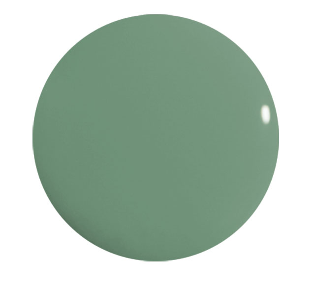
Maybe you need to relax, in which case you should definitely consider this calming combination. “Sage green and lilac are among the hottest colors of the moment,” says Xaykao. “Together, they create a unique tension that is oddly harmonious.”
Take a page from Tuscany and try your hand at color-blocking, either with two adjacent walls or with your walls and the floor. “If you’re not ready to go all in on the lilac trend, pale blues offer a versatile alternative. The key to this look is a super-matte finish to play up the soft, powdery quality of the color,” recommends Xaykao.
Pick a Pastel

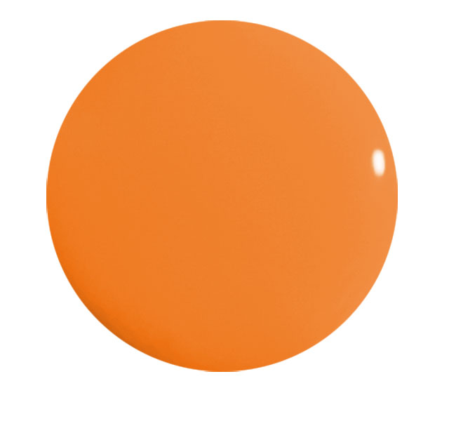
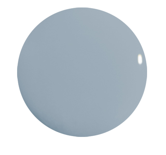
Blue and orange are color wheel opposites, which can feel daunting to test out. But allow this dreamy bathroom to convince you it can be done subtly. “A muted blue creates a soothing backdrop for so many bold colors, and orange is an especially classic complement that coaxes out the more playful side of blue,” says Xaykao. Dull the polarity a bit by peppering in some yellow accents, too.
Our dream Italian getaway is looking much more vibrant these days.
See more spaces inspiring our color palette: We’re Living for the Painted Doorways in Menorca’s Spirited New Hotel 3 Zesty Color Combos We’re Stealing From an Ultra-Cool Roman Hotel Get Summer Sunset Vibes With These 6 Paint Colors