We may earn revenue from the products available on this page and participate in affiliate programs.
Making up your bed isn’t just something you do in the morning so you can sleep a little better at night: It’s an art. While we’d like to believe otherwise, composing a complex bedding scheme isn’t a simple matter of how many throw pillows you can pile up. Not unlike baking a perfectly-prepared pie, dressing a bed requires a certain level of skill and creativity. Worried you don’t have what it takes? Never fear. Such artistry can be learned over time—that is, with plenty of practice.
If we were to break down the anatomy of a well-styled bed, color would be lesson number one. Going bold on the bed is one of the most captivating ways to spice up your space. And while we’ve seen tone-on-tone decorating work wonders in entire rooms, we’re excited to take this monochrome-inspired trend to the sheets. Read on for seven different ways to pull off this look at home.
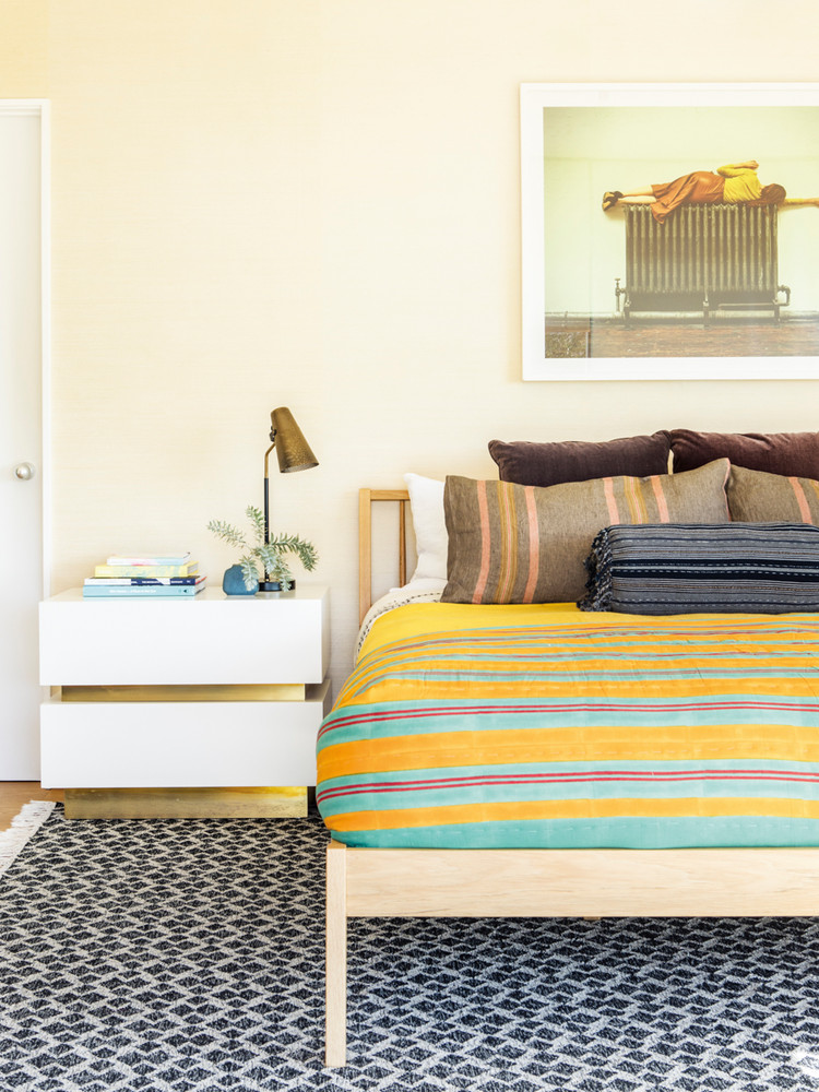
Yellow
In its purest form, yellow radiates optimism. If the bedroom is your one and only place to recharge, why not swath it in a color that’s bound to give you an energizing boost? The genius of this gorgeous display in Michelle Nader’s LA home is the gradation created by both the transition of color as well as the motion of the stripes. Here, the continuation of lines from the throw pillows up front to the tucked-in top sheet create a sense of movement.
The tones: Sunny bright and muddy mustard. A radiant, citrus shade (think, a loud lemon or buttery marigold) cooled down with brassier tones makes yellow feel more casual.
Other colors to consider: Teal, hot pink, and dark brown. While fiery pinks and splashes of blues play off of its fun-loving spirit, browns and blacks bring the hue back to its earthy roots.

Brown
OkCupid co-founder Christian Rudder’s zen bedroom in Williamsburg sticks strictly to an earthy-organic palette of blacks and browns. While we tend to think of brown as evoking notions of masculinity, this sophisticated arrangement proves that the hue can be quite warm and welcoming when surrounded by intriguing shapes and perforated textures.
The tones: Deep hazelnut, rusty terracotta, and khaki. Think outside of your standard mud brown for this one. For a dynamic display, start with a cool copper fitted sheet as your base, and add sand-colored throw pillows and a caramel comforter.
Other colors to consider: Black, white, and blush pink. Pull inspiration from the outdoors and you won’t go wrong with your combinations.

Pink
Now, this is how you commit to an all-over look. A mix of punchy blushes and electric pinks, this darling room in Laura Grabe’s Connecticut beach house is hot, hot, hot. Beginning with dusty rose king-size pillows, the color trickles down and culminates in a crimson throw blanket at the foot of the bed. The cherry on top of this floor-to-ceiling look, of course, has to be that ombre wall treatment.
The tones: From blush to deep burgundy, you should feel free to span the spectrum when it comes to pink. Note that there are few rules when it comes to pairing your pinks
Other colors to consider: While pink generally looks best when it sticks within its own color family, dark reds and bright whites can look especially stunning too.

Pink, Take Two
Surrounded by a healthy dose of texture, pink takes a more bohemian turn in this Moroccan-inspired bedroom. Unlike the previous bedding arrangement that feels decidedly composed, this adult-approved scene comes off more relaxed thanks to the whitewashed walls and casually striped blanket. If layering isn’t your forte, opt for a patterned stand-alone blanket that says it all.
Other colors to consider: Chocolate brown and light gray.

Blue
A dear friend to jet black and loud graphics, blue was seemingly made for high impact. For a sophisticated arrangement, avoid teal and turquoise and, instead, stick with natural tones like navy and muted blue-grays. To create a similar scene, keep things dark at the foot of the bed and slowly go up the scale as you make your way to the headboard. No matter the color, this contrasting strategy gives the impression of a subtle gradation.
The tones: Inky navy that veers toward black and soft sky blues.
Other colors to consider: Black, white, and cream. Rich and moody blues also pair well with certain greens, like emerald, and other jewel tones.

Black
The rest of Maria Santana’s entire Manhattan apartment commits to a monochromatic palette, so why should the bedroom be any different. Peppered with moody grays and abstract shapes, her predominantly black and white retreat is a lesson in contrast.
The tones: To prevent the room from feeling too stark, a soulful touch of gray (think, one as dark and complex as this linen blanket) will go a long way.
Other colors to consider: Silver, blue-grays, and deep lavenders. Don’t be afraid to mix and match these variations with your shames and pillowcases.

Green
No matter the shade, green exudes absolute tranquility. When you want to feel relaxed and at ease, there’s no better color to bring into the bedroom. This casual linen arrangement from CULTIVER feels especially easy and fresh.
The tones: Pale sage and forest green. This color tends to stun when you make an abrupt jump from, say, a light mint top sheet to a dark moss duvet. In comparison to other colors, obvious contrast keeps things interesting. If you want to go the extra mile, continue the color theme going elsewhere in the room with real greenery.
Other colors to consider: Green has a very natural and organic appeal. Peachy terracottas, sea blues, and sandy tans are a few great pairs.
Need help picking out your sheets?
Literally Every Question You Have About Bedding, Answered