We may earn revenue from the products available on this page and participate in affiliate programs.
If kitchens are generally known as “the heart of the home,” then all-white features are doing them a disservice. Such uniform finishes may look appealingly spotless, but a lack of color fails to complement the many scenes that inevitably unfold at a kitchen counter. Red can capture the timeless lipstick and infectious laugh of a beloved aunt, blue can tune into the cherished calm of a solo Sunday morning, and yellow can match the lemon slices that garnish a perfected family meal. When so much of life is filled with color, then the center of a home should be no different.
Instead of thinking of a kitchen as a white canvas that’s better left untouched, consider shades that would highlight this all-important space as a personal work of art. We found 13 bright kitchens that didn’t shy away from the personality that can be found on the color wheel, whether one hue was used as an eye-catching accent, or another was picked for a floor-to-ceiling showcase. Take a cue from their designs and aim to make the heart of your home beat a little faster.
Powder Blue

Interior designer Kim West’s kitchen proves that if you like a color enough, you can use it on a kitchen’s cabinetry, island, seating, and floors. Not only does this shade of blue make a room feel calmer, but it pairs well with gray and white tones—making for an airy space that welcomes natural light.
Charcoal

Black kitchens have become an increasingly popular style in recent years, and this one from Studio McGee is an expert example of how to pull it off. By offsetting the dramatic raven color with uplifting white and gold accents, the kitchen still feels bright—but with an undeniably cool edge.
Crimson

Red is an understandably difficult color to embrace in a kitchen. After all, just imagine confronting that shade before drinking your morning coffee. That’s why this incorporation of red by designer Alexandra Angle is so appealing. By painting the cabinet shelves in the shade, and leaving them open for display, it’s hard to ignore this kitchen despite its small size. The red also complements the striped orange floors, making for quite a fun place to start the day.
Yellow and Blue

Want to ensure that your kitchen has personality? Follow the lead of this design by R2 Studio Architects and devote a full wall of cabinetry to a traditional shade of yellow. Not only will it make a kitchen with few windows feel brighter, but if you also decide to pair it with blue paint and a geometric backsplash, then you’ll never be accused of having a boring kitchen.
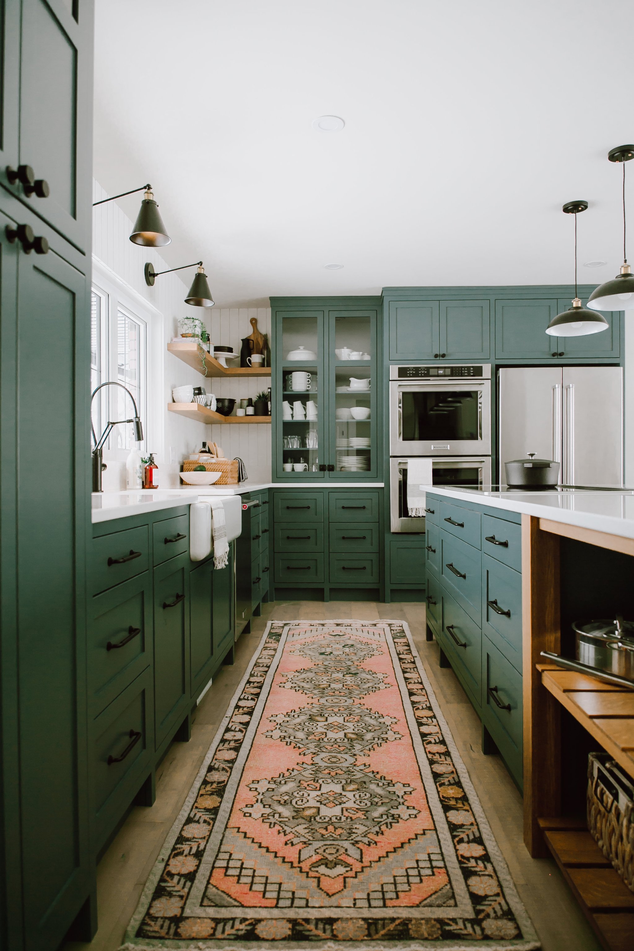
Dark Green
Opting to choose color for a kitchen doesn’t necessarily mean that you have to pick something bright. Take this example from Jaclyn Peters Design. This saturated shade of green comes across as cozy, while the black accents and pink runner bring in a more modern feel. It’s warm and inviting shade that doesn’t overwhelm the space.
Bright Yellow
That being said, if you do want to make a statement—and you’re don’t mind a kitchen that routinely steals the spotlight—then perhaps this kitchen from Lookofsky Architecture can be a much-needed push of inspiration. Unapologetically bright yellow envelops the island, designates the seating area, and serves as a backsplash, making any other flashy details unnecessary.
Rainbow

The architecture and design firm Sabo project came up with an unconventional idea here: Instead of focusing color on kitchen cabinetry, why not contain it to the floor? By keeping the rest of the kitchen minimalist and white, the floor becomes the focal point with not one, but a rainbow of shades. The plant wall also helps to keep the room from feeling too sterile, since everything but the plants has a sheen.
Teal

If blue would be your color of choice, but you’re looking for something rich, then look to this darker option from brand director Gillian Schwartz’s kitchen. This polished shade of blue still works well with a textured white backsplash, while its oversized matching knobs add a playful finish.
Midnight Blue

A deep shade of blue is also featured in photographer Martyn Thompson’s studio kitchen, which is paired with matte black countertops and rustic wood cabinetry. When looking to make a kitchen feel more like a room for entertaining rather than a workspace, a dramatic shade of paint and equally charismatic details—like intriguing artwork and a big vase of flowers—will do the trick.
Blush Pink and Blue

A pink-and-green kitchen may seem suspicious at first, but not when it’s pulled off like this design from 2LG Studio. The soft pink walls and rich green cabinetry make this angular corner feel more inviting, and the matching geometric floors and gold accents add to its charm, too. It’s a light-and-dark combination that works—especially in cramped quarters.
Pale Blue

Blue and white is used once again in this modern take on a coastal-inspired kitchen by Heidi Lachapelle Interiors, and it’s the type of look that can serve as a compromise between an all-white design and one with color. The black pulls, wood shelving, and gray grout still make this space feel muted, and the blue shade is bright but not entirely bold. In other words, it’s a comfortable balance between a modern color and a timeless feel.
Multicolor

A classic midcentury kitchen by Veneer Designs still feels fresh and modern thanks to the color block accents on its cabinets. The wood finishes, white ceiling, and neutral backsplash allow the colors to pop, but the shades are still muted as to not overpower the room.