We may earn revenue from the products available on this page and participate in affiliate programs.
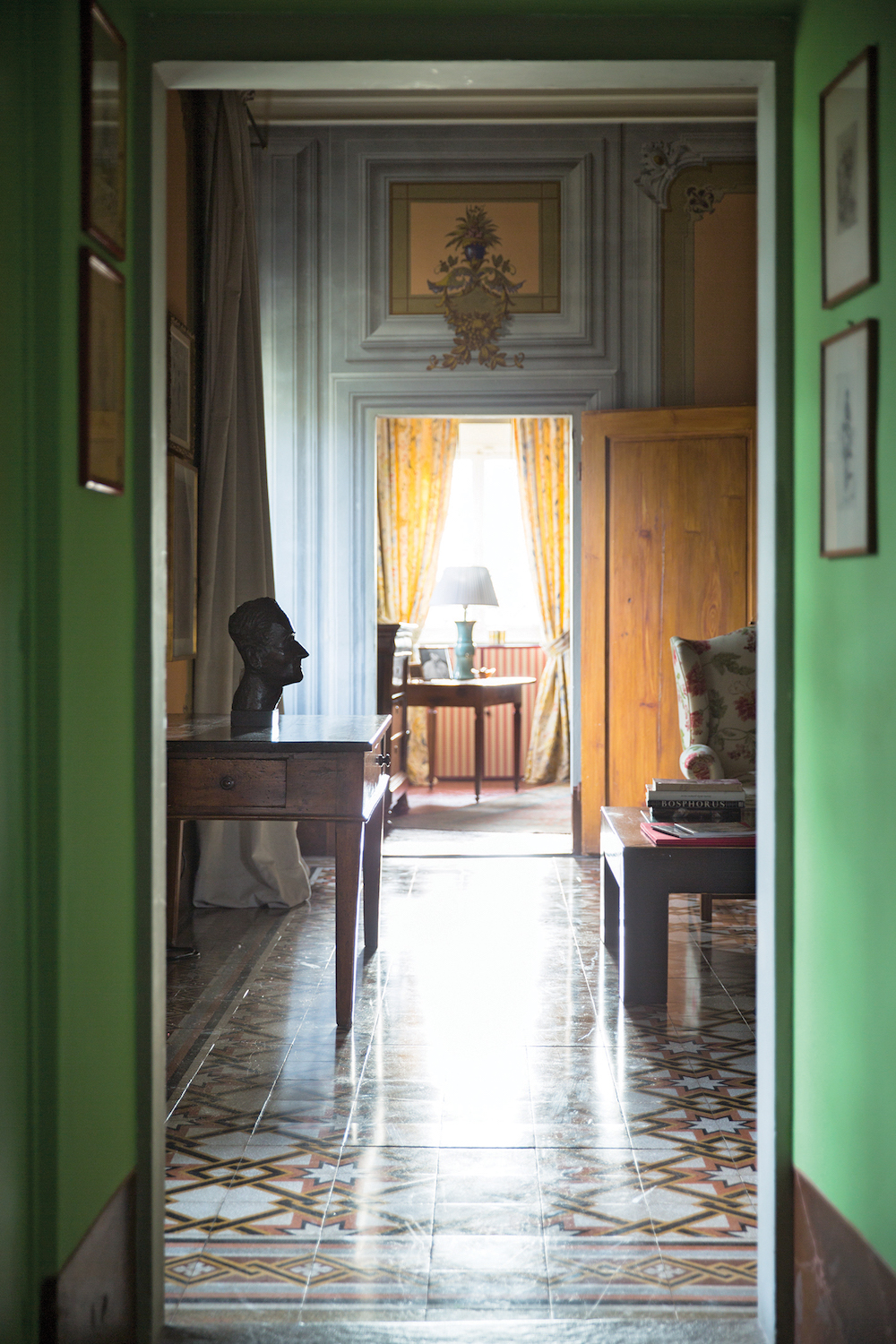
Yellow is widely considered a cheerful color, but on the flip side, it also has a reputation for being tricky to work with (particularly in the form of paint). Before you resort to muted sage kitchen cabinets or greige bedroom walls, consider Farrow & Ball’s classic take on the happy hue: Babouche No. 223.
The “uncomplicated” hue, as F&B describes it, was handpicked by the British brand’s color curator, Joa Studholme. And while the company suggests rooms with Babouche “appear to be full of sunshine,” they’re far from the blinding scene you’d expect. The key? Translate the paint to the pattern.

Checkered floors are all the rage, and achieving the look with paint (and a stencil) is a budget-friendly alternative to laying down large slabs of colored marble or tile. The plant-filled bathroom, above, is all the proof you need: Carrying the design up onto the wall (or the tub in this case) creates a modern optical illusion that’s not so in-your-face. We’re getting spa vibes—not Big Bird—from this chic idea. But if you’re not ready to swipe this shade across your surfaces just yet, you can shop some of our favorite sunny-colored picks to infuse a little light on a smaller scale.
This story was originally published in August 2021. It has since been updated.