We may earn revenue from the products available on this page and participate in affiliate programs.
To all the overwhelmed or undecided, this news is for you: Farrow & Ball and Liberty, two British powerhouses in the interior design world, are making life much easier when it comes to finding paint colors and fabric patterns that go together. For the brands’ first collaboration, they’ve selected 15 exclusive shades from Farrow & Ball’s Archive collection and matched them with complementary interior fabrics from Liberty’s Modern Collector range. “The feel of the fabric and color, when paired together, was important to us. We worked instinctively and trusted the magic of these combinations,” explains Joa Studholme, international color consultant at Farrow & Ball.
For Genevieve Bennet, head of interiors at Liberty, partnering with Farrow & Ball felt natural. “We’ve always loved its palette of chalky, rich, and sophisticated colors,” she notes.
The best tip for a successful duo? “Pick a secondary color [found] in the print—a small detail in a flower or a leaf that’s not the main color—and then choose that as the paint color,” says Bennet.
Here’s a selection of our favorites—and why Farrow & Ball and Liberty think these matches were meant to be.
Countryside Cottage

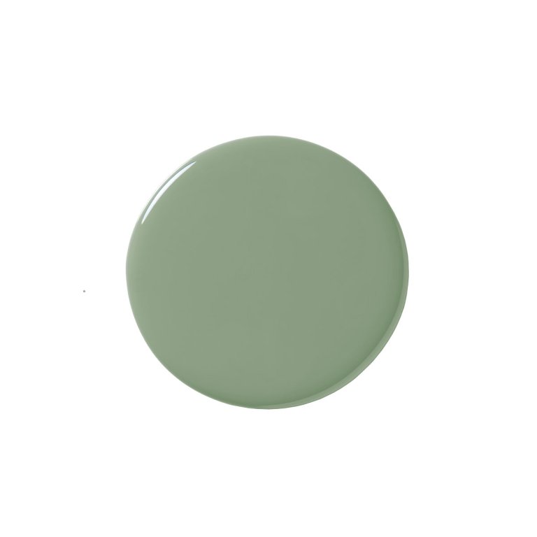
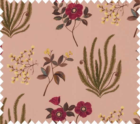
Choosing a wall color that mirrors the hints of green in Wiltshire Blossom, rather than the more forthcoming colors of its flowers, is a less obvious approach to building a palette, but one that works beautifully.
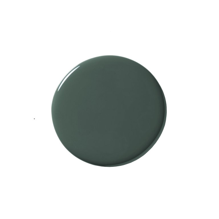
Modern Romance

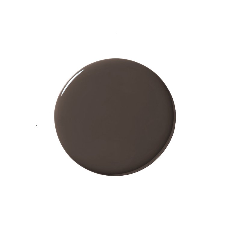
Using a contrasting secondary tone from your fabric on walls or molding, as we’ve suggested here with Cola and Botanical Flora, gives both elements enormous impact.
Deep Blues

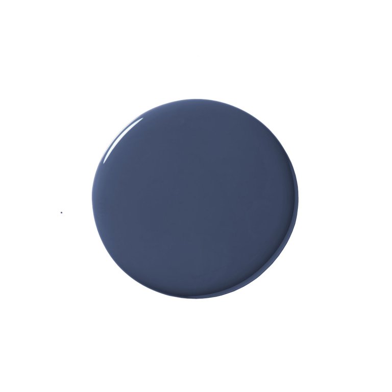
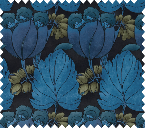
Serge is the perfect medium between the rich, dark ground color of Regency Tulip and its bold blue botanical print. Try it on molding—including the doors—for a luxurious look.
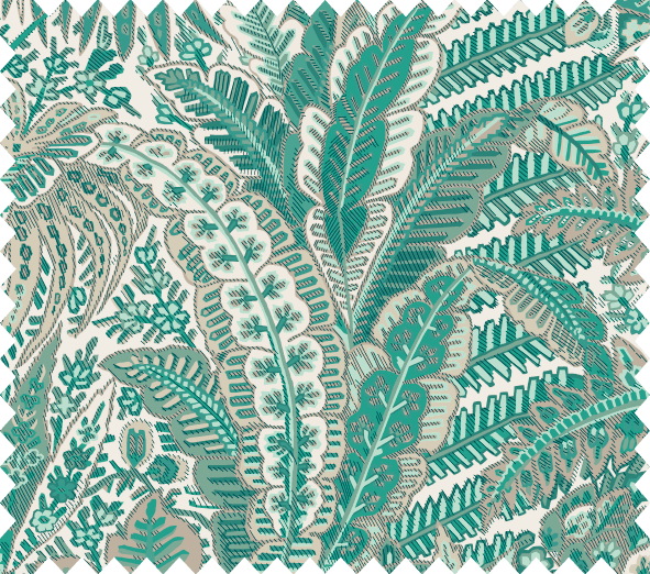
Retro Chic

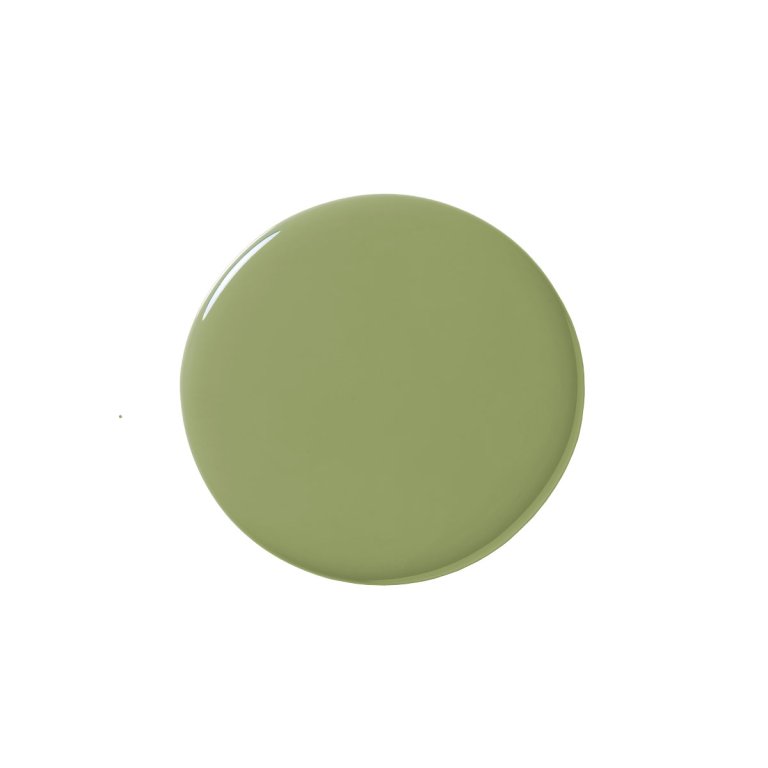
Poppy Meadowfield is based on an archival print from 1910, but the clean lines of the reworked pattern give it a real retro-cool, 1960s feel that works brilliantly with Olive, creating a contemporary twist on mid-century modern.
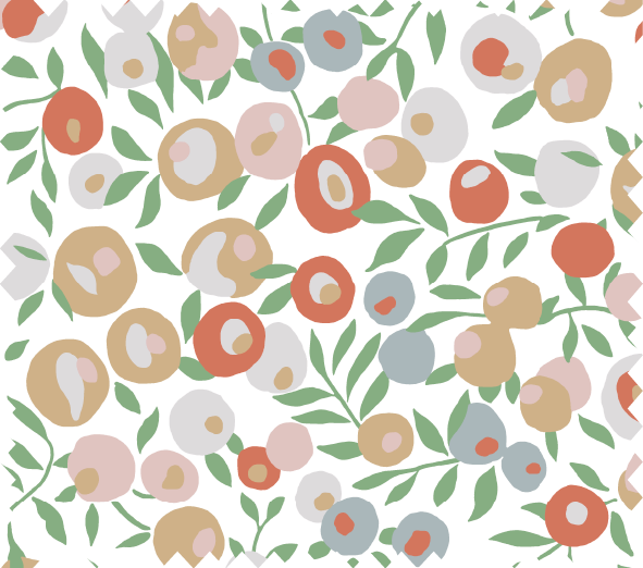
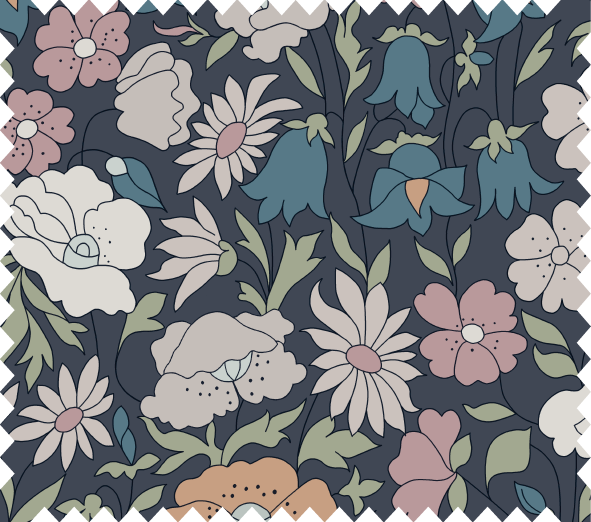
Soothing Pastels

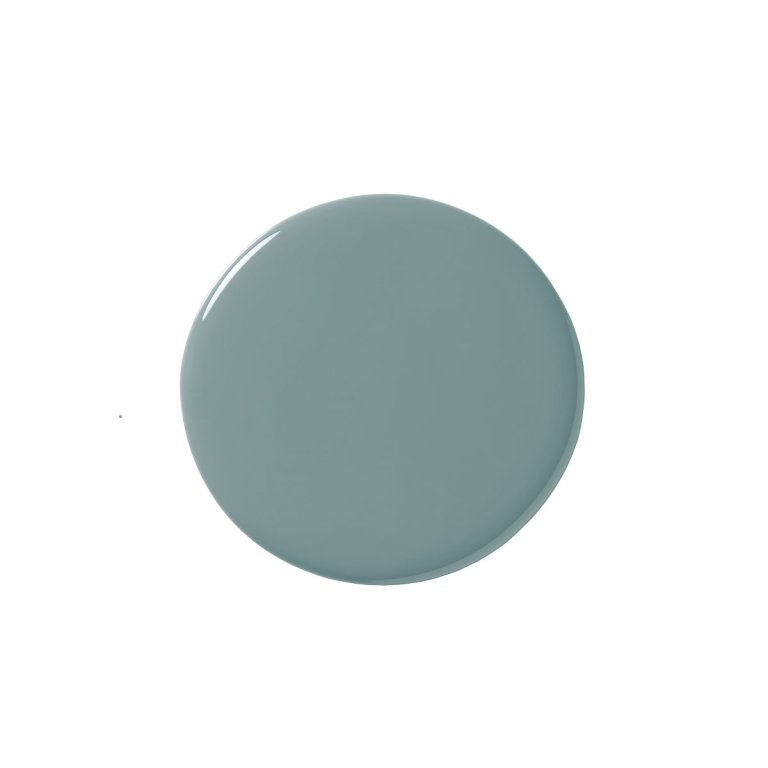
Choosing a wall color just a few shades darker than the background color of your fabric, as we’ve done here with Berrington Blue and Palampore Trail, creates a look that’s dynamic but still calming to live with.
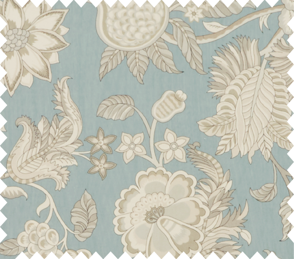
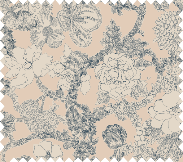
Crown Jewels

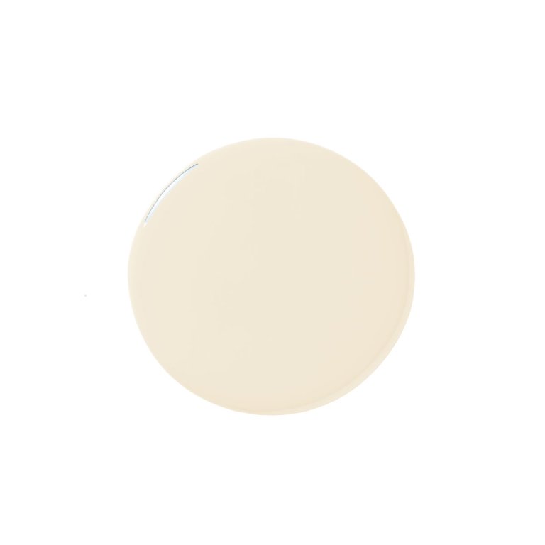
A laid-back shade, Clunch offers a clean, neutral backdrop that allows the intricacy and jewel-like colors of Persian Voyage fabric to really shine.
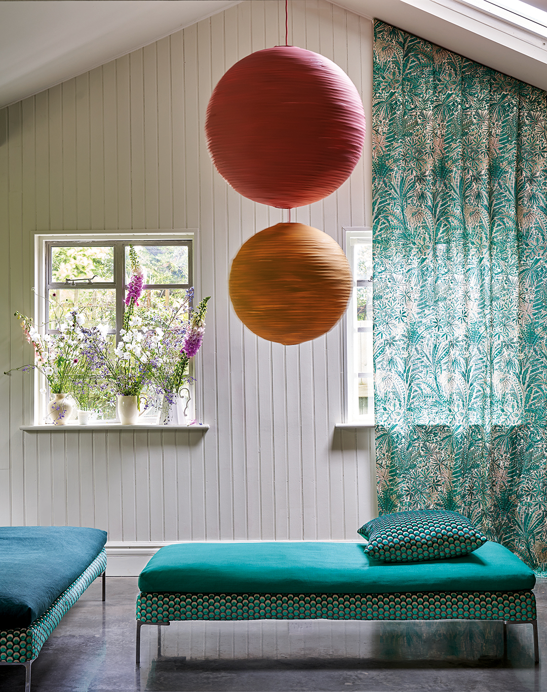
Downton Abbey Vibes

The finely detailed print and light colors of Zennor Arbour give it a delicate impression. Combining it with deep Chine Green adds some strength and edge to the equation, making for a perfectly balanced, very modern scheme.