We may earn revenue from the products available on this page and participate in affiliate programs.
California-based designer Caitlin Murray of Black Lacquer Design assumed working on a space for her newborn, Alister, would be a breeze. After all, she’s conceived more than 10 different nurseries for clients and has a reputation for her outside-the-box approach to color. But when the time came to draw up plans to convert an existing guest room in her 1920s Spanish abode before the arrival of her son, she was stumped. “I always love creating rooms for kids; my goal is to make them both chic and playful, which is a balance I try to strike in really anything I design,” says Murray. “But for my own baby’s, I was at a bit of a loss at first. There were so many directions I could take it.”

Overwhelmed by the options and determined not to default to an overdone white-and-wicker scheme, her only self-given guideline was gender neutrality. Complicating the matter even further was the fact that Murray’s intention wasn’t for him to grow into the room, but rather for it to instill a sense of imagination and wonder during a formative time. In other words, playfulness trumped practicality. “I wanted the space to feel whimsical and magical, and that it was designed for him, not just to be trendy,” she explains.

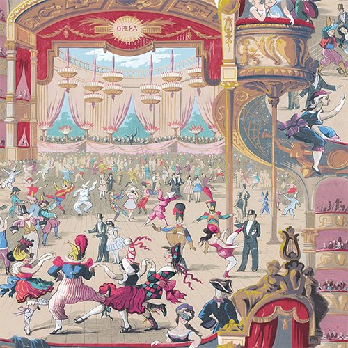
To overcome her creative rut, Murray visited Walnut, an artisan wallpaper retailer in Los Angeles. “If I’m looking for something but don’t know what, I’ll go there and flip through every page,” says Murray. The fabric boutique has a little bit of everything when it comes to vendors—Schumacher, House of Hackney, Osborne and Little, you name it—and it was there that she stumbled upon Cabaret, the carnival-themed print from Cole and Son’s Archival collection. It was a love at first sight kind of moment; Murray can’t quite put into words what drew her to the pattern.

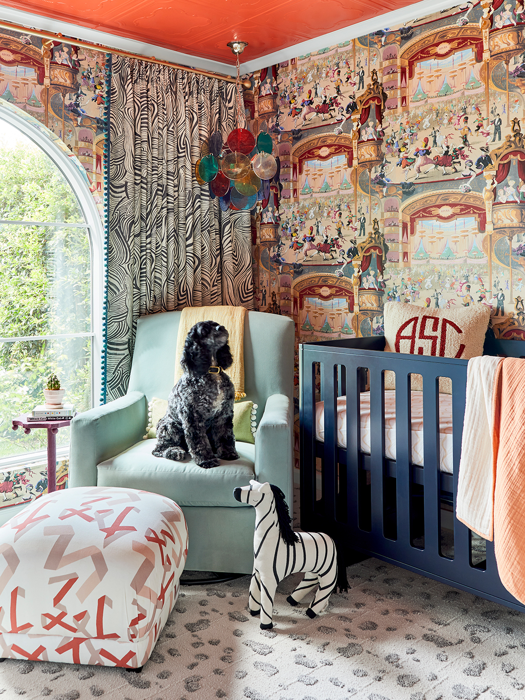
“If you told me I was going to go with a carnival-circus theme including primary colors, I would have laughed so hard,” she says. Her confusion makes sense, especially when you consider Murray’s designs are often described as modern or minimal. Cabaret? Her words for it are intense and loud. But the wallpaper’s exuberant color scheme—red, yellow, pink, green, blue, and purple—gave her complete design freedom, something that doesn’t always happen. “It didn’t limit me at all when it came to all the other stuff I wanted to pull for the room,” she explains. “I get really hung up on having a palette established, whether it’s in a piece of art or a rug, because I think that’s what keeps a space cohesive.”

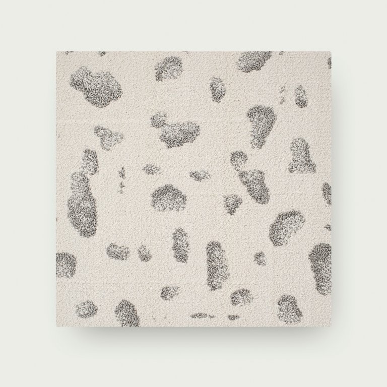
From that point, all the pieces started to come together. Using the wallpaper as a framework, she went bold and bright, leaning into the maximalist composition by layering in color and pattern. “Right now, there’s just so much organic, modern-neutral out there, and I felt like doing that would be such a cop-out,” she says. Marbled zebra window treatments play off the Dalmatian-like spotted carpet from FLOR, and painting the foam tile ceiling vermilion—Benjamin Moore’s Habanero Pepper in a high-gloss finish—and trim a light blue gave the nursery a dynamic, architectural feel, emphasized by all the natural light that comes in through the room’s arched north- and west-facing windows. The light is part of the reason why the combination works. “I cannot believe how much darker and cozier the space feels,” Murray points out. “It’s that kind of stuff you can’t really predict until it’s all in place.”

Even the furnishings take root in the wallpaper. Including the orangey metal bed frame Murray found on Chairish from the 1800s (then dressed up with a linen skirt), many of the items are vintage scores, from the elephant end table to the Murano glass pendant lamp. But it took time to find all the right pieces. “I agonized over it,” notes Murray. For a client, she can draft something up in 15 minutes, but for Alister? It took roughly four months for the room to feel complete. And by embracing the unusual and unique, Murray avoided a matchy-matchy setup. “Some things felt too safe or too traditional,” she points out. “What’s fun about this wallpaper is that you don’t necessarily need art, but I could add stuff regardless and it still didn’t feel out of place.” It was an unexpected but welcome lesson for a designer who’s already seen it all.