We may earn revenue from the products available on this page and participate in affiliate programs.
One bathroom had McDonald’s-yellow walls; the other, a retro pink sink. Caitlin Murray of Black Lacquer Design had her work cut out for her. The easiest approach would have been to pick one complementary palette, buy two of everything, and get the his-and-hers bathrooms in sync. The riskier way in (and the one Murray took)? Create two drastically different spaces for the homeowners, a couple with young children.
While the 1930s bungalow had some beautiful architectural features, they’d since been tampered with. So Murray decided to pare things back to fit the style of that era (“I’m a little bit of a purist about that sort of thing,” she says), infusing each bathroom with some much needed modernity in the process. The challenge was giving those individual spots their own unique personalities without making them feel disjointed. We tapped the designer for her tricks.

Look to the House’s History
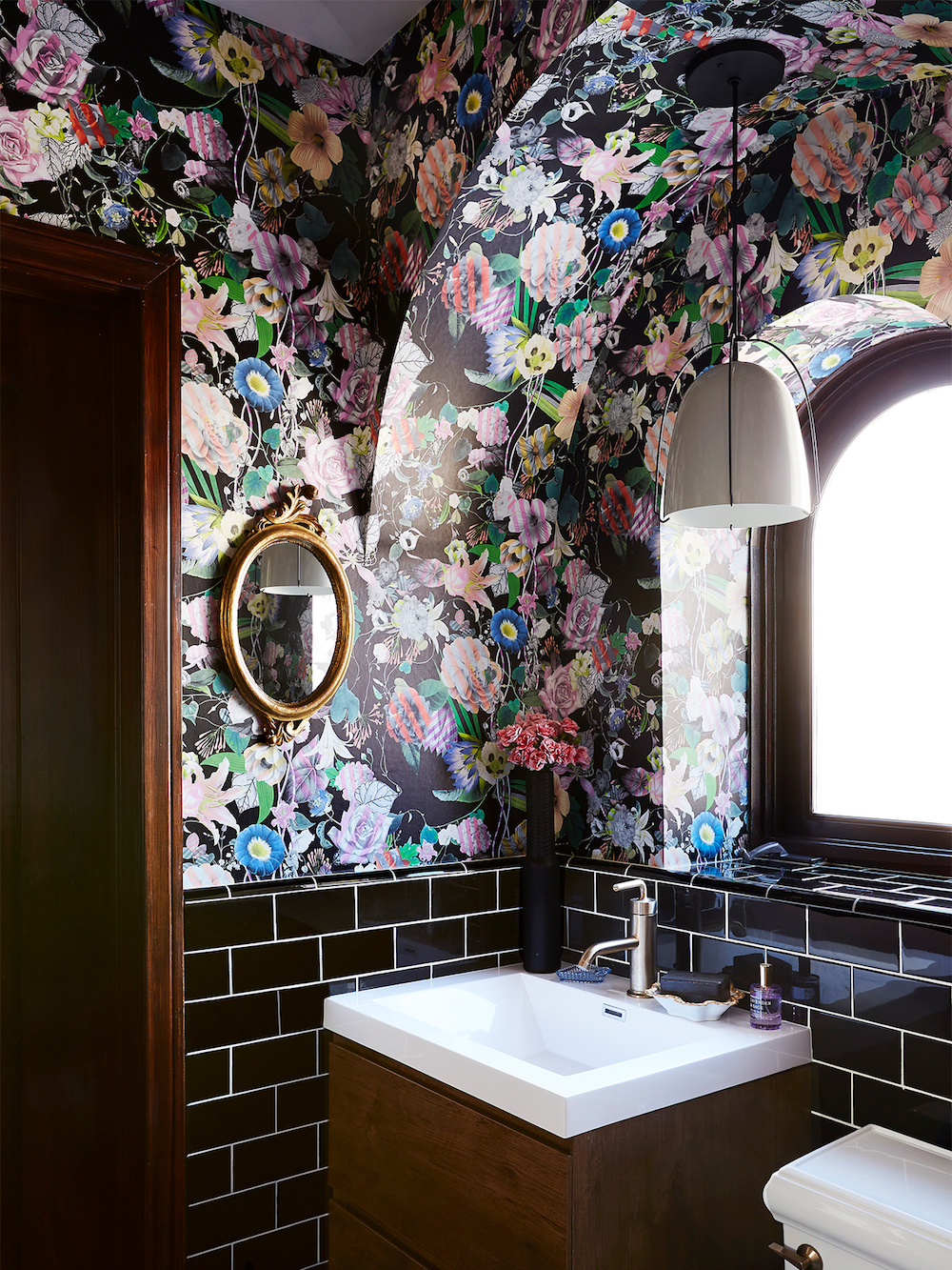
Subway tiles and penny rounds are no-brainers for a ’30s-inspired space, but Murray felt she could do a little better. In the larger of the two baths, she opted for zellige in the shower instead of regular ceramic for a timeworn look. In the other, she took a bolder route, playing up the original arches by hanging a pendant light in a nook to emphasize its silhouette and pairing the look with penny tiling in a bright teal.
As for the fixtures, Murray went the vintage route wherever possible—an antique rug here, a gilded mirror there. She even ditched the built-in vanity in one room in favor of a repurposed credenza, worried that the former would read too contemporary and overpower the space. “It’s not always about having a star of the show; we need a supporting cast,” she says. “I was looking for something that wouldn’t be too jarring.”


Use Color to Create Cohesiveness
“Pick a wall treatment that has a pretty expansive palette—that way you can really pull any of the colors from it and use them to continue the design. It’s already done the work for you!” says Murray. Here, that color is pink. It’s found in the flowers in the wallpaper (the first thing she bought for this project) and echoed in the walls of the bigger bath. The shade came about for a specific reason: It tested best against the stained glass’s blue and yellow reflections. “As long as you have that common denominator, you can incorporate a lot of different styles,” she explains.


Give Yourself Room to Go Wild
Murray designated one bathroom as the “safer,” more classic space, and the smaller one as a place for experimentation. “We wanted it to be a jewel box,” she says. “You have the opportunity for so much impact with less square footage.” Not to mention it’s more affordable and less of a commitment.
Her green light for creating pockets of pattern? “Think about the surrounding spaces. What do you see when you’re looking out or in?” she says. “If everything else around it is somewhat neutral, you have more of an excuse to do it up.”