We may earn revenue from the products available on this page and participate in affiliate programs.
If there’s one thing I’ve learned during my time as a style editor, it’s this: One bold, eye-catching decision can make the rest of the design process a breeze. When you’re completely fearless about one element—a graphic area rug, giant Noguchi lamp, magenta throw blanket—often the rest will take care of itself.
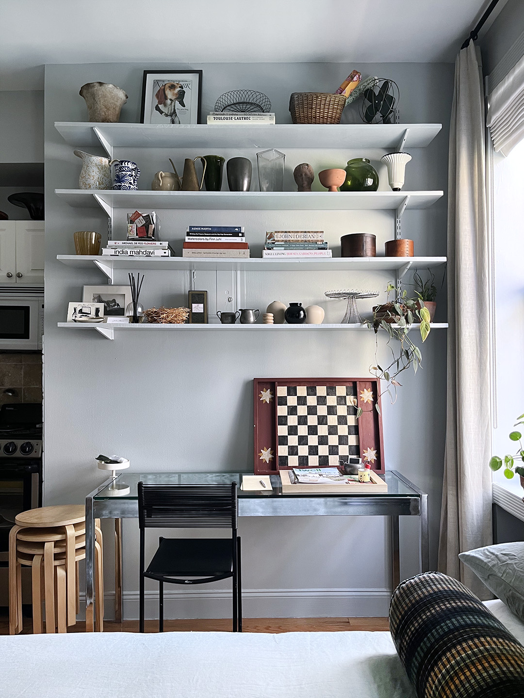
Until recently, I had never designed a space from start to finish, let alone one that’s meant to represent my taste and my taste only. There’s nothing architecturally significant about my Manhattan studio; it’s a 230-square-foot square with medium-height ceilings, and I thought long and hard about what I was going to do with my contract-grade white walls. I wanted to create an impact, but not one that I’d get sick of after a month.

While I considered beige for a short time—Benjamin Moore’s puttylike Natural Wicker is so chic in interior designer Brett Williams’s studio—I worried that it might end up looking drab. I was equally hesitant to go with something too bold in a studio (there’s no escaping that one room), so I settled on a blue-gray for its calming but distinctive look.
You’d think that as an editor I would be decisive, but making this choice took quite a bit of back-and-forth. I spent hours staring at swatches, getting second opinions, and pinning images. Here are the 20 hues I started with.
The Initial List


Nailing the Inspo
I’ve always been drawn to cooler tones, which is probably why Roman and Williams’s design of New York restaurant La Mercerie was, for me, love at first sight. The walls are drenched in the perfect shade of blue-gray, complemented by velvet banquettes in a deeper shade. It’s not overly saturated and can also look a bit green in certain light. I used this as a touch point, comparing images of the space to my swatches.

More really is more with this color; layering it with shades in the same family creates a calming effect—like putting on blue-tinted glasses. I have had images of this room, designed by New York design firm Charlap Hyman & Herrero, pinned for years; I loved the bed so much it was one of the reasons I went all in and used blue bedding, too.

And lastly, I’ll never forget this story from the first issue I worked on at Domino: the Paris apartment of the couple behind the shop Raw in Milan. Each room is a different shade of dusty blue, and seeing how beautifully the color blended with warm wood antiques and metals certainly helped seal the deal.


The Front-runners
Throughout the process, I kept coming back to a curated selection from Farrow & Ball. You can’t really go wrong with any of the British brand’s colors, and at a certain point, less options to pick from was pretty appealing. Plus the pigmentation is so vivid and the different qualities and sheens so specific that I felt like a real interior designer. Yes, it’s pricier than other paint brands; thankfully, my apartment is so small that it wasn’t too expensive.
Farrow & Ball swatches contain the actual paint applied to paper, and taping larger ones to the wall was much easier than making a mess opening cans. Overall, the colors looked vastly different on the screen than they did in real life. My advice to anyone looking for paint colors: Bypass hemming and hawing online and head straight to a paint store.
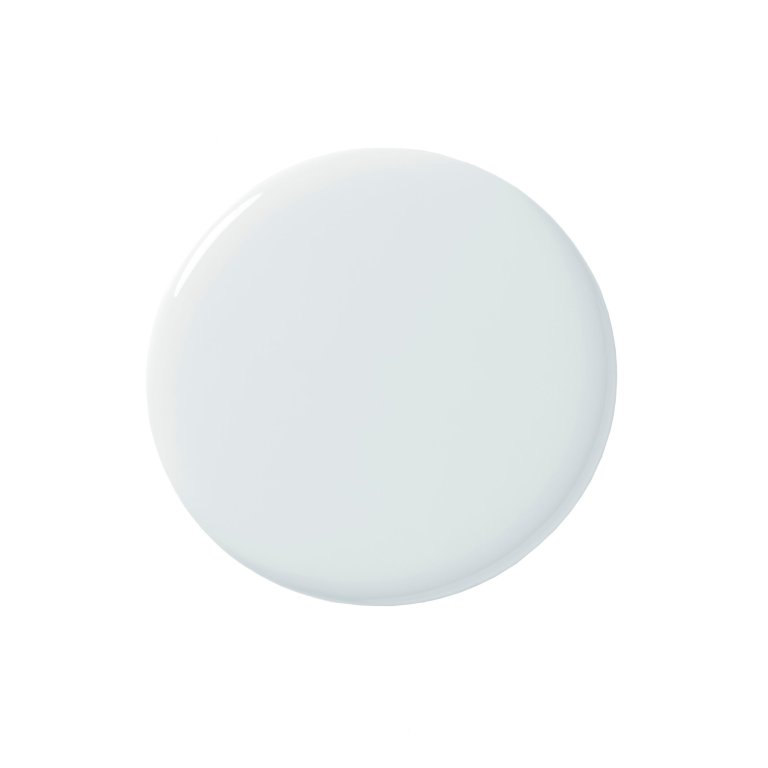
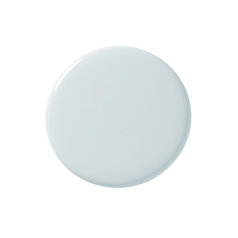
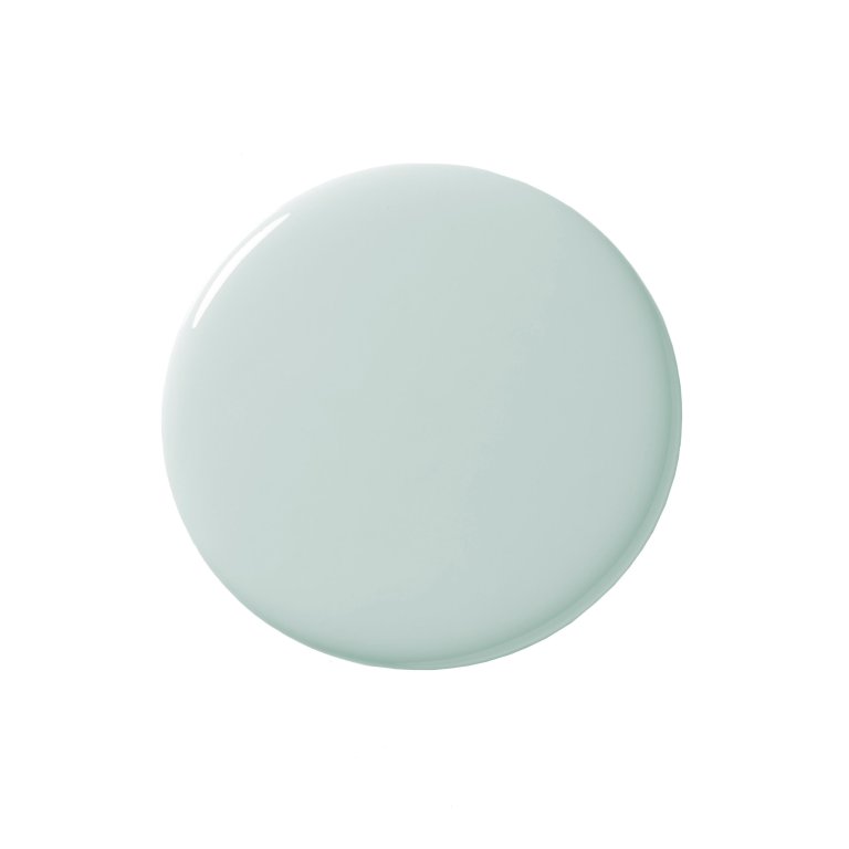
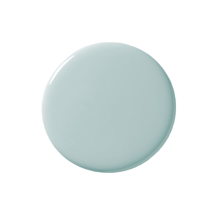
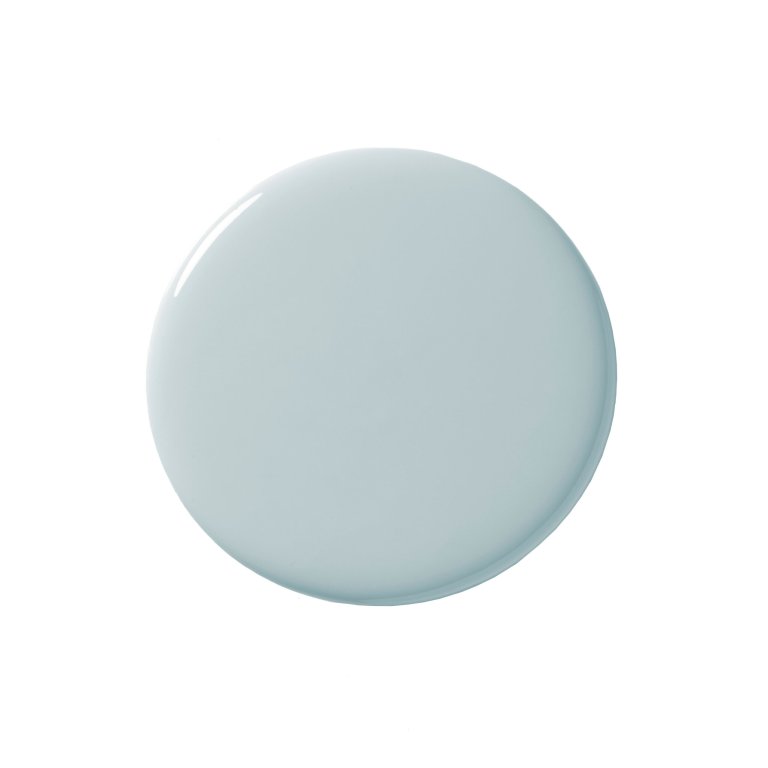
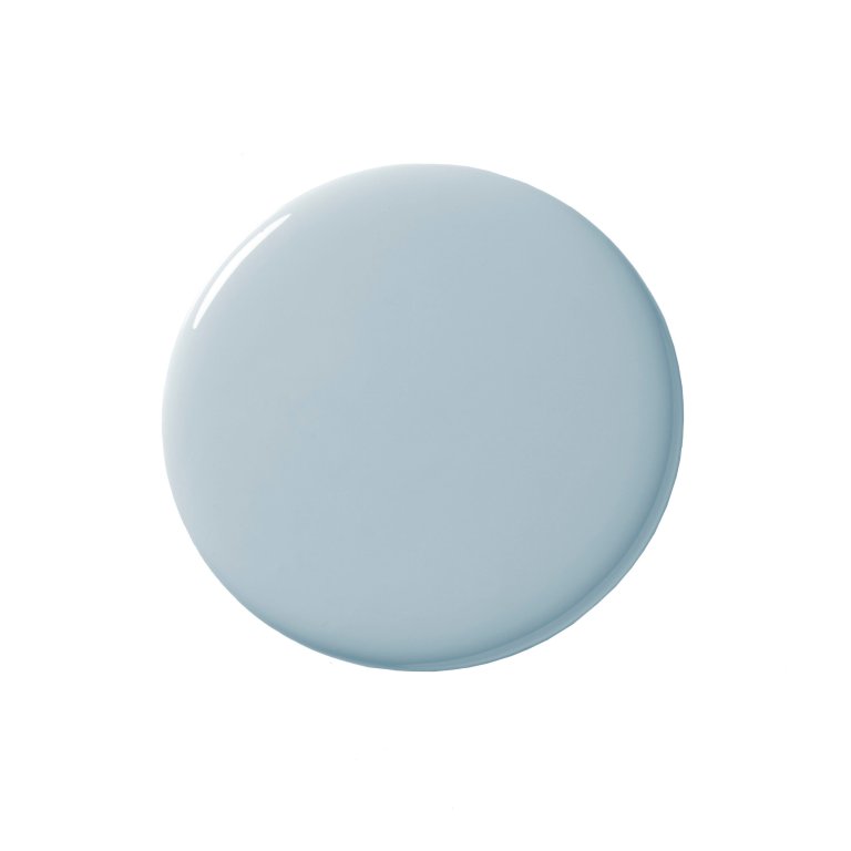
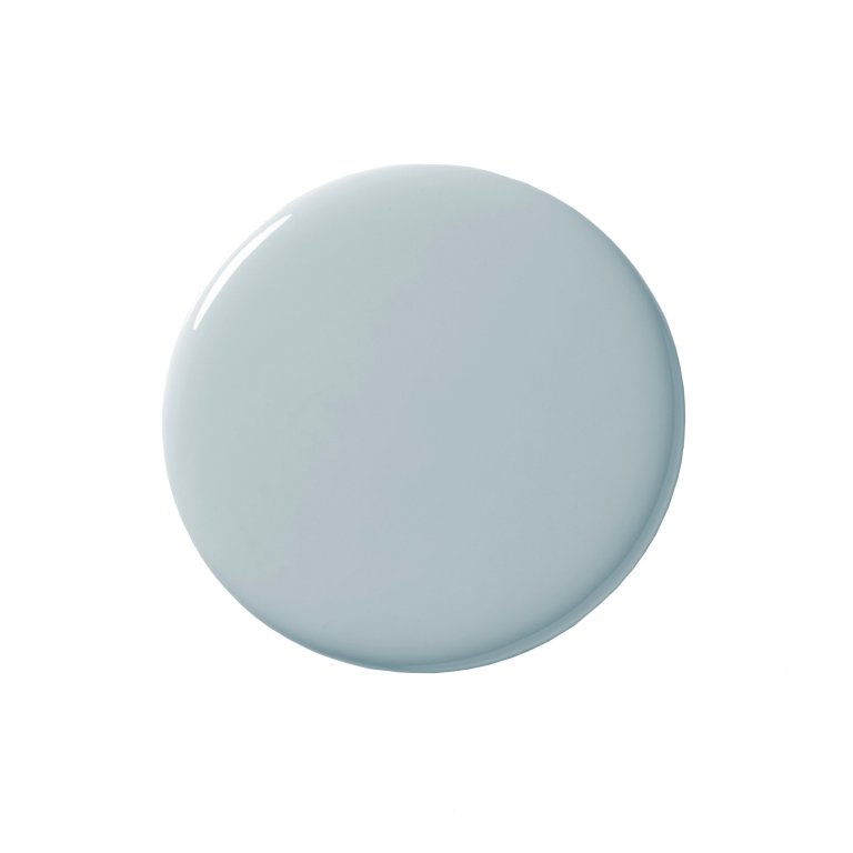
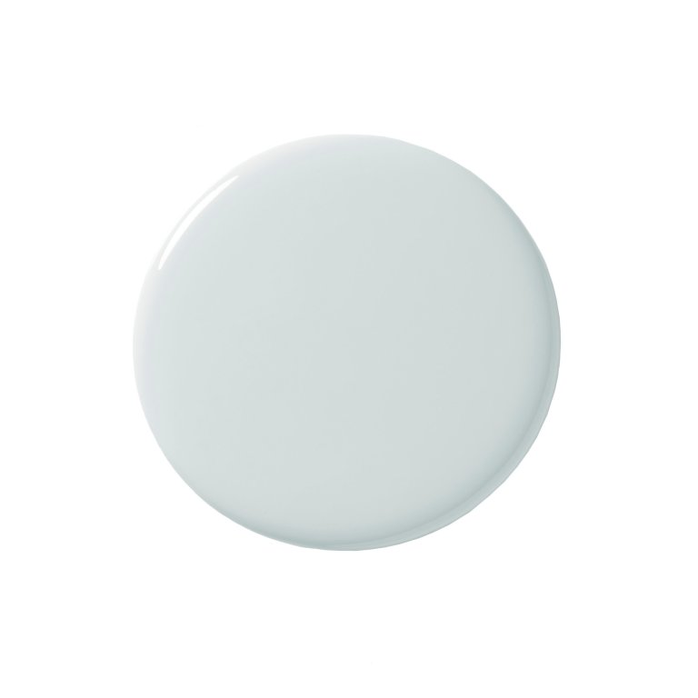
After getting up close and personal with each swatch, I immediately ruled out the brighter, fresher Borrowed Light and Parma Gray in fear of my studio looking like a nursery. I initially thought I’d go with Light Blue, but after seeing it in the room, it was far too dark and leaned a bit green.
The Final Decision


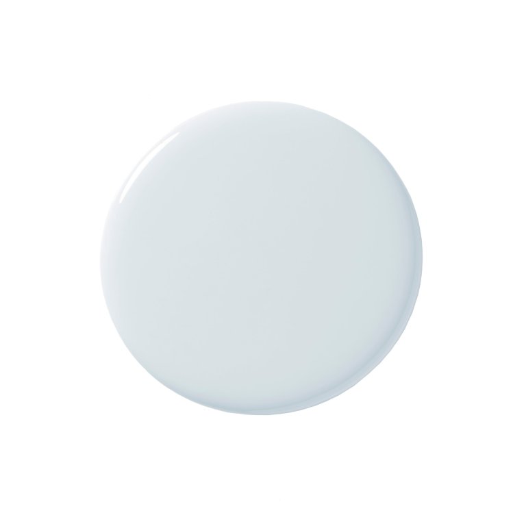
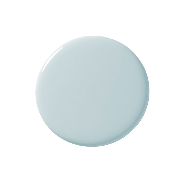
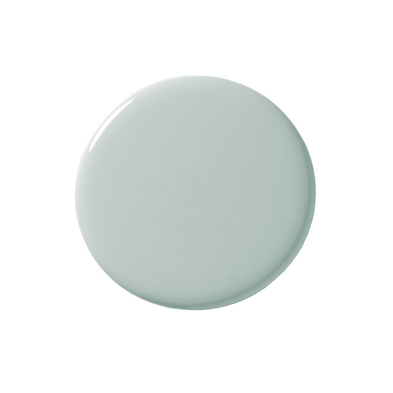
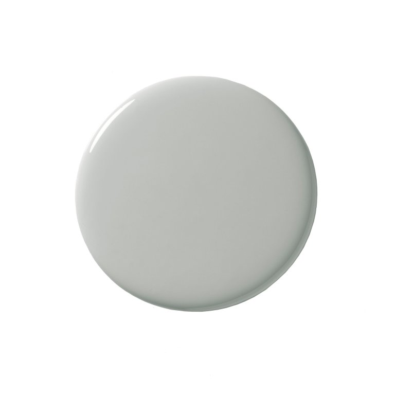
Skylight ended up being a happy medium, light and cheerful while still a little gray. It felt sophisticated and neutral enough to live with long term. I used scuffproof matte Modern Emulsion on the walls and durable satin-finish Modern Eggshell on my Ivar cabinets, shelves, and trim.
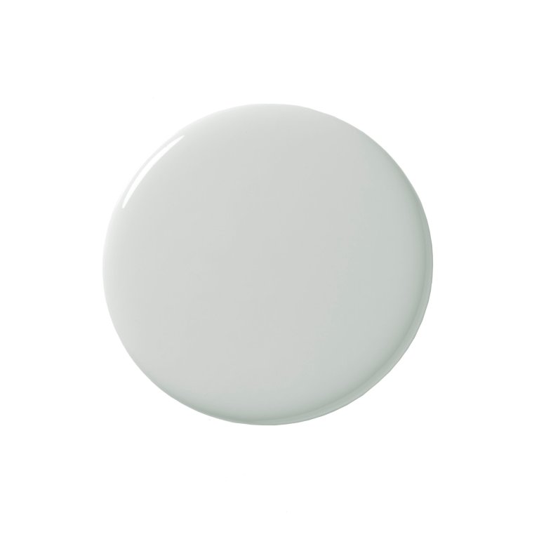
Skylight
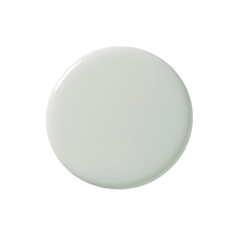
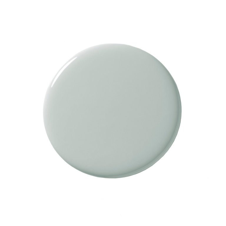
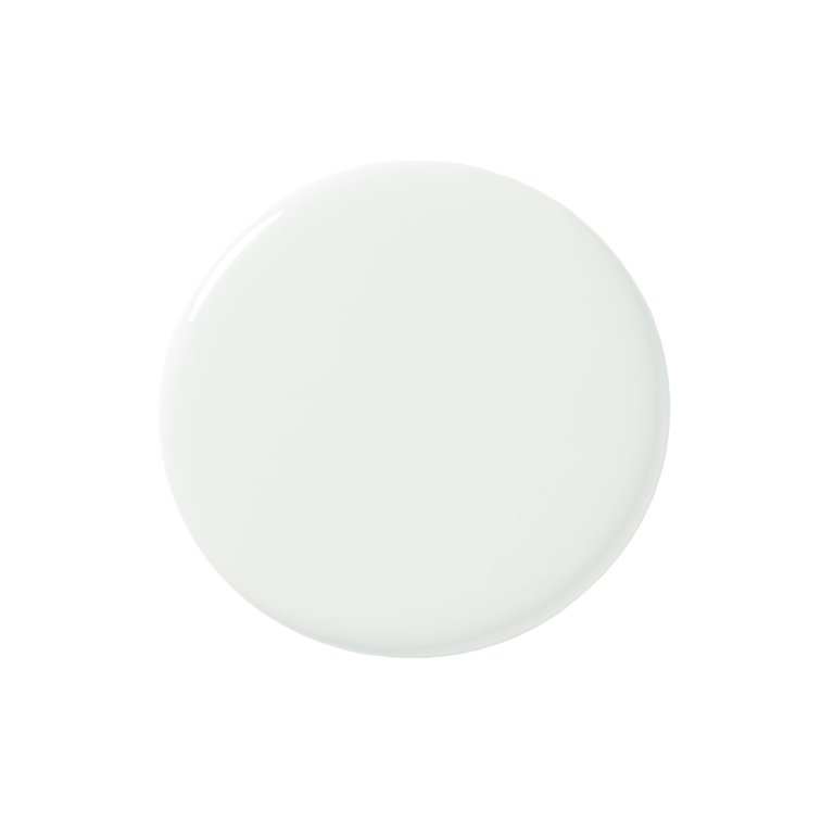
Shop NowI would have painted the ceiling the same color, but because the windows and doorframes have a traditional trim, I wanted to maintain the classic style and painted the ceilings one shade lighter than the walls: Cabbage White, in chalky Estate Emulsion. Not only will I never tire of the color in my current space, I’ll likely use it again in the next place I live. And the one after that.