We may earn revenue from the products available on this page and participate in affiliate programs.
If you’re torn between going bold with a darker paint color like an inky black or playing it safe with a simple white, there’s fun middle ground to be found with gray. Of course, this versatile choice can shift depending on the time of day or the direction of the sun, so if you’re determined to keep the vibes inside comfy and cozy rather than stark and sterile, designers suggest sticking with a warm gray (and perhaps finishing the look with brass hardware and a cashmere throw blanket).
Naturally, it’s easy to dismiss gray as a cool color; even when you narrow down your swatches to those with beige, violet, or yellow undertones, a trip to the hardware store can still reveal aisle after aisle of options. To help, we asked pro designers for the best warm gray paint colors they’ve used in projects (in kitchens and living rooms, on trim and molding). Here are their top seven picks.
Our Favorites
- Balboa Mist by Benjamin Moore
- Light French Gray by Sherwin-Williams
- Guru by Portola Paints
- Classic Gray by Benjamin Moore
- Reclaimed Wood by Dunn-Edwards
- Pilgrim Haze by Benjamin Moore
- Collingwood by Benjamin Moore
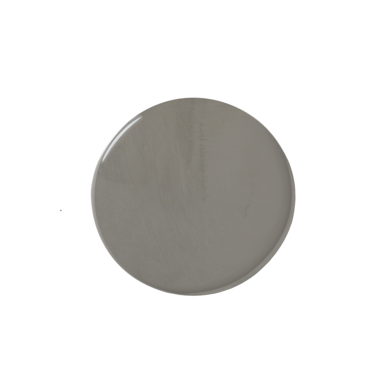
For an Effortlessly Lived-In Look: Balboa Mist by Benjamin Moore

LRV: 67.37 | Similar colors: Athena, Light Pewter | Undertones: Beige, pink
Why we chose it: A versatile pale gray that’s borderline off-white.
In their bedroom, Brett and Kara Phillips of High Street Homes went with Benjamin Moore’s Balboa Mist, a classic, putty-like greige. “We love the way the color changes from a gray to beige tone as the light moves throughout the day, giving our room a timeless elegance,” says Kara. “We used it in eggshell on the walls, and painted the trim in Sherwin-Williams’s White Duck.” To further pull out its warmth, the pair added a vintage wood side table and bouclé armchair. Originally, they assumed they’d go with a darker paint, but now they love how a light and airy morning feel gives way to a cozy ambience in the evening.
What we like:
- Can amplify light in a room
- Popular, easy-to-find color and a best-selling neutral of the brand
Worth noting:
- Part of the Off-White collection
For a European Escape: Light French Gray by Sherwin-Williams
LRV: 53 | Similar colors: Knitting Needles, Fortitude | Undertone: Purple
Why we chose it: Transport yourself to the cobblestone streets of Paris without a plane ticket.
“I recently used Light French Gray by Sherwin-Williams in satin for a built-in and was very happy with how it turned out,” shares designer Kate Lester. “It was the perfect neutral pop of color, especially against white walls.” This mid-tone gray fits best in rooms constantly bathed in light, whether from nearby windows or the lovely glow of an illuminated floor lamp. In smaller, darker interiors, though, it might appear too strong. That’s why Lester paired it with a bright white for appealing contrast.
What we like:
- Excellent depth
- Can easily create contrast
Worth noting:
- Not the warmest of warm grays

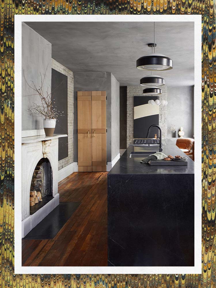
For the Illusion of Texture: Guru by Portola Paints
LRV: N/A | Similar colors: Dry Gourd, Tintype | Undertone: Yellow
Why we chose it: A concrete-like color and finish.
“The homeowners of this dream kitchen love themselves some gray—but I didn’t want the room to feel flat; I wanted it to have warmth, texture, and life,” recalls Leanne Ford. Portola Paints to the rescue. “Starting in the kitchen, we applied limewash over the drywall and the ceiling for a heavier texture,” she explains, which also creates a moodier ambience with the right light. Zeroing in on the space’s unique surfaces, Ford also applied the same technique to the powder room, coffee corner, and exposed brick in the kitchen, deviating from her usual approach. “You could say it elevates the space,” she adds. “I say it fancifies it!”
What we like:
- Earthy texture
- Can be applied on everything from Sheetrock to brick
Worth noting:
- Natural ingredients can cause variation in color between orders

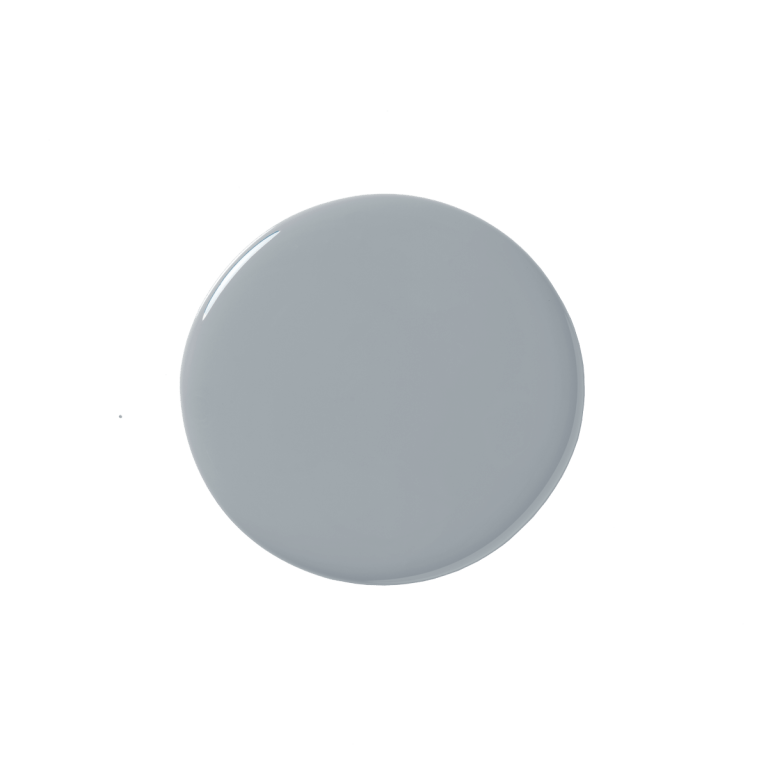
For a Neutral Backdrop: Classic Gray by Benjamin Moore

LRV: 74.78 | Similar colors: Dove Wing, Silver Satin | Undertones: Beige, pink
Why we chose it: A light gray that won’t fight your focal point.
This warm gray paint color has become a designer go-to for good reason: It can easily blur into the background, making it a safe choice. “Classic Gray is a wonderful, very subtle warm gray,” explains designer Young Huh. “In fact it really balances the line between a gray and an off-white and looks fantastic on kitchen cabinetry, especially when combined with a striking countertop and backsplash.” Bright enough to lighten low ceilings (a favorite strategy of Berkley Minkhorts, co-owner of House of Nomad, who used the shade all over her own home), this is also one of the softest picks.
What we like:
- Flattering in both small and large rooms
- Lighter than Balboa Mist
Worth noting:
- Can read as white

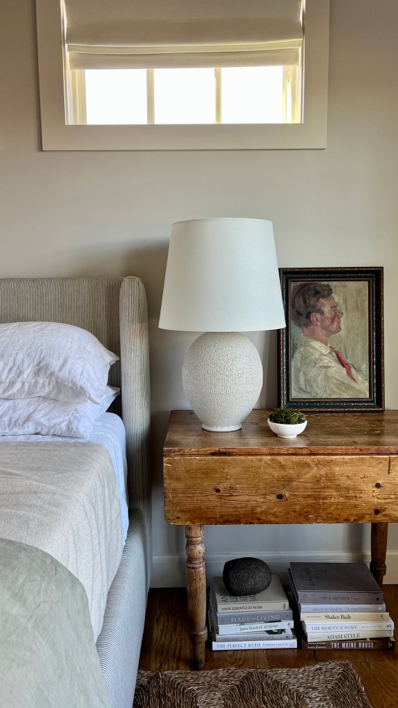
For a Natural Touch: Reclaimed Wood by Dunn-Edwards

LRV: 47 | Similar colors: Flintstone, Play on Gray | Undertone: Brown
Why we chose it: A woodsy neutral that would fare well in a greenery-filled interior with natural accents.
Lindye Galloway, founder and chief creative officer of Lindye Galloway Studio and Shop, is a big Dunn-Edwards fan and recommends the brand to all her clients. For gray in particular, she almost always turns to Reclaimed Wood for the visual calm it brings to every room, whether it’s the kitchen, bathroom, or, in this case, the bedroom. “This is a soft and neutral gray that pairs beautifully with a wide variety of hues,” she notes. “We recently used it in a primary bedroom with a semigloss sheen, and it was the perfect backdrop for the wood furniture and white headboard that we selected for the space. It’s definitely one of our go-to colors.”
What we like:
- Brand includes paintable and movable sample swatch
- Traditional, classic choice
Worth noting:
- Limited finish options available

For a Coastal Getaway: Pilgrim Haze by Benjamin Moore
LRV: 37.8 | Similar colors: Shadow Gray, Stonington Gray | Undertone: Blue
Why we chose it: A mid-tone gray that can balance a space.
Though designer Katie Rosenfeld rarely goes with grays, she loves Benjamin Moore’s Pilgrim Haze. Since it’s warm-toned with just a hint of cool, she uses it to soften coastal interiors, especially in her own designs, which skew warm. Her trick to getting this bold, bluelike gray to appear less intense? Cutting it back by 50 percent, just as she did for these cabinets in a kitchen in Kennebunkport, Maine.
What we like:
- Saturated appearance
- Mid-tone gray
Worth noting:
- Warm it up with your decor; alone it leans more cool

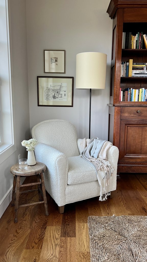
For a Calming Corner: Collingwood by Benjamin Moore

LRV: 62 | Similar colors: Nimbus, Apparition | Undertones: Brown, purple
Why we chose it: Goes well with anything and everything.
At the moment, Kim Armstrong—owner and principal designer of Kim Armstrong Interior Design—can’t get enough of Collingwood. “It’s warm, it’s light, it’s just enough color to enhance the room but not change the other colors that you bring in through textiles and art,” she says. “It plays the perfect supporting role when just a touch of color is needed on the walls but you still want a sense of calmness and brightness in a room.” But her favorite aspect of this hue is that it plays well with the entire color wheel. “You can put beige, red, blue, green, white…I’ve never seen a color that doesn’t work with Collingwood. It is the perfect light, warm neutral for any room.”
What we like:
- Versatile
- A neutral light reflectance value (LRV)—more on that, below.
Worth noting:
- Part of the brand’s Off-White collection
How We Chose These Products
We asked seven designers to share their favorite warm gray paint colors. They told us both what they loved and how they used each shade (whether it was application, placement, or finish) plus the different ways that light—ambient or natural—can impact how warm these hues actually come off.
Our Shopping Checklist
Undertones
“Undertones can be really tricky when selecting grays,” offers Armstrong. “Once I have narrowed down a color I am considering, I take that color chip, cut it out, and lay it on a piece of white typing paper. If there are any weird undertones in the color, they will be amplified when contrasted onto plain white paper. I’ll also compare it to other colors, like blue and green and purple, and see if there are any undertones that show themselves.”
Of course, a lot of factors can influence the way a warm gray paint color looks, especially light. “Warm grays typically bring out pink and red undertones, while cool grays can read blue or green, so you need to take that into consideration when pairing with other colors,” stresses Lester. “For example, if you have a cool gray with a noticeable blue undertone, don’t pair blue furniture with it unless you want it to read completely blue. Same goes with warm grays and pinks or reds. You need to make sure they are being paired with balancing colors.”
Amount
So you narrowed down the color, but should you bring home one bucket or two? Determining how much paint you need may seem confusing, but Decorist designer Casey Hardin has previously explained that all you need is a calculator to purchase the correct amount. Multiply the length and height of your walls, then divide that number by the paint brand’s promised coverage—usually between 300 and 400 square feet—to know how many gallons your room requires.
Application and Tools
Now it’s time to get working. A first layer of primer is highly recommended (especially if the original wall is a deeper, darker tone), though not always necessary, especially if you go with a self-priming formula. But how to decide whether to pick up a brush or a paint roller? The latter does a better job of quick coverage on plain walls, but for delicate details like trim and millwork, brushes are best.
In between coats, experts advise waiting at least three hours before adding another layer. And thanks to most lines touting low VOCs, all you need to do is crack open your window for a bit of fresh air. Once you’re done, you should be able to spend time in the room as soon as the walls are dry.
Ask Domino
Most designers agree: White and gray make the perfect pair. “I think the pairing brings out the best in both of them. Sometimes when you pair white with a color, the color makes it look gray, and sometimes when you pair gray with a color, it makes it look white,” notes Lester. Galloway notes that Dunn-Edwards’s Whisper is a creamy alternative she loves to use, especially for those instances where a typical white or ivory isn’t working.
“I love to use gray tones with clear, real primaries like navy, red, and yellow,” adds Rosenfeld. “Really, any shade of blue works well with a gray backdrop. Think of the sky: It is all blues and variegated grays. I always look to nature to understand how these colors interact.”
LRV stands for light reflectance value. It’s a measurement of how much a color reflects light: The higher the number, the more light it reflects; the lower the number, the more light it absorbs. “We find that we are drawn to colors with a lower LRV when we have ample natural light, but confirming the livability of the color throughout the day with paint samples is a must,” advises Kara Phillips. “Always apply paint samples to your walls before making a decision. The color will change throughout the day based on the amount of natural light that floods into the room.”
Once your project is complete, it’s important to seal your lid tight: Exposure to air can dry paint over time, and particular climate conditions (hot, cold, damp) can clump it beyond repair. Try to store it in a closet or shelf on the first floor rather than, say, your basement or garage. If you do happen to revisit a can (it should be good for about three years!) and notice it’s looking a little funny, perhaps even separated, just give it a good shake and stir before dipping your brush in again.
The Last Word
Whoever said gray was stark and sterile never met these warm gray paint colors. And because gray is a bit of a chameleon, taking on the appearance of its surroundings (whether that’s northern light or glossy blue zellige tile), you can play with your decor to change up how this dynamic neutral reads in a room.