We may earn revenue from the products available on this page and participate in affiliate programs.
When interior designer Valerie von Bechtolsheim, the founder of Studio Von B Interiors, and her husband Benny Bentham embarked on an addition for their Victorian row house in London, they didn’t think twice about which architect to hire. Valerie’s brother, Felix von Bechtolsheim, is the founder of Wylde Architects, and Valerie had collaborated with him on many projects already. “We often work on old, existing buildings and really breathe some life into them again while being respectful to the buildings,” Valerie says. Her own 150-year-old home was a similar creative challenge.
For the extension, Felix pushed out two walls on the back of the home: two meters to the side and three meters to the rear, creating 25 square meters of additional space and allowing for an open kitchen-dining-living area on the main floor. “We basically dug down a lot in order to achieve these wonderful ceiling heights that we now have,” explains Valerie. “So you have a completely unexpected volume in one of these classic Victorian terrace houses.” Tall glass sliding doors create a seamless flow between the indoor space and a new patio.


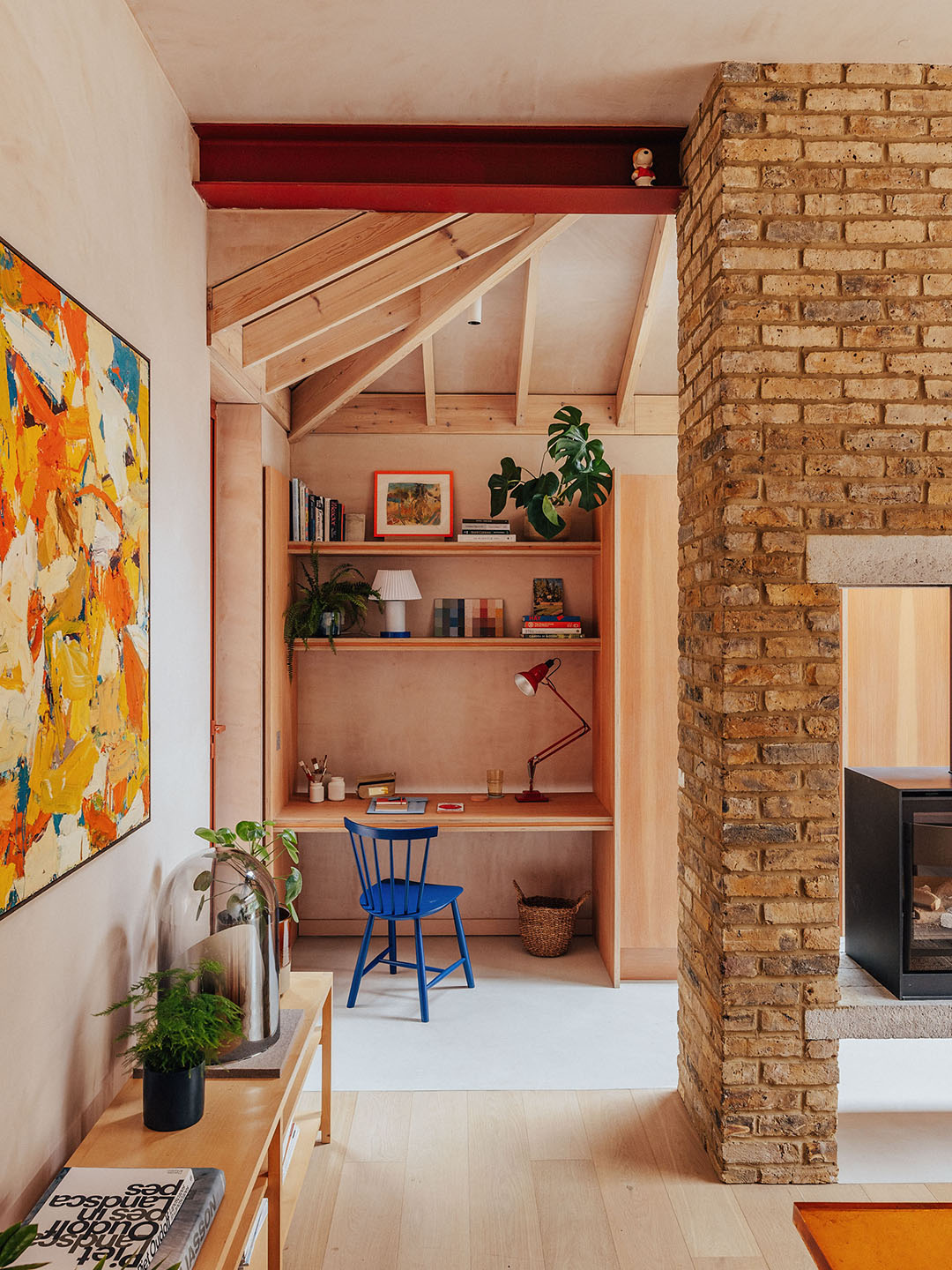
The von Bechtolsheim siblings’ work tends to celebrate the way things are constructed and the materials from which they are made. In this house, Felix intentionally highlighted the original footprint: The exterior brick is still visible on the interior where it meets new steel supports, and the flooring shifts from oak to concrete to delineate the newly added section. The entire extension is timber frame rather than masonry, a choice that cut costs and construction time. When they realized it was too expensive to reveal the structural framing of the new addition, the pair devised a plan to add decorative beams beneath the hidden structural ones, alluding to how the addition was built. “Architects love to express what’s going on in the building,” says Felix. “We like to show the structure where possible.”
They also love working with raw materials like exposed brick, steel, and thistle plaster, a gypsum-based material that Valerie leaves unfinished to impart a subtle glow. Felix says “you can coax out more interesting and unique spaces” that way. Using it on the walls and between the ceiling beams “allowed us to achieve a bespoke beam design with sharp, clean lines and subtle shadow gap detailing,” says Valerie.
They repeated that combination in the primary bedroom to make the new extension feel a part of the whole. The warmth in the new living and dining kitchen area was also achieved through the natural wood Valerie selected for the cabinetry.

Using natural materials can result in a quiet, organic looking interior, but Valerie also has a taste for zips of pure color; think: an Yves Klein blue chair, a cherry red task lamp, a minty-green door. These enliven the space, while also helping to tie the old parts of the house to the new; for example, the bright blue color appears in both the formal parlor of the old part of the house and the new more contemporary space.
When it came to the garden, Valerie turned to yet another family member. Her husband Benny, who previously worked in the advertising industry, had recently pivoted to become a garden designer. Felix 3-D modeled how the land could step up from the new patio, which was lower than the original garden after digging out for the extension. The garden then gently slopes upwards to the back of the property, visually extending the outdoor space. Then Benny came in and softened everything with a lush planting scheme. The garden is a strong presence in the new living space thanks to double-height glass sliding doors in the back of the house.
You might worry that a husband, wife, and brother-in-law working together could easily devolve into squabbling. But when pressed, none of them could recall a single point upon which they had needed compromise. In fact, they’re already working on another project together.
Great Room


Parlor


Primary Suite


Garden
