We may earn revenue from the products available on this page and participate in affiliate programs.
No other season necessitates a colorful interior update quite like spring. After months of dreary grays and sensible cozy neutrals, the cheery effect of a bright pop of color cannot be understated. Of course, not everyone has the time or budget to be running around buying new sofas on a whim at the advent of a new season, but chromatic updates don’t have to be extensive. They can be as simple as a vibrantly hued accent wall in your living room or a fresh coat of paint to give an old table new life. The best thing about spring color trends for 2019 is that each hue is completely adaptable to both large-scale changes and smaller design updates.
With the changing season in mind, we tapped some of the leading voices across creative industries to get their predictions for spring’s biggest color trends. From the bold to the demure, there is a slew of options to suit every design aesthetic—though you may notice one color, in particular, is garnering widespread attention. Here’s what the experts have to say.

Bright Orange
Anthony D’Argenzio of Zio & Sons was inspired by a recent trip to Morocco, which he said spawned his latest color obsession: orange. “It’s a stimulating yet chic hue that promotes a sense of warmth and joy,” he says. “This high-energy tone is the perfect color to transition into the upcoming warmer months.” Given its potency, you only need a small amount to make a big impact.
Try it out… on a thrifted wooden dining room or accent chair in dire need of a colorful refresh.

Blue Green
For those in search of a more calming, pared-back hue, take a page from Nicole Gibbons. The designer (and founder of Clare) recommends a medium-hued blue-green—specifically Views from Clare. “It’s reminiscent of the Caribbean Sea and feels calm and tranquil, just like the ocean,” shares the designer. The beauty of a versatile hue like this is that it won’t go out of style with the changing of the seasons and can be used in a myriad of ways.
Try it out… in your bathroom or bedroom to create a serene, spa-like environment, per Gibbons’ suggestion.
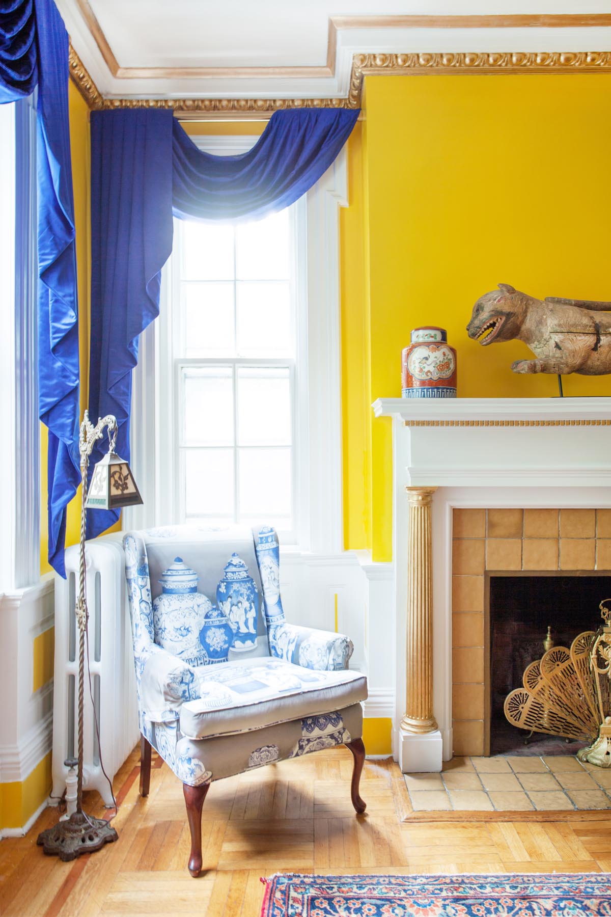
Canary Yellow
Anyone familiar with designer Sasha Bikoff’s lively, colorful spaces won’t be surprised that she picked a sunny hue as her prediction for the leading color trends of 2019. For Bikoff, it’s about what the color represents. “Spring is all about rebirth and fresh beginnings. In feng shui, yellow represents earth, and for me, it’s a pivotal spring color trend,” she explains. “Yellow represents happiness and is a color we see so often in nature, which also connects to spring. When I think of yellow, birds chirping come to mind, as do various flowers, bees, and other spring elements.” If your space needs an endorphin boost, enlist the help of this happy color.
Try it out… on your interior doors to infuse a tiny burst of sunshine in an unexpected way.

Burnt Orange
Leanne Ford’s spring color pick comes courtesy of a personal project: The home she and her husband are renovating and living in. “I am being drawn to all things rusty red and burnt orange,” says the designer and HGTV star. Her LA home, which she says is “a cross between a ’30s bungalow and a ’70s groove shack,” is prime for these rich, old-world colors.
Try it out… on an antique dresser to play up the old-school charm of the storied piece.

Citrus Yellow
“Like the first bite of a tart citron or the refreshing zing of a slice of lemon in your gin and tonic, this zesty hue is just the pop you need to perk up your decorating scheme,” says UK-based designer Sophie Robinson. She favors using the vibrant hue in subtle accents, via piping or a small lamp—or go natural and try a vase of pretty daffodils. “It looks sensational against more well-established color trends, like deep blues or blush pinks, as it instantly gives them a pick-me-up,” she continues.
Try it out… on your window’s trim or the arch of your doorframe for a two-tone look that’s sure to wow.

Beige
Who says color trends for 2019 have to be… well, trendy? Make like Emily Henderson and embrace a classic. “I know it’s probably not the ‘cool’ answer,” says the designer of her love for beige. “It’s been spamming my social media and I’m here for it, even using it in my new mountain home.” The trick to making this neutral tone feel fresh is to pay attention to the gradient: Henderson steers clear of the early 2000s-era beige that got a bad rap for being boring and instead opts for a lighter shade that isn’t too yellow. “It’s warm, neutral, and honestly so pretty,” she says. “The key is to pair it with lots of texture and other tonal whites and beiges, like flax and oatmeal. It’s a serious breath of fresh air.”
Try it out… to zhush up previously stark white walls, offering a hint of warmth without throwing off your neutral color palette.

Mint Green
Artist and textile designer Dee Clements of Studio Herron is sneaking green into her work this spring. “I’m inspired by Dorothy Liebes’s use of mint green in her textile samples from the 1940s,” she says. For Clements, the power of this color trend is all in the clash: She’s a fan of mixing patterns and utilizing asymmetry in her designs, so she recommends balancing out the calming hue with a bolder tone. “Charge it up with its complement: a powerful orange or a sunny yellow,” she says. “Depending on the mood or tone of the room, the color pairing is important, as it will bring out those undertones.”
Try it out… with color-blocking. Opt for bright yellows and oranges per Clements’ recommendation or keep it cool-toned with a royal blue hue.

Rustic Red
“I’m really digging this rustic red color. It’s got a lot of pink and a bit of orange in it,” says Justina Blakeney. The boho queen is all about globally inspired layering, so if you want to emulate her signature style, go the ombre route and match this antique red with similarly warm colors. Blakeney loves pairing it with ochre and lighter shades of pink. “It feels rich, earthy, and warm all at the same time,” she says.
Try it out… as an anchor accent wall for your living space. If your sofa, throw pillows, and textiles embrace a warmer color palette—think pinks, oranges, and reds—it’ll really drive the tonal theme home.

Sage Green
As far as spring color trends for 2019 go, Chasing Paper founder Elizabeth Rees is thinking tonally. Shifting away from the darker, moody green colors we loved in autumn and winter, Rees recommends choosing a lighter, sage green hue. “When used well, it almost feels like a more interesting neutral, and can be used in a space with so many different color combinations,” she explains of the nature-inspired, versatile color.
Try it out… on your kitchen cabinets—Rees says this is her favorite way to paint with sage green.

Pale Yellow
One thing’s for sure: Yellow, in all its forms, is indubitably trending for spring. The latest convert? Photographer Tekla Severin. “What I like about the color is that it’s timeless, like a vintage car and yet it’s also super modern,” she explains, noting that she has plans to involve it in one of her upcoming projects. “My dream would be to buy a porcelain sink in the color for my bathroom, but since I live in a rental apartment, I might paint my walls in it [instead] and be sure to accompany it with porcelain tableware for sunnier breakfasts.”
Try it out… in your breakfast nook. Even if it’s just one wall, this subdued color will cheer up the space without overwhelming it.

Royal Blue
On the other end of the color spectrum, Sunday/Monday founder Nisha Mirani is advocating for a deep royal blue. The textile designer, who is known for her bold mixing of prints and color, points to a recent trip to the Chhavi Nivas in Jaipur with her cofounder (and husband) Brendan Kramer for her newfound color crush. “We love this saturated blue because it packs a punch with its brilliance while also adding depth and a sense of tranquility,” shares Mirani.
Try it out… against less dramatic colors for some modern juxtaposition in any space. Mirani pairs it with sandstone pink and mustard.

Terra-Cotta
Aside from yellow, it seems the earthy tones are a close second for spring 2019’s biggest color trends. Textile designer Aelfie Oudghiriis a big fan of the hue for impending warmer weather. “The color can add earthy drama to an interior through something small, like an unglazed pot, or through painting a whole room,” says the Aelfie founder.
Try it out… with a sponge-painting technique to really drive home the character of a timeless color like this. It’ll bring instant charm to any space—even a rental apartment.

Daffodil Yellow
“I can’t seem to get enough of vibrant yellow this spring. I want to wear it and pop it in my home,” says artist Angela Blehm. “It’s sunshine and bananas and flowers, all telling me winter is almost out the door.” Take a note from the artist’s bold, maximalist home and try the color out in a more statement-making way.
Try it out… against other primary colors. For example, Blehm’s yellow chandelier works beautifully against the red console in her entry.

Fuchsia
Not the sticky-sweet cliché it once was misconstrued as, fuchsia pink is back with a vengeance. Joy Cho of Oh Joy is a believer, calling it a sassy, bold alternative to the ubiquitous blush trend of recent years. “I love it as a burst of energy that you can take into any outfit or space,” she explains. “It’s sure to add a spark that will make everyone smile.”
Try it out… in small doses to ease into one of the trickier color trends for 2019. An old nightstand in need of a refresh, for example, or a floating shelf.

Goldenrod
Somewhere between yellow and orange sits this pretty, warm hue. MINNA founder Sara Berks was inspired by various shades of yellow when designing her latest collection. “I imagine using it as an accent for a pop of color—whether it’s the kitchen, bathroom, or bedroom—paired with warm neutrals,” she says.
Try it out… on your ceiling; because, why not? Even if the rest of your space is completely pared-back and neutral, adding an unexpected pop of brightness instantly takes it to the next level.
It seems clear that if you’re in the market for a spring refresh, yellow is the way to go. From pale tones to vibrant citron hues, the color is a versatile one; plus, it’ll make your home feel instantly cheery. Happy decorating.
See more 2019 color trends to know: Klein Blue Is the Color Du Jour, But What Exactly Is It? This Color Palette Is Taking Over My Instagram “Saved” Folder Lime Green Is the Ultimate Color Underdog of 2019