We may earn revenue from the products available on this page and participate in affiliate programs.
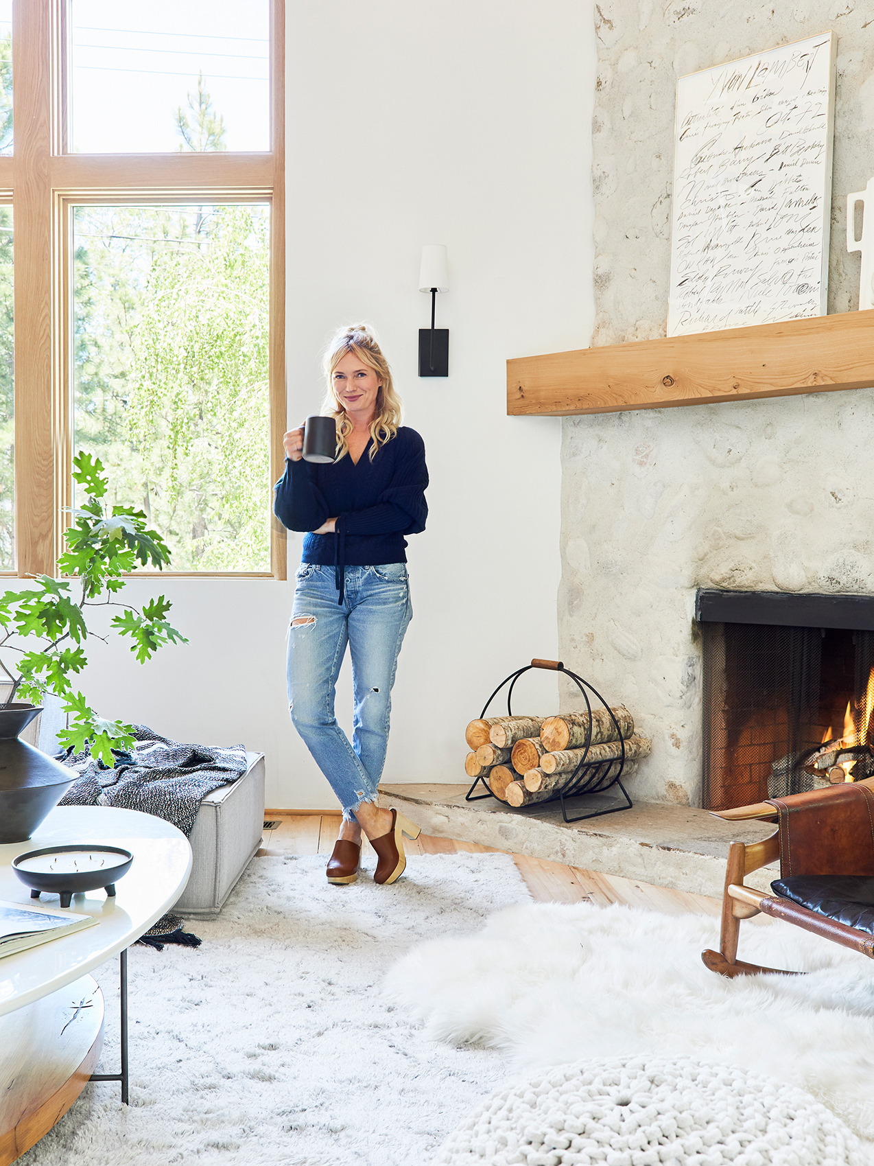
School is in session—styling school, that is. Designer and author Emily Henderson is teaming up with the online learning platform Skillshare to launch a crash course on design basics. The video series takes place in Henderson’s newly renovated mountain house and is broken up into 13 different segments, in which she tackles the tough subjects, from identifying aesthetics to shopping for vintage pieces. “One of the biggest issues is that people don’t know where to start,” Henderson tells me. “But when your home looks like you, it does something to your soul—it makes you a lot happier.”
Because even design obsessives sometimes need a refresher, I took Henderson’s class early and walked away with a ton of new notes. To keep students on track (and encourage them to put her ideas into action), Henderson has peppered the class with quizzes (in one, you’ll select different pieces of furniture to narrow down your style) and scavenger hunts. The course is available to those with Skillshare’s premium membership, which usually costs $99 per year, but the first 100 Domino readers to sign up can snag a two-month free trial with the code 1WETIs. Here are four fresh decorating tips I walked away with (you’re going to want to write this down):
Mix Styles, but Keep a Consistent Palette

While it’s not impossible to combine a Moroccan vibe with an American-traditional aesthetic in the same room, layering ornate on top of ornate can look messy and over the top if you don’t do a little editing. Henderson’s trick for mixing eras and styles: Pick larger pieces of furniture (sofas, rugs, tables) that are clean and modern, then pepper in playful accessories. In her last home, the designer gravitated toward mid-century furnishings and Victorian embellishments, but it worked because of her carefully curated mix of colors. “This is my number-one tip in life: As long as you have a consistent palette, you can mix any styles together,” she says.
Choose Visual Interest Over Balance

There’s a crucial moment toward the end of the course where Henderson is deciding which side table to put next to an armchair. The first one is a basic shape but the just-right scale. The second one has a cooler silhouette but overwhelms the armchair. To our surprise, she chooses the latter. “When I switched from being a stylist to a designer, I started abiding by all these rules about balance,” she says. “Now I’m shifting. If something is rad and creates tension (even if it’s out of scale), it makes for a more interesting space.”
Reference the Color Wheel

Henderson is a big fan of brass and wood, but she almost never puts the two materials next to each other. “The tones [are too similar, so they] compete with one another,” she explains. Early on in the video series, Henderson breaks down the color wheel and explains the importance of pairing cool tones with warm tones. The same goes for metals, natural materials, and fabrics. “White on wood or silver on wood, on the other hand, creates enough contrast,” she adds.
An easy work-around if you want to set a gold or yellow lamp on a wood table: Put a stack of books in between them! Or you can always try Henderson’s fix: Only buy black lights.
Follow the Rule of Three

“Things need friends,” says Henderson. When it comes to dressing up a vignette, the designer prefers trios. “Groups of three are easy for the eye to understand,” she explains. In the case of a console table, the designer suggests having one thing that’s flat (a tray), one thing that’s tall (light fixture), and something sculptural (an oversize branch). That’s an A+ tip in our book.
See more stories like this: This Once-Boring Color Is Getting a Rebrand (And We’re On Board) What Nate Berkus Would Buy With $50 at Target I’ve Interviewed More Than 100 Designers—These Are the Best Tips They Gave Me