We may earn revenue from the products available on this page and participate in affiliate programs.
While there are certain design faux pas we just hate to see (like hanging art too high or window drapes too low), there are other rules we don’t mind breaking every once in awhile. One such decorating “no-no” is pushing the dining room table against a wall. If you’re like us, chances are you thought long and hard about your dining table before making your purchase. And while it’s only natural to want to show off your piece to the best of its ability, sometimes we have to compromise function in the name of maximizing space.
In our dream world, we would have a dining room large enough to include a table for all of our friends and family to gather ’round. Not only is a room that follows the laws of symmetry visually pleasing, but having a solid anchor to center the space is easy on the eyes. But let’s throw the rulebook out the window for a minute. Sure, pushing your beloved table aside might mean sacrificing a seat or two, but doing so can actually lend a more intimate feel to the room—not to mention, free up a little space.
Ahead, we share ten unconventional dining layouts that embrace this so-called faux pas. Keep reading to discover our top tips for pulling off this look in a way that feels natural and cohesive.

White on White
With little access to natural light, this breezy dining space—which, no, is not in an apartment, but is instead situated in the trendy office of event and design planning firm 23 Layers—could have easily taken a turn for the dark and dingy. Luckily, the room’s whitewashed walls and minimal white table give the place a bright and airy feel. In fact, this streamlined space is so cohesive that the table appears to continue right through the wall, drawing the eye up to the color-coordinated bookshelf (a bonus detail that we can’t get enough of).

Similarly, this decidedly tinier scene also plays with depth and dimension. Because the two-seater table effortlessly blends in with the adjacent wall, it gives the impression that the surface recedes into space. The sliver of exposed brick seemingly breaking through the crisp painted barrier only furthers this visual trickery.

Small and Square
The problem with most tiny dining tables is that it’s often a challenge to squeeze a third person on the shortest end. And even if they can successfully pull up a seat, their knees are probably bumping into an obstructive post or stray leg. Instead of opting for a traditional rectangular table, designer and artist Malene Barnett invested in a larger square surface with ample room for guests. Not unlike the rest of her Carribean-cool townhouse, the most intriguing moments come in the form of bold color details and space-savvy solutions.

The Kitchen Island
Be it in the absence of a proper dining room or for the want of an eat-in kitchen nook, uniting the dining table and the kitchen island is a clever way to sync your cooking and dining space, as this technicolor Manhattan Beach home proves. Already a central hub for food and conversation, this seamless marriage makes it especially easy to set food on the table the minute it comes out of the oven.

Long Division
If you’re lucky enough to have an open floor plan layout, it can feel counterintuitive to set the end of your dining table against a wall when you have enough space to center it. But when an incredibly wide and empty space is in need of direction and division, a table abruptly jutting out from the wall can act as both a visual and physical barrier. In this rustic-industrial Brooklyn apartment, the dining table extends a sense of separation, while mixed seating furthers the overall casual approach.

Rustic and Cozy
From a strictly aesthetic standpoint, the table-wall combo works wonders in small, rustic settings. In this sweet, Scandi cottage, a simple farmhouse table, textured walls, and antique lighting make for an incredibly cozy vibe. Ultimately, this close-knit set up will encourage all tablemates to engage in conversation and connect.

A Tiny Spot for Two
Just because your 300-something-square-foot apartment doesn’t have a dedicated dining space doesn’t mean you should have to give up a civilized spot to eat. This sun-drenched Swedish studio masters its space problem by setting the table’s longer side against the wall. Going parallel will help you conserve whatever precious floor space you have left.
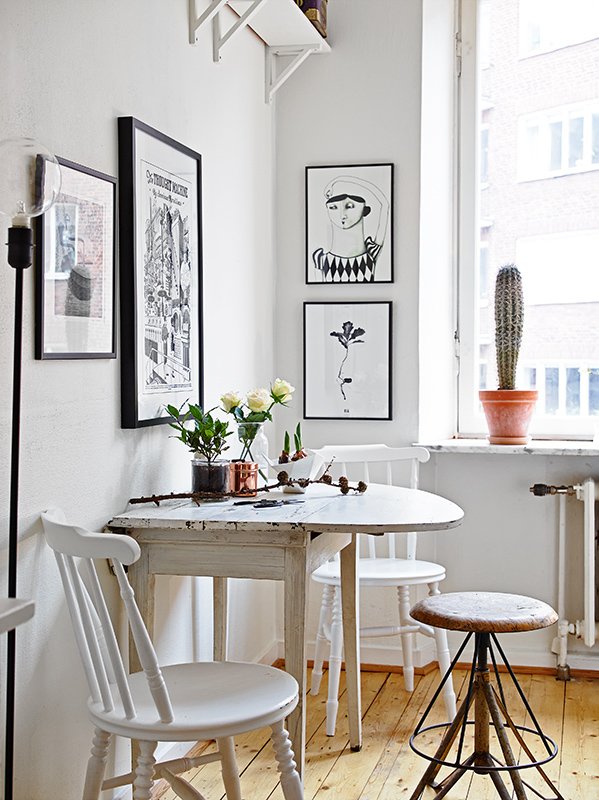
Have a third roommate or a penchant for hosting intimate gatherings? A table with an extendable leaf is a solid fix for expanding your usual party of two. Take a cue from this teeny artistic apartment and pull up an equally teeny stool on the adjustable end. Not having a third bulky chair will make it easier on the host to move about the room and navigate between the kitchen and the table.

Curve Appeal
Have we ever told you how much we adore round dining tables? Of all the reasons to love a tabletop with some curve to it, flexibility reigns supreme. Huddled near the corner of this joint dining-living room, this antique wood stunner just kisses the wall, thereby allowing enough room for a proper place to sit.

For those that want to really commit to this look, opt for a wall-mounted piece that, by design, is only supposed to have three functioning sides—like this sleek version with a stand alone leg. Once dressed up with your go-to tableware or an unexpected floral arrangement, this utilitarian approach will feel both chic and instinctive.
Want more dining room inspiration? How to Mix and Match Your Dining Room Chairs and Actually Pull it Off Dining Room Alternatives For Tiny Apartments Update Your Dining Room With These Stylish and Affordable Chairs
For more stories like this, sign up here for your daily dose of Domino.