We may earn revenue from the products available on this page and participate in affiliate programs.

Anyone who has ever gone to the hardware store to quickly grab a can of white paint knows it’s no speedy errand. There are hundreds of shades to choose from. Some are warm and creamy; others have cool gray undertones. Some read as yellow in brightly lit rooms, others take on a purple-ish tint when applied to the ceiling. Clearly, the perfect white does not exi-
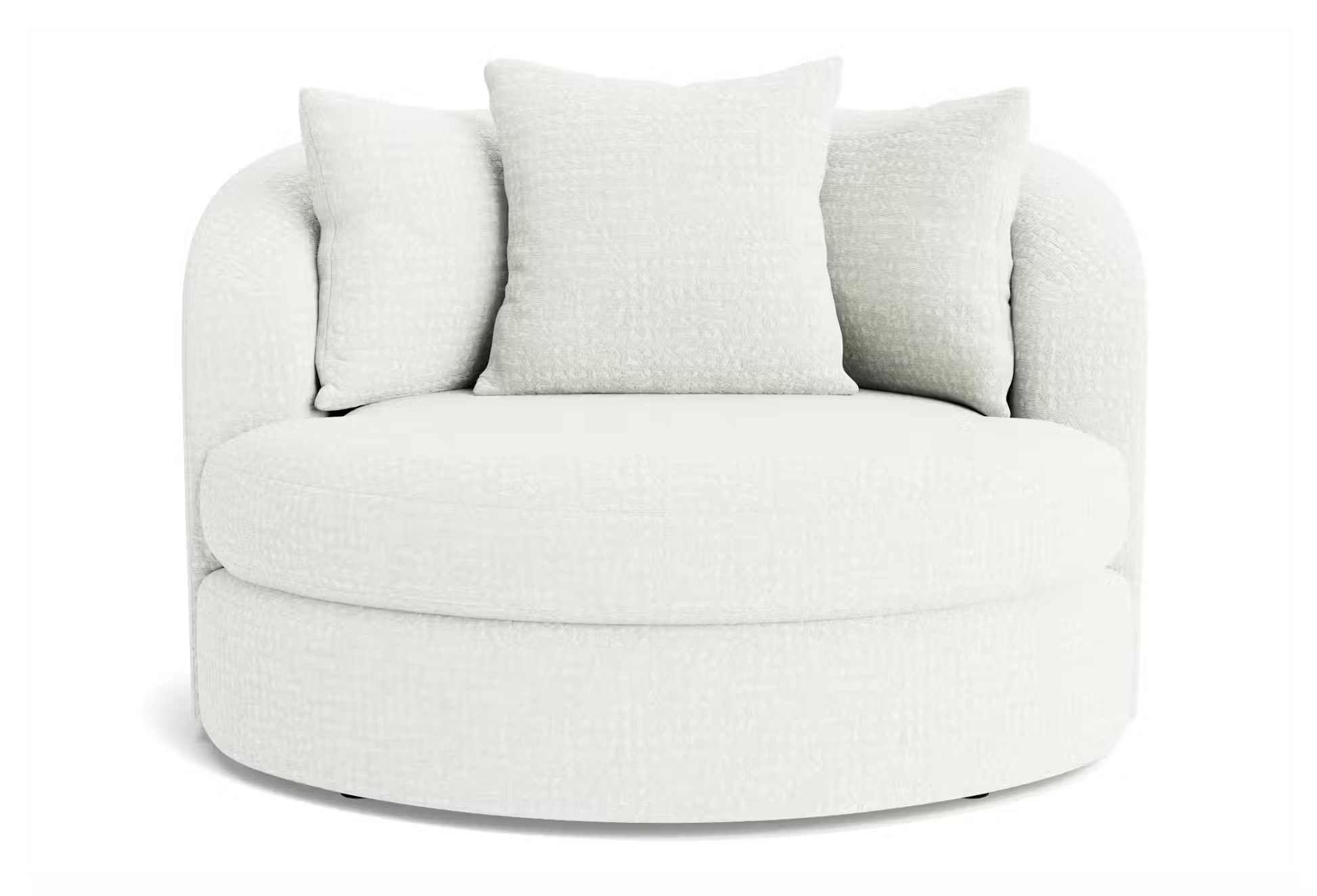
Pantone’s 2026 color of the year, Cloud Dancer, could be the answer we’ve been searching for. Laurie Pressman, VP of the Pantone Color Institute, and Leatrice Eiseman, executive director of the Pantone Color, describe the choice as a “natural white.” “The fact that it’s a soft white (not a scientific, cold white) invites relaxation,” says Pressman. Eiseman adds that it’s a “lofty white that reads like a breath of fresh air” and is “imbued with a feeling of serenity.”
While it might seem controversial to select a shade of white as a color of the year (the only other time Pantone came close was back in 2006 with Sand Dollar), Pressman and Eiseman credit it to our newfound need to disconnect from technology and reconnect with each other. “We want respite, relief from all of this stimulation,” says Pressman. Surrounding yourself with a warm white is one way to unplug at home. It’s a blank slate; a visual cleanse; a chance to embrace your inner minimalist.
Pantone’s 2026 Color of the Year: Cloud Dancer


Okay, so white looks good just about anywhere…with anything. But Pressman and Eiseman do have some direction for making the most of Cloud Dancer. For starters, embrace the billowy white on voluminous textiles like Joybird’s new Soul and Karina fabrics designed in partnership with Pantone. Want to try this balanced white out on your kitchen cabinets? Get it color matched at your local paint store.
The Pantone Color Institute also provided a whole range of color palettes (seven, to be exact) to use with this year’s winner. Some of the pros’ favorites include powdery pastels, warm caramel, cool atmospheric grays and blues, and tropical tones like turquoise and citrus yellow. The breadth of the palettes reinforces the nuances in this white.
More Pantone Colors to Try in 2026


“Sometimes when people go into a paint store looking for a shade of white, they aren’t aware that some can be cool and some can be warm,” says Eiseman. “Now, they might start to see it and have a conversation about it. It’ll get their creative juices flowing.”