We may earn revenue from the products available on this page and participate in affiliate programs.
Michaela Landau could see the potential in her sister’s Cheviot Hills, Los Angeles, home: it was on a tree-lined street, had plenty of 1930s charm, and was just the right size for her growing family. She also realized its flaws. The flow was all wrong (there were openings in walls that didn’t make sense, hallways that led nowhere) and the finishes were dated. So, Landau, a junior designer at Studio M.Haas at the time, decided to introduce her sister to her boss, Merissa Haas. They hit it off right away, and soon Haas was dreaming up ideas for the small galley kitchen. “My favorite thing to design is kitchens, so that got me really excited about the project,” says Haas. As renovations got underway, Haas convinced her clients to redo the floors, update the bathrooms, and carve out new, logical pathways throughout the house. Here’s how it snowballed into a full-blown transformation.
Say Goodbye to the Galley


Opening up the kitchen was a no-brainer, but it required the input of an engineer first, because directly in the middle of it all was a concealed staircase leading down to the basement water heater. “My sister loves to cook and entertain so I knew opening up that space and changing the access to the basement would not only look so much better but give them the right function for how they like to live,” says Landau.


They put up a structural beam and relocated the basement access to the family room so they could create an expansive cooking zone with an island, breakfast nook, and beverage bar (psst: those two drawers are actually Subzero refrigerators).
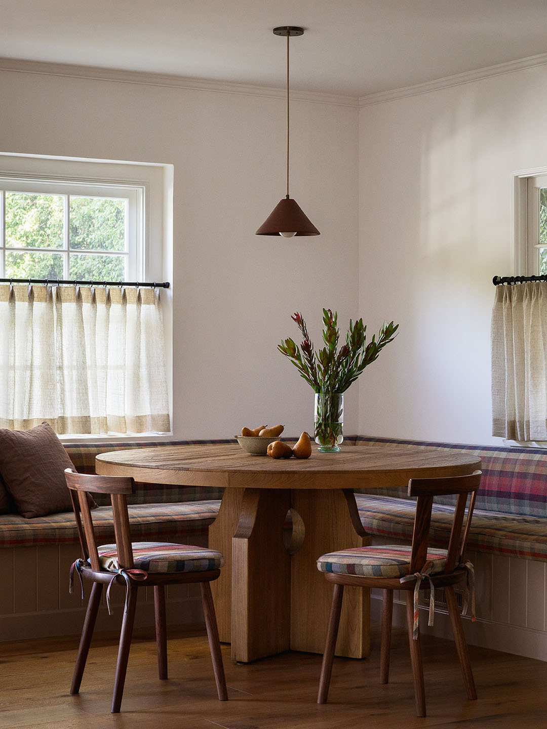
Take Your Fabric Swatches to the Stone Yard


Haas’s inspiration for the look of the new kitchen started with a plaid de Le Cuona fabric she’d been holding onto for four years. “I’ve been waiting for the right project,” she says. And the perfect spot, which turned out to be this breakfast banquette. She took her textile sample with her to the stone yard, holding it up to slabs, and found it paired really well with lavender quartzite. At the paint store, the same swatch looked perfect against Farrow & Ball’s Dead Salmon (now on the cabinets).
Conceal Thresholds That Don’t Serve You


Before, when her clients walked into the house, they were met with a narrow hallway leading to the galley kitchen. To Haas, the pass-through was unnecessary given the kitchen is now accessible through the living area. So, she put up a solid wall in its place, resulting in a proper entryway—mirror and console table included. “When you close things off that don’t really serve a purpose, you can gain so much, even if it’s 36 inches,” says the designer.

Haas made the area even more useful by converting the repetitive sitting area into a formal dining room and cleaned up the curved staircase by removing the railing, refreshing the treads and risers with the new wood flooring, and adding a fresh coat of paint.
Switch Up the Dimensions of Your Built-In Shelves

Another unnecessary threshold Haas decided to ditch? An opening next to the fireplace. Now, there’s a full stretch of built-ins where the family can store tech, toys, and games. The designer clad the surround in a petite granit (one of her favorite stones). “It’s got these tiny little fossils in it, it’s really beautiful,” says Haas. She played off the rich material with a burgundy sofa and Farrow & Ball’s Salon Drab on the millwork. The shelves are different widths and heights on purpose: The irregularity gives it an older look while creating pockets for table lamps and tall vases.
Strip Back Greige Stone


The powder room wasn’t originally on the homeowner’s punch list, but Haas convinced them they could keep the reno simple—and she followed through. “Let’s just strip it all back,” she told them. She went for an old-school, farmhouse look with a basic trough sink, checkered tile floor, and a lick of brown paint.


Haas continued the checkered theme in the kids’ bathroom upstairs, going for an aqua blue and white scheme that extends up the shower walls. “I felt like you could get away with this playful moment in a kids’ space,” says the designer.
Warm Up White Oak

Throughout the house, the designer switched out the floors for engineered white oak finished in a honey hue that felt a little more timeless than trendy gray or white. She even continued it into the primary bathroom. “We’ve been doing a lot of wood floors in bathrooms lately. As long as you have a bath mat, you’re good!” says Haas.
Pick a New Spot for Your Medicine Cabinet


On paper, the primary bathroom had everything on the owners’ wish-list—a double vanity, a tub, a shower—but the proportions and finishes were all wrong. “It was really struggling,” says Haas. The shower was way too big, you had to step up into the Jacuzzi-style tub, and there was no privacy around the toilet. Haas convinced the couple that shrinking the size of the shower would allow them to situate the toilet in a water closet, still squeeze in a freestanding tub, and construct a double vanity with cabinet storage underneath.

The only thing they didn’t have room for were recessed medicine cabinets (there’s a pocket door within the wall), so instead she added a flush cubby over by the tub. The door panel is almost invisible, save for a little knob. “Even though I won’t be siblings with all clients, just really knowing your client deeply and taking the time to understand their habits and lifestyle makes such a big difference for a smooth and successful design process,” says Landau. What sister doesn’t get needing some overflow storage for skincare?