We may earn revenue from the products available on this page and participate in affiliate programs.
While planning the recent renovation of a one-bedroom apartment in Brooklyn, the client of Shapeless Studio architects and designers Jess Hinshaw and Andrea Fisk was eager to talk paint first. “Paint was so fundamentally important to her,” Fisk recalls, adding that before they could even mull over material choices or decide how to open up the originally tiny and windowless kitchen, 20 different shades of pink had been applied to the walls. “She wasn’t set on a certain color, she just knew she wanted it to be all-encompassing,” Hinshaw adds.
When the contractor—Sunshine Renovations Management—painted a sample, the owner would find two more to try. “It’s lovely to have a client who cares about this level of detail,” notes Hinshaw. “She just got it.”

So when they found a winner—Benjamin Moore’s Whispering Woods, a mauvy taupe that goes from soft to fiery in the afternoon light—she wasn’t intimidated by the suggestion of bathing the entire main room in it, from floor to ceiling.
That isn’t to say after settling on Whispering Woods that everything else came together easily. The three weighed every decision during the full gut renovation with equal gravitas. “I think she feels more calm when a space is a bit more sparse. So in that sense, every object, every color, everything in the apartment is that much more important,” explains Fisk about the design choices. Here’s how Shapeless Studio delivered.

The first thing we bought for this project:
Andrea Fisk: We began design work in summer 2019. We were helping our client choose a contractor right as the pandemic began, so we had a bit of time before construction started. Aside from appliances, I think all of the lighting came first; we wanted to make sure that got there in time.
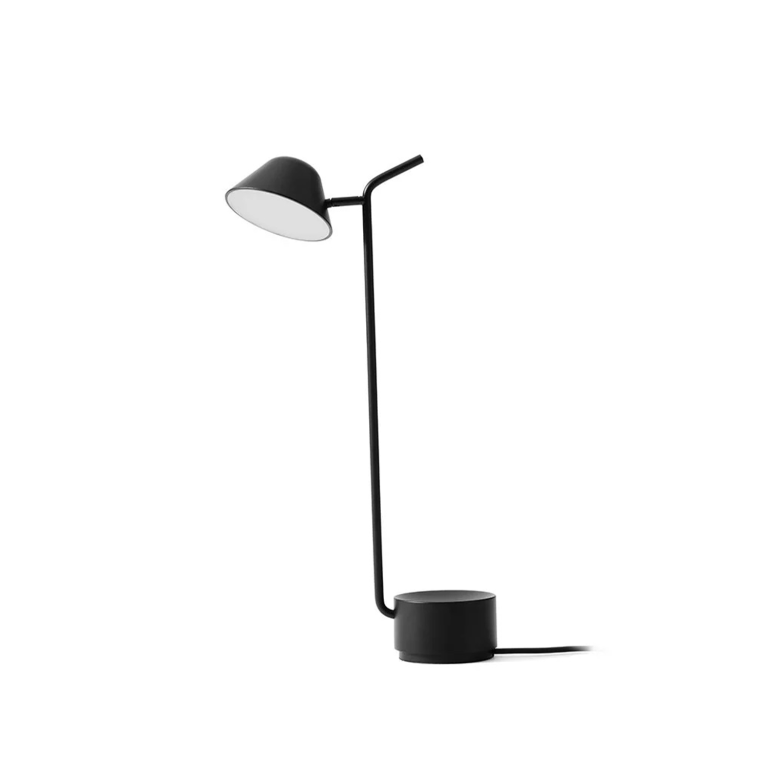
Jess Hinshaw: And I feel like the dining area was one of the first we tackled. I think that the pendant lamp dictated a lot of design decisions. All the lights are directional; they bounce off of something. Overhead lighting isn’t something she had typically used in the past. She really likes table lights and floor lamps. We wanted to create a very soft space that she could complement with other types of lighting.

Fisk: Yeah, she’s a huge reader and very sensitive about harsh lighting. So that was something that we spent a lot of time talking to her about. It’s a very restrained color palette, aside from the walls, and most things in the apartment—including the sconces and lamps—are black and cream.
The last thing we bought for this project:
Hinshaw: The sofa. This was an especially important piece of furniture to get right, because it is the main place to sit, which is so important to someone who loves reading. There were a few alignments that were important: The sofa had to be a pretty specific width, to keep this half of the L-shaped room feeling centered. We didn’t think the arms and back of the sofa should be much higher or lower than the windowsill, and we wanted the cushions to look tidy but still be very comfortable.

We probably looked at more than 40 different sofas, but nothing really fit exactly. Luckily we work with an amazing local upholsterer, Pierre Atelier, who was able to bring our vision to life. He’s a genius. I think this is one of the reasons we love working in the city. There’s just so many incredible, talented people around. It’s really a pleasure to work with them. The fabric, which is a cotton velvet, works so perfectly with the wall color, especially in the highlights and shadows. The back cushions are low but hit at just the right spot on your lower back, so it’s still supportive. She wanted to be able to take it with her, too, so it can easily separate.
Fisk: It was delivered in five different pieces and then assembled in the apartment because it’s a little longer than the elevator.

How we narrowed down the rest of the palette:
Fisk: The living room is south-ish facing and the bedroom is north-ish. So that was another thing we were thinking about when choosing paint colors. Northern light is a lot more blue, so we leaned into that there to make it kind of like a cooler, nighttime color.

Hinshaw: While we chose the pinkish taupe for the main spaces, we wanted to add a bit of variety. So we came up with the concept of dividing the apartment into the “day” section (living, dining, and kitchen) and the “night” section (bedroom). We thought it would be nice to paint the night section in an enveloping cool color, like moonlight, and we landed on this wonderful shade called Porch Swing by Benjamin Moore. It has just the perfect amount of green and blue, and its appearance changes a lot based on the weather; it’s really dynamic.
Fisk: We didn’t think the bathroom should also be taupe or even a green—we didn’t want to introduce a totally different color. We went with Benjamin Moore’s Balboa Mist in an eggshell finish. The bathroom doesn’t get any natural light, so she wanted it to feel light and airy. It’s kind of a nice break; it feels very fresh and clean, like a different mindset.


Why using various finishes makes a world of difference:
Fisk: There’s also a shadow line, where the ceiling meets the wall, to add a little bit of definition in the alcove desk area to separate it from the living space. The strip in between the two rooms is actually painted with a higher sheen than the rest of the ceiling. So it’s the same color, but it feels like a different material there. We used the Aura line in matte for the walls, and the trim was Satin Impervo in a satin finish.

Our favorite design moment:
Hinshaw: The doors to the bathroom are custom-fabricated millwork that just have a lovely, filleted edge. They’re on what are called Harmon hinges, which allows them to be recessed into the wall. So if she wants it to, during the day, the light from the front can reach to the back, and she can open them in a way so they’re not flush with the wall. When they are closed, both the fluted glass and caning on the bottom still allow a lot of light to filter through. She didn’t necessarily want privacy, just a delineation of a sense of place, which I think is nice.

Something we’ll definitely use again in a future project:
Hinshaw: The windows in the living room have a nice splayed jamb detail, which lets the sunlight spill into the space in a really happy way. This came about because, in order to hide the large through-wall AC unit, we built the entire wall out a few inches so everything could be flush. The caned panels below the windows hide the radiators and the air conditioner. We were worried about the windowsills becoming too deep and blocking the view, so we decided to angle them out as steep as we could, and we are very happy with the results. It makes the windows feel so much larger! We couldn’t change the size—that’s pretty much in the building’s purview—and we actually did something similar at a townhouse in Brooklyn’s Bedford-Stuyvesant neighborhood.


The brand we’ve been dying to work with:
Hinshaw: This project has some lighting that we love. We’ve used Cedar and Moss in a couple of projects, but we’ve also wanted to use Ladies and Gentleman for so long; we were so excited to finally be able to install such a beautiful fixture.
Fisk: It’s so stunning with the cast glass. It’s really, really gorgeous.

A detail the homeowner sold us on:
Fisk: The space where that ceiling paint strip is between the living room and the alcove desk area. We had designed this really cool set of glass doors that could pocket against the wall, and then you could separate it off to potentially be a guest-bed area if someone were to come and stay. We thought this was a very cool idea. And we were trying to sell her on that. Ultimately, it fell out of the project. And I think it’s nice how everything feels. I think it would have felt more divided if we had added it.
Hinshaw: I agree. We pushed hard for that. But it feels more open and allows the living space to extend a bit into the office area. I think it actually ended up better.