By Opening It Up to the Outdoors, Sarah Sherman Samuel Gave This Midcentury Michigan Ranch New Life

Sunlight reaches every nook.

We may earn revenue from the products available on this page and participate in affiliate programs.

warm wood den with slanted ceiling and black hearth
In the family room, the goal was to let the original wood paneling take the lead. To support that, we limewashed the mottled brown brick in a deep charcoal, creating contrast that amplifies the wood’s natural warmth. A substantial 1980s Alessandro for Baker coffee table anchors the space, its sculptural heft offering a visual counterpoint to the fireplace. Throughout, a mix of wool, linen, leather, cotton canvas, and velvet adds quiet tactility—subtle layers that invite touch and soften the room’s architectural geometry.

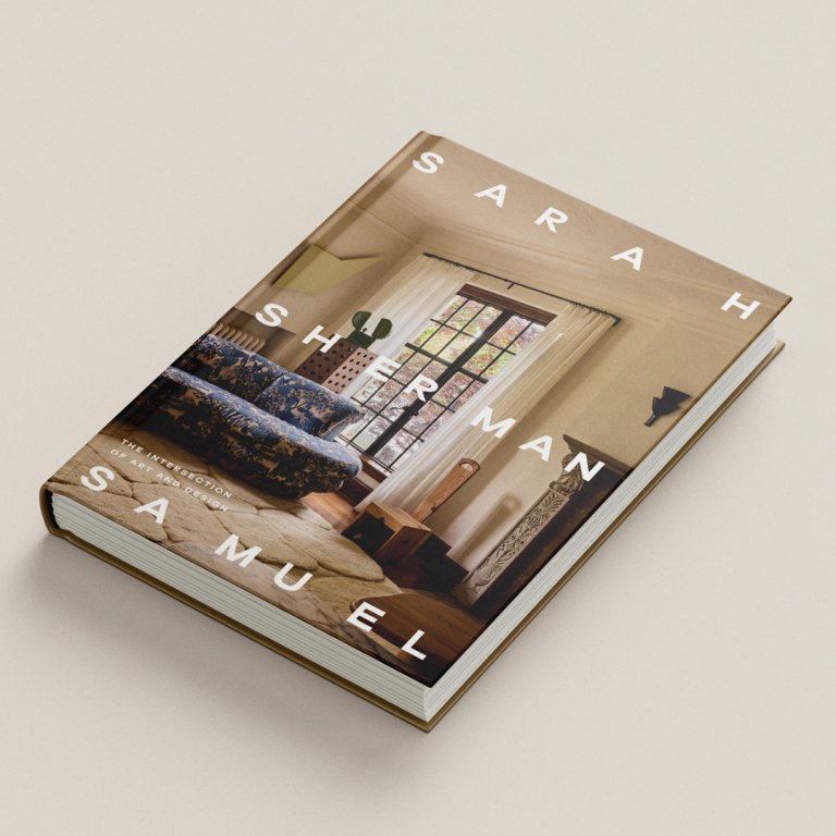
In the introduction to Sarah Sherman Samuel: The Intersection of Art and Design (Abrams), Mandy Moore describes the author, who designed her home and whom she now counts as a friend: “She doesn’t decorate; she narrates a story. To spend time in Sarah’s spaces is to remember that style doesn’t have to overwhelm. It can be layered, playful, considered, but never overthought.” The following house, plucked from the pages of the book and shared exclusively with Domino readers, is a testament to exactly that. It honors the past but sets the stage for the next act to play out.

Tucked at the end of a cul-de-sac surrounded by leafy oak-covered hills sat a charming 1964 Edward Hawkins custom home. From the outside, it appeared to be a humble-sized ranch. But once inside, the interior unfolded into a generous midcentury enclave. The positives included a wood-clad family room with high ceilings; a unique curved brick wall sculpturally delineating the space between the kitchen and family room; and the gorgeous, wooded setting with a meandering stream, complete with a wooden footbridge. But the 4,000–square-foot home had disjointed exterior finishes of vinyl siding and brick, a claustrophobic kitchen, a fragmented primary bedroom, and virtually no connection to the lush landscape beyond. And everything was brown. Every surface, every finish, every fixture—a sea of various shades of brown and taupe. I appreciate a rich, earthy tone, but this was just too much. The lack of contrast and variation left the interiors feeling dated, flat, and visually stagnant.

Amazon

Sarah Sherman Samuel: The Intersection of Art and Design

$60 $55
Shop Now

The structure of the house itself was built with exceptional craftsmanship and remained relatively untouched. It was apparent that in its time, it really shined..and not only because of the metallic wallpaper, in a shade of light brown, of course. As dated as it was, each room reflected intentional design choice: unique wallpapers, custom details like built-in desks, and even an integrated brick planter built directly into the architecture. The assignment was to build on those strengths while thoughtfully updating the home, expand and update the primary suite and kitchen, open the home to its surroundings, and infuse the space with color and personality to reflect the young family who would live there. I firstmet the clients at my son’s preschool orientation. It was a late session for just our two kids, my son and their daughter, as we had only just moved from Los Angeles and my clients from San Francisco. We bonded quickly over being recent California transplants and the shared experience of relocating with a toddler and a baby in tow. When they eventually found this property, I already had a sense of their personal style and priorities. It became a matter of translating it into the home while still honoring the original architecture—and addressing its shortcomings

The original primary bedroom felt constrained—a patch-work of undersized rooms with little sense of cohesion. We reimagined the layout, converting a narrow bath into a generously scaled walk-in closet and merging the bedroom with an adjacent nursery-office hybrid to create a proper suite with presence. The new primary bathroom emerged as a blush marble–clad retreat, grounded by tumbled travertine and a warm wood vanity.

The kitchen, now a central hub, features a monolithic blue marble island sitting center stage while new floor-to-ceiling windows dissolve the divide between indoors and the surrounding landscape. Throughout, a material palette of jewel-toned carpets, saturated grass cloth wall coverings, and richly pigmented marbles lends the home a vibrant new spirit—a layered domain designed for family life, full of texture, color, and intent.

Tour the House

white kitchen with grey marble island
In the kitchen, the cabinetry and fixtures are deliberately understated. Instead, attention is drawn to the materials themselves: the bold veining of the blue marble, warm oak cabinetry, raw brass, and handcrafted tile. The minimalist detailing reflects a sense of restraint, allowing the inherent beauty and character of each material to take center stage.
Wooden desk in a black brick room
A T.H. Robsjohn-Gibbings midcentury desk for Widdicomb sits perfectly at home in the corner of the family room. Contemporary art and a sculptural chair introduce enough contrast to keep this vignette from feeling locked in time.
white kitchen with wood cabinetry and a. marble island
When the lines are this clean and the forms so spare, I believe it’s essential to introduce elements with soul—materials that carry a natural patina or objects that reveal the hand of their maker. Even in a newly built space, these subtle imperfections—like the irregularities of hand-thrown pottery or finishes that evolve over time—bring a sense of life. They keep the room from feeling static, adding depth, warmth, and memory.
dining nook with curved brick wall and banquette
On the breakfast nook table sits a footed bowl I made in the pottery studio. Its irregular form and tactile finish offer a quiet counterpoint to the clean, modern lines of the table and chairs—a reminder that even in the most edited spaces, contrast and craft give life to the whole.
dining table with blue velvet chairs
In contrast to the home’s previously monochromatic palette, the dining
room is a study in color and mood. Green grass cloth walls wrap the space in texture, while blue dining chairs, an amber glass chandelier, and an apricot-toned painting layer in saturated depth. The result is a palette that feels intimate and atmospheric—a tonal shift from the light-filled kitchen just beyond.
powder room with forest wallpaper and white sink
In the powder room, a utilitarian wall-mounted sink plays against the illustrative wallpaper, an everyday fixture set against a fantastical backdrop.
bedroom with tiger rug and oversized gingham curtains
In the kid’s bedroom, we enveloped the space entirely in blue—walls, carpet, ceiling—all one seamless shade. This monochromatic canvas became the perfect stage for mixing patterns. The room shows how layered motifs can feel modern and restrained when tied together by a focused color story. Animal print, stripe, gingham, grid, and botanical patterns coexist within the same space—a combination that could easily overwhelm—but when calibrated through scale and tone, the result is balanced, graphic, and playful.
bathroom with soft teal cabinets and knobs
A pistachio-painted vanity with a striped tile backsplash sets a whimsical tone in the kid’s bathroom. The checkered tiled shower peeks through the mirrors’ reflection.
bathroom with wood-and-marble vanity
Tumbled travertine floors and a palette of rosy marble, soft ivory, and warm wood create a quietly soothing atmosphere in the primary bathroom.
bedroom with paneled artwork above the bed
In the primary bedroom, we custom embroidered a bedcover, which depicts a willow tree to reflect the nature found outside the windows. Above the bed hangs my painting, Fragments Toward Eden.
living room with metallic silver art on wall and curved seating
The living room reads as equal parts gallery and den, bringing together contemporary pieces like the Sarah Ellison Huggy Chair, our SSS Atelier Fort Credenza, an Olivia Cognet ceramic lamp, and a Bordeaux-colored Jonas Wagell Julep sofa, paired with a vintage live-edge wood chair. Wall-to-wall blush-toned carpet grounds the space, bridging the varied scales and silhouettes of both furnishings and art. It’s an intentional amalgam—each piece distinct, yet in conversation—encouraging the eye to move fluidly through the room.