We may earn revenue from the products available on this page and participate in affiliate programs.
You’ve wallpapered your ceiling and maybe even revamped an old piece of furniture with the leftover strips—now what? It may be time to take your love of pattern to the next level: Try matching your bed to your wallpaper, for what might quite possibly be the ultimate maximalist touch. More is more, right?
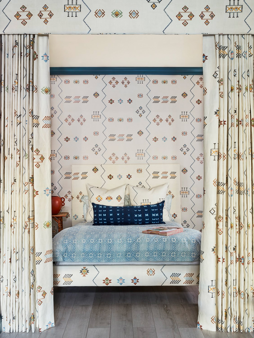
We discovered this idea in St. Frank’s new Palm Beach store, where the brand’s founder, Christina Bryant, applied it in a stunning bedroom display. The canopy, wallpaper, upholstery, and pillows all match, culminating in quite the visual treat. (Doesn’t it make you want to overhaul your sleeping situation, stat?) After doing a bit of digging and finding a similar setup in Derek Blasberg’s apartment, our obsession heightened, which inspired us to seek out some wallpaper-and-fabric combos of our own. But first, we turned to Bryant to get the how-to on this dreamy design.
Sort Out Your Inspiration
Bryant envisioned a new take on an all-white bed. “I wanted a trompe l’oeil effect with an all-encompassing environment,” she explains. She turned to a boho-printed cream fabric to accomplish this, using the subtle coloring of each symbol to kick things up a notch.
Consider Scale
The best part of this style is that there are no rules: Use whatever colors and shapes your little maximalist heart desires. That said, you will need to take into account the bedding you’ll be pairing your fabric of choice with. “If the patterns in your wallpaper and upholstery are large scale, I’d go with a smaller print for the bedding so they don’t compete,” suggests Bryant. Switch up the proportions so the finished product looks complementary rather than clash-y.
Take Your Time With Assembly
First, Bryant and her team decided on the bed’s placement. Then they laid out the fabric on the frame. The last (and most important) step: Line up your material with the paper that will go on the walls so it’s all fluid. Mismatched patterns will end up looking busy, and the goal is an optical illusion—not a headache.
Shop Our Favorite Combos of the Moment:
For a Botanical Touch
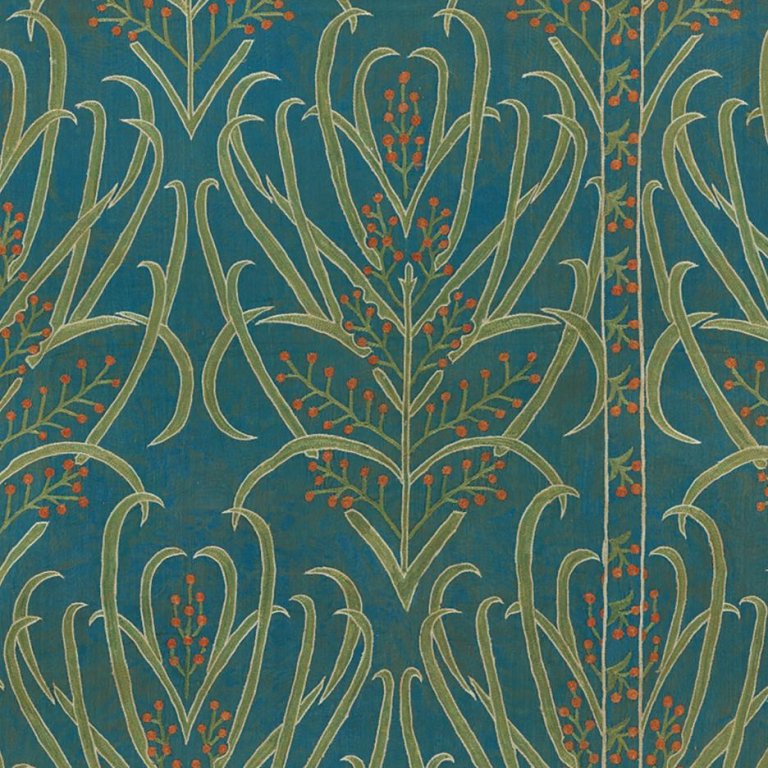
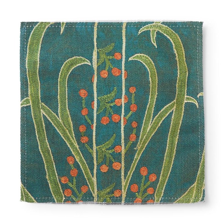
If you’re seriously struggling to keep that monstera alive, incorporate greenery using a more low-risk method. Complement this paper’s tree motif with bedding equally rich in color: emerald green or earthy terracotta.
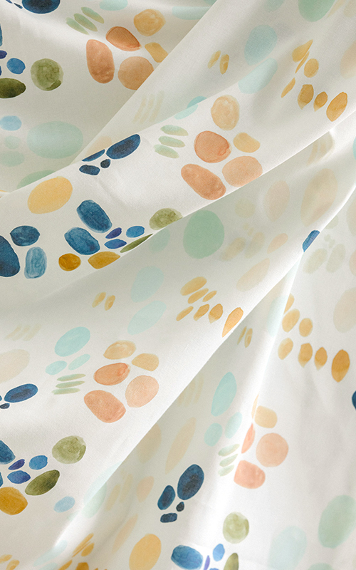
For a Painterly Palette
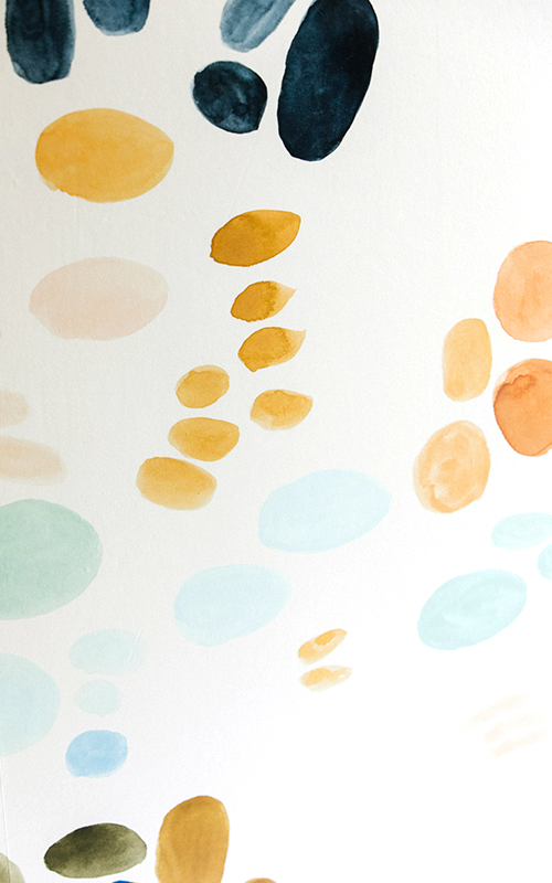
Not afraid to get a little playful? This multicolored option is for you. Pair with sheets in any color of the rainbow (the major bonus of a Technicolor print), or keep things simple with crisp white linens.
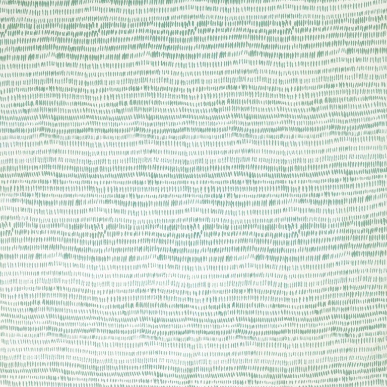
For a Bit of Simplicity
This pattern only looks dramatic up close. From a distance, the paintbrush dashes are so teeny that they almost resemble stripes. The result is preppy and cool all at once.
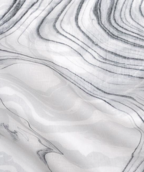
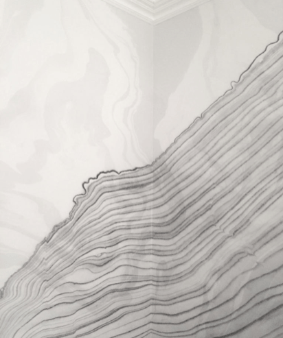
For an Otherworldly Feel
Swirly gray lines add a galactic touch—it almost looks like the fabric is moving. Named after the Japanese tradition of suminagashi marbling, Cope’s Sumi print is the ultimate elegant finish (plus, if you love a monochrome room, it won’t compromise your all-white aesthetic).
See more ways to upgrade your bedroom: No Room for a Bedside Lamp? No Problem This Designer’s New Wall-to-Wall Headboard Is Actually an Optical Illusion You Can Do This: Turn a Spare Bedroom Into a Walk-in Closet
