We may earn revenue from the products available on this page and participate in affiliate programs.
Designer and Domino columnist Sarah Sherman Samuel takes us behind the scenes of her latest project in a monthly series that tackles the nitty-gritty of remodeling—from sourcing materials and fixtures to DIYing a kitchen island.
I am definitely not a spreadsheets person. I’m so visual that if I’m doing a project for myself, I have to use Pinterest. Usually I’ll pin products to my own private boards so I can go back and check the link if I want to purchase an item—though generally, if I see something I like, I just buy it. There’s not a long deliberation process.
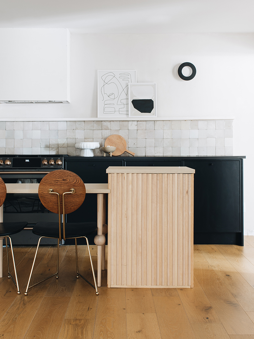
When I plan a new project, the first thing I do is look at what I have in my house already. You’d never guess, but this kitchen (the second in my Grand Rapids, Michigan, home) is actually designed from scraps: The base of the island used to be the desk legs from my office; the wood paneling around it is the wall trim we used upstairs, so we had extra in the garage. The zellige backsplash is left over from our master bathroom floor. I weeded through the bunch, pulling all the lighter ones together, to repurpose here.
For tile, I always check Clé Tile first. I love Wayfair for renovation stuff because it really has everything; CB2 is great for tabletop items, and so is Hawkins New York—that’s where I found my storage canisters. In terms of vintage, my go-tos are Chairish, Sotheby’s Home, and even Etsy: The key to sifting through those big databases is to search by material. You can “favorite” items to go back to—a lot of the time, they’ll sell out, but then you still get the name of the style you like, so you can figure out the specific designer and look for more pieces by them. Secondhand shopping is fun because you never know what you’re going to find.
In this particular room, the hardest thing to decide on was the lighting. Because we were doing this project on a major budget, I couldn’t splurge, but in the end we made it work. Here’s a peek at my sourcebook.
The Lighting
The Kelly Wearstler ones were a close contender. I liked how they brought the matte black finish up to eye level. Apparatus Studio’s Trapeze sconces had been a dream of mine for a while now—I love the ceramic shades next to the brass metal and the possibility of mixing the two-light version with the single-light version. But because of the budget, they didn’t fit in. I ended up choosing the LED Huxe sconces because of the dimension they add to the wall; the kitchen is extremely symmetrical, so I wanted to contrast that by ordering multiples in different sizes and installing them at varied heights.
The Range
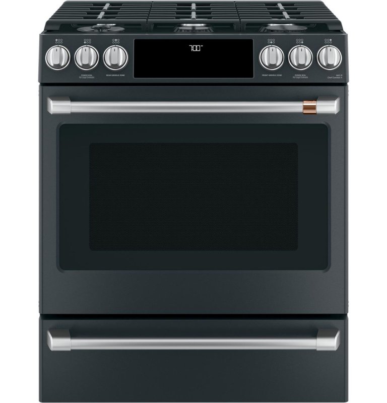
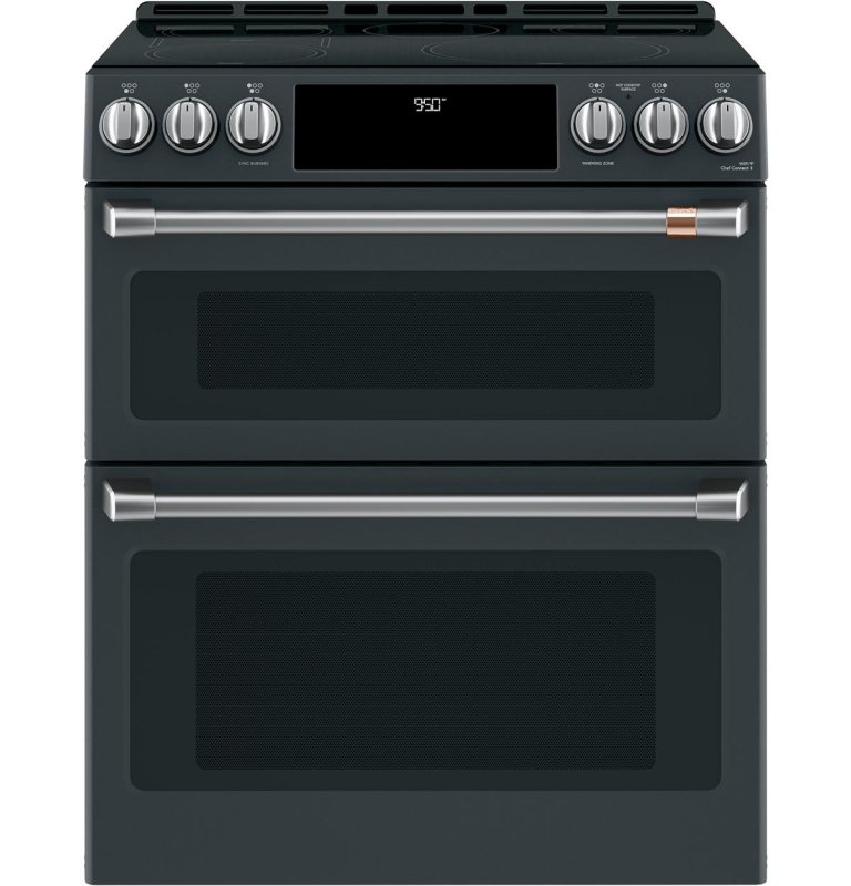
I waffled between the 30-inch oven and the 30-inch double oven. I knew I wanted matte black, and the warm tone of the bronze hardware on these appliances is what set them apart. In the end I went with the single oven simply because of aesthetics; also, I didn’t need the double oven because we have an upstairs kitchen.
The Cabinet Fronts
In the very early stages of designing, I had thought about using Semihandmade’s Tahoe Impression door for a wood-on-wood look with the flooring, but the tones didn’t match up. Then I pictured using my beaded fronts from that same line—at one point I was even considering the pink option—but what I really wanted was a modern version of a Shaker cabinet. Actually, the idea for my new Quarterline collection came while working on this kitchen! We began the process of getting it into production, and I was able to use the first round of samples for this space.
The Fridge
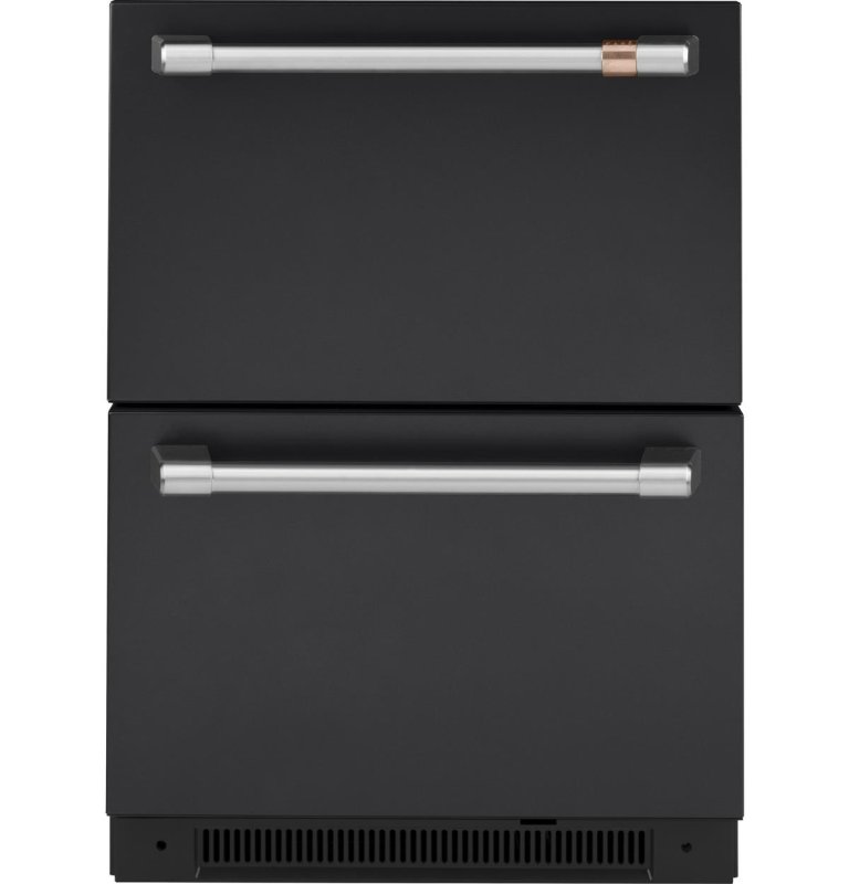
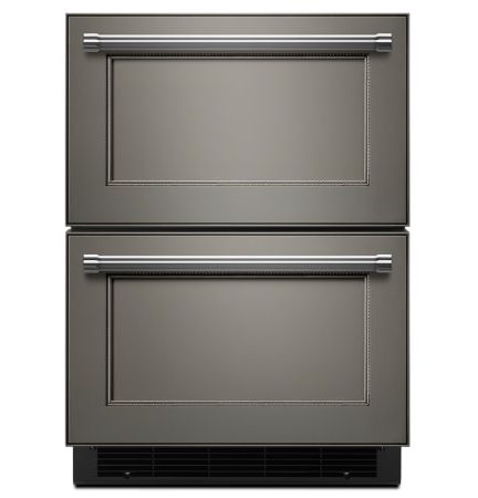
I wanted an undercounter refrigerator to keep the sight lines clear, and it’s all we really need in this smaller kitchen. Since I’d already picked the Café range, the matching fridge was a no-brainer. KitchenAid’s version was a runner-up because it comes panel-ready, which means I could have used my Semihandmade fronts to put on top.
The Faucet
I liked the Kohler faucet because of the unique shape, but it wasn’t quite right; and while the matte black color and clean modern lines on the Pfister one were great, it was a bit too large. I was already familiar with Moen as a brand, and it had a faucet at a good price point and—most important—the right scale. Our sink is pretty small, so it was crucial to find one that didn’t look disproportionate.
The Chairs
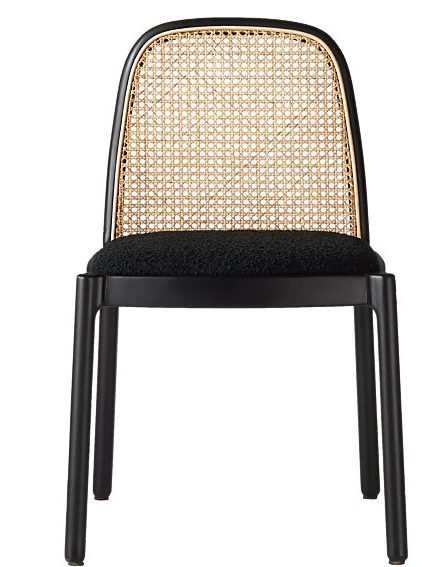
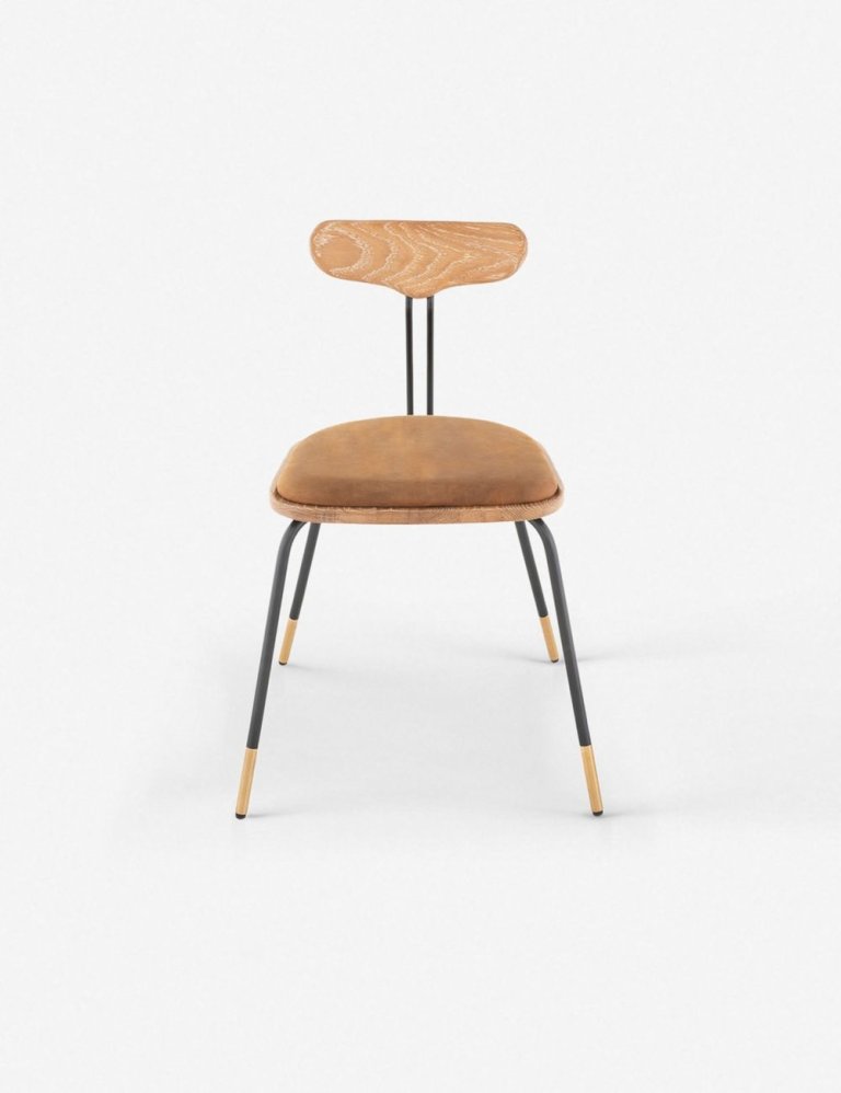
As soon as I saw these chairs, I had to have them. The curved wood back and the black seat are a nod to the postmodern design and geometric shapes I love—unfortunately, they were from the Goop x CB2 collaboration and no longer available. However, I also love this rattan option; I never met a cane chair I didn’t like. And similar to the ones I went with, Lulu and Georgia’s Payton dining chairs have a unique shape and a nice mix of wood and black.
The Countertops
I considered using Caesarstone, as it’s a go-to for me when it comes to durability. In the end, we went with laminate for a less expensive material and also because we could install that ourselves and not have to get a fabricator involved. IKEA’s wood-look counter is one of its newer designs, and it matched so well with the back and side panels we created for the island. For the main surface, I chose another IKEA colorway that matched the matte black appliances exactly; I love the monochromatic look.
As told to Elly Leavitt.
Check back next month, when we’ll be diving into how Samuel DIYed her eye-catching island.