We may earn revenue from the products available on this page and participate in affiliate programs.
When we think about what our favorite kitchen cabinets have in common, we realize: not much. In fact, installing mismatched, multicolored cupboards—as Joy Cho, Susan Alexandra, and George Glasier have done—is a relatively easy way to make a major impact in the room where you probably spend most of your time gathering. The only real hard part is choosing a palette. Whether the top cupboards are sunny yellow and the bottom are stormy gray or you stitch together a collection of pastels at random, we’ve rounded up the best paint combinations for making your cabinets—even basic IKEA options—the most interesting part of your home.
Make It Mid-Century

While we’re in full support of the open-kitchen shelving trend, there are some items (i.e., a half-empty bag of flour) better left unseen. The architects at Uncommon Projects embraced the best of both worlds, creating sporadic sunny yellow cabinet fronts that resemble a Mondrian. Below, stormy gray cupboards are the ideal antidote. Pantone’s colors of the year never looked so good.
The New Loft

We’re used to seeing blue and white kitchens, a preppy classic. But how often do you see the colors mismatched within a kitchen cabinet system in a loft-style setting? Down to the coordinated wheeled island and black appliances, fixtures, and hardware, this space proves you can have a little fun while still embracing the classics. And the bright white upper cabinets help the whole thing pop.
Shades of Fog

As maximalist as you may be, there is no need to rationalize the desire to live in a neutral-hued space. After all, who doesn’t need a sanctuary to come home to after the stimulation of the outside world? But just because you want to keep it simple doesn’t mean things need to look boring. Layering neutrals and even adding in some texture—Superfront has an excellent selection—will add dimension without sacrificing your chill.
Down-to-Earth

Sage green is the It paint color for cabinetry and beyond. But before you color-drench your kitchen, set your space apart by mixing in natural wood, too. Because sometimes, less is more. For the designers at Pluck Kitchens, it’s all in the details: They even painted the integrated “pulls” in the opposite color.
Bar Party
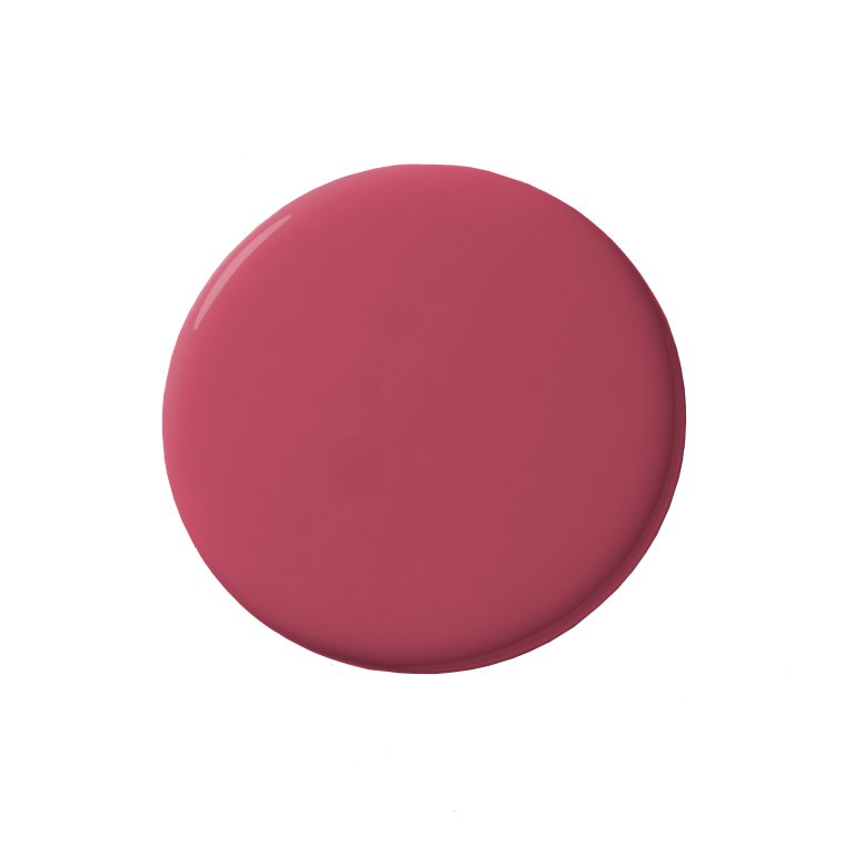
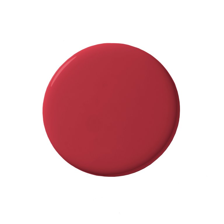
While we love all shades of pink and red paired together, there’s something especially chic about deep crimson and rosy mauve. Bauhaus-esque curved edges keep the design as fun as the bursts of yellow accessories. When it comes to bold spaces, balance is key; the glass doors break up the flat color, and the black-and-white–tiled backsplash is a much-needed break from the action.
Soft Touch

Brass hardware is everywhere, but brass cabinet fronts? We love this new twist from our Summer issue cover star, Joy Cho, who skipped on the top cabinets and opted for Amnuel’s custom system, leaving all the fun to be had on the lower half. Matching hardware and fixtures tie it all together, as do the pastel-filled rooms throughout the rest of her home.
Rainbow Wonder

Fashion designer Susan Alexandra took a paint-free approach to achieving the multicolored cabinets in her Manhattan rental: contact paper. This shields the eye from the gray lacquered IKEA cabinets she started with and creates a space that’s just as joyous as her new homeware collection.