We may earn revenue from the products available on this page and participate in affiliate programs.
Kaitlyn Coffee had just one requirement when she and her husband started looking for a new home in Dallas: It had to be untouched. The graphic designer didn’t want anything resembling a trendy open floor plan or updated bathroom. “If we were going to move, the house needed to be able to be fully ours,” she explains.


Finding a 1960s-era time capsule was a difficult task. Despite the city’s rich architectural history, all that seemed to be available were new builds with no personality. “I started to resign myself to the fact that the school districts would be the deciding factor,” Coffee recalls. “I knew I could make anywhere cool.” In February 2021, though, she discovered a middle ground—a mid-century place near a good school and with original French doors.

While some designers focus first on the material mix or floor layouts, Coffee sees everything in Technicolor. “I’m obsessed with complementary pairings,” she says, laughing. Red and green are across from each other on the color wheel because of the way they neutralize (and energize) each other, and Coffee ran with the science; the duo became the foundation of the home’s palette. It’s easy for the shades to scream “Christmas,” but Coffee insists that varying textures is key to an understated combo.

Burgundy high-pile carpets (her husband’s suggestion) ground the kids’ green-and-white–striped beds, and terracotta floor tiles contrast with smooth hunter green millwork in the main living area. The family will not be getting “Jingle Bells” stuck in their head in the middle of August. “The goal was to make it look like some quirky lady redid her home in the late ’60s and no one has changed anything since,” says Coffee.
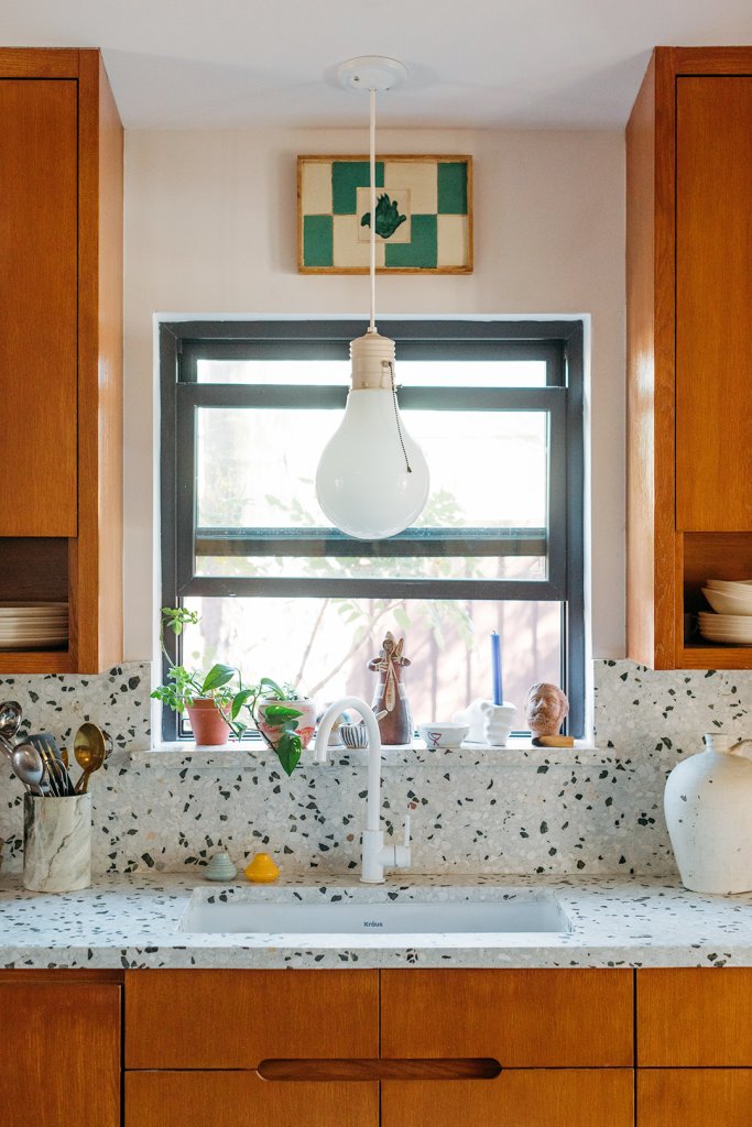
Coffee’s passion for original details doesn’t extend to dated kitchen appliances, though. Local designer Sara Garza lent her skills to the space’s renovation in exchange for a branding refresh. The women leaned into the mod energy of the house, keeping Italian mid-century elements at the center of their mood boards. The cabinets are dark wood with sleek, inset grooves instead of hardware, with open shelves built into the bottoms. Red-striped barstools, one of Coffee’s many vintage treasures, are sturdy enough for her toddlers to climb onto for breakfast at the white terrazzo countertop.

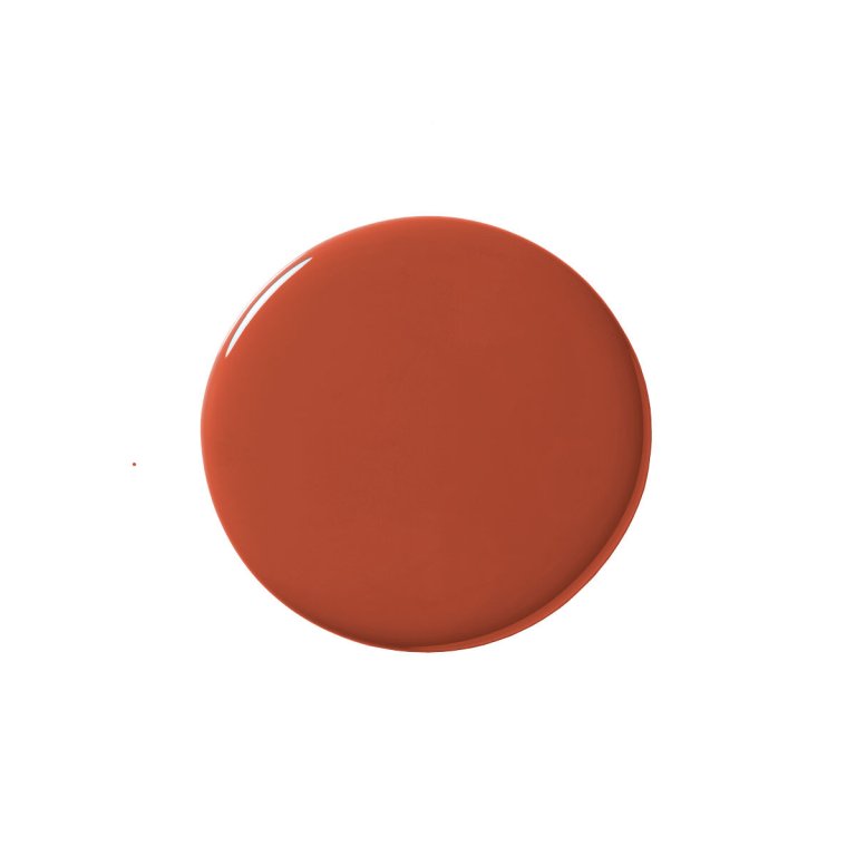
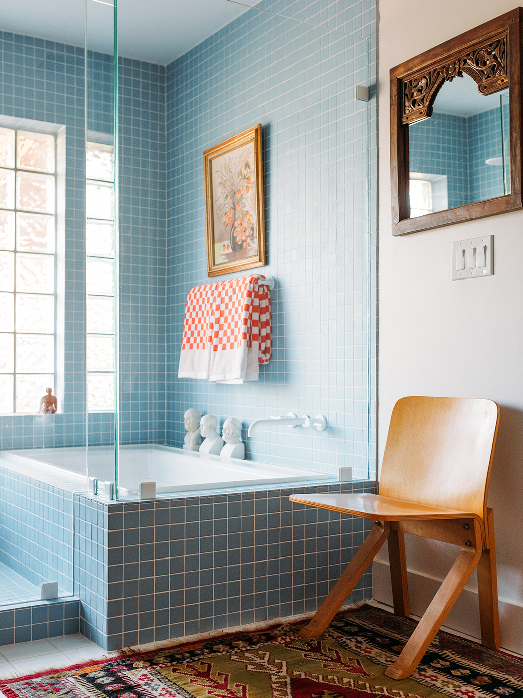
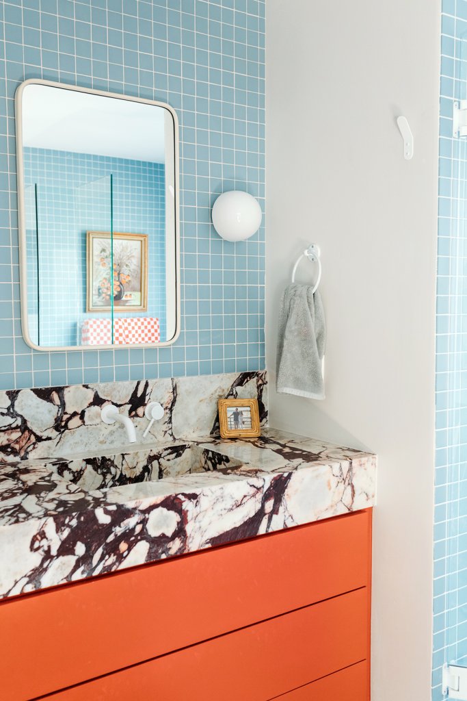
In the primary bath, the team went bolder still. Powder blue subway tile covers three of the four walls, and a burnt orange vanity (painted in Navajo Red by Benjamin Moore, to be precise) only makes the color pop more. Even the marble counter has a not-so-subtle navy and orange veining, two more opposite hues hard at work.

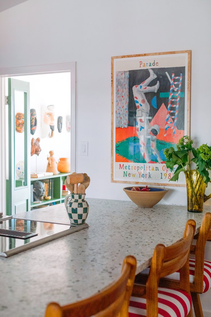
Coffee’s always-growing art collection (all estate-sale and Goodwill finds) ensures no room feels too technical. “I just hate when I walk into someone’s home and they have the same four prints I see every day on Instagram,” Coffee explains. She’s not precious about what she does hang up; the selections the family is currently living with, like the African masks that hang above Coffee’s desk, are a trial run of sorts. “If it doesn’t work, I can resell it,” she says. She changes the walls whenever the mood strikes—the portrait of Jesus in her office previously hung above the bathtub, and the living room’s gallery wall gets a new addition almost every week.

Sometimes big purchases aren’t agonized over either. Take the yellow dresser in her sons’ room. “I bought it from the Salvation Army; it had to live in my house,” Coffee says of the cheerful design. The just-right fit between the twin beds was simply a lucky coincidence.