We may earn revenue from the products available on this page and participate in affiliate programs.
Come spring, who isn’t craving major color? With our latest issue on newsstands, we’re celebrating all things bright and bold with Color Month on Domino. Check back daily and sign up for our newsletter to see vibrant spaces; palettes that pop; and our weekly advice column from dynamic British design duo (and authors of the new book Making Living Lovely) Jordan Cluroe and Russell Whitehead of 2LG Studio, Free to Be Hue. Let’s get chromatic.
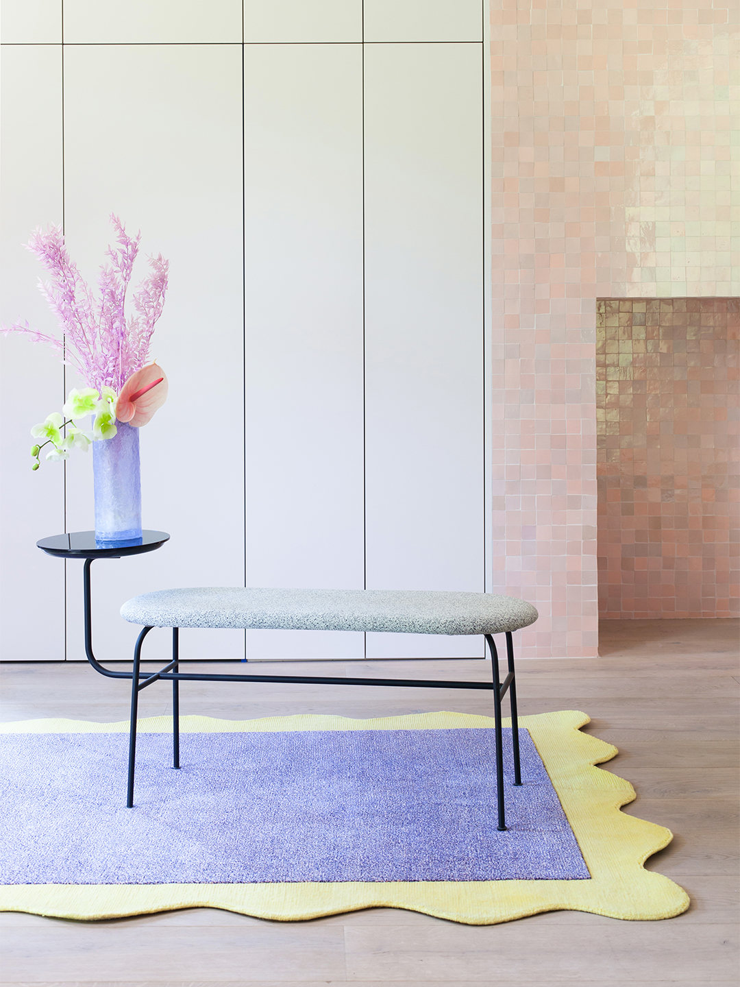
How do you decorate with pastels the right way?
Ice cream tones have been spiking in popularity recently—but for Cluroe and Whitehead, they’re practically second nature. All it takes is indulging your inner child.
The biggest misconception is that pastels are only for kids. Or that your space is going to look too sweet or like a child’s bedroom. But why would anyone not want to appear super-young? We’re all too set on having things be grown-up and serious, but there’s nothing wrong with embracing a childlike love of creativity and playfulness. Lean into it!
In fact, the biggest mistake people make is not taking pastels far enough. More is more; bigger is better. Where they start to look a bit wishy-washy is when people do a gray room, for example, and only include a small touch of pastel, like in a fireplace. If you’re going to paint with them, be confident.
We always think of function first: What room is it in? How is the light? Just because pastels are different doesn’t mean you should ignore all general ideas about using color in a room. You still need to think about things like light and scale.
Paint-wise, we’re actually in a period where pink is accepted as a neutral, so it’s a great pairing for lots of pastels. A nice way to make the colors look mature is to add creams and camels: Two pastels and a neutral work really well together, like lavender, pale coral, and a really warm cream. Or we’ll go all out with neons, which bring pastels to life—such as pale pink with mint green and a neon yellow.
On the decor side, there are lots of Scandinavian brands doing pastels well. Where items have traditionally been beige or stone or terracotta, we’re now seeing pale blues and soft corals. We love Muuto and Normann Copenhagen, and of course Hay has been using pastel hues for a while now. We’re also obsessed with Tekla. We want all of its lilac bed linens and towels.
We’re big believers of the saying “Be the change that you want to see,” and color has become a big way to make that change your reality. A pot of paint is relatively inexpensive, so everyone has access to color. That’s why we love it so much. And with regard to pastels, there’s something quite optimistic about them—we could all do with a little optimism right now.
As told to Elly Leavitt

What’s the best way to tackle a monochrome palette?
Coating everything in one hue looks great on the ’gram, but how does it translate in real life? According to Cluroe and Whitehead, you don’t have to be a design pro to make it work at home.
We love living in monochrome. For many years, the idea of being matchy-matchy had a negative connotation—but this monochrome movement is quite different, because its roots are in minimalism. The key players (the furniture, the walls, the built-in cabinetry) are all in that one shade, so the base structure is really powerful and clean.
Start by picking your favorite color. This is not a time to go with the intimidating choice; opt for something that brings you absolute joy. For me that’s pink, which has been my favorite since I was 4 years old. It’s what I wanted my bedroom to be; I would try to find boys’ clothes in pink. It’s always made me feel invigorated. It’s different from a throughline, which unites. This is about making a statement about who you are and the world you want to live in.
The key to making it work is texture. It’s like fashion: You might pick out an outfit that has a green suit and a green sweater, but the knit would be a really textured wool, and the blazer, a cotton sateen. You’ve got to play them off each other. In interiors, that can be as simple as matte and gloss.
Think about grounding. We’ve done an all-pink bedroom, grounded with black lighting and trims—really subtle touches that keep it from floating away. In the case of our malachite dining room, it’s the period fireplace that’s black cast iron.
You can also alter the shade slightly with your accents. Not everything in a room can be the star! You need something that will support the leading lady. A lot of the work is done for you on a paint chip: Look either at the tint above or the one below—and whatever you do, don’t pair it with white. That sort of contrast never works.
Keep in mind that certain things are easier to color-match than others. For example, basing your paint off a fabric is going to be a lot easier than finding the perfect fabric twin for a paint shade.
Finally, release yourself from the pressure that it can never change. To keep a one-tone room feeling different and fresh, we’ll do a new curation of decorative objects every so often. If you’ve done the groundwork in the beginning of giving yourself time to think about what you love and not being distracted by outside sources or trends, you won’t ever tire of it because it’s true to you.
For example, our green dining room is never going to be something we’re bored of because it doesn’t feel transient. It was based on nothing other than us, so unless we get tired of ourselves, I don’t think it’s going anywhere.
As told to Elly Leavitt

How do you nail a tricky color palette?
Bright red, zippy neon yellow, matte black—just because a hue is intimidating doesn’t mean you shouldn’t try it out. Here, Cluroe and Whitehead walk us through exactly how they deal with scary shades (plus, how to make them easier to live with).
Personally, whenever we’re afraid of something, we run toward it. For us, lime has always been a color we find difficult to get on board with, but we’re probably going to end up doing a neon green interior after this. There are two ways of approaching a daunting shade: pairing that hue with another color to bridge the gap and soften it, or creating a combination of three colors. You need yin and yang. You might be in love with malachite and pale pink, but a touch of lime green could actually enliven them. Once, a client requested yellow and gray—which doesn’t sound that strange, apart from the fact that they referred to themselves affectionately as “the elephant and the duck,” and they wanted us to reference that in the interior. We introduced a blue, which opened up the palette a little bit and made it more interesting.
Often people think that if they just put the scary hue in one place and pair it with white, it won’t be as intimidating—but actually I think that makes it worse. It highlights that color. Neon yellow with white is going to be really high contrast and not the most pleasing.
We also look at proportions. Use the color in a transitional space—an entrance, a hallway, even a dining room—or in a downstairs bathroom, which has forever been a space where people are confident enough to express themselves, because it doesn’t involve a huge spend. Plus, when you’re having a dinner party and your friends pop into the statement-making powder room, it’s a built-in conversation starter when they come back.
Don’t fall into the trap of feeling that you have to put the shade everywhere in order to show that you’re not afraid of it. In our sitting room, for example, we have two bright red lacquered side tables that, in isolation, we don’t particularly like. But there’s something about them in the blush and cream room; they look perfect. Think of your space like a recipe: You wouldn’t eat a whole spoonful of salt or suddenly bite into an entire chili pepper, but a tiny touch of them makes a dish really flavorsome. If there’s a color that scares you, use it, but do it in the right way.
As told to Elly Leavitt

How do you make a Technicolor space cohesive?
For Cluroe and Whitehead, it all comes down to picking a throughline: One base shade that sets the tone for the entire space. Here’s how they find their perfect palette, and why they think it’s so important to get it right.
In our house, our throughline is Mylands’s Rose Theatre—a really beautiful lilac-y, grayish pink. The gorgeous thing about quality paints is that they’re multilayered, so the pigments change in different lights; it’s worth investing in them to give yourself various design opportunities.
The throughline can go anywhere: In our guest bedroom, which is a very vibrant pink, the only place it appears there is on the artwork above the fireplace. It’s also the color we used in our office, on the ceiling in our bathroom, on all of the radiators, on our staircase, and in our master bedroom. We’ve been living here for four years now, and that shade is literally our most-asked about on Instagram. We should have bought shares in it!
Because white doesn’t appear in our house anywhere, this pinky gray means that the really bold moments—like Yves Klein Blue or emerald green—feel more grounded. They’re less shocking, because the overall atmosphere is quite layered.
To find your own personal throughline, steer clear of mood boards in the beginning. Keep it loosey-goosey. We like to have an extensive research period that includes looking at fashion shows or even walking around in the garden (we have loads of flowers that inspire us).
You can find inspiration anywhere—we once even did a color scheme that was based around our dachshund, Buckley. He’s black and tan, with a really pink tongue. It actually turned into a beautiful palette! But also, it’s as simple as: What’s your favorite hue? When you’re having a dull day or you’re feeling down, what do you put on that makes you feel fantastic? Color is so personal; it shouldn’t be trend-led. The most important thing about a space is how it makes you feel.
We try to start with three shades. That doesn’t necessarily mean we stick to them, but it’s a jumping-off point—having that strong structure helps keep everything on track. Think of it as choosing which key hues you can live with forever and which ones you want as moments of fun.
Then we do a walk-through. What is the natural flow of the space? How can color help you to create that? From there, we move onto creating large-scale swatches. We often use a roll of lining paper and paint really large chunks of each color we like, then move those around the rooms and see how the tint modulates.
Treat color as if it’s a material rather than a decorative layer. You might put the most saturated version of your throughline in a hallway—somewhere that’s transitional—so that it’s not something that you’re surrounded with. Then in a sitting room—somewhere where you can relax—you might try a more desaturated take. That prevents it from feeling frivolous or transient; it’s ingrained in the design.
But there are times when you just throw caution to the wind. If you find a shade that’s a wonderful clash, maybe it’s a moment of genius. Play it out and see how it goes. Give yourself time to sit with it for a couple of days and let the light hit so you can experience the color at different times of day. Don’t judge your decisions. Once you’re free from the idea that you might get it wrong, the sky’s the limit.
As told to Elly Leavitt
See more paint stories: The One Thing Most People Overlook When Picking a Paint Color Ever Wonder How a Color of the Year Is Decided? No One Will Guess You’re a Rookie Painter If You Follow These Steps