
We may earn revenue from the products available on this page and participate in affiliate programs.
There are more life-changing home products to discover. Head back to the table of contents or shop them all in one place.
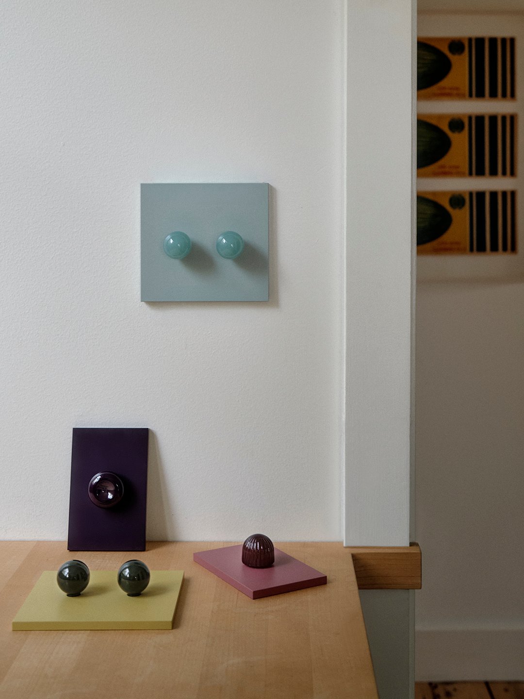
Despite its name, Dimwit is anything but silly. Rather, it’s a genius system of interchangeable knobs and ceramic-coated brass backplates that walks the line between refined and playful. Of all the home products we sifted through for the 2026 Domino Good Design Awards, Dimwit’s debut stood out for its power to make a room feel complete in mere minutes. In other words, it was destined to be the Groundbreaker of the Year in our 2026 Domino Good Design Awards.
Founder Joanna Bean Martin, a brand consulting veteran, had a lightbulb—or, shall we say, light switch—moment back in 2022. In the midst of a home renovation and notoriously detail-obsessed, she had searched high and low for electrical hardware that spoke to her. But all she found was a category lacking in the personality, materials, and colors she saw elsewhere in the design industry. “As I began to talk about it with others, I realized that there really was a need,” remembers Martin, “which then led me to the ultimate question, ‘Do I want to be someone who talks about good ideas or someone who goes for it?’” Dimwit was born.
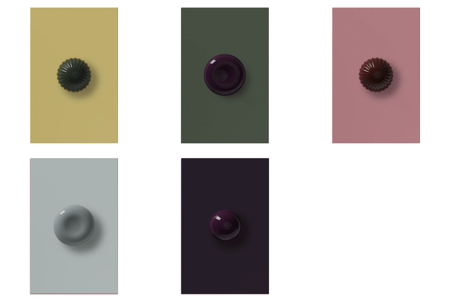
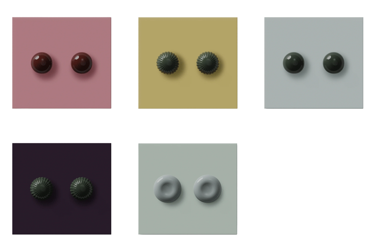
Anagrams, the first collection, is called such for its unique ability to rearrange. Martin and her team developed a magnetic dimmer module that allows the plates and knobs to be removed and swapped without screws or tools, an engineering feat that became the brand’s trademarked Magwit System. On the eve of her win, we caught up with Martin to get the full story behind Dimwit’s innovative approach, bestselling colors, and the moment she knew she had a game-changer on her hands.
Give us the full Dimwit origin story.
It was really a series of questions, ideas, experiences, and conversations—both in my head and with other people—that eventually led to Dimwit. First, I wanted to make something the world might actually need—something useful. Second, I wanted it to be simple and iterative: a product where we could front-load the engineering, then continue to play within the confines of the system. I often think of Baggu’s reusable bag as a model for that approach—the fundamental product stays the same, while color, pattern, and collaboration create endless opportunities for reinvention. And third, I wanted to start with something inherently utilitarian and find a way to inject beauty, personality, and feeling into it.
There’s so much about this concept that was right time, right place—I’d worked in-house at brands, where I learned about product development and production, and then spent more than 15 years running a brand design studio, where so much of the work is about defining guardrails and figuring out how to turn limitations into the distinctive traits of a brand. On top of that, my kids were at an age where they needed me less, my work was at a place where it wasn’t all consuming and I was in my early 40s and realized, if I was going to pivot, I better get going.
Why magnets?
I didn’t want the product to feel intimidating or precious, and I didn’t want achieving the final look to require additional specialists or added expense. Those little points of friction can really change how someone feels about a product. I wanted the experience to feel considered all the way through. The magnets themselves were the result of a lot of collaboration with my incredibly talented engineer and team. We went through many iterations to figure out a system that was secure and precise, but also made installation and changing out the faceplates and knobs incredibly simple. One of my favorite things now is watching people interact with the product for the first time. There’s something so satisfying about that little click when the plate snaps into place. It’s a tiny detail, but it creates this unexpectedly tactile moment—which feels very Dimwit.
What surprised you most during the design process?
How much engineering is required to make something ultimately feel simple. There have been so many moments where I’ve thought, surely this can’t be that hard, only to discover the ten reasons why it is. Behind the wall, you’re dealing with electrical codes, safety standards, heat management, load compatibility, different wiring configurations, certification requirements—the list goes on. Change one seemingly tiny thing and it can have a ripple effect through the entire product.
But I’ve also come to really appreciate that complexity. Every constraint forces us to be more thoughtful and where it makes the most sense to innovate for a product like ours.
What’s the secret to that refined/playful balance?
The corner radii, the depth of the plates, the finishes, the range of colors, the shapes and scale of the knobs—all of it was considered in immense detail. Too cute or too bright, and it becomes a completely different product for a completely different customer. Too neutral and it’s not saying enough. Too wild and we lose people.
It needed to feel new and familiar at the same time; that became a really important design principle for us. The application itself—using decorative, sculptural forms as dimmer knobs—is already unexpected, so the shapes needed to have a certain familiarity. You might recognize something in them without necessarily being able to place it.
I also never wanted the collection to feel decorative for decoration’s sake. There’s a fine line between personality and novelty, and I wanted every decision to feel deliberate and enduring.
When did you know you had designed a product that was going to change the game?
I would say it was the moment I put a shape on the page that wasn’t a traditional circular dimmer knob. Everything cracked open after that. Suddenly the knob wasn’t just a functional component—it became a place to explore form, material, color, and more. Once I saw that possibility, I started thinking about all the different directions we could take it and how much room there was to play within this very established category.
What are the bestselling colors so far?
Porto and Cello (pink and yellow) which has pleasantly surprised me!
Personal favorite combinations of plates and switches?
I love the tone-on-tone combinations, where you really notice the shift in finish from the flat plate to the ultra-satisfying shininess of the knob. But I also love mixing shapes and colors on the multi-gang plates. I want to encourage people to break the rules a little here, especially because the knobs are so easy to swap out.
Which ones are in your own house?
I have Rhone plates with Dip knobs in Boysen, our deep purple. I love them so much. The color is dark enough that in certain light it almost reads as black, but the purple makes it feel much more deliberate and unexpected. Especially when it’s tone-on-tone, it’s like a neutral with a wink. I may also be on a personal mission to convince more people that they like purple more than they realize.
What’s next for Dimwit?
Right now, we’re just getting our legs underneath us—finalizing production and preparing to get these first products into people’s homes.I’m trying to stay focused on doing that really well before we move too quickly into what’s next. That said, I have a very long list. More configurations, more electrical hardware, new shapes, new materials, collaborations—there’s so much room to play. We’re just getting started!