We may earn revenue from the products available on this page and participate in affiliate programs.
Walking into a century-old home is like opening up a time capsule—you never know what you’re going to find (good or bad). Case in point: When Blair Moore, creative director and principal of Moore House Design, was enlisted to renovate a 1920s Colonial in Rhode Island, she found that it had garnered some not-so-timeless updates over the years. “It had a ton of ’80s veneer cabinetry, which I can totally get down with on the right project,” she says. “But on this one, it didn’t feel like home for the family.”
So Moore peeled back the house’s mismatched interiors and revived its historic roots. She took notes from the architecture, embellishing the abode in intricate wainscoting, walnut-burl chests, and an overall sense of “broodiness”—Moore’s signature combination of moody and bright. Spatial flow was also top of mind. Because the home was intermittently updated room by room, it lost its cohesion. As a result, Moore knocked down walls and made unexpected moves (like shaving 2 feet off the dining room) to make the space functional and beautiful for the clients. Here, she explains how she gave the home a modern update without sacrificing its enchanting heritage.
Reuse Old Architectural Features in New Spots


To carve out a true primary suite, the designer gutted the walls to make room for extra storage, but that doesn’t mean she tossed all the scraps. Moore couldn’t bear to part with one of the room’s double-hung windows, so she transported it to the bathroom where it now frames a freestanding tub, soaking it in light. “If it’s a good product, I prefer to reuse it over buying new, because honestly, [it] is usually less quality than when it was built in the 1900s,” Moore explains.

She also relocated French doors that previously boxed in the dining room to create a new entry zone in the bedroom and adorned them with ruched sash curtains for extra drama (and privacy).
Don’t Shy Away From Brick


Most of the house’s original brick detailing had been removed over time, so Moore wanted to bring it back—though not just in an accent wall or fireplace. “We engulfed the entire kitchen in brick,” she points out. The stone braids across all four surfaces, from the window headers to the backsplash, even enveloping the vent hood.


To prevent the material from feeling heavy, Moore overgrouted and cured the brick for three weeks, transforming its original terracotta hue to a cool, misty white. “It’s almost like limestone,” Moore says of the finished look. “But it’s easily cleanable and accessible, and you can touch it up.”
Drop the Top Cabinets

To keep the kitchen airy, Moore ripped out the upper cabinets and instead maximized bottom drawer space, extending the cupboards around brick beams and incorporating hidden island storage. Still, she wanted the family to be able to showcase their glassware—and have an indoor garden. “[The owner] loves using herbs in her cooking,” Moore says. “I was like, how lovely would it be to cascade the herbs on a shelf all the way around the kitchen.”
So she designed a solid brass shelf, wrapping from the right side of the hood, across the windows, to the fridge. It’s so slim you barely notice it until it glints from the sunlight streaming in behind it.
Make a Good First Impression


The home’s entryway had a jarring direct view of the kitchen, taking away from the staircase and its elegant newel posts. “It has [a] curlicue detail going up and a nice ogee profile on the top. It was absolutely stunning,” says Moore. The designer blocked off the hallway to the kitchen and swathed the stairs in Sherwin-Williams’s Iron Ore to make it pop. The extra wall space provided room for a dainty iron shelf, which displays the family’s collectibles, offering a softer (and more aesthetically pleasing) landing for guests.
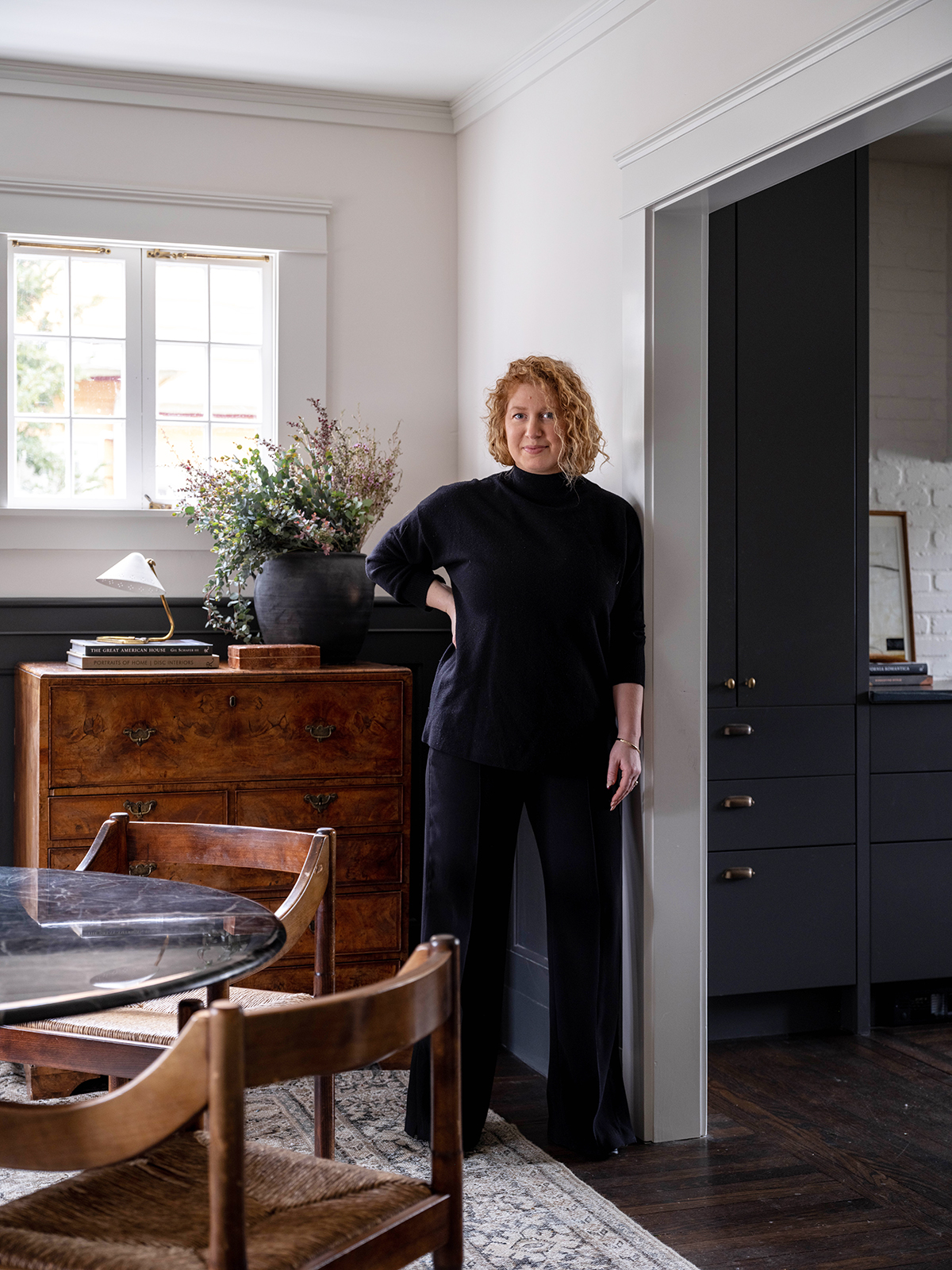
Use Color to Create Illusions


To expand the kitchen, Moore stole square footage from the dining room. But to ensure the area still felt expansive, she covered the lower half of the walls in wainscoting and painted the millwork in Iron Ore once more. “I really wanted this dusty Old English, Colonial Cotswolds vibe,” Moore explains. The two-tone walls give an illusion of loftier ceilings and help frame the casement window. A black stone dining table with dark flecks of green riff on the color palette while echoing the mini herb garden in the other room, culminating in a full-circle feeling. “Those details are important,” Moore says.
