We may earn revenue from the products available on this page and participate in affiliate programs.
What does 2026 have in store? In Design Psychic, our community of editors, experts, and tastemakers predicts the trends coming soon to a house near you.
You wouldn’t think twice about swapping out your bath towels every few years, but there is nothing casual (or cheap) about painting your house a new color. We get it, this is one design decision that’s really got to stick. But allow us to make a case for thinking outside of whites and grays. We recently asked interior designers what paint colors—down to the exact swatches!—they’re excited to use in 2026, and the wonderful news for the risk-averse is even the boldest hues are surprisingly timeless (or you can always limit a punchier pick to the trim). One moody shade in particular leads the way…
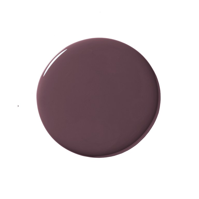
The Winner: Brown-ish Purples and Purple-ish Browns

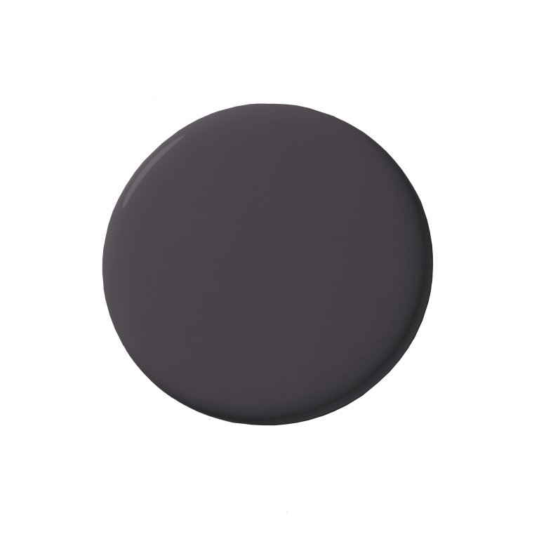
Aubergine, a dark shade of purple with warm brown undertones, makes a great exterior accent color. While we wouldn’t necessarily recommend using it as the main color, it pairs great as an accent with many outdoor natural materials, such as limestones and different shades of terracotta. We used Vintage Wine by Benjamin Moore for a front door in Miami. —Karen Asprea, founder of Asprea Studio
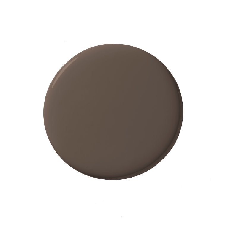
Farrow & Ball’s Mahogany is a standout: an earthy, plummy brown that shifts between chocolate and aubergine in natural light. It feels fresh because it reads like a new neutral with real depth, pairing beautifully with creamy trim, natural wood, and aged brass for a warm, elevated exterior palette. —Amy Courtney, founder of Amy Courtney Design
I am craving richer exteriors, and specifically deep chocolate hues for 2026, especially on modern L.A. architecture. My favorite swatch: Benjamin Moore’s Branchport Brown. —Coco Greenblum, founder of Studio Coco Greenblum
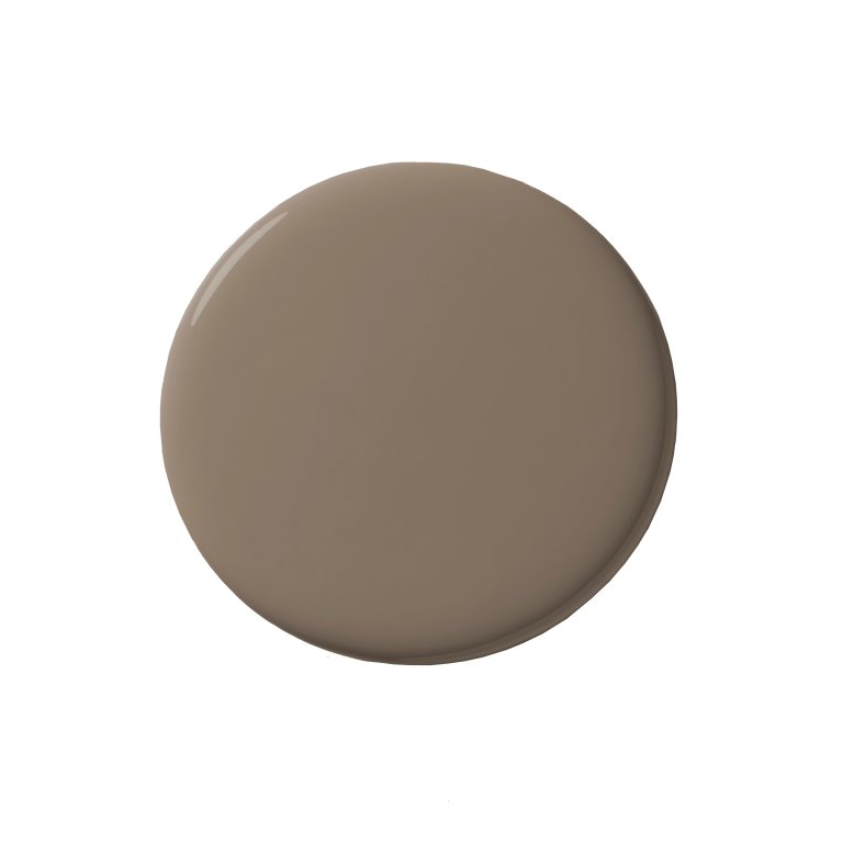
We’re seeing a shift toward moodier palettes, with deep hues like aubergine, olive, ochre, and mauve-taupe becoming new staples. —Huma Sulaiman, founder of Huma Sulaiman Design
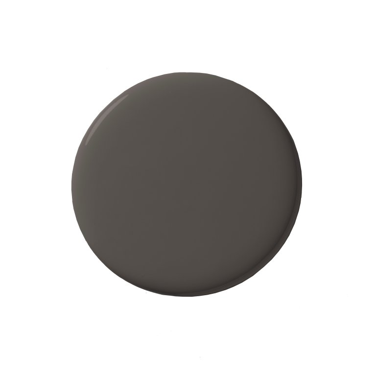
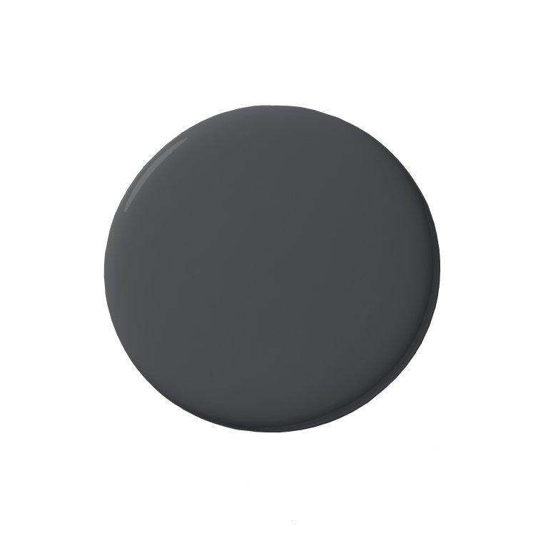
I’m personally excited to see more of Benjamin Moore’s Silhouette, a smoky charcoal-brown that adds sophistication to any facade, and Farrow & Ball’s Broccoli Brown, a warm, earthy tone that feels timeless and rooted in nature. Both colors pair effortlessly with stone, natural wood, aged brass, and deep green landscaping. —Sarah Akbary, founder of Sarah Akbary Interiors
The Runners-Up: Deep and Mid-Tone Greens

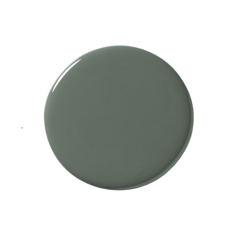
I am all about Succulent. This color is rich, layered, and a little unexpected but still feels neutral enough to work with so many different materials. —Alykhan Velji, creative director at Aly Velji Designs
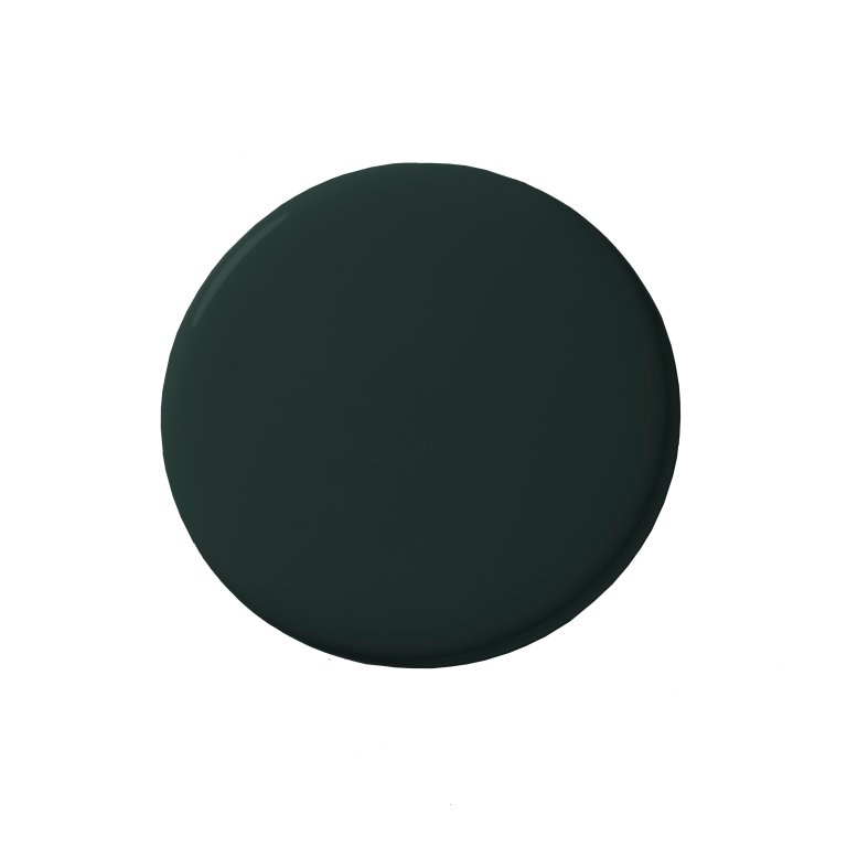
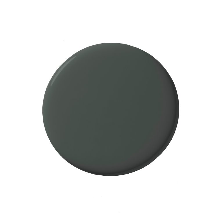
I’m captivated by deep, desaturated olive-blacks that read like shadows in a forest canopy. Shades I absolutely love: Benjamin Moore’s Black Forest Green and Farrow & Ball Studio Green. Against natural stone or warm woods, it creates a palette that feels both powerful and poetic. –Anu Jain, founder of Atelier Oleana
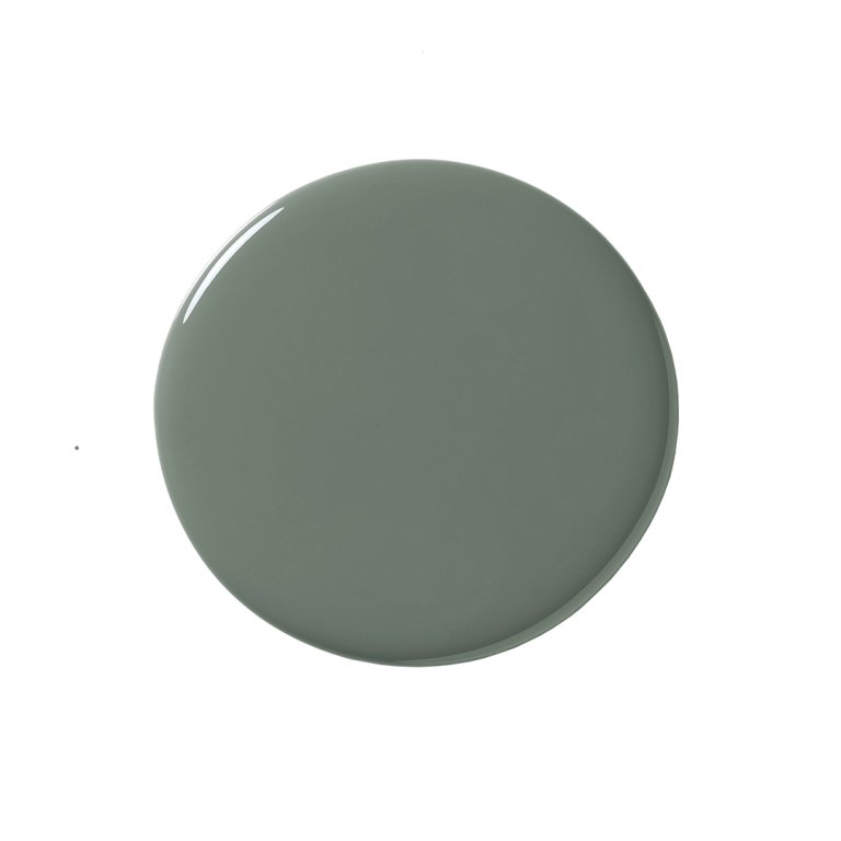
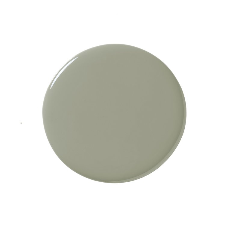
I am hoping to see more exterior paint colors that fall into an olive green shade or sage green like Green Smoke with a deep paring trim like Brinjal by Farrow & Ball. —Christina Cruz, founder of Christina Cruz Interiors
I am hoping to see more of a deep, warm green that feels both grounded and sophisticated. I adore Louisburg Green. —Michelle Murphy, founder of Demi Ryan
The Honorable Mentions

Black
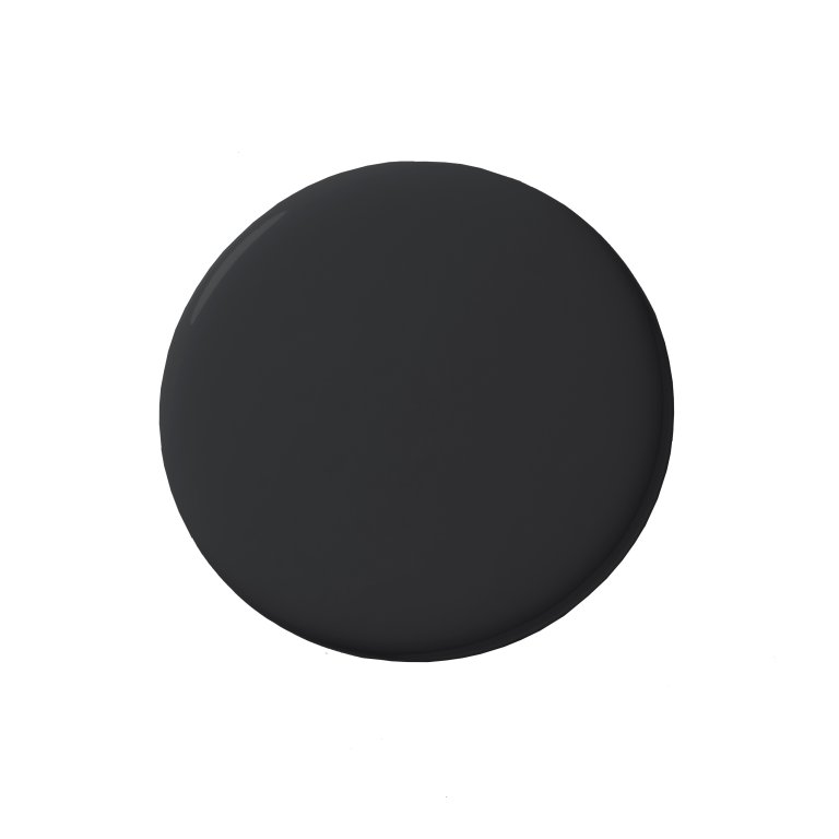
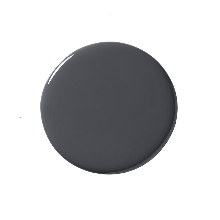
I am loving ultra-dark, moody exteriors, like Farrow & Ball’s Paean Black, with contrasting shutters. —Cynthia Ferguson, founder of Cynthia Ferguson Designs
My dream exterior trend is black exteriors with layered textures like charred woods and matte metals. Favorite swatches: Benjamin Moore’s Wrought Iron and Sherwin-Williams’ Tricorn Black. —Britany Simon, owner of Britany Simon Design House
Cream

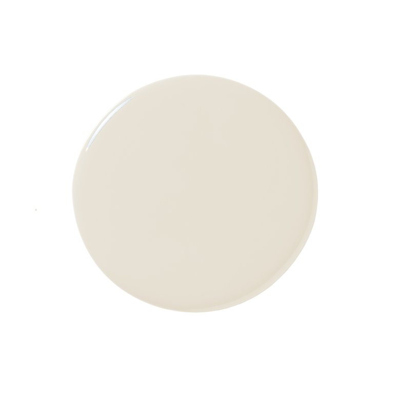
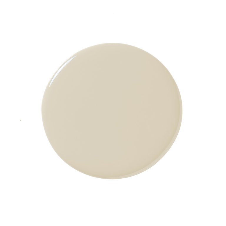
White has been the default for so long, but it’s starting to feel a little expected. My favorite cream is Benjamin Moore’s Feather Down. Pair it with a wintery blue or a sage green accent, and it instantly feels elevated and historic. —Christine Vroom, founder of Christine Vroom Interiors
Grecian Ivory by Sherwin-Williams is a soft, warm off-white that creates a welcoming feel. It’s a timeless, classic color that suits both modern and traditional architectural styles, and works well on a variety of materials, including brick, stucco, and siding. —Kevin Kaminski, architect and cofounder at Kaminski + Pew
Gray-Blue

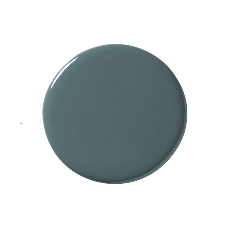
I love the idea of painting an entire home (including trim, windows, and doors) Inchyra Blue. —Jay Jeffers, founder and principal of Jay Jeffers Inc.
I really want to see more deep, dark blues like Benjamin Moore’s Raccoon Fur. There have been so many white or cream homes in the past ten years, I’d love to watch people change it up a bit and start adding some depth to their exteriors. –Kristin Harrison, founder of Georgia & Hunt Design House
Nuanced Pink

I am confident we will soon see a shift toward more vibrant hues, moving away from the dulled-out shades of gray and blue that have dominated in recent years. These bold, lively colors not only make a statement but also offer a fresh appeal. Benjamin Moore’s Dusty Mauve would make a beautiful exterior color. —Caren Rideau, principal of Kitchen Design Group
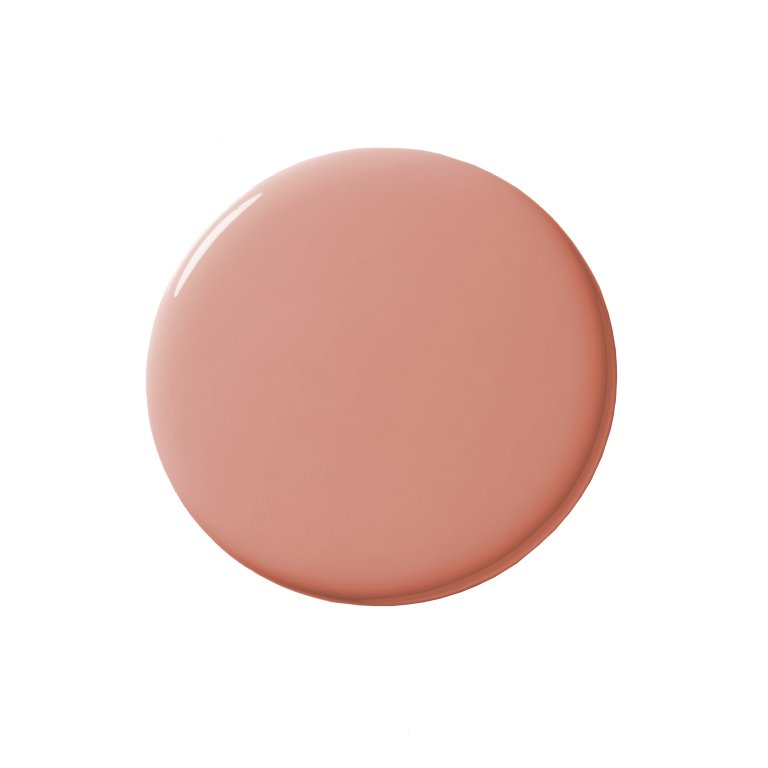
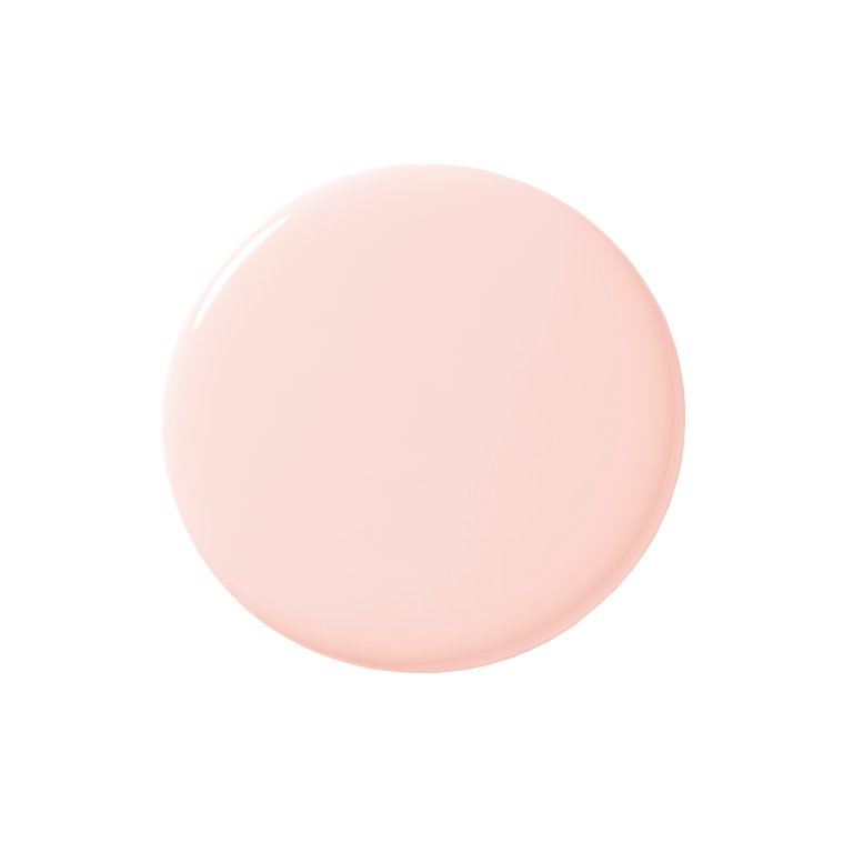
As a heritage-minded designer, what I’m yearning to see more of in 2026 is a soft, architectural pink exterior. Think of California in the 1920s: Mediterranean-revival villas, social-club mansions, sun-lit boulevards, but reinterpreted with contemporary sophistication. This isn’t bubblegum or candy pink. It’s an emulsion-finished pink with depth, warmth, and a golden undertone that glows beautifully in sunlight and dusk. —Jaime Rummerfield, founder of Jaime Rummerfield Interior Design


