We may earn revenue from the products available on this page and participate in affiliate programs.
“I’m a rule breaker,” says interior designer Hayley Francis of Neon Doves, before launching into a happy cackle over the phone. She’s discussing her use of multiple types of wood in the dining room of her latest project, a family home in Seattle, where the owners wanted her to give the three-bedroom a “bright, California plant lady vibe,” she says.


To be fair, not even her clients were sure if placing burl wood next to a walnut table and lighter oak console would be winning combo. “I wish I had an equation of how I would explain it,” says Francis. “For example, I wouldn’t have just mixed burl wood with anything, but I knew we were going to do that crazy gallery wall with reds and modern aspects to it, so I knew it would work.” In other words, throw out the rules; we have no use for them here.

That motto could be applied to the entire house, which the homeowners bought in 2018 and, with the help of Francis, transformed into a bright, white, art-filled nest. Instead wasting materials on a total gut reno, which the house didn’t need anyway, they made high-low cosmetic changes, like a kitchen remodel, that would refresh the entire space. Floors stayed the same, but a smattering of white tiles and a new island helped.


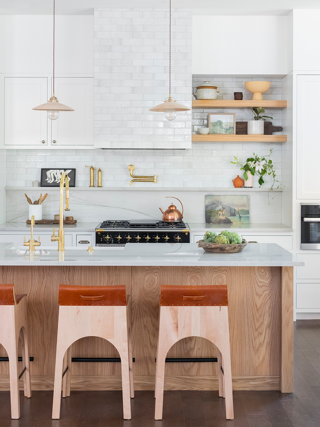
In the kitchen, where the layout changed slightly to accommodate a bar, the oak island inspired the countertops and open shelving—but the matching stops there. Leather-wrapped stools contrast the darker wood, and bright white cabinets and subway tile create a clean slate. The light fixtures, Lacanche range, unlacquered brass fixtures, and barstools weren’t exactly inexpensive, but nearby in the breakfast nook, a CB2 fixture that Francis scored for $90 lights up the room.

Another example of crafty design is in the powder room, which Francis gave what she calls “a facelift”—no pun intended—with a graphic black and white wallpaper. The flooring and shower stayed, but a new vanity and faucet later, it’s nearly unrecognizable from before. “It’s where their guests are going to be, so I wanted it to have a bit of loud, modern swag,” she says.

Upstairs, the primary bedroom is a bit more subdued, but you can see where Francis’s creativity came into play while trying to work with a challenging layout. The bed frame, a Wayfair find, got a glow-up thanks to a Peruvian blanket (her clients love layered textiles), and the leather sconces add a luxe touch. The carpet was already there (and the owners didn’t want wood floors that would feel cold under foot because of the Pacific Northwest weather), so Francis covered it with vintage rugs. And as for that complicated layout? She took a cue from her clients, who are avid readers, and made a relaxing reading nook out of it.

In the guest bedroom, the homeowners placed their previous bed, and its dark frame gave Francis the chance to get a little moodier than she had in the primary, knowing that they wouldn’t be in the room every day.

Places they would see every day? The living room, a space that she chose to give personality with an oak bench punctuated with two Block Shop tiles hanging above. And then there is the nursery, the ultimate status quo–defying room, where instead of sweet pastels, Francis went bold with a wallpaper mural that looks as if the cribs are suspended in the treetops. (A real olive tree helps with the effect.) It would all be a lot for some people, but for Francis, it’s a reminder that design rules are made to be broken.


