We may earn revenue from the products available on this page and participate in affiliate programs.
Nate Berkus has a question for all his Instagram followers out there: “Why does everyone think I don’t like color?” the interior designer asked in a recent Instagram Reel.
The misconception likely lies in the fact that in any one of his projects, you’re bound to find a creamy linen sofa, a light gray seagrass wallpaper, or a slab of Carrara marble. Berkus admits there are so many other designers out there who work wonders with bright colors, and he isn’t one of those people. But he’s ready to set the record straight. “I do like color,” Berkus confirms in the video, “and I’m going to give you a color right now that is one of my all-time favorites.” He has our undivided attention.
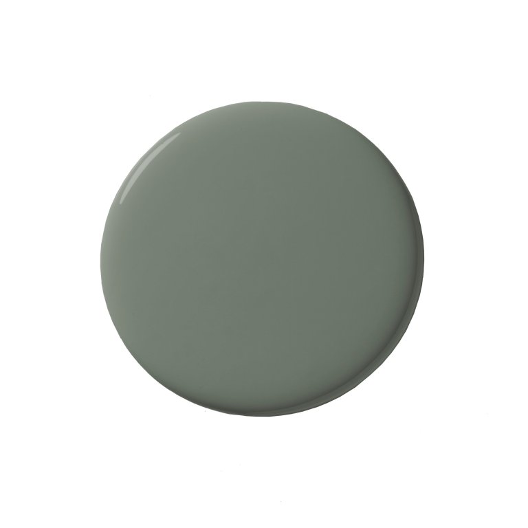
When the designer reaches for a non-neutral color, he goes for something that he describes as “muddy, like a non-color, a little bit softer, a little bit deeper, maybe even a little bit moodier.” This isn’t the first time Berkus has explained his love of muddy colors, at least to us. When he and his husband, Jeremiah Brent, made over a family’s living room for The Jennifer Hudson Show, they landed on a Behr color called Tranquil Gray, which Berkus told us has undertones of putty and taupe in it. But that’s not the hue he’s obsessing over right now. “For me, regardless of what anyone else says, the color of the moment is Nitty Gritty by Portola,” Berkus reveals in his Reel.
He isn’t just using this dark green in client projects—it has appeared in his own homes, too. Specifically, he swathed the kitchen cabinets in his family’s Manhattan townhouse in the paint color. “There’s something about it for me that reads really elevated. I just think it’s beautiful,” he says. Want to up the moodiness of this color even more? Opt for the textured Roman Clay treatment instead.