We may earn revenue from the products available on this page and participate in affiliate programs.
Usually, Brad Sherman, cofounder of Float Studio, approaches a project with a client-approved concept and a tight color strategy. He took a completely different approach when it came to a 5,000-square-foot home in Rye Brook, New York, where he ditched his studio’s usual methodology for a gut feeling. The switch-up had nothing to do with the home’s size or the 19th-century architecture. It was based purely on the premise that he and the owner, Dr. Jamie Royal, have been friends since high school. (They also worked together on the remodel of Royal’s orthodontic practice in Gramercy Park.) Being able to tackle the project with a deeper personal knowledge of his client gave him more opportunities to weave in meaningful details. “When I started talking with Jamie, it was very clear that she liked a lot of different things that are related to Cranbrook, where we both went to school,” Sherman says. “This was a case of combining things someone loves in a way that’s a bit more guided and less strategic.”

The objective was to merge the 1866-built home’s heritage with Royal’s bold, color-loving style in a way that would evolve with her family of five. “I was really set on an old house,” Royal says. “I wanted a contrast of a modern interior within really old bones. We also wanted every part of the space to feel livable, like we weren’t going to lose our minds if the kids spill hummus all over something.” After eight months of renovation, every space now speaks to the family’s playful dynamic, starting with a primary color scheme visible from the second you walk in.


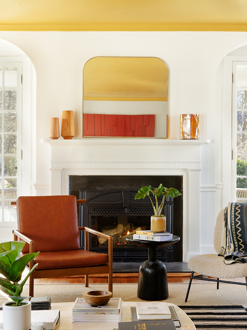
A royal blue runner and French doors immediately make a bold statement against red accents and a yellow ceiling in the living room, but the muted tones mean it’s more elevated and less elementary school. “We were toying around with the idea of painting the ceiling and looked at this color called India Yellow by Farrow & Ball,” says Sherman. “To be honest, I wasn’t 100 percent sure about it, but the minute it went up, we loved it.” Royal agrees: “It’s the number-one thing people comment on.”

The duo was determined to make the high-traffic space that connects the living and dining areas more than a mundane hallway. Red sconces on a graphic black and white Kelly Wearstler wallpaper keep the primary theme going. Mushroomlike poufs add whimsy and, when brought into the living room, a place for the family to kick up their feet. They also incorporated sentimental touches on the console next to the arched doorway, including a photo of the Friendship Arch from their hometown—a nod to Sherman and Royal’s shared history.

The color scheme softens beyond the cobalt double doors where the family gathers in a dusty blue area whenever they entertain. “My parents have a formal dining room they use for maybe two days a year, but I didn’t want any wasted space. We use ours all the time,” Royal says. “It feels elevated, but we’ll be in there for something as casual as a Saturday night barbecue.” To maximize the space for year-round use, they built a custom 12-seat dining table that fits the size of the room, and opted for a glass top so it doesn’t feel as if it’s taking up the entire space.

The kitchen was the easiest makeover in the house. All it took was painting the orangey wood island a deep green, updating the backsplash with checkered tile, and replacing the old tubular lighting with modern pendant lamps. They instead focused more of their energy on renovating the eat-in area. There, a custom banquette is built from solid oak and vegan leather, with a tabletop made of hard-wearing laminate typically found in commercial spaces. “We know the kids bring toys over here, so if it scratches, it can be stained or sanded, and the cushion can be hosed down if it needs to be,” says Sherman. “It’s beautiful and it’s pretty much indestructible.”


In contrast to the saturated shades throughout the common areas, the primary bedroom is an oasis of warm whites and natural textures. “There’s so much chaos everywhere else in our house,” Royal says. “It was important that this room be serene and peaceful.” A similar sense of escapism resides in the library, located on the opposite end of the house, where Royal wanted a “moody, sexy” scene. To set the stage, they drenched the room, from the ceiling and the millwork to the desk and windows, in a singular inky hue. “Because it’s separated from everything else, I’ll duck in there and pour a glass of wine on Fridays,” Royal says. “It’s my ease-into-the-weekend room.”


On the not-so-quiet side of the house, the kids’ rooms also incorporate a generous serving of everyone’s favorite shades. The inspiration, which Sherman gathered by hosting a Zoom call with each child, came from dinosaurs, unicorns, and—for the eldest—summers at his sleepaway camp (which, in a full-circle moment, is also where Sherman went). “Some of the colors on the existing window treatments and carpet already took us there, so we started with that,” Sherman says.


The room that belongs to Royal’s daughter leans into all the frills and fantasies of girlhood. “She would like to have everything be rainbows and butterflies,” says Royal. ”Brad did all of those things but in a muted way that doesn’t feel cheesy. She’ll be able to grow into it.” They started by adding a chair rail around the room, painting the lower half in pink. The color-blocking also served a practical purpose: Since he knew there would be a lot of traffic around the walls when Royal’s daughter and her friends play on the floor, Sherman used it to disguise scuffs and scratches. “We didn’t want to paint the entire space, but that little bit of cheer also brings in one of her favorite colors,” says Sherman. Like the rest of the house, it’s a place where color, function, and fun all play well together.
