We may earn revenue from the products available on this page and participate in affiliate programs.

New York City–based interior designer Emma Beryl’s latest clients live in a quintessential Upper East Side building (think: Charlotte York-Goldenblatt’s address in Sex and the City). There’s an elevator operator, a formal doorman, and 1920s prewar charm galore. So naturally, when the couple set out to renovate the three-bedroom space, Beryl embraced the neighborhood’s classic style. “But we also didn’t want it to feel like we were setting unrealistic expectations for a young family to live in,” says the designer. With that in mind, she embraced traditional furniture silhouettes in fun colors (peep the Aegean blue sofa) and similarly opted for elegant millwork in the main bedroom, but swathed everything in a soft green paint color.


Before Beryl could get to work, architect Gary Eisner and his team at BuiltIn Studio reoriented the apartment’s layout. The split-level living area was changed into a guest bedroom; all the doorways were made extra-high as a nod to the space’s grand prewar roots; and they added steel doors in between the more public entertaining areas and the hallway leading to the bedrooms. With the home’s flow in a solid place, the designer sought a balance between “old New York and new Park Avenue.”
Make a Closed-Off Kitchen Feel Open Concept

While the kitchen’s zigzag-like layout isn’t all that conducive to entertaining, Beryl didn’t mind it that way. “Opening up the kitchen would have been a departure from that old-world, classic Upper East Side apartment style,” she explains. Still, the designer wanted to make it a place where the couple’s toddler could hang out while dinner is in the works, so she reserved one corner for a tiny breakfast nook. The long bench is finished with thick-weave Maharam fabric, so it’s extra-durable.

The dark blue cabinets also strike a balance between modern and traditional: Typical Shaker rails and stiles would have looked too stuffy, so Beryl went with a thin beading around the door edges for a fresh look.
Save a Spot for the Adults

In a space most would designate as a bedroom, Beryl created a library-slash-WFH zone for the adults in the house. “When they have friends over and don’t want to be in kid-land, they have a place where they can sit and have a drink,” she notes of the toy-free spot. Fully enveloping every surface in the same rich navy hue (it’s even on the ceiling in the form of wallpaper) makes the private area feel like a cozy cocoon.
Go (Light!) Green


One of Beryl’s top tools for making a home feel less formal and more family-friendly is paint. Farrow & Ball’s Cromarty is a muted green inspired by a place of swirling mists and, in the bedroom, it achieves the desired effect. Beryl swathed the walls and new closets in the shade, and rather than leave the gap underneath the windowsill empty, she doubled down on function with a storage bench. No room for a TV? No problem. A projector screen is hidden behind the roman shade so when the homeowners are in bed they can simply wind it down.
Achieve Family-Friendly With Wallpaper
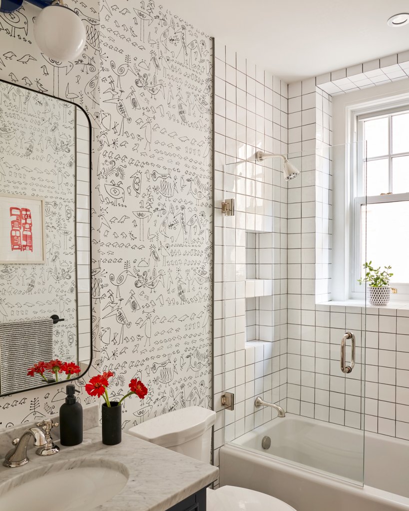
In the secondary bathroom, Beryl sought a different type of balance: guest- and kid-friendly. (The room is mostly used by the couple’s 3-year-old, but it had to be fit for out-of-towners, too.) Covering the walls in a playful wallpaper print gives it a fun touch come bath time, while the simple square shower tiles and dark grout keep things looking streamlined.


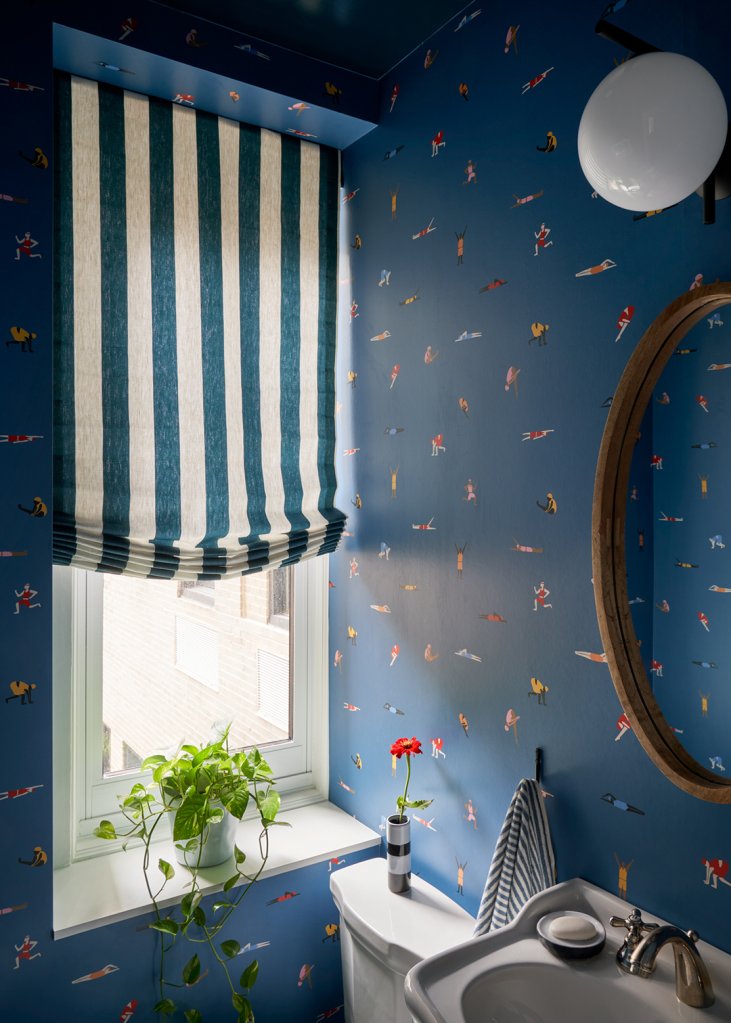
There’s no mistaking that a kid lives in the second bedroom, though. Beryl chose a jungle-themed wallpaper from Etsy and used it on all the walls to really transport the little one to the depths of the Amazon. The powder room presents another full-force pattern moment. Because the space is connected to a small Peloton area, Beryl kept the sports theme going with a swimmer-inspired print.
Don’t Let Your Windows Go Bare
For her final touch, Beryl addressed the apartment’s window treatments. “It always ends up being the hardest conversation because they’re expensive and I think they make people nervous,” notes the designer. Her argument? “It’s also the biggest glow-up.” One example is in the living room, where blue patterned drapes adds a strong punch. “It makes it like a celebratory event,” she continues. “It’s another opportunity to add something beautiful, so you need to take it.”