We may earn revenue from the products available on this page and participate in affiliate programs.
Scene setting, mood altering, energy shifting—the right shade can completely transform your outlook with the stroke of a paintbrush. This month we’re dipping into that chromatic magic with our series Color Your World.
When art director Swantje Hinrichsen moved with her boyfriend to a basement-level garden apartment in a small suburb outside Münster, Germany, last December, she went all in on repainting. From the foyer to the kitchen, Hinrichsen was on a mission to set a different mood for every room. “Every color I see brings out a different feeling,” says Hinrichsen. “It’s emotional synesthesia.”

In the early planning stages, “I saw these reflections coming through the one window in the hallway and it looked like I was in a forest,” she remembers. Naturally, changing the walls to a fitting, deep color was her next step. “People think you can’t paint a room with no sun a dark green,” she says. “Of course you can. You can always light it using good lamps. It gives it a special atmosphere that way.” Plus by keeping the clutter usually found near the front door—keys, catchalls, coatracks—tucked away, the hue feels relaxing not heavy.

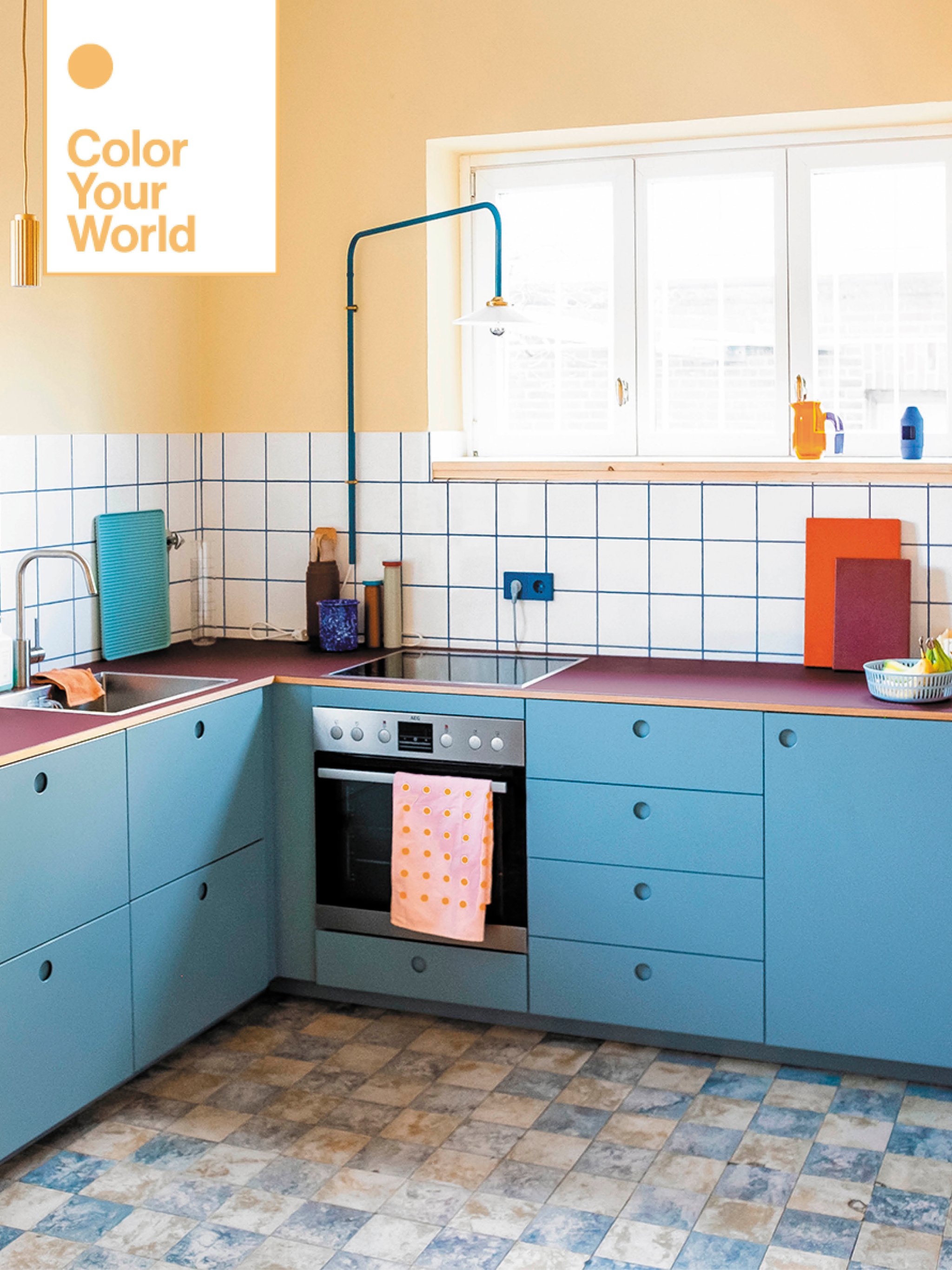
The kitchen, however, received the biggest facelift: The owners approved painting the 1930s cabinets, getting new appliances, and adding modern touches like an arched Muller Van Severen light to illuminate late-night dish washing. Upon first glance it appears there are dozens of colors packed into the small space. But really they’re all variations of just four shades—yellow, blue, a deep red, and orange. With each merely a different saturation—an Yves Klein Blue alcove and cornflower cupboards, for instance—the mix doesn’t overwhelm. “I wanted the kitchen to look like Pippi Longstocking’s house,” says Hinrichsen. “This color scheme brings out bold, confident feelings—a sense of freedom.”

It might shock you, then, to know Hinrichsen left multiple spaces white, starting with a second hallway—that’s the power of love. The neutral backdrop lets her boyfriend’s collection of vintage bicycles be the star, an outcome she took advantage of with the furniture and accessories, too. When you walk through the bubblegum pink door (there had to be one lick of paint), a block-patterned rug and Kelly green chest of drawers grab your attention instantly.

The dining area is similarly subdued, but for a different reason: The room is almost entirely surrounded by windows, leaving little surface area to transform. Hinrichsen’s current mission is to soften the space with texture and warm neutrals. “When I’m done, I want it to look like a Scandinavian forest,” she says. Adding a natural-fiber rug counteracts the cold tile floor, and leaving the table and chairs in their original wood grain makes the space feel cozier. (Next up: some woolly curtains.)

At first the couple’s bedroom was a moody blue—until Hinrichsen realized she wasn’t waking up fully rested. For the color-sensitive creative, the hue was simply too stimulating. “In the rest of the house, that’s great, but not in here,” she explains. Painting it back to white (yes, another white space!) let her brain shut down before bed. Now vivid tones come through in the details—she’s constantly rearranging the ceramics on the built-in headboard and switching up the sheets.

In their bathroom on the other side of the apartment (that’s rental living for you), Hinrichsen leaned into Easter egg shades of yellow and pink. On the buttery walls, two floating cabinets by Montana Furniture, one in each color, encourage her to get the day started on the right note. “Once I’m awake, I’m ready for that stimulus,” she says.

While Hinrichsen has a studio a 15-minute bike ride away, the guest room also functions as a home office for the couple. The space is white, but a super-bright version to reference a blank canvas. The patterned daybed and record-filled Bentonggruvan bookshelf extending over the doorway are meant to inspire creativity, whether they have visitors for the weekend or are trying to meet a deadline. On the lower level of the storage unit, a bright green swath of fabric by Marimekko cleverly covers up stray wires. The room was Hinrichsen’s final project, but she’s always ready to dive into something new. “Who knows?” she says. “Sometimes a color pops into my mind and I know I just have to use it.”
The Goods
This textile is so me: It’s definitely the Marimekko Tiiliskivi grid.
I’m always browsing at: Artek Second Cycle’s universe for some (slightly) used modern pieces. The quality is great.
Go-to online resource: I’m constantly looking at Finnish Design Shop’s website. It has a wide range of brands but also small businesses’ products.
Most beloved object: We use our Mags sofa from Hay more than anything else.
Who to Know
Carpenter I couldn’t live without: My friend Ulf Stückenschneider, who helped with the kitchen cabinets and the extended bookshelf.
Storage superstars: Montana. They have the perfect pairing for every situation.
Our Winter Renovation issue is here! Subscribe now to step inside Leanne Ford’s latest project—her own historic Pennsylvania home. Plus discover our new rules of reno.