We may earn revenue from the products available on this page and participate in affiliate programs.
Tash Bradley is a self-proclaimed color obsessive. As the director of interior design for British home decor company Lick, she signs off on every one of the brand’s 124 shades (and counting!) and happily spends thousands of hours consulting with homeowners on their palettes. And if you’re one of those people who has spent days agonizing over the perfect shade of white paint (guilty!), you can imagine what a brain-bending job that must be. But Bradley took the gig one step further and trained to become a color psychologist. Now she not only picks what looks best, she weighs in on what feels best.
According to Bradley’s experience, each color, and every variant of it, evokes a mood that enhances that space’s purpose. For example, she chose what she calls the Harry Styles of pinks (“It’s on trend and literally everywhere!” she says) for her Somerset, England, living room because of its playful yet cuddly appeal. She wanted guests to feel like they could sit back, relax, and have a good time over a bottle of—what else?—rosé.
As part of her day job, Bradley keeps coming back to this one question: What makes a color worthy of a whole mood? Ahead, she explains her theories and shares exactly which paints to choose for the vibe of every room in your house.
To Feel More Relaxed

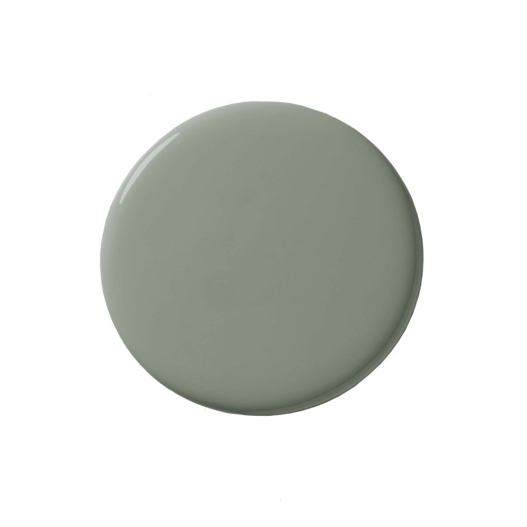
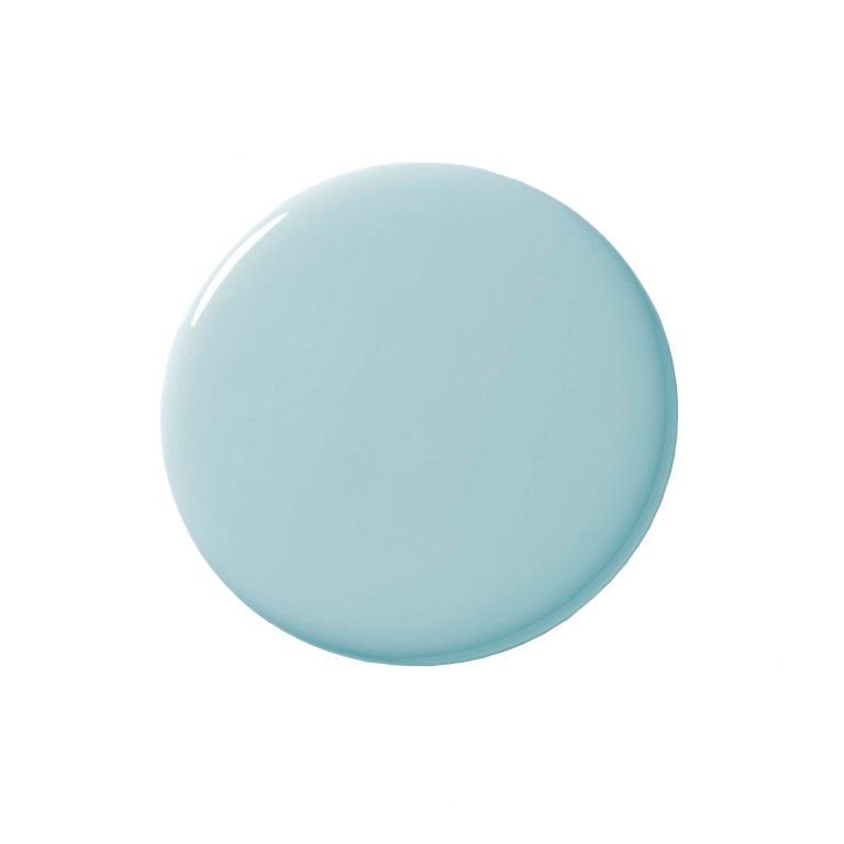
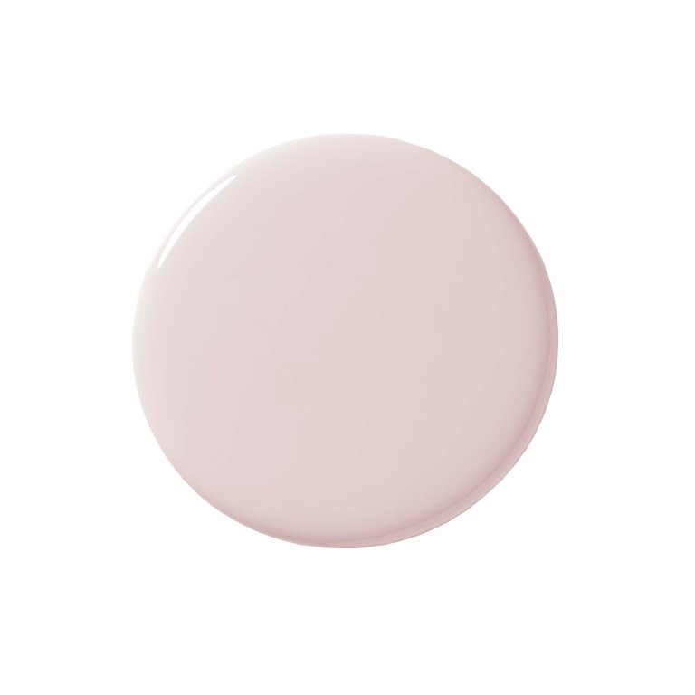
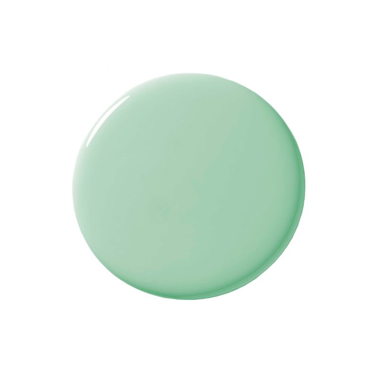
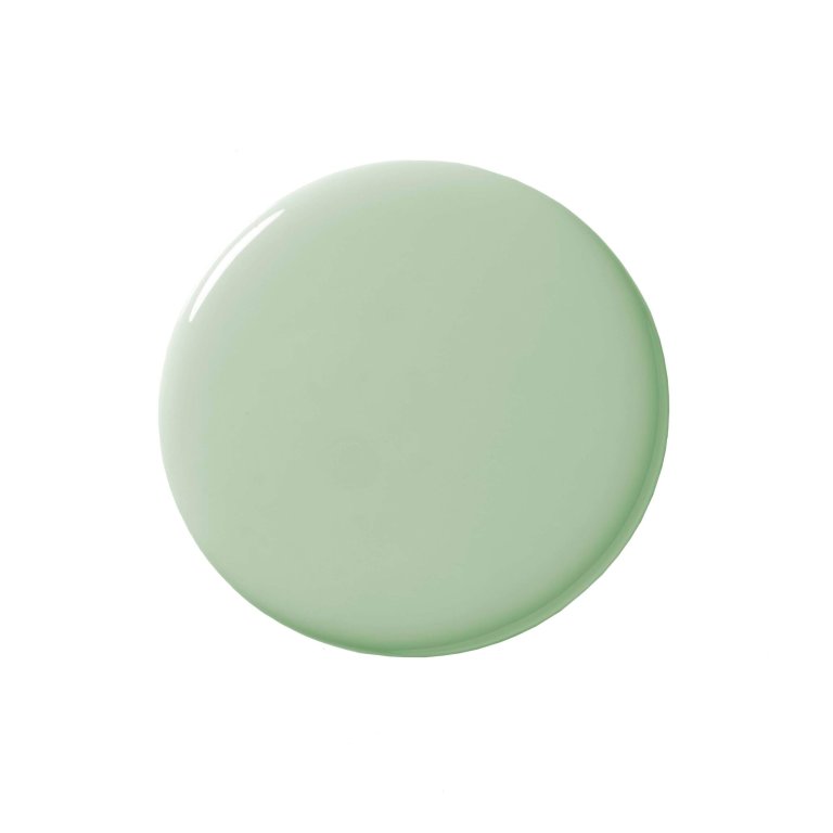
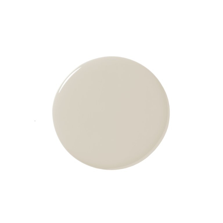
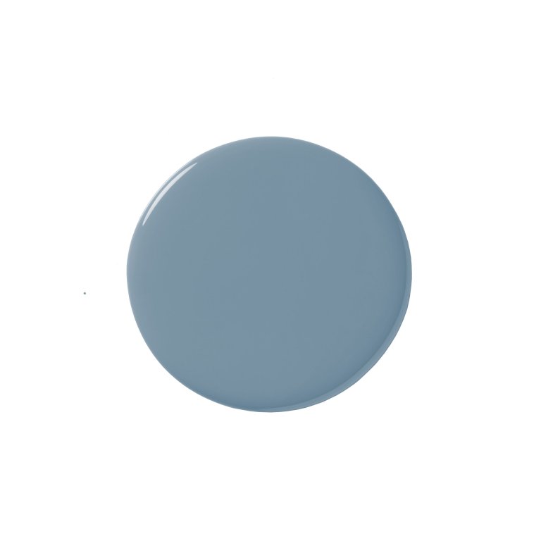
The colors: Earthy green, light blue, warm beige, soft pink.
The psychology: Bradley picked Pink 04 for her home because the soft shade is so instantly relaxing. “I call it the shoulder-dropping color,” she says. “The lighter you go, the more nurturing it is.” To create a calm, grounded environment, she also leans heavily on greens because biophilic shades mentally bring us closer to nature and harmony. Beige, of course, is innately relaxing because it doesn’t demand too much attention. And blue, the color of the mind, as Bradley calls it, is soothing to a busy brain.
The rooms: These all work well in a living room, where you’d want people to unwind and stay a while. As we know, green is a go-to for kitchen cabinets, perhaps in part because it subconsciously promotes healthier habits, according to Bradley. And she shares that light blue in a bedroom is the best option to help you get a better night’s sleep.
To Ramp Up Your Energy

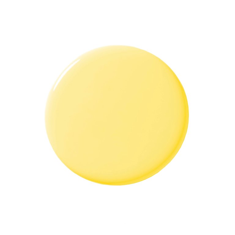
The colors: Blue or green with yellow undertones. Or a pop of pure yellow.
The psychology: To really channel that get-up-and-go feeling, Bradley recommends infusing sunny tones in your choice because they boost self-esteem and optimism. Even though these are happy hues, she notes that proportion matters and these shades are best used in small doses. That’s because painting an entire room in one bright neon is likely to create the kind of energy no one enjoys: anxiety.
The rooms: A door, bathroom, or small accents like a desk or window frames are great for these mood boosters. For an extra kick, combine with vitamin D and take the tints outside to upcycle old outdoor furniture with a fresh coat.
To Get Cozy

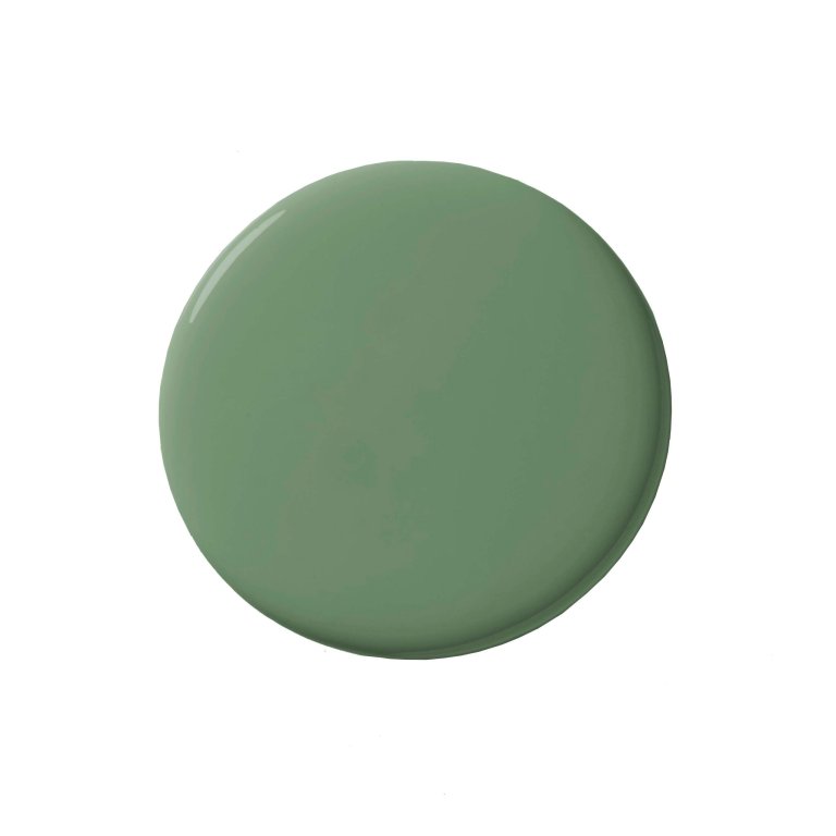
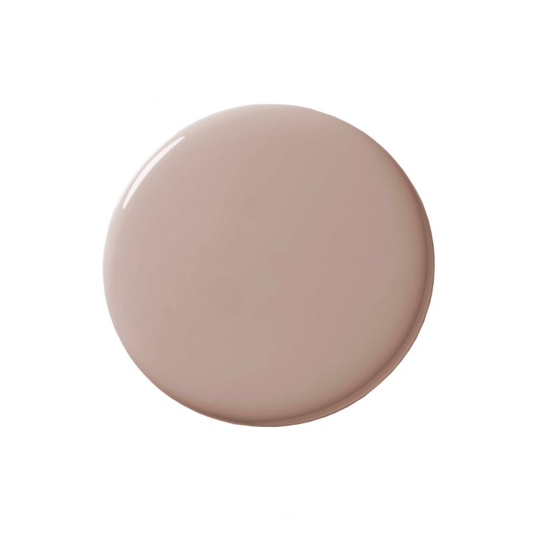
The colors: Beige, deep green, earthy pink.
The psychology: As “the snuggle-up colors,” these make us feel settled and safe. They’re perfect for people who want to create hygge-inducing spaces.
The rooms: The living area, or anyplace where you’d want to curl up and watch a movie.


To Stay Focused

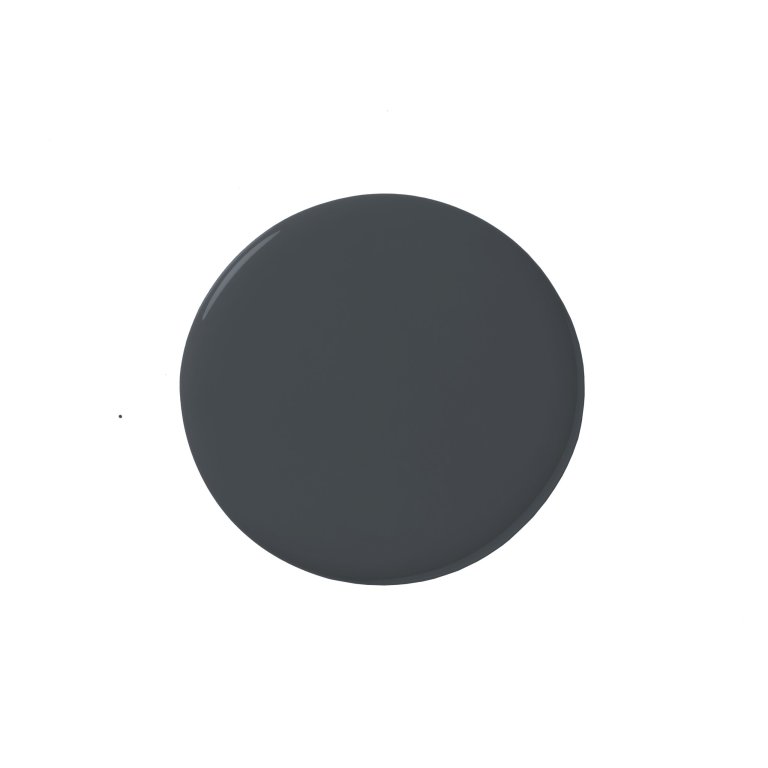
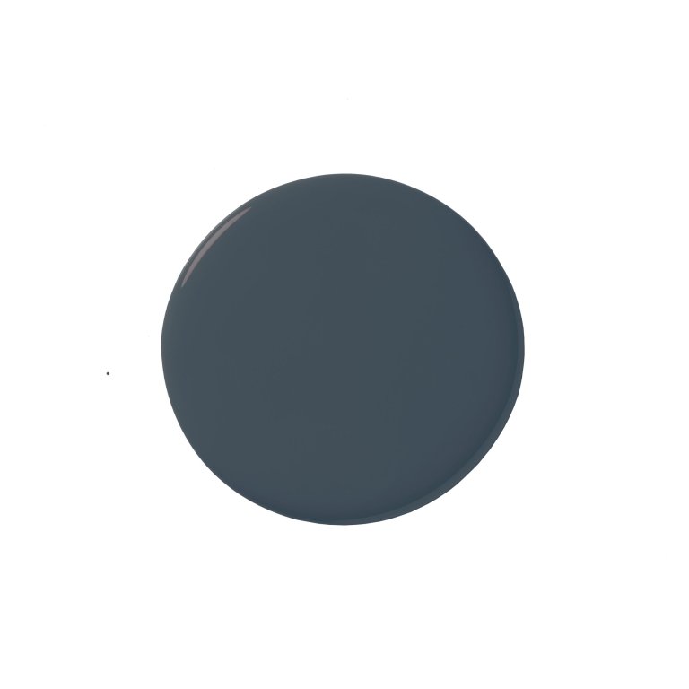
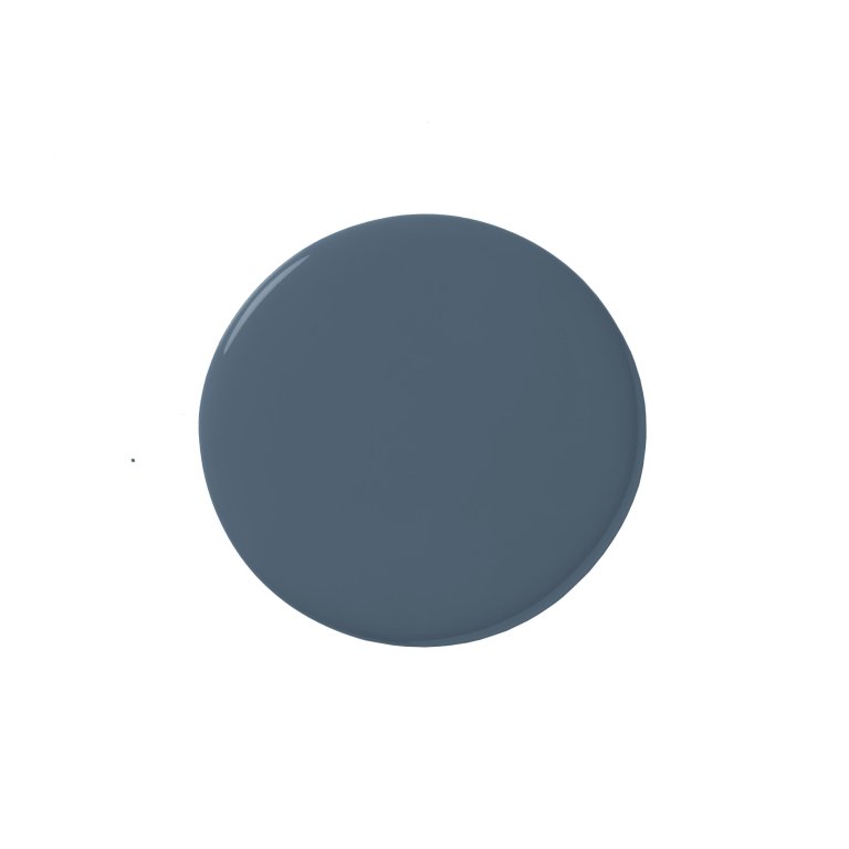
The colors: Dark shades of blue.
The psychology: These colors emit a sense of serenity, security, and order. “Most people would say paint your bedroom dark blue and it’ll put you to sleep,” says Bradley. “But it actually does the opposite!” Deeper shades of blue encourage a thinking mind to stay focused.
The rooms: Swipe a few coats on the walls of your at-home office or in little nooks that are carved out for reflection-based activities like reading or writing.

To Embrace Being Moody

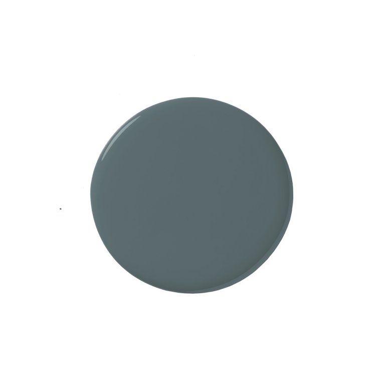
The colors: Deep purple, teal, red.
The psychology: A room in these rich pigments creates a dramatic interplay with neighboring spaces. By going dark in one area, the surrounding ones appear more illuminated.
The rooms: If you’re going for full drama, Bradley recommends completely committing and wrapping the entire space in color, from the floorboards to the fifth wall. Otherwise you risk creating contrast within the room that’s too stark. On a smaller scale, try it in a bathroom, or better yet in a transitional space, so all the rooms along the way feel brighter and more inviting.