We may earn revenue from the products available on this page and participate in affiliate programs.
I learned as a graphic designer that there’s no such thing as a bad font. I mean, there are some that are uglier than others, but there’s always a way to make it work. That’s how I feel about paint now.
My husband, Joe, and I bought our new home—located a mile down the road from our last place—during the pandemic. It was an unexpected find: A friend sent us the listing and we fell in love with its quirkiness from the get-go. When we toured the place, I really did look past the wacky paint colors, which ranged from hot pink to lemon yellow, because I thought we would be changing them immediately. Instead, I focused on the crown molding, the fireplaces, the detailing on the floor—all things that are important to me. I made a choice to look past aesthetics in order to have some of the stuff that was original. These are the types of things you can’t necessarily inject into a new home.
But once we moved in, the only real thing that bothered me was feeling overwhelmed with all the choices I was going to have to make. I didn’t know where to start. So I didn’t.
With the exception of some basic maintenance stuff (it’s a funny thing, trying to FaceTime with your plumber to fix a leaky pipe), we’ve made no major renovations. I had planned on painting everything and refinishing the floors, but in the midst of the lockdown, I was honestly tired. I was working from home with my kids. I wanted to have fun with the design and not feel like I was being forced to make decisions, so I shifted my perspective. Instead of looking at it as, Oh, I hate this wall color, I decided to work with it, and I quickly realized there’s a lot of fun that happens when you listen to your own energy.

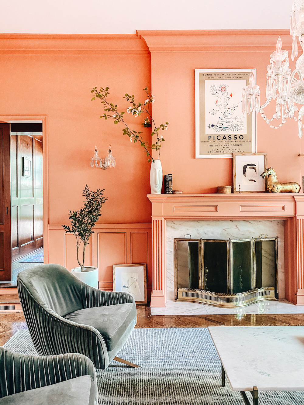
When you put pieces of furniture that you love together in a space and you understand basic design elements, like how primary colors stand up really well next to each other, cool things can happen. In decorating our yellow family room, I’ve discovered that neutral fabrics that once looked good against all-white walls blur into one big shade of amber. So I’ve started bringing in brightly colored flowers—think: true magenta azaleas—and dark woods, and, now, I’m on the hunt for a cornflower blue chaise and a striped red sofa. After doing some digging, I learned that this shade of yellow is actually a very historic color. Monticello and Monet’s Giverny dining room became my new sources of inspiration.

Still, I’m looking forward to the future. Our kitchen renovation will likely happen this year, mostly because there are some major functional issues (a cabinet recently came crashing down on my toe and the tiled countertops are a recipe for a mess when you’ve got little ones).
Oftentimes when design is your business, you can make choices that don’t reflect real life. But now things are different. Now is the time to appreciate what we have even though that might mean putting up with a dated kitchen. You never really know what you’ll love until you style a corner and realize that this is different; no one else has this.

Introducing Domino’s new podcast, Design Time, where we explore spaces with meaning. Each week, join editor-in-chief Jessica Romm Perez along with talented creatives and designers from our community to explore how to create a home that tells your story. Listen now and subscribe for new episodes every Thursday.


