Ice Cream Pastels Are Flooding Our Social Feeds Right Now
Here’s how to decorate with this trendy color palette.
Updated Sep 29, 2021 7:38 AM
We may earn revenue from the products available on this page and participate in affiliate programs.
Ice cream is going to be big this summer in more ways than just dessert—and our way won’t guilt you into spontaneously buying an overpriced gym membership. Ice cream pastels, from cool mints to sorbet yellows to rosy pinks, are making their way from the fashion runways into home decor, and if you need convincing that this trend is one perfectly suited for stylish adults and not, let’s say, a baby nursery, this story is for you. From pastels paired together to evoke the cool and contemporary, to the sweet and feminine, here are some of the best ways we’ve seen this color palette incorporated in interiors.
The contrast of the bold black pendant lights against pale pastels in this little dining nook is seriously striking. Commitment to keeping other aspects of the room within the same colorway, like the pink fireplace and pink trim on the border of the door, keeps everything feeling streamlined.
This plant-filled pink armoire is quite literally the stuff of Pinterest dreams, and we love the inclusion of various mint tones as decor on clear display inside it. Committing one object to the trendy palette is an easy way to test out the trend if you don’t want to re-do an entire room.
Not sold on going full-pastel? Play around with saturation; so instead of opting for a pale yellow, go for something like a mustard sofa to play off the other pastels in the room. In the case of this living room, that would be the mint green two-tone wall.
Underscored by a seafoam trimming around the living room, this space pairs patterns with pastels for a mix of color and print. Geometric shapes on the throw pillows bring some edge to the softer hues.
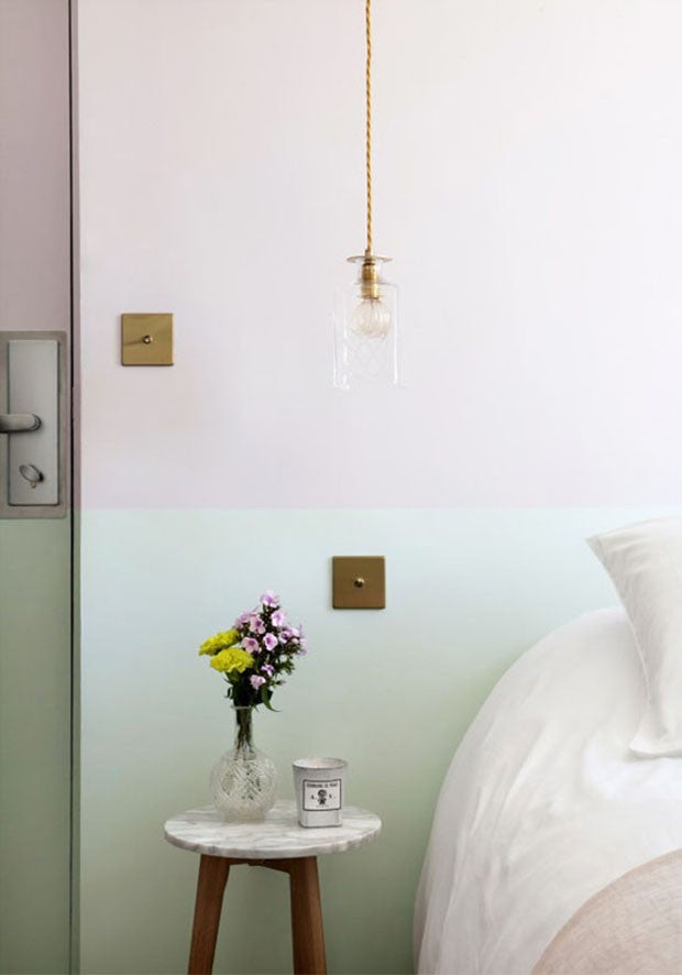
And speaking of two-tone walls, here’s how to take on that trend with the color palette of the summer. The ever-chic Parisian hotel, Hotel Henriette, expertly pairs a pale mauve with a contrasting—yet still complementary—pale green. More saturated version of the two colors make an appearance in the nightstand flowers for the perfect finishing touch.
Sorry, Ikea, we like this version of blue and yellow so much more. A perfect blend of baby blue and light lemon colors brighten up this dining room, right down to the matching chairs and slightly-darker chandelier. The bowls full of lemons are a nice touch.
Fancy yourself a bit of a weekend DIY project? Grab some tape and a few different colored cans of paint and get going. This perfect hallway moment may not be the product of a DIY per se, but it can easily be recreated at home for budget decorators. The combination of blush pink, apricot, and sky blue are definitely worth copying, regardless.
File this under painted floor ideas we want to steal ASAP. This Scandinavian apartment masters the balance of a complementary blue-orange pairing with dreamy painted cabinets and multicolored triangle patterns on the floor.
Sometimes the simplest approaches are the best. Keep your white walls (and your rental’s security deposit) and instead infuse pastels via the decor. Here, the blue tablecloth and light pink tabletop accents pair nicely with a raspberry-toned throw pillow, which offers up a delicate hint of contrast.
See more color palettes we love:
A Fresh Take on Spring Pastels
The Color Combo You’re About to See Everywhere
16 Ways to Embrace This Year’s Hottest Color Trend
Learn to love your inbox again—sign up for Domino’s daily email.