We may earn revenue from the products available on this page and participate in affiliate programs.

What do Burnt Cinnamon, Glass Slipper, and Water’s Edge all have in common? They’re all the names of paint colors—and they can all be found in a Salt Lake City home designed by Susannah Holmberg. The homeowners, a couple with four children, were the first ones to admit that the historic 1920s house was a “hodgepodge” of renovations, some of which they’d undertaken themselves, like adding a glass-enclosed addition off the kitchen, photorealistic floral wallpaper in the dining room, and Spanish tile in the kitchen. “There were so many different architectural styles happening,” says Holmberg. “By using color and weaving it throughout, we simplified the experience of being in the house.”

One key trick that helped tie all the rooms together? Painting the undersides of the arches a rust color. (Psst: The detailing is Benjamin Moore’s Burnt Cinnamon hue.) “We needed to make sure we had slightly more refined tones,” says Holmberg of steering clear of obvious pastels or overly saturated primary shades in favor of soft pinks, golds, and blues throughout. “The color story unifies all the spaces.”

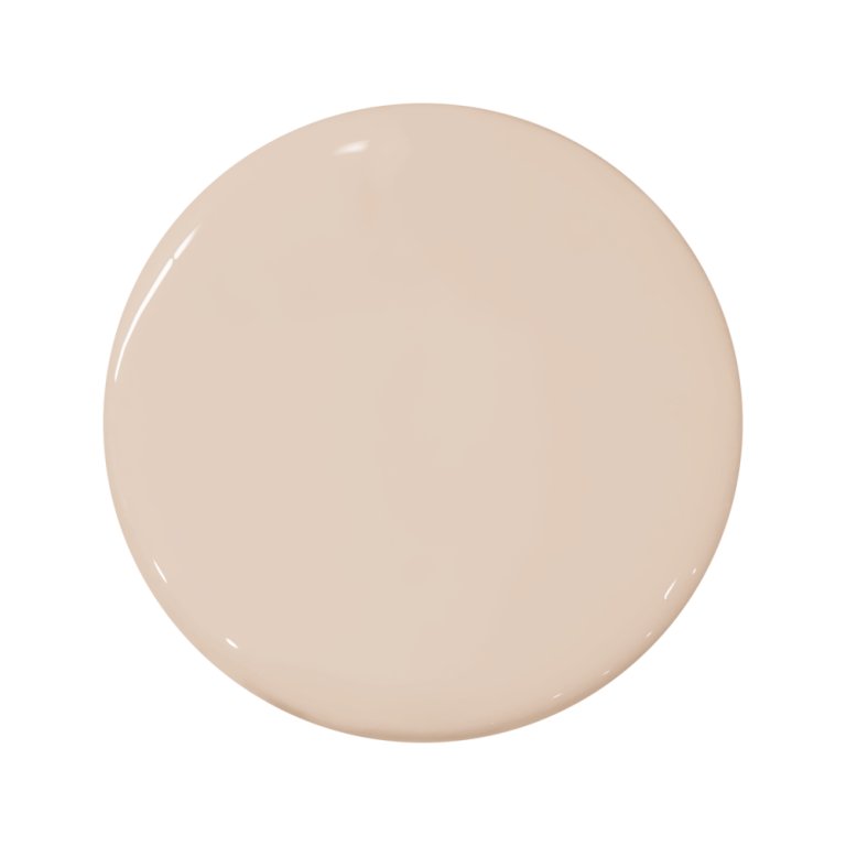
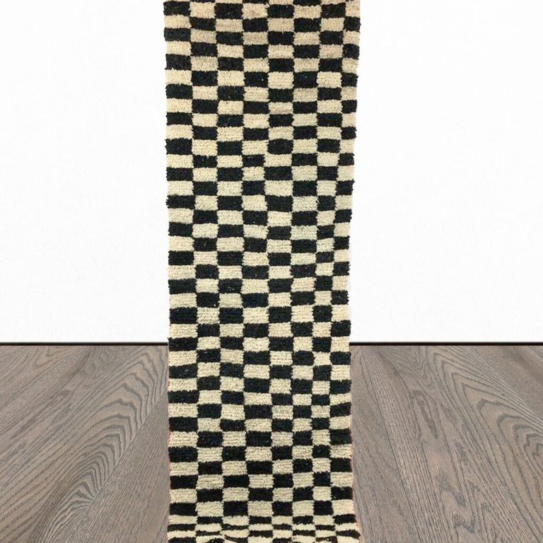
Creating cohesion wasn’t Holmberg’s only goal. She also didn’t want the home to appear too traditional. In need of a little edginess, she painted everything in the entry—ceiling and trim work included—pink (the swatch is Portola’s Angel’s Landing). The warm blush shade, which also pairs well with browns, felt less risky once she found the checkered stair runner on Etsy and coated the risers and railing in black paint. “That kept it from feeling like a little girl’s room,” she explains. Off to the left is the subdued living room with Benjamin Moore’s Glass Slipper on the ceiling—a color that’s a few shades lighter than the monochromatic office nook, which was dipped in Water’s Edge.


Even the tone of the fireplace grout elevates the space from classic to cool. After getting rid of the cheap large-format tile that was there before, the designer brought in elongated black rectangles from Stone Source. By widening the spacing rather than soldier stacking the pieces and using an unexpected ochre-hued grout, the feature moment looked instantly more sophisticated. “We were able to use very affordable tile and still create a pretty noteworthy fireplace,” says the designer.


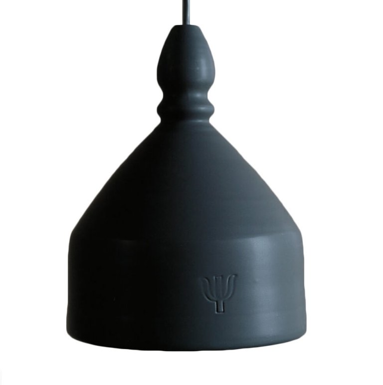
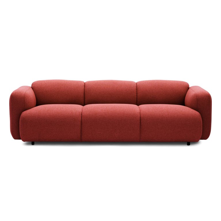
Curved furniture like the red sofa from Normann Copenhagen and the Couleur Locale light were additional ways to make the home feel current. “Those modern forms create a contrast in older homes,” says Holmberg. A shaggy rug from Rugs Direct takes the chill out of cold winter nights and post-ski trips.


Given one of the homeowners is a director of commercials and short films, Holmberg sought out large-scale, contemporary art. The giant Joan of Arc film poster in the living room is hung off to one side to ground the wall (the white space around it helps spotlight the work in a way that mounting it in the center of the room would not). For pieces that the couple already owned, it was a basic matter of swapping out the frames. Take the graphite drawing in the dining room: “It had a Western-style border around it before, which made the piece less cool,” explains Holmberg. “We simplified the frame so that you notice the art.” The crackled wallpaper from NLXL delivered a sense of texture to the room without going the splurge-worthy grasscloth route. If only these walls could talk…

The Goods