We may earn revenue from the products available on this page and participate in affiliate programs.
It’s common advice to live in a home before renovating, so that you can better learn what your pain points are. From the moment interior designer Deidre Webster’s clients first walked the kitchen of their turn-of-the-century Minnesota Craftsman, however, they knew the awkward layout was an issue. The kitchen had been inefficiently divided into three rooms during a circa-1980s renovation: an area for cooking, a butler’s pantry, and mudroom where the fridge was located. “You kind of zigzagged through the space,” the designer remembers. It wasn’t ideal, but after buying the house and hiring Webster’s firm, Studio Day, to refresh the rest of the ground floor, the couple needed a break from renovating. They moved in and lived in the house—the rest of the rooms renovated, but with the old and awkward kitchen—for three years, even having two kids, before deciding what to do about it.

It was potty training that pushed them to make a change. At first, the couple thought they might be able to do a simple cosmetic refresh on the kitchen. But then they realized how much they needed a ground-floor bathroom—running upstairs for every potty break with two toddlers was a non-starter. And adding even a tiny powder room downstairs was going to require major renovation of the kitchen.
Refreshingly, the clients didn’t want an over-the-top design for their new kitchen. “They are really good at balance,” says Webster. “They wanted it to feel down to earth, but nice.” The family mostly just wanted a space that worked better, so Webster’s mission was to improve the kitchen’s flow, while making it just as beautiful and in keeping with the rest of the house. And to carve out a powder room, of course. Here’s exactly how they did it.
Explore All Possible Layouts


Webster had been revising the kitchen in her head ever since she first saw the house. The question of fitting in the powder room was a structural puzzle; they wouldn’t know what layout would make sense until they opened up the walls to see what square footage was useable. “I worked through about seven different plan options,” confesses Webster.


After demolition, Webster found the inches she needed. By combining the contiguous butler’s pantry and cooking space into a single galley-style kitchen, she gained back valuable storage and room for the fridge. (She also removed the window in the former’s butler’s pantry so the fridge could sit in that space.) Then she carved out a powder room, just three feet wide, behind the wall of cabinets with the new stove, which in turn smoothed the zig-zag of the former cookspace into a wide open aisle. A powder room now opens into the hallway. Webster also removed the door between the dining room and kitchen, salvaging it for the powder room, and widened the opening.
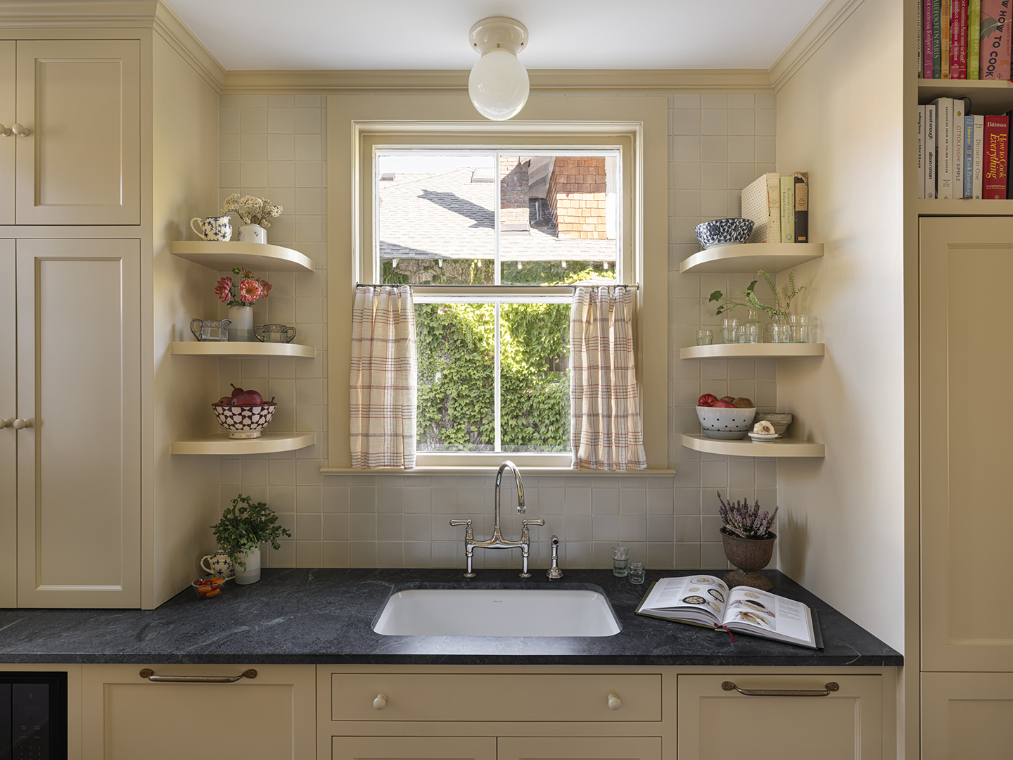
Choose a Style that Suits the House

Webster looked to the rest of the house for inspiration for the kitchen’s style and palette. She chose an inset cabinet profile that felt in keeping with the original 1905 moldings of the house. “Every color stems from that William Morris paper in the dining room,” says Webster (visible below). For the trim and cabinets, Webster used one of her favorite paint colors, Ambient Light from the Magnolia Home by Joanne Gaines collection for Kilz, and sourced salvaged hardwood flooring to match the home’s original flooring.
Nod to the Past, Don’t Replicate It


The true-to-the-house ethos extended to details like materials and hardware, but without veering into historical pastiche. The microwave is plainly visible, for example, and after much consideration the clients splurged on a state-of-the-art induction range from Aga. Their preference for nothing overtly fancy led Webster to suggest soapstone for the countertops and painted knobs for the cabinets, two period-appropriate choices that also balanced the budget.
Milk glass ceiling lights from MacLaren Fixture Co., café curtains, brass hardware from DeVol, and curved shelves around the sink are little touches that give this kitchen the charm that contemporary kitchens often lack. Webster notes those retro-looking shelves also give the sink and the window a little bit of breathing space.
Add Utility Instead of Square Footage


Originally dominated by the refrigerator, the mudroom stayed in its original position, with Webster adding floor-to-ceiling storage and a handy bench and hooks. She also cleverly carved out room for a shallow pantry (not pictured) on the kitchen wall just outside of the mudroom. “They were losing that butler’s pantry, so we wanted to make sure the storage was really efficient,” Webster explains. A Helene Blanche wallpaper on the ceiling adds a subtle decorative layer to the utilitarian space.
Squeeze in a Powder Room


It’s hard to believe that adding a ground-floor powder room was the main motivation for this kitchen renovation. The space that Webster carved out of the old kitchen is so small, just shy of 16 square feet, that there is only room for the tiniest, wall-hung sink. But Webster lavished the room with just as much attention to detail as the rest of the house. She covered the lower walls with beadboard and wallpapered the upper in a ditsy-print wallpaper from Sarah Vanrenen, while the Huey Lightshop delft tile sconces and a vintage ceiling light further elevated the space.
The new kitchen and powder room feel right at home in the house, which Webster chalks up to balance. “It’s about sticking with some of the classic things, like the profile of the cabinets, the square tiles, and the simple light fixtures, but pairing them with nice updated appliances and a more contemporary bridge faucet,” she says. “It’s not trying to be 1905.”