We may earn revenue from the products available on this page and participate in affiliate programs.
Interior designer Nicole Arruda was casually browsing homes on Zillow in her New York City apartment, as one does, when she saw a 1927 Spanish Revival upstate in Larchmont. So charming! But wildly over-priced for the amount of work it required. She hit the heart icon in the top corner anyway and kept scrolling.“Lo and behold, a month later, I got a notification that the price dropped,” says Arruda, “so I thought, okay, I’m going to go see it.”
The clay roof, iron windows, and plaster walls were all wins in her book, and she didn’t mind that the kitchen was a little scary—it was a project she knew she could sink her teeth into. After successfully scooping up the house from other eager buyers, Arruda got to studying Spanish Revival architecture, hoping to pay homage to the two-bedroom home’s history during the renovation. In other words: “I wasn’t going to put blonde oak in this house,” says the designer and founder of Nicole Alexandra Design Studio. “Not that there’s anything wrong with it, but it would never be in that era.”

Working alongside Profound Construction, Arruda welcomed tedious tasks like matching the new plaster walls to the one-hundred-year-old ones and mapping out a more functional layout. Ahead, she takes us behind the scenes of the transformation.
The Smoother Entry

When Arruda bought the house, the foyer was so tight that two people could barely enter without tripping over one another. The space was sandwiched by a wall with a fake window and a teeny closet, “so shallow it didn’t fit a standard winter coat,” she recalls. Arruda demolished both to double the space width-wise and add three feet of depth.


A tiny, windowless nook opposite the entryway became an office, and gained natural light in the process—Arruda installed vintage iron doors to allow sunshine to filter in.
The Breezier Kitchen


Another wall that got the axe? The one separating the kitchen and dining area. There was only one issue: By connecting the two rooms, the designer knew she’d be losing a significant amount of closed cabinetry. “That’s when I added the island, to gain some storage back,” she shares. In addition to a suite of drawers, the six-foot-long feature also houses a pull-out trash can and the dishwasher.
The Aesthetically-Pleasing Lighting

There are only two recessed lights in the entire home, and they’re both in the primary bathroom. Instead, articulating flush mounts, vintage Visual Comfort sconces from Etsy, and an airy pendant act as both decorative and functional lighting in the kitchen and dining area. “I typically suggest picking either an over-the-table light or island pendants unless you have a massive space to work with,” suggests the designer. “Otherwise, you’ll have too many things dangling from the ceiling in a small space.”
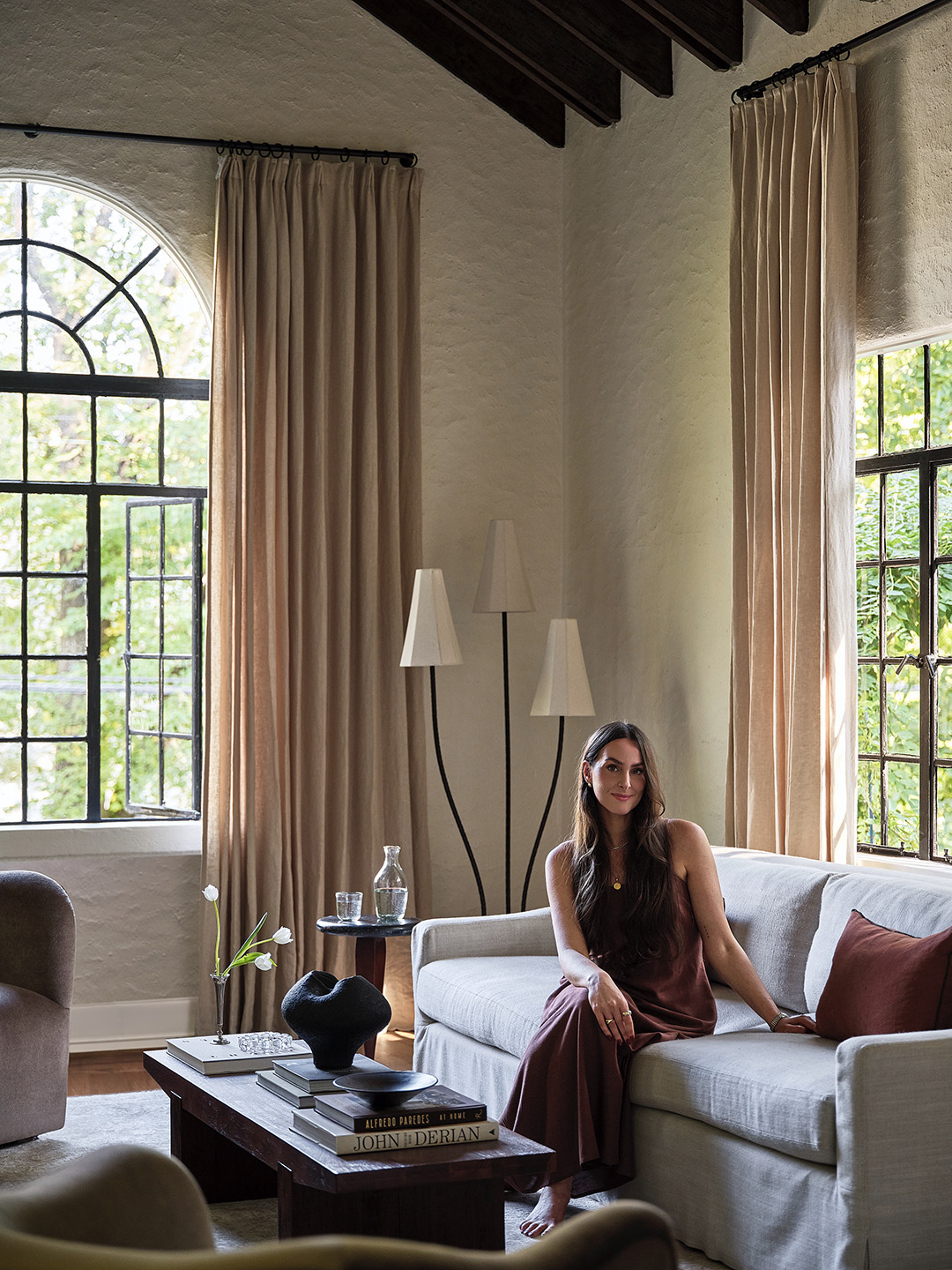
The Low-Key Fireplace


While Arruda has nothing against brick fireplaces, she wanted the ceiling beams to be the star of the living room. As a quick fix, she framed and plastered the old structure to make it more grand and match it to the walls.


The new seven-inch bump-out also hides a crucial but not-so-cute element: the TV, accessible via push-to-open doors.
The Sweeter Bathroom


Moving the showerhead in the primary bathroom to the adjacent wall, further away from the window, immediately made the room feel less cramped. She saved the existing flooring and beadboard, but it was more than time to splurge on a new tub. “The one that was there was falling apart. I remember my first shower…it was squishy. I thought, I’m going to fall right through this thing,” Arruda remembers. The double-wide utility sink, in better shape, simply got a new glaze and fresh faucets.

Still, the designer will be honest: “The no-vanity situation is not ideal.” There’s a tall closet behind the door that holds extra products and linens, but from the beginning, Arruda knew she’d need a recessed medicine cabinet, too—one that was deep enough to hold a shampoo bottle.
The Low-Key Closets


The mirrored sliding doors in the primary bedroom reminded Arruda of an old motel. Luckily, the size of the closet behind them was workable, so she swapped the doors for four Shaker-style swinging ones and called it a day. “It looks a bit more to scale,” says the designer.


The guest space was lacking in the built-in storage department, but rather than craft something new, Arruda brought in an antique wardrobe—something the owner back in 1927 probably would have done, too. “Normally, everybody just put things in armoires or dressers,” says the designer. “It was a sign of the times.”
The Backyard Bliss


“If this house didn’t have the backyard it did, I probably wouldn’t have bought it,” admits Arruda. The spacious main courtyard was a huge draw, plus there’s a lower terrace located off the kitchen. In the dining-slash-lounge space, low-maintenance turf fills the crevices between simple square pavers. Below, the designer replaced the crumbling concrete hardscaping with reclaimed brick set in a basket weave pattern.
The Timeline Hack

Arruda is often asked how she pulled everything together in a mere six months, and her answer will resonate with all type-A homeowners: She started shopping before she closed on the house. The designer rented a storage unit nearby where she could stash all her finds—the RH sofa, the West Elm coffee table, the Lulu and Georgia bed—and renovations kicked off just six days after she got the keys.