We may earn revenue from the products available on this page and participate in affiliate programs.
Historical homes are like time machines—that’s why Aubrey Ament and Will Glaser of Brooklyn-based design firm Glam Studio love them. “There’s this record of how people lived in these spaces across eras, and an architectural framing of those eras over time,” says Ament. “If you had multiple generations of one family living in a house for 100 years, you’d see time layering [through] all of those different styles.” So it was on the parlor floor of a 140-year-old brownstone in Brooklyn’s historic Clinton Hill neighborhood, which the design duo had been contracted to refresh while improving the flow of the spaces.
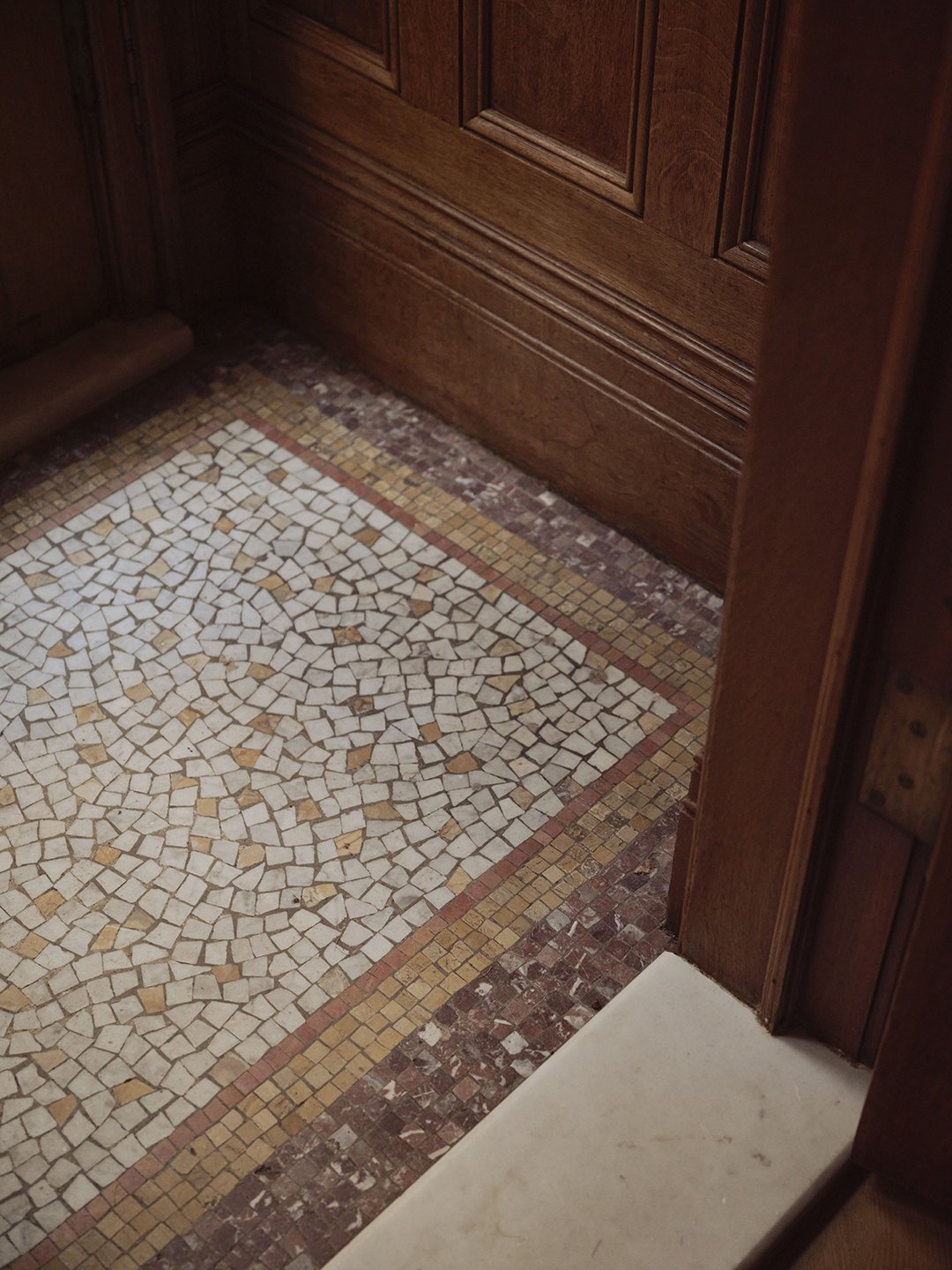
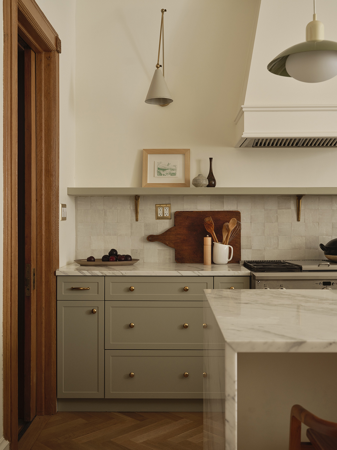
Though many original details remained intact—like the rosette-studded molding in the kitchen’s door frames, the stained-glass panels in the living room, and the mosaic-tiled flooring in the entry vestibule—the rooms had been modernized with early aughts embellishments like cove ceiling lighting and ebony-stained wood flooring. The combination seemed more cold and disjointed than harmonious.
“It reminded me of a commercial lobby,” says Glaser.
Yet the potential was obvious. “We felt like we had a lot to play with and wanted to bring the house back to life,” says Ament, referencing how the house has endured through the Prewar period, the Art Deco era, and then into the glam of the 1970s and beyond.
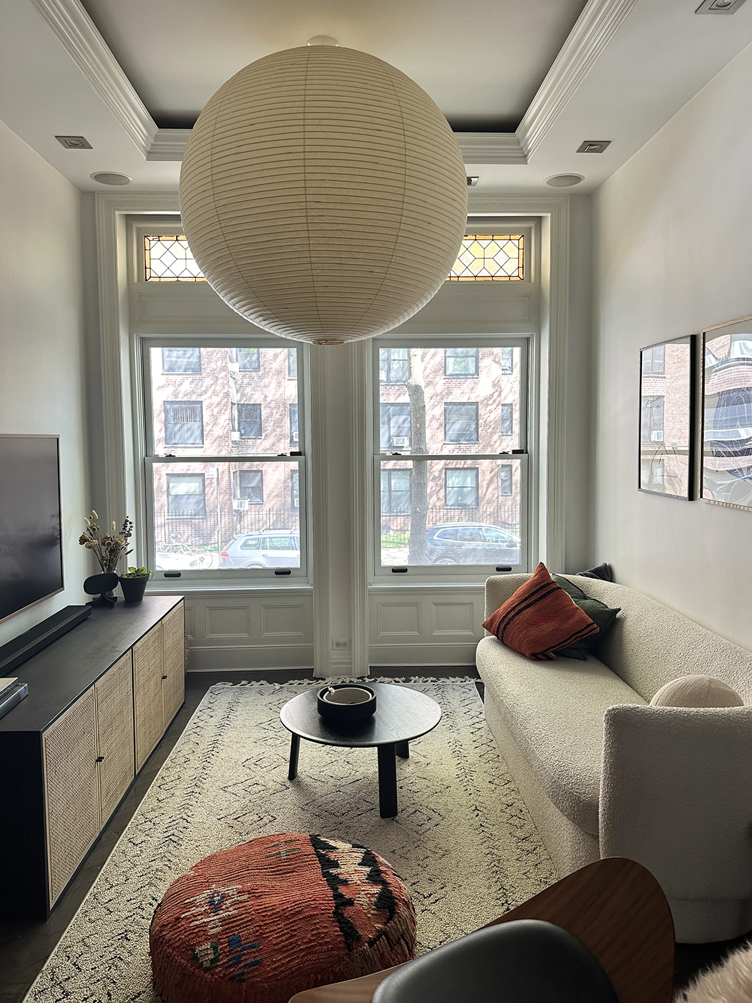
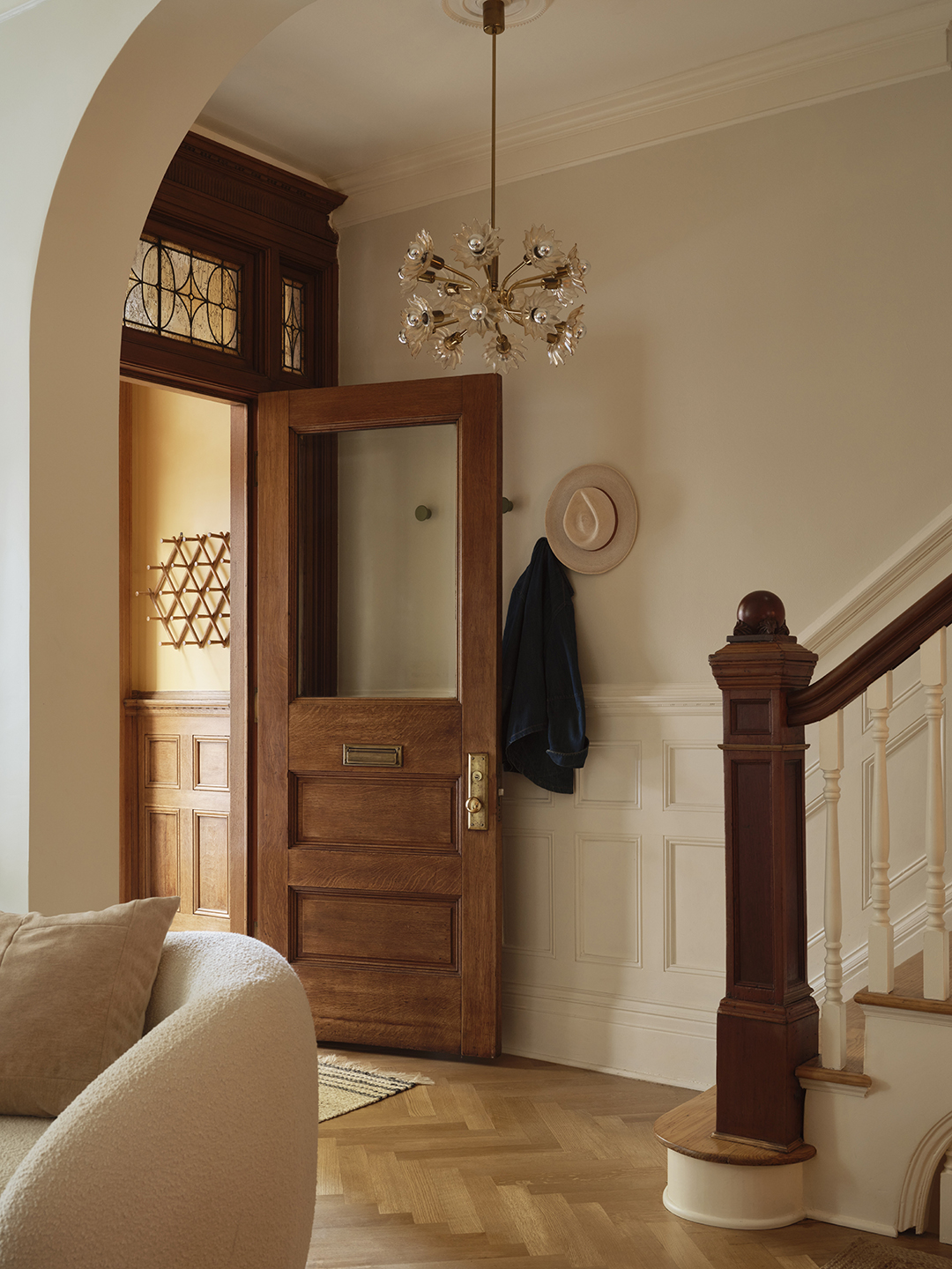
To maximize circulation and brightness, the pair widened the opening between the entry hall and adjacent living and dining rooms. Shortening one wall of the narrow living room to do so ultimately made it feel more spacious—and furnishings less crowded. They installed herringbone white oak flooring, a staple of old-world apartments, and stripped and refinished the millwork and molding throughout, embracing the varied wood species that were incorporated over the years: a pocket door remains mahogany on one side, oak on the other, and the treads and railing of the staircase coordinate rather than match. “That kind of wabi-sabi is good,” says Glaser. “We leaned into it.”
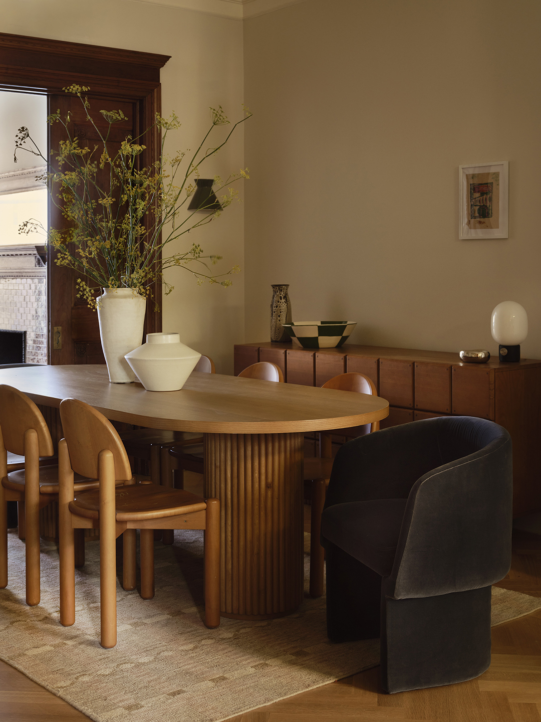
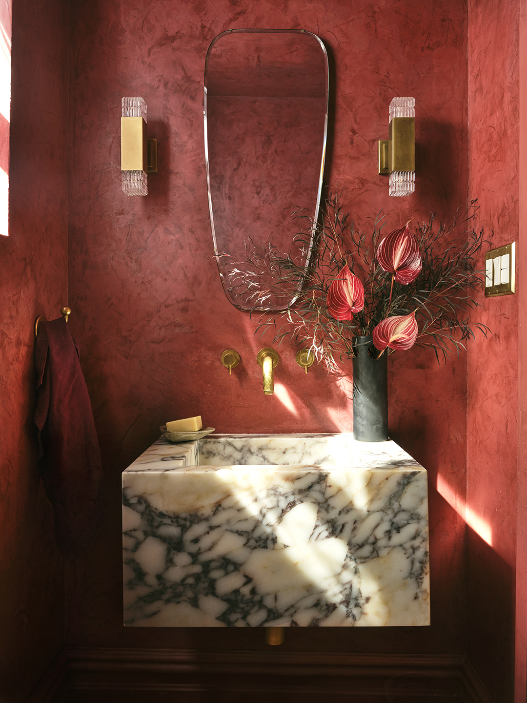
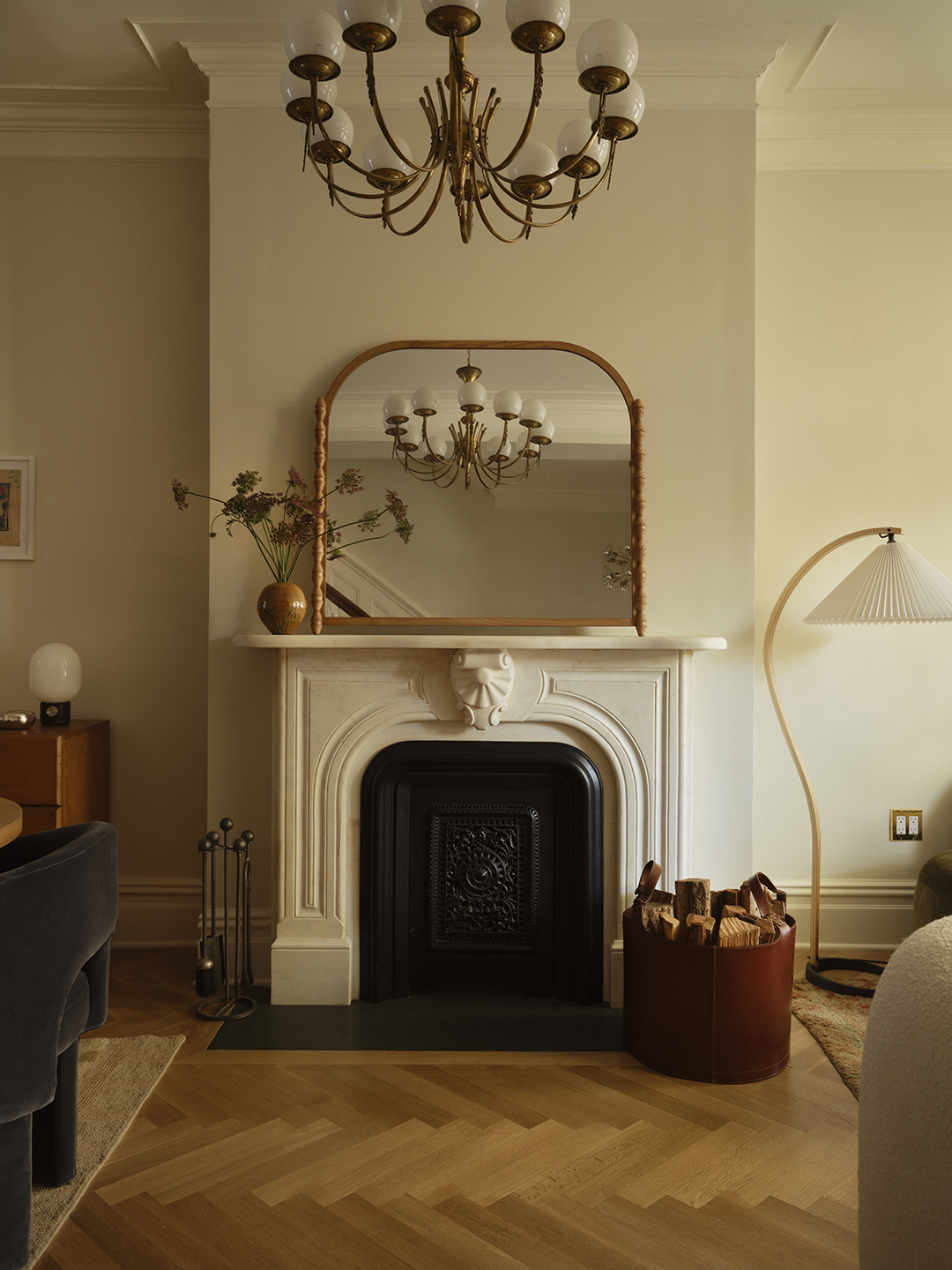
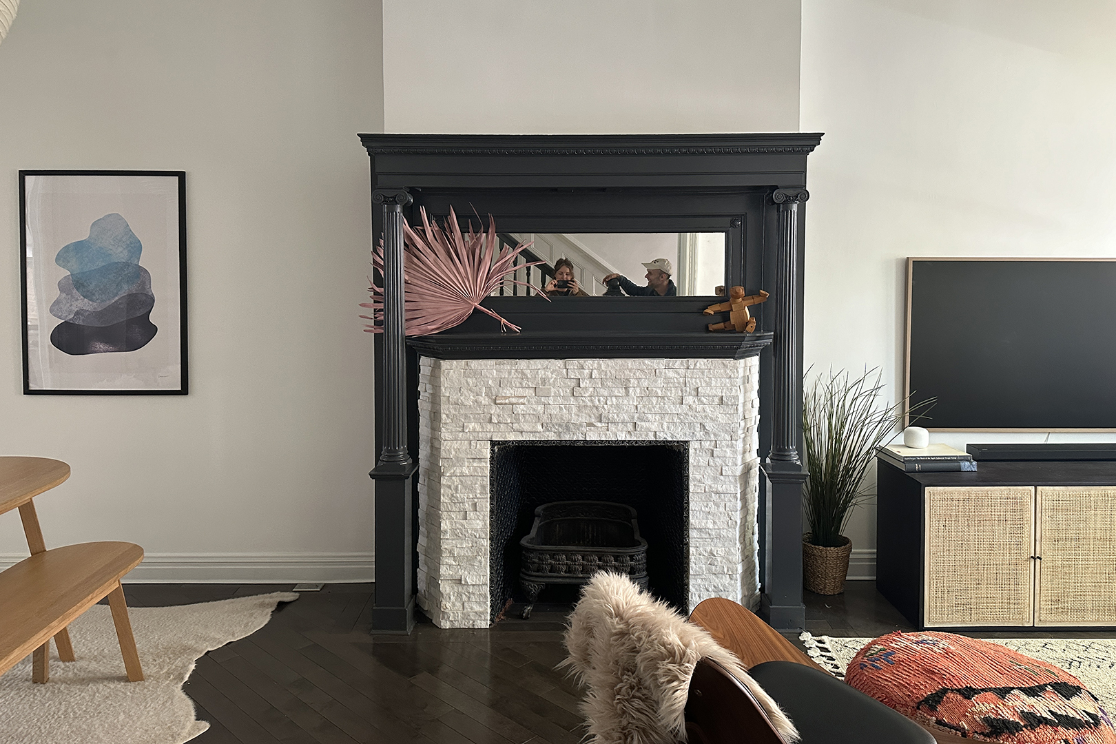
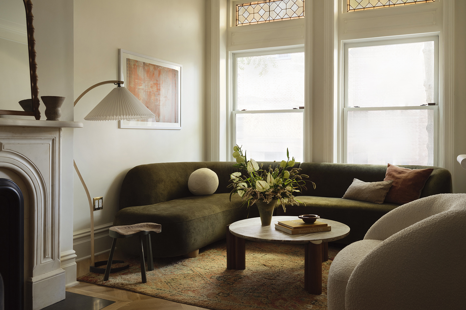
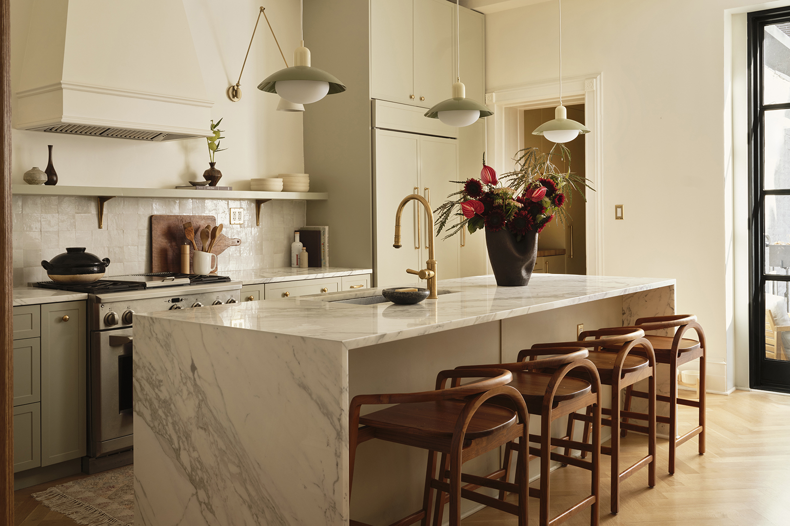
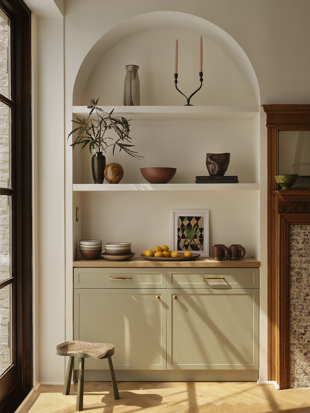
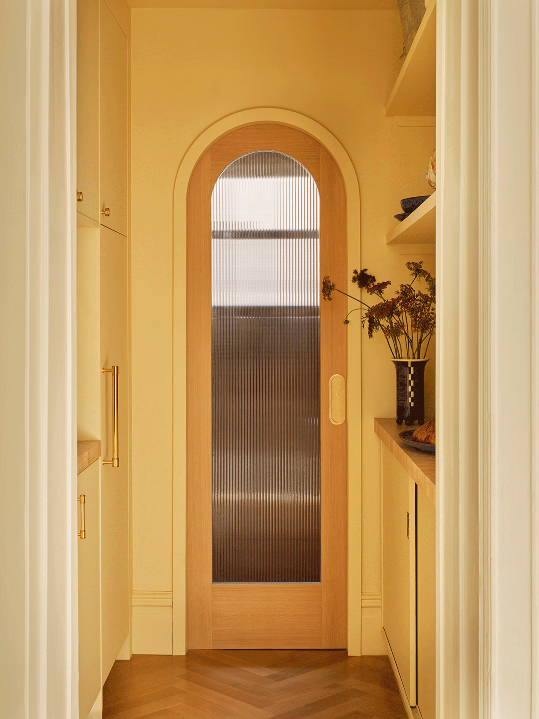
In the kitchen, the Glam Studio team increased storage with two custom wall niches, refinished the decorative fireplace, and converted a minor hall closet into a finished pantry that leads—through an arched, fluted glass doorway—to a burgundy lime-washed powder room. Another original fireplace, previously covered in dated tile and a mirrored mantel, anchors the adjoining living and dining areas. The team stripped the 2000s details and got it working again; now the family can have dinners in front of a wood-burning fire and a period-appropriate, far less imposing marble mantel.
As with most historical renovation projects, peeling back the existing layers revealed plenty of surprises from the previous reinvention. Among them? Nearly two inches of poured concrete hidden beneath the floorboards, which added unnecessary weight to the house’s foundation and needed to be removed before the floor could be re-leveled.
And before the pair could restore the main fireplace, they had to build back the chimney stack that had been removed on the fourth floor—but only the fourth floor. Ament says, “I don’t know who made that decision or why, but discovering those quirky moments is just part of the charm of working with old houses.”
With the functional elements in place, Ament and Glaser set to work creating an easy-going elegance that would allow the homeowners to relax as a family or welcome friends on a whim. Inspired by soft rose, ochre, and mauve in the vestibule’s mosaic-tiled floor—as well as the low-fi haze of photographer Dinanda Nooney’s black-and-white photos of a bygone Brooklyn—the pair wove in thoughtful Deco details: reeded pedestal legs on the dining table, frosted globes of a vintage Italian chandelier in the living room. A blonde wood, curvaceous olive-green velvet sofa in the living room lends a 1970s-inspired coastal-California vibe.
“There was a beautiful little cadence of style that lent itself to this warm, glamorous, inviting design,” Ament says. “There’s this enveloping that happens visually with all the curves.”
The result feels dreamy yet grounded, of a time but entirely modern, and honors the house’s past as much as its present with tactile depth and layered finishes. “It’s fun to take motifs and reframe them through another idea,” says Ament. “Renovations shouldn’t be a completely new thing. They should build off the existing design in a meaningful way.”