We may earn revenue from the products available on this page and participate in affiliate programs.
Set on a Victorian-lined road in a borough of London, this once-boxy 1950s house had always felt slightly out of step with its surroundings. Interior designer Tasha Freeman had a clear brief: improve the flow, connect the interiors to the garden, and infuse the space with a sense of history and warmth that would help it sit more comfortably among its genteel neighbors.

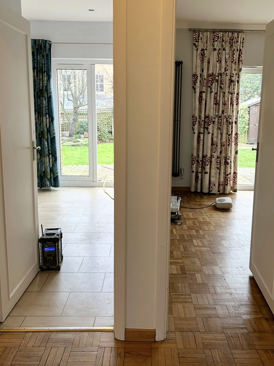
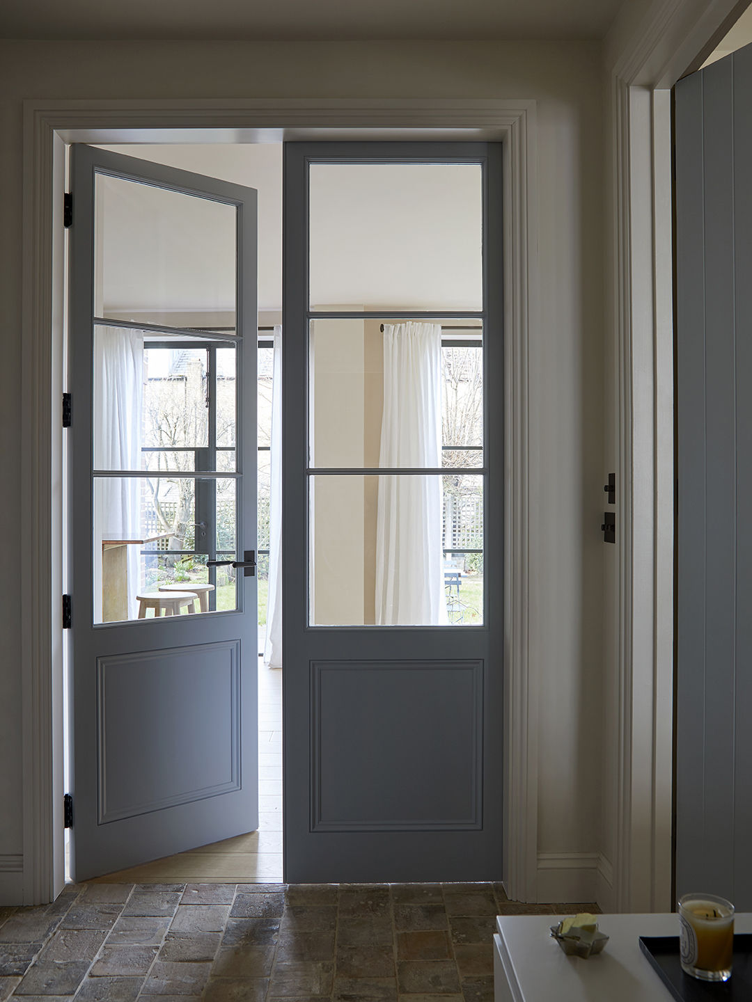
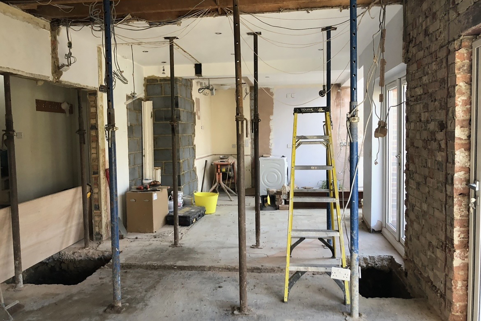
The solution began with a fundamental rethinking of the home’s layout. A series of closed-off spaces made the house feel smaller than it was, with the dining room tucked far away from the kitchen. Freeman opened up the ground floor, creating a fluid, L-shaped path between the kitchen, dining, and living areas. Walls were removed and openings were raised toward the ceiling. The most transformative move was in the entryway: two separate doorways directly opposite the front door were replaced with a single, glazed opening, allowing a clear view straight through to the garden. The effect is immediate—a sense of light, space, and welcome that defines the entire home.
From there, Freeman got to work layering in character without overwhelming the calm. Given she is opening a gallery and shop in May that will feature vintage furniture and textiles along with art and ceramics, there was no better person for the job.
Call Attention With Color
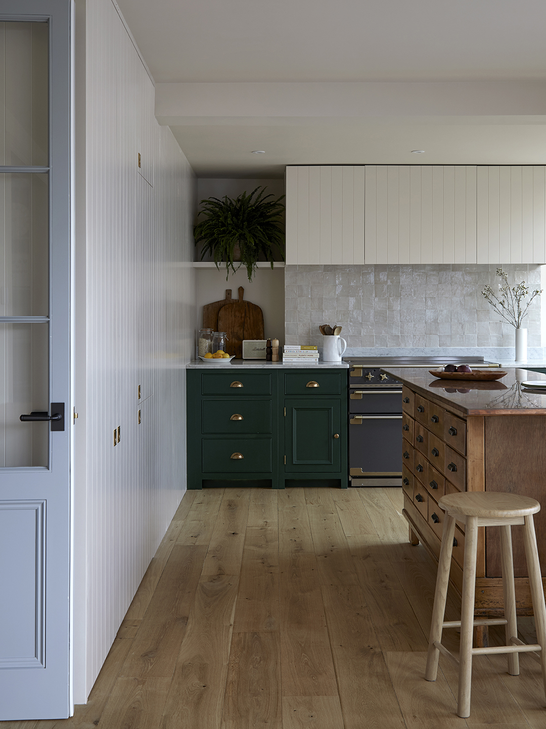
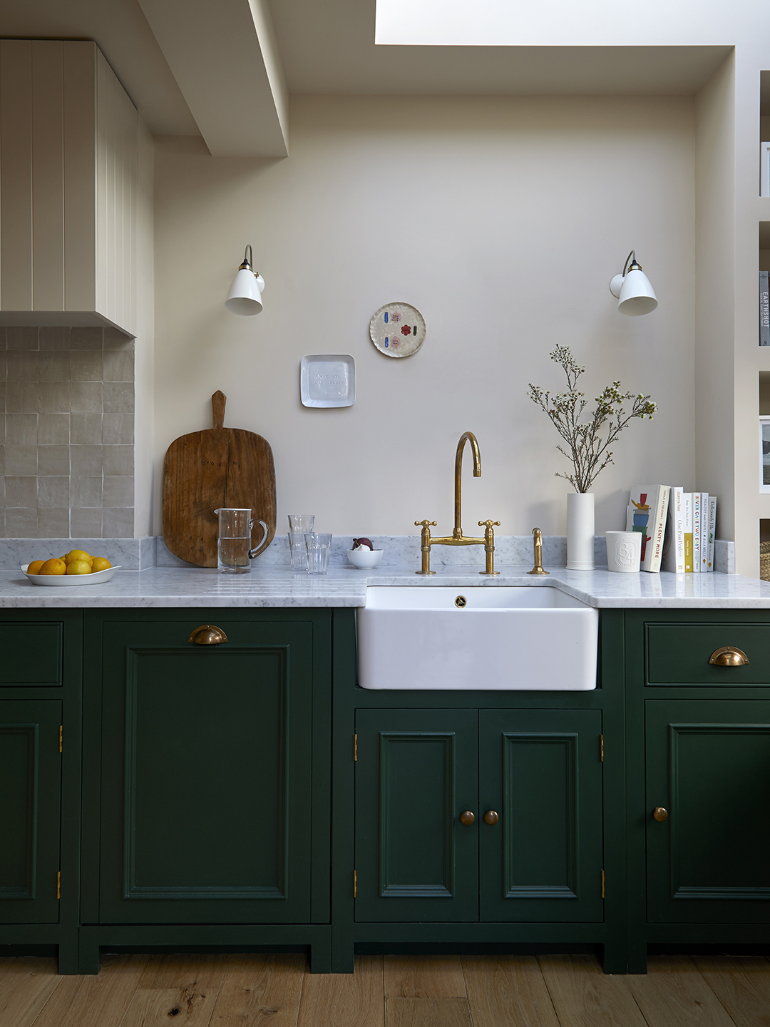
Rather than use paint decoratively, Freeman deployed it to highlight the various architectural interventions: new openings, sash windows, molded trim. “We used Farrow & Ball’s Stirabout on the kitchen walls and ceiling to color-drench the room and help make it feel bigger, and really warm and welcoming,” adds the designer. In the bathroom, a shower stall dressed up in slate blue and burgundy zellige tile anchors the space with unexpected depth.
Design for Later

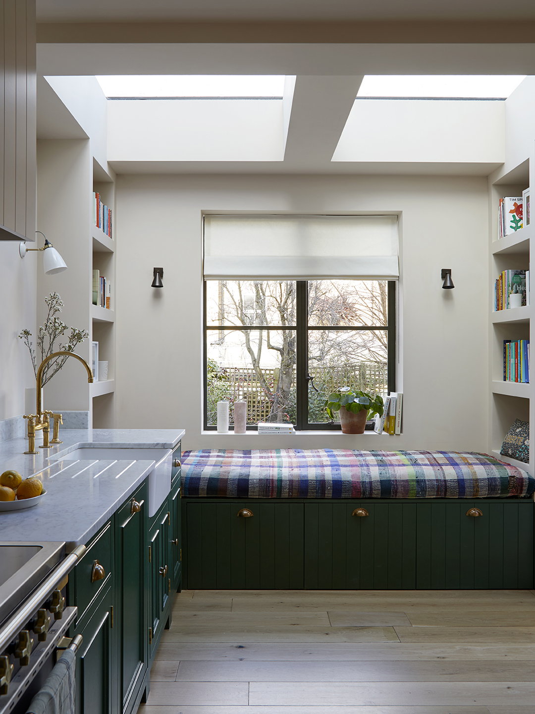
On one side of the kitchen, a built-in daybed sits beneath a skylight, imagined as a reading nook for eventual children. “To the right, there had been a little window, and we turned that into a door, so that it created more access to the garden,” says Freeman—again, with little ones in mind. “We had this idea that the kids would eventually be running outside.”
Add the History Yourself
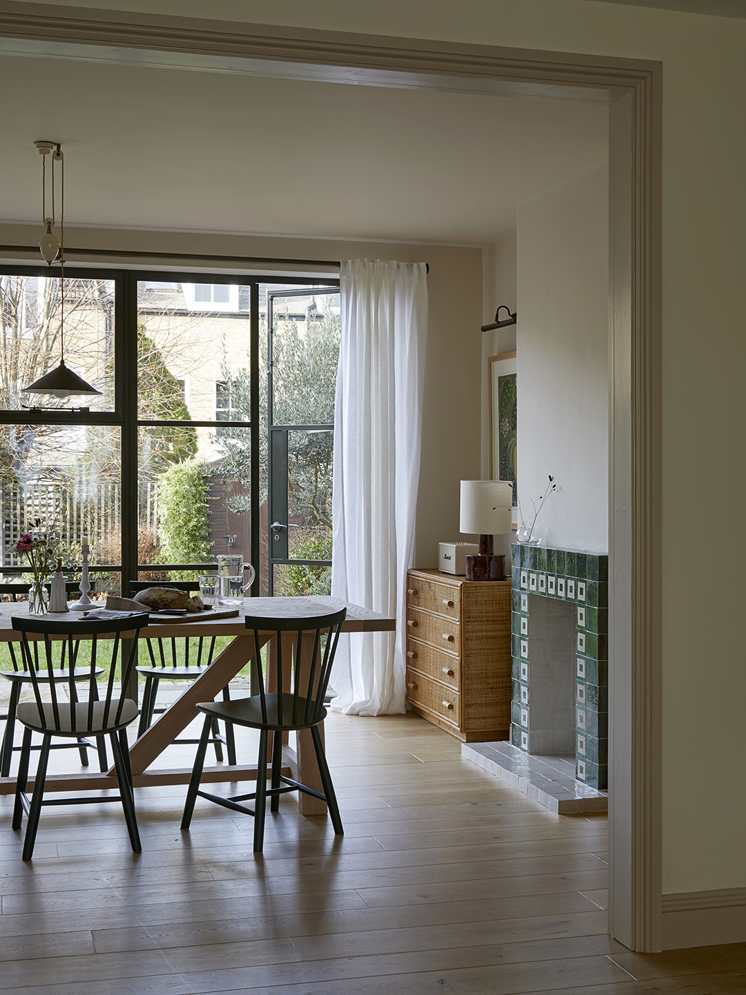
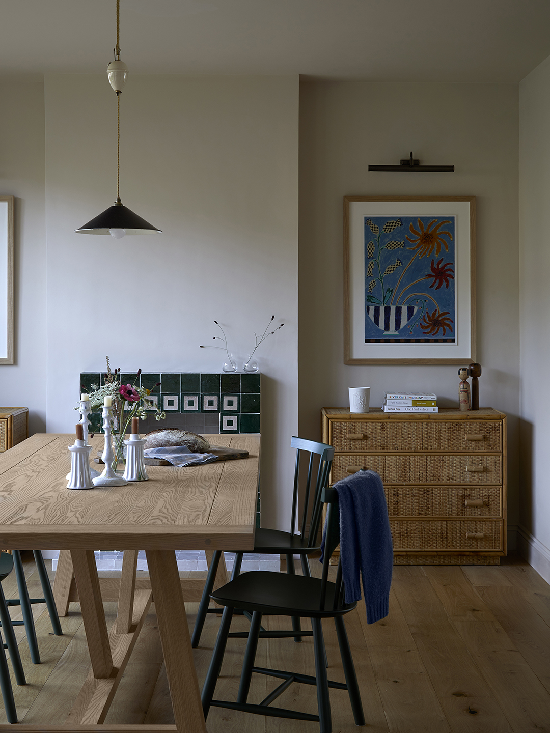
A 1930s shop counter acts as the kitchen island, reclaimed boards from old science labs became cabinetry, and vintage pieces were woven throughout, from the bamboo chests flanking the fireplace to a Facebook Marketplace pendant above the dining table. It’s these moments that lend the home a lived-in feel, as though it has evolved slowly over time rather than been freshly remodeled.
Get Playful With Tiles
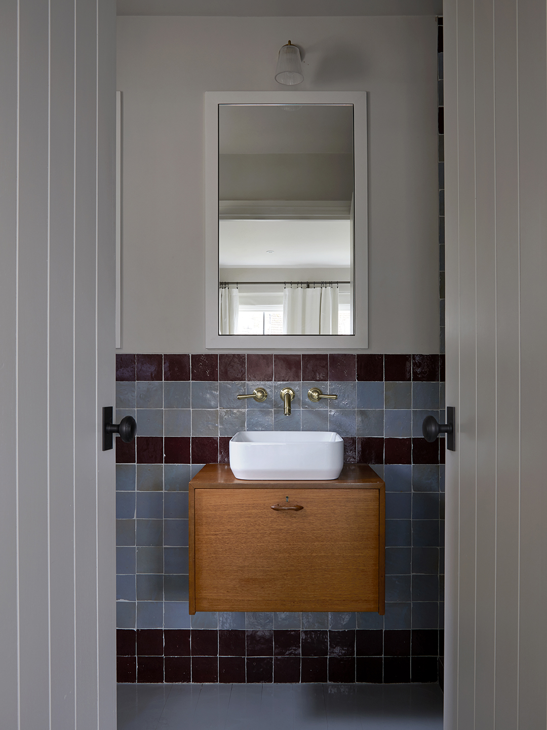
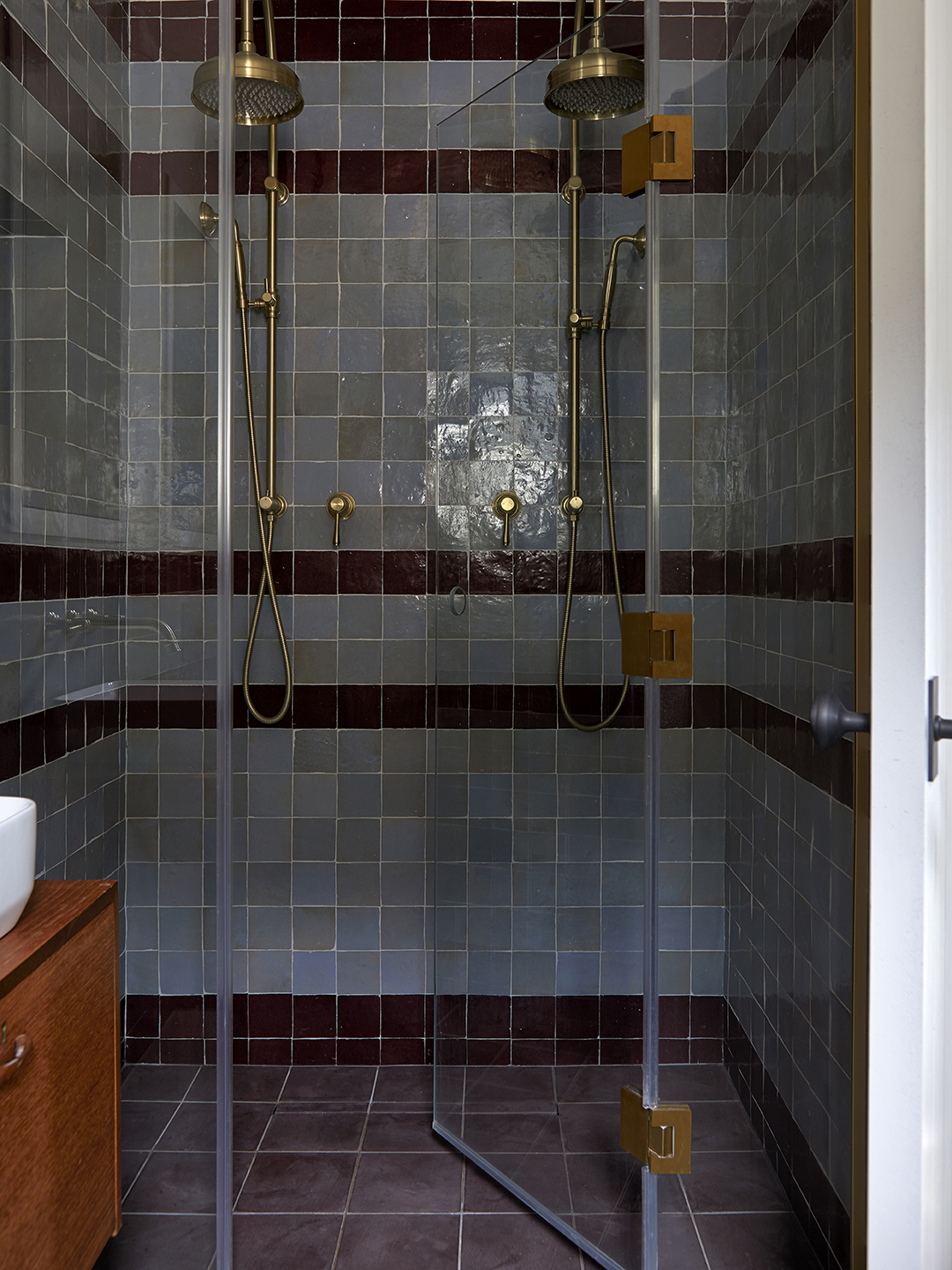
As for the en suite bathroom? “That room didn’t exist at all [before the renovation],” says Freeman. She borrowed square footage from the bedroom next door, creating enough space for a walk-in double shower that she clad in jewel-toned zellige stripes. “The client wanted to come in and go, ‘Wow!’ but also have a moody space,” explains the designer. Double doors connect it to the bedroom while framing the vintage floating vanity, a moment of delight and layer of history among many.