We may earn revenue from the products available on this page and participate in affiliate programs.
Nestled in the foothills of the Tian Shan mountain range, the Kazakhstan city Almaty enjoys sweeping views of coniferous forests and snow-capped ridgelines. Designer Elina Mussakulova, of the studio Sdelaemremont, says that the summers are stunning but winters can be a little unforgiving, extremes that informed her latest project in a new low-rise residential building that looks out onto the peaks.
This is the designer’s second project with the client, who was so delighted by Mussakulova’s flair for color and practicality the first time around that she called her for an encore.
The original open-plan layout posed a challenge—with a riser inconveniently located right at the entrance, Mussakulova and her team quite literally had to raise the game. After elevating the kitchen onto a platform, she merged it with the living area and linked it to the main hallway leading to the entrance, which improved circulation, enhanced sightlines, and minimized dark corners. Now, the 133-square-meter (roughly 1,400 square feet), three-bedroom apartment flows with more intention and better reflects the client’s bold taste.


Color, unmistakably, takes center stage: uplifting greens, sunny yellows, earthy tans, and playful reds stretch across the rooms. Textured wallpapers, custom tiles, and mirrored built-ins add a light-hearted twist, offering a cheerful antidote to the long, frosty winters outside. Ahead, Mussakulova lets us in on how she channeled perpetual warmth in the design.
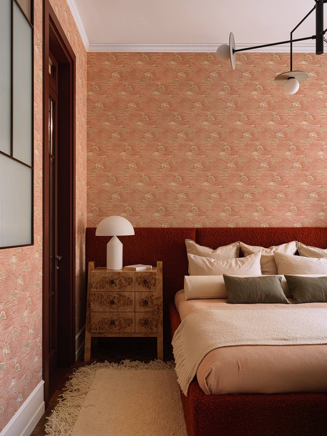
What was the very first thing you bought for the project?

The first thing we bought was wallpaper for the primary bedroom—The Sunrise by Nobilis. The design features a muted red tone with subtle golden highlights. At first, the client worried it might look too pink or old-fashioned, but once installed, it lent the sleeping quarters a rich, sophisticated depth. The closet followed suit, with a coordinating green wallpaper from the same brand and a headboard fabric chosen to harmonize with the rest of the palette.
What design decision felt like the biggest risk?

The biggest risk was rethinking the layout of the shared spaces. We decided to merge the kitchen and the living room even though there was no plumbing where the kitchen needed to be. To make it work, we raised the floor slightly and introduced two gentle steps between the zones. This subtle shift created a lovely sense of flow, allowing everything to stay connected yet feel distinct.

It also turned the kitchen into a lively, stage-like hub for gatherings and everyday life while adding a home for a dishwasher in the island, which would have been impossible otherwise. One of the floor-to-ceiling windows had to be partially closed, but in the end, the different areas feel perfectly balanced and full of warmth.
What do you consider your biggest splurge on this project?

The Constanze 3/4 armchair and ottoman by Wittmann in rich tan leather. The piece instantly elevated the living room with a more contemporary, slightly formal aesthetic, while still feeling inviting. I wanted a small, polished chair placed opposite the sofa to create a face-to-face seating arrangement, and since the client loves to read, it naturally became the perfect nook. It claimed a generous portion of the budget, but everyone agrees that it was worth every penny.
Was there a particular design detail that you were especially determined to include?


We spent a lot of time curating and designing the primary bathroom to give it a truly immersive feel. We worked closely with our tiler, selecting two complementary shades of beige and designing a large interior window with frosted glass for soft, diffused light. But the element that took the longest—and the one we were absolutely set on—was the India Mahdavi mirror for Ralph Pucci: a stunning piece in natural-varnished rattan and glass. We searched everywhere for it, all across Europe and through every retailer we could think of, but it was impossible to track down. Finally, our procurement partner located one in a small shop in a remote corner of Europe and managed the shipment. I keep a running list of design pieces I dream about, and sometimes the project itself tells me which one belongs. In this case, the bathroom—with its Équipe tile—felt like it was calling for that mirror. It was the moment the entire space clicked into place.
What piece of storage felt like a real game-changer for your clients?


Two storage solutions truly transformed daily life for our client. The first was a large closet in the hallway with mirrored fronts; a clever touch that disguises storage while reflecting light, making the space feel brighter and more expansive. The second sits in the primary bedroom: in addition to a separate walk-in, we added a built-in wardrobe with glass doors. Since our client loves planning her outfits for the week, this “display” closet lets her see everything at a glance. That small detail feels both elegant and functional.
What was the most unique or exciting material you used in this home?

We had never used wall-to-wall carpet in our projects before, but this time we decided to take the plunge. In the walk-in closet of the primary suite, we swapped parquet for something softer underfoot to create a cozy, tactile feel.
How did you decide on each room’s color palette?


We began with a color we’d admired for ages: a dusty lemon with gentle green undertones from Danish paint brand Flügger, shade No. 86. It became the foundation for the entire palette. We used it in the main living area and designed the kitchen to complement its warmth, while the adjoining hallway took on a soft, dusty orange. We were deliberately bold—the primary bedroom in a muted red paired with a green walk-in closet, for example—yet the tones remain refined and quietly confident rather than loud. The children’s spaces, by contrast, are softer and lighter, designed to evolve gracefully as they grow into their teenage years.
Take us through the kitchen layout.

The kitchen was designed around three tall columns: two concealed refrigerators, and a central compartment that houses an oven with a microwave and coffee machine. Upper cabinets hold items used less frequently, while open metal shelves lend a cohesive industrial edge. One of the cleverest details lies in the depth: at 800 millimeters (less than three feet), the counter allows small appliances to remain on display yet tucked neatly to the back.

The island, crafted entirely from metal, features drawers and an integrated dishwasher. To convince her to choose the material, we sent the client to a restaurant with a steel island, just so she could see firsthand how beautifully it ages over time.
The outdoor seating looks particularly appealing. How did you design it?

In Almaty, the weather is glorious from March to October; the perfect excuse for our client to create a rooftop terrace above her apartment. From there, sweeping views of the mountains and the city unfold in every direction. We designed a striped fabric canopy in shades of red and beige, then furnished the patio with generous seating and layered textures. It has become her favorite spot, whether for hosting lively dinners under the stars or enjoying quiet mornings with a book and a view.
In light of this project what are some essential features that can transform a home?

Several elements can make a lasting impact: light, flooring, and, of course, the color palette. When it comes to flooring, clients often hesitate to commit to something dark and expressive, but we’re thrilled ours did; it adds warmth, depth, and a quiet sophistication. As for lighting, it’s essential to plan a mix of scenes throughout the apartment. Here, technical lamps lines the ceiling, while statement pendants bring softness and personality. We love to use lighting as a bold design gesture—it can create a playful contrast and add just the right hint of repartee, something we always aim to infuse into our interiors.