We may earn revenue from the products available on this page and participate in affiliate programs.
In Heidi Caillier’s book, Memories of Home, the Seattle-based designer rounds up some of her absolute greatest hits: homes with saturated hues; catch-your-eye wallpapers; and rooms that make you wonder, Is this house new or has it been like this forever? Her traditional style never veers into tacky, and her paint choices are always just right. Here, we excerpt one of our favorite chapters, which features a home in San Francisco—though you might be fooled that it’s nestled in the Cotswolds.
One reason I love British design is that it’s tailored to a part of the world that isn’t known for great weather. People accept the fact that it’s going to be gray and drizzling for much of the year, and they design cozy, inviting, layered interiors to counter that dreariness. Because San Francisco—where this traditional family home is located—is often covered in marine fog and cool for much of the year, it can feel more like England than sunny California. When I met the homeowners, we bonded over our shared love of color and English interiors. They knew instinctively that the bright, neutral, Bohemian look that’s so popular in the rest of the state wouldn’t feel right in this historic 1911 home, located in the San Francisco neighborhood of Cow Hollow, near the Presidio just south of the marina. Together, we interpreted classic British design in a more modern way.

We began the design process in the kitchen, which is quite dark and has only a single window that faces a stairwell. There was nothing we could do to the layout to make it lighter because there are houses butting up against two sides of the home—there was simply no place to add a window. The best option was to embrace the low-light atmosphere by painting the walls and cabinet a deep navy and installing a stone floor and soapstone countertops and a custom-fabricated soapstone sink. I wanted it to feel immersive. The island is quite narrow, and we designed it that way so we’d still have enough clearance around it on all sides in the square footprint. There are two layers of lighting, flush mounts and pendants, available when the owners need to brighten up the space for meal preparation. In contrast, the adjacent dining nook features windows on two sides. I love that contrast of light and dark, moving from a shadowy room into a fully lit dining space, which is designed with a built-in bench that has deep drawers for storing linens and dishware underneath.

One of the more unconventional aspects of this home’s funky layout is that there is no formal dining room. The clients knew they wouldn’t use it, so they opted to create three living rooms with the extra space, two on the main floor and one upstairs adjacent to the bedrooms.

On the main floor, the front door opens onto a foyer with a round table and two chairs. We installed climbing vine wallpaper here, with small birds and flowers, to cover the walls up through the stairwell, creating an interior garden.

Adjacent to the entry is a more casual family area we call the “hearth room.” This feels like a classic British room to me, with the small-scale fireplace, muddy brown walls, and striped Indian dhurrie rug. There’s a deck just outside the double French doors at the bay window, so it can get very bright when the sun is out, but most of the time it’s cozy. On the opposite side of the entry is the original living room, a long, somewhat narrow space that was an awkward size to furnish. We decided to create two separate conversation areas that are petite in scale. The color combination in this room is bold, with Farrow & Ball’s Setting Plaster pink on the walls, upholstered furniture in shades of eggplant and blue, and a deep ruby sofa that’s buttoned up and proper.

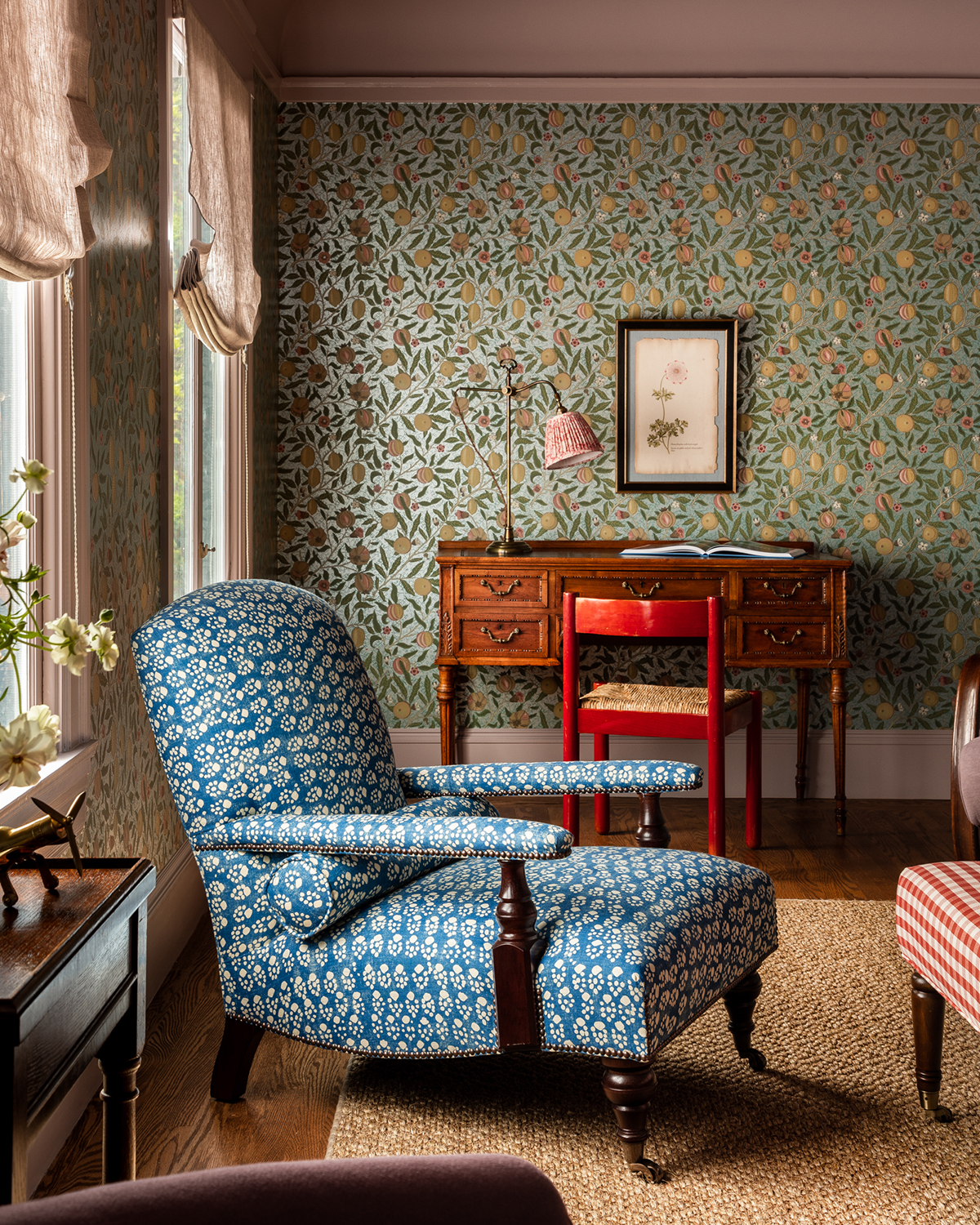
On the second floor, there is a private living room we call the “lady’s den” that serves as a retreat for the busy mother of three. There are cozy chairs for reading, a conversation area, and a small desk. We covered the walls in a William Morris pattern and used Delft tile for the small fireplace. The palette is cheery and feminine. She can close the door and have it all to herself, without a single toy in sight. I loved designing the boys’ rooms upstairs because the clients were open to the idea of using some unexpected color, like the dusty pink draperies and florals. The muted rose color is often perceived as feminine, but I find that when paired with a boxy valance it feels neutral or even masculine. These rooms give the impression that the house was inherited, as if the kids were occupying bedrooms decorated long ago for a previous generation. Yet they still offer plenty of storage for toys and comfortable spots to play and read, and the boys love their rooms. I’d been looking for the perfect room in the house to cover in pattern. When I saw the layout of the primary bedroom suite, with all of its nooks and angles, I knew it was the opportunity I’d been waiting for. I used two contrasting wallpaper prints and covered all the surfaces, including the ceiling. The generous use of pattern and layered rugs give this room a rich, eclectic feel. Choosing the mix of patterns was a painstaking process. We wanted to push it without going overboard. It’s a delicate balance, but I love how it feels when you walk into that room.
Reprinted from © Memories of Home by Heidi Caillier. Rizzoli New York, 2023. All images © Haris Kenjar.