We may earn revenue from the products available on this page and participate in affiliate programs.

There is a surefire way to make your house not look cookie-cutter, according to interior designer Kristin Harrison, the founder of Georgia & Hunt Design House. It’s a lot simpler than you’d think: paint your window trim an unexpected color or, in other words, skip the stark white for a blue-gray, a taupe-pink, or a rich black. Harrison personally loves Smoke by Benjamin Moore. “Sometimes it looks blue, sometimes soft green, sometimes gray,” she says.
Even if your windows aren’t all that fancy or historic, coating them in a fun hue can give them a boost of character. We’ve seen the pros take all kinds of approaches; some strive for contrast while others like to match the frame and sash to the same color on the walls. And there’s one thing they all seem to agree on: you can’t go wrong with green.
Ahead, we asked 20 interior designers for their favorite non-white paint color for windows.
Railings by Farrow & Ball


My favorite color for window trim is Railings because it creates a great contrast and makes the view outside pop. Not quite blue and not quite black, this dark bronze color is an incredibly versatile shade. —Luke Havekes, founder of Luke Havekes Design
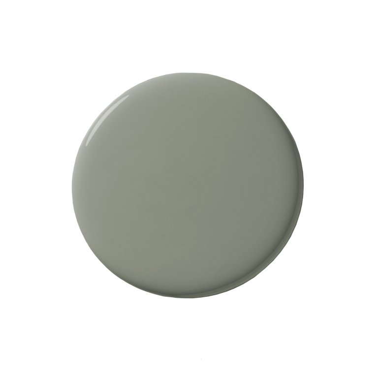
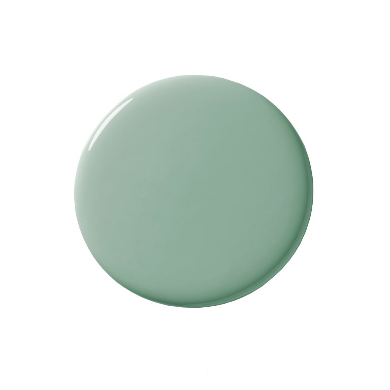
French Gray by Farrow & Ball

I love contrasting trim in our interiors these days. A more neutral wall is a perfect duo with this color, as seen in our Charleston project’s stair hall. It feels appropriate for a historic home but also firmly planted in today. —Laura Jenkins, founder of Laura W. Jenkins Interiors
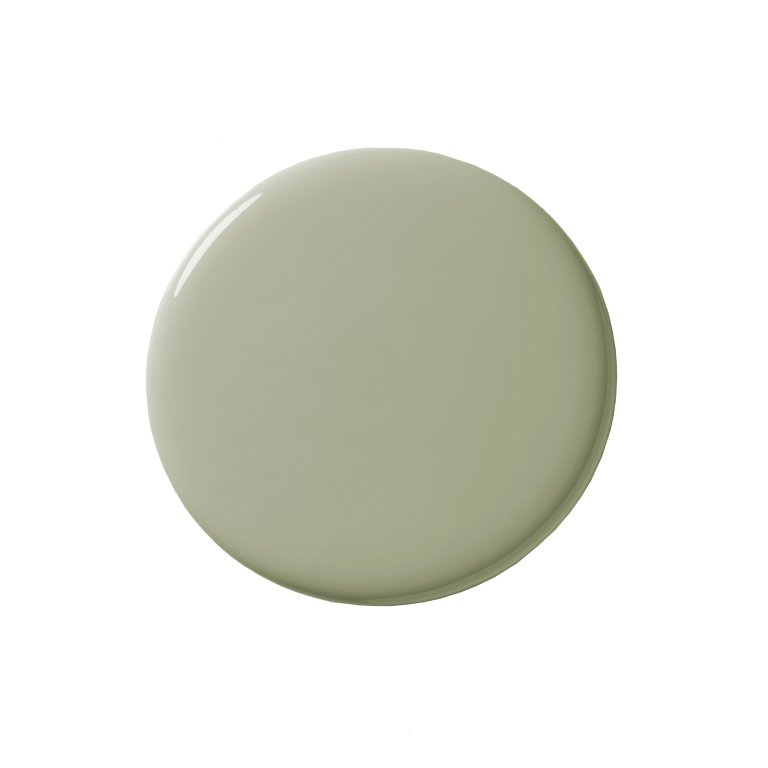
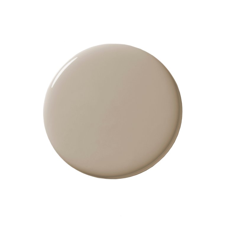
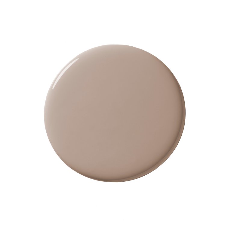
Tapestry Beige by Benjamin Moore

In our Petworth Place project, we paired Tapestry Beige trim with White Dove on the walls. The soft, warm undertones of the beige bring a subtle coziness to the entry, making the space feel both refined and inviting. —Maggie Goodrich, interior designer at Third Street Architecture
Rookwood Shutter Green by Sherwin-Williams

One of our favorite ways to accentuate the window trim and add a rich, layered effect is to match the trim paint to the overall wall covering. In this example, we used Rockwood Shutter Green in tandem with Varias antique marble, making it feel tailored and immersive.” —Ashton Taylor, founder of Ashton Taylor Interiors
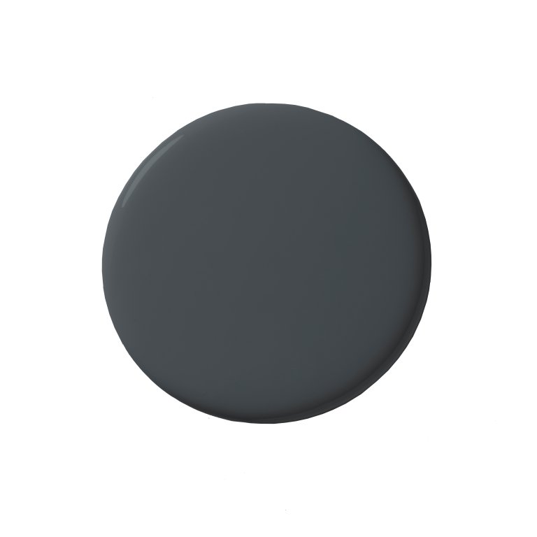
Graphite by Benjamin Moore

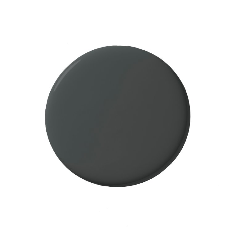
This is one of those moody darks that adds depth without stealing the show. I suggest pairing it with a mid-range to darker wall paint so it doesn’t feel too high contrast. —Christine Vroom, founder of Christine Vroom Interiors
Nature Lover by Benjamin Moore

We love using varying shades of green on window trims because it frames the exterior view beautifully and brings the outdoors in. —Melanie Love, founder of Love & Interiors
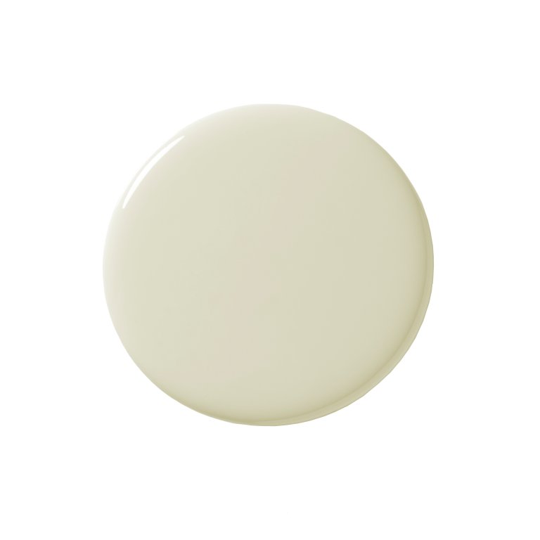
Cashmere Wrap by Benjamin Moore


Using an unexpected trim color makes a space feel well-designed and every detail intentional. This artistic powder bath balances playfulness and sophistication with a pale pink trim color. —Jessica Bennett, owner and design principal at Alice Lane Interior Design
Inchyra Blue by Farrow & Ball

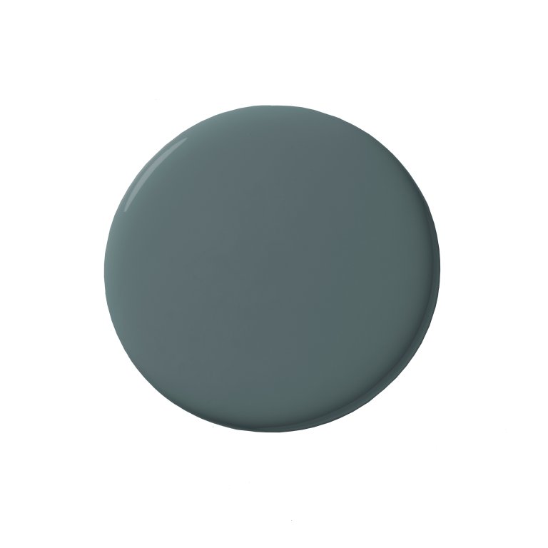
This color looks blue sometimes and green at other times, reflecting the natural outdoor tones we might see outside in the greenery of nature, and the blue of the sky. What could be better to outline your window frames, especially if they are wooden original windows? —Julia Chasman, founder of Julia Chasman Design
Napa Vineyards by Benjamin Moore

I love to use the window trim as a way to weave in an accent color and tie together the color scheme in the space. In this instance, we matched the window trim to the green tile color to help make the whole room feel more balanced and cohesive. —Leah Ring, founder of Another Human
Hidden Sapphire by Benjamin Moore

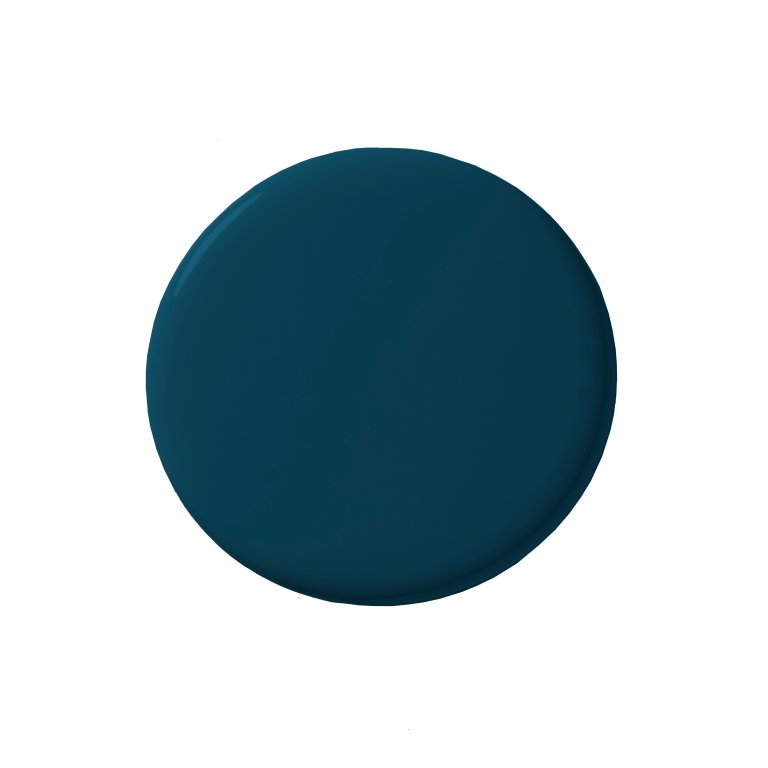
Hidden Sapphire proved to be a stunning choice for the trim in this enchanting powder room, perfectly complementing the delicate blue birds featured in the wallpaper. —Jamie Toporovsky, founder of JBT Designs
Cedar Path by Benjamin Moore

Committing to a bold wall color can feel like a big leap, but painting the trim is a fun, low-pressure way to bring in personality. In this kid’s bath, I used Cedar Path to add a sunny, playful touch that really pops against the light walls. —Maria Wu, founder of Studio Wu
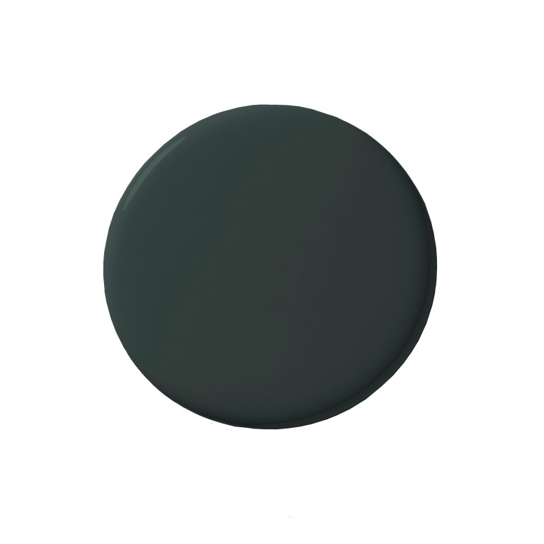
Card Room Green by Farrow & Ball

We love matching our window trim to cabinetry or millwork detail in a space for visual cohesion and to make a space feel intentional. —Trish Lynn, founder and principal designer at Colette Interiors
Dark Olive by Benjamin Moore

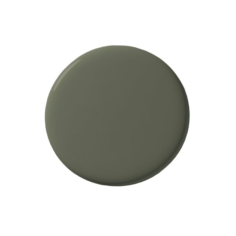
White window trim can really kill the vibe of a room. It instantly draws attention to the windows and interrupts the visual flow. I prefer to paint the trim the same color as the walls. It helps the architecture recede just enough so the overall mood and materials take center stage. —Anabel Herring, founder of Black Salt Home Design
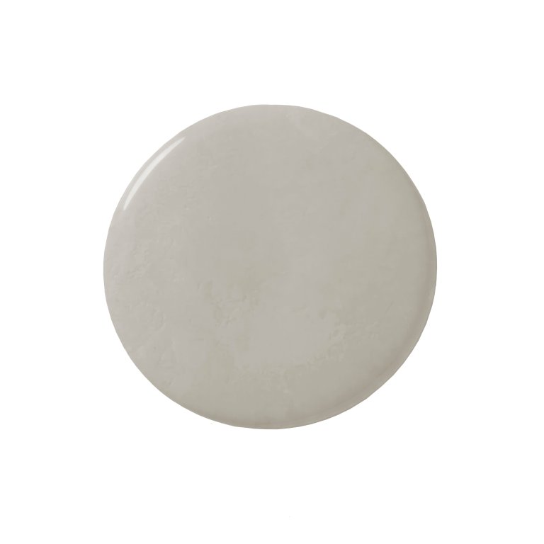
Cotswold by Benjamin Moore

Cotswold is a beautiful, weathered neutral that adds quiet depth without overpowering a space. It complements organic textures and layered neutrals in a way white just can’t. —Laura Brophy, founder of Laura Brophy Interiors
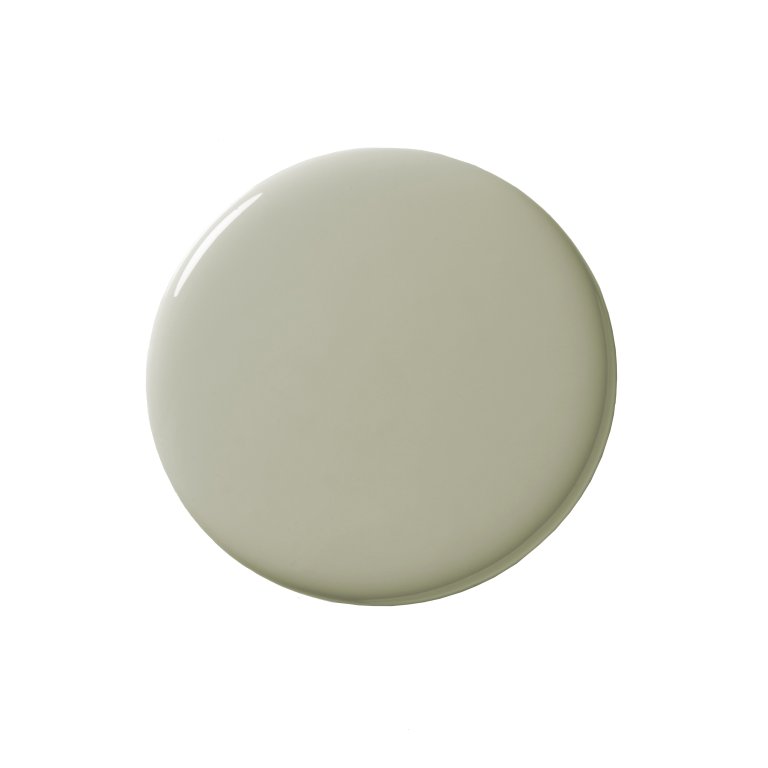
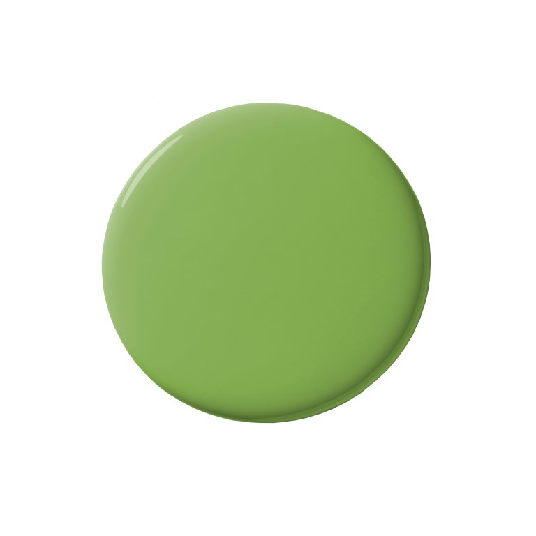
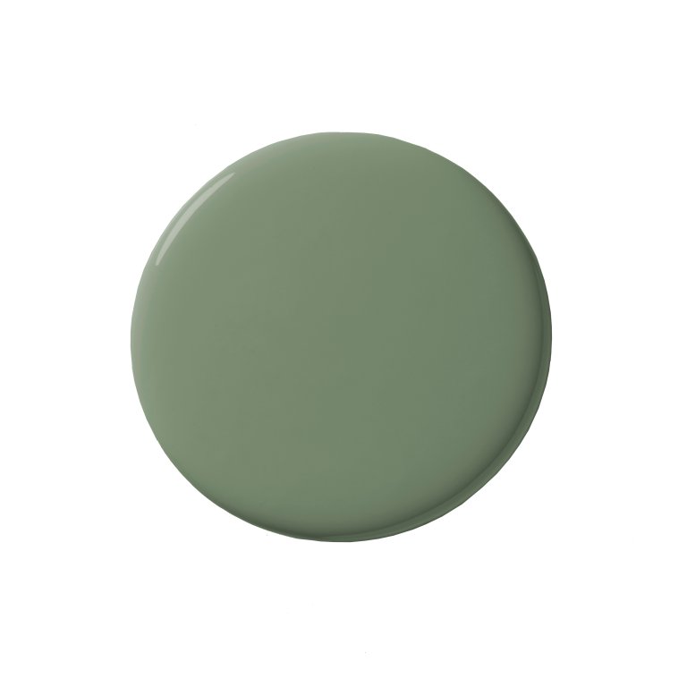
Avocado by Sherwin-Williams

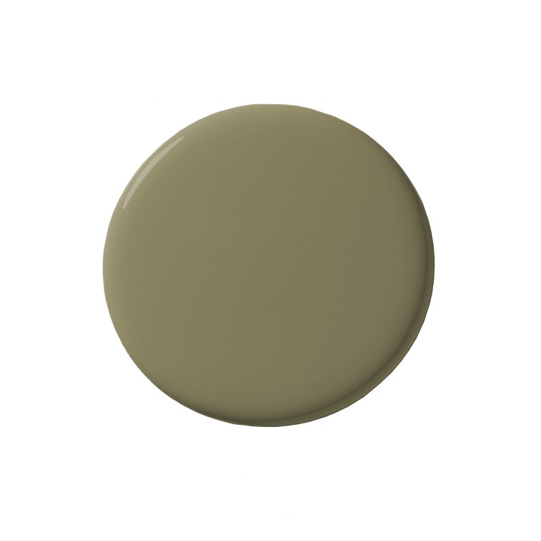
I love having the opportunity to paint interior window trim in a space where color is already present. For this olive green kitchen, we chose a sage that wasn’t too matchy-matchy. —Raili Clasen, founder of RailiCA Design
Piano Room by Portola

This is one of our favorite non-white paint colors for interior window trim. It has a rich, moody depth that adds instant character and contrast to a space, while still feeling timeless and elevated. —Ashley Clark, founder of Skout Interior Design
Million Dollar Red by Benjamin Moore

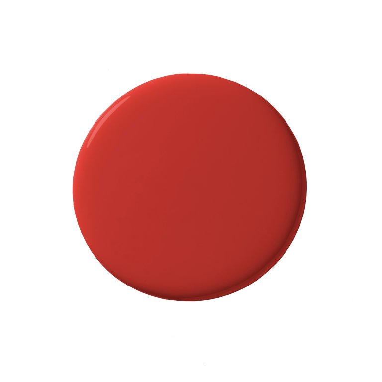
Million Dollar Red is a favorite when we want to create a true moment in a space. It draws the eye outward and turns the view into a framed piece of art, making the outdoors feel like part of the room. —Emily Tucker, founder of Emily Tucker Design
Black by Benjamin Moore

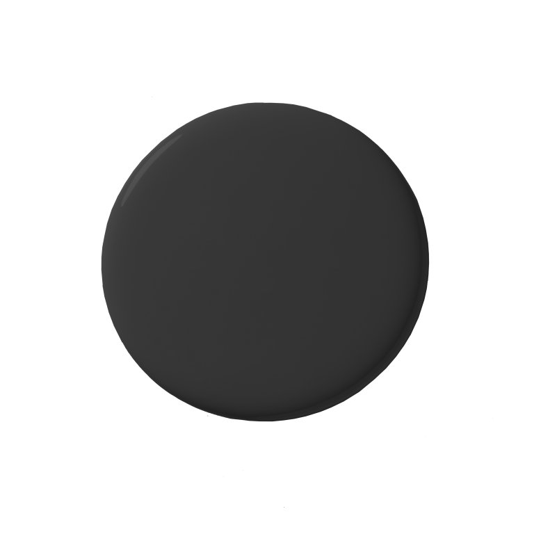
A black trim sharpens the overall palette, allowing surrounding finishes to feel more vibrant and intentional. It’s a simple, effective way to elevate a layered, character-driven space. —Diane Rath, principal designer and owner of The Rath Project
Restful by Sherwin-Williams

A muted green trim is an easy way to introduce color while keeping the overall look soft and balanced. Green trim works especially well in spaces with vintage or patterned details. —Miranda Cullen, principal designer and founder of Inside Stories
Dead Salmon by Farrow & Ball

When I select a bold wall color, I like to bring it onto all the painted surfaces, including the window trim. I encourage clients to use a semi-gloss on all interior trims and doors as it’s more durable than the satin or matte we use on the walls. —Rachel Sherman, principal designer of Rachel Sloane Interiors
Bonus Idea: Custom Paint That Matches Tile

While I don’t have a single go-to paint color for interior windows, I love to match window casing and trim to the surrounding finishes, especially when we’re working with rich colors. On a recent kitchen refresh, we installed a deep green backsplash then color-matched the adjacent window trim to the tile. —Courtney Batten, founder of Paige Studio