We may earn revenue from the products available on this page and participate in affiliate programs.
I once was infatuated with a roll of wallpaper. Story time: 20 years ago, I was working at ABC Carpet & Home, assisting celebrity shoppers like Kate Hudson and Sarah Jessica Parker. Suffice to say, I always ended up in the cool-girl section, a drop-dead-gorgeous enclave on the sixth floor where a collection of beautifully-curated Moroccan rugs and vivid flatweaves by Madeleine Weinrib resided. One wall was covered in Weinrib’s “Endless” wallpaper, a stretch of sexy curves and glamorous black and white contrast. The dramatic, artsy motif made my heart flutter, but it was also a reminder that I had a tiny rental and no such sprawling surface to use it on.
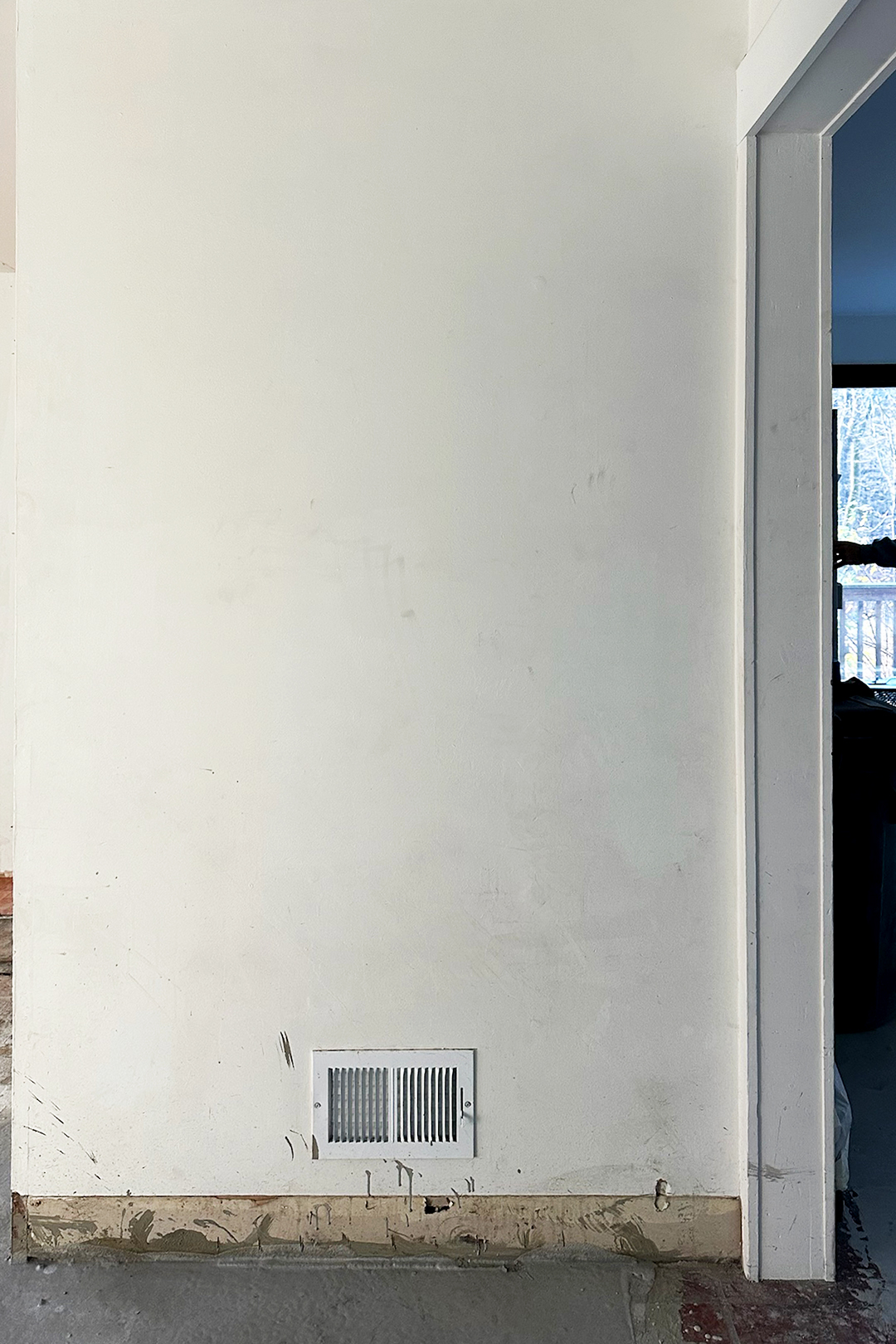
When I did, finally, buy my first home a few years back—an ugly makeover project in New York’s Hudson Valley that I purchased with my partner for about $350,000—I didn’t know what I wanted it to look like, but I knew what I wanted it to feel like: an amalgamation of the Weinrib aesthetic that inspired me and my authentic adult style.
Our life in Brooklyn is magical, which is why we’ll never fully leave, but it’s also stressful, messy, and loud. We have two kids in a 900-square-foot apartment that faces the highway. I write (books, television scripts, magazine columns) around the clock to make a living. My partner’s work schedule is equally chaotic, and filled with emotional ups and downs. To balance out that relentless city hustle, I needed our country house to embrace that, beneath it all, we are sensitive, gentle, and creative artists. My design rules were no hard edges, nothing noisy, and no hints of our daily grind. I wanted wallpaper to intentionally set that tone as we walked in the door.
When the time came to make decisions, I spent weeks compulsively searched for a wall covering that felt hand-drawn, hand-painted, scribbled, or splattered…
Every Wallpaper I Considered
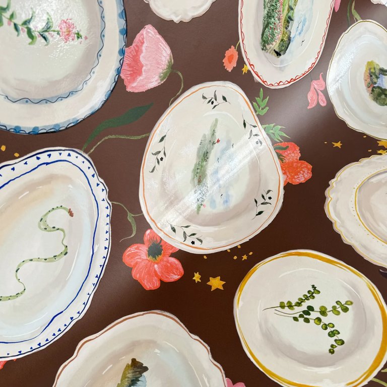


The first samples I pulled were from John Derian, if for no other reason than this one is literally called “The Artist’s House.” I loved it online, and swooned over the sample even more, but found it a little too loud for the small entryway. My ceramist fetish led me to this Tablescape pattern, designed in collaboration with New York artist Laura Chautin. Though it wasn’t right for the space—too specific, not calming enough—I’d love to return to it for a different room.
I was instantly drawn to the Georgia Burgundy wallpaper from Pepper Home, and the sample arrived looking just as stunning in person. However, it didn’t explicitly convey soft living to me; it was more “sexy people with great taste” (which we are, too, but it still makes me think of the city!). Similarly, there was a moment where I thought that something more weather-worn and vintage-y would give off old European painting studio—could that work? I pulled vintage styles from Rebel Walls to find out. Once again, more beauty, but I didn’t feel any sort of spiritual connection.
That’s when I started Googling quirky combinations like “wallpaper + splatter paint” and “wallpaper + metallics + cool” (this one by Michele Varian entranced me). But no, too risky. I even searched, “wallpaper + messy artist + paint spilling everywhere!” and this fun one popped up, straight from designer Kerri Rosenthal’s dirty floor.
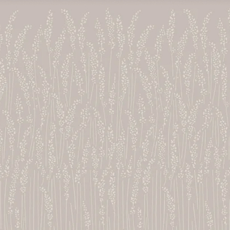
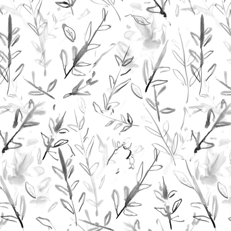
In the spirit of bohemia, and because the brand embodies quiet luxury so well, I pulled some Feather Grass from Farrow & Ball. The hue was, in fact, too quietly luxurious. After a friend suggested I look at her painter sister’s website, I contemplated ordering Spring Leaves by E.Lamb Studio. But, by then, something else had caught my eye.
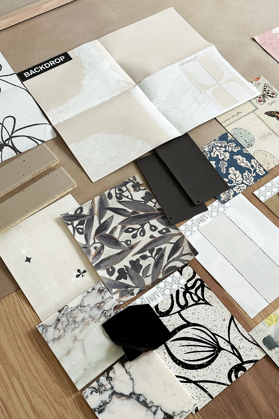
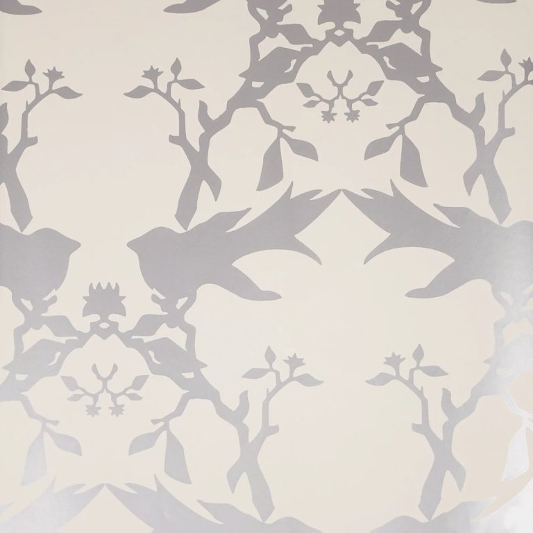
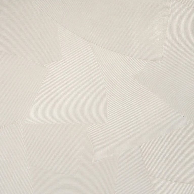
I scoured Schumacher’s website, knowing that they have a reliably beautiful, high-quality range of styles, for a design that was touched by a true working artist. At first, I was tempted by a hand-combed plaster-like wallcovering in “Cement.” After going further down the print and pattern rabbit hole, I happened upon designs from the hip startup Backdrop.
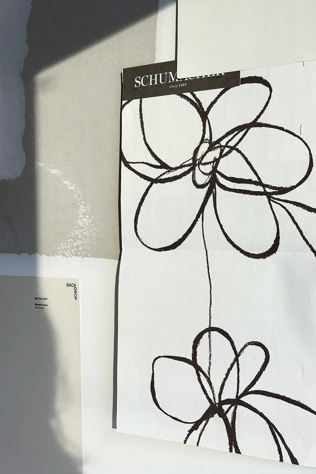
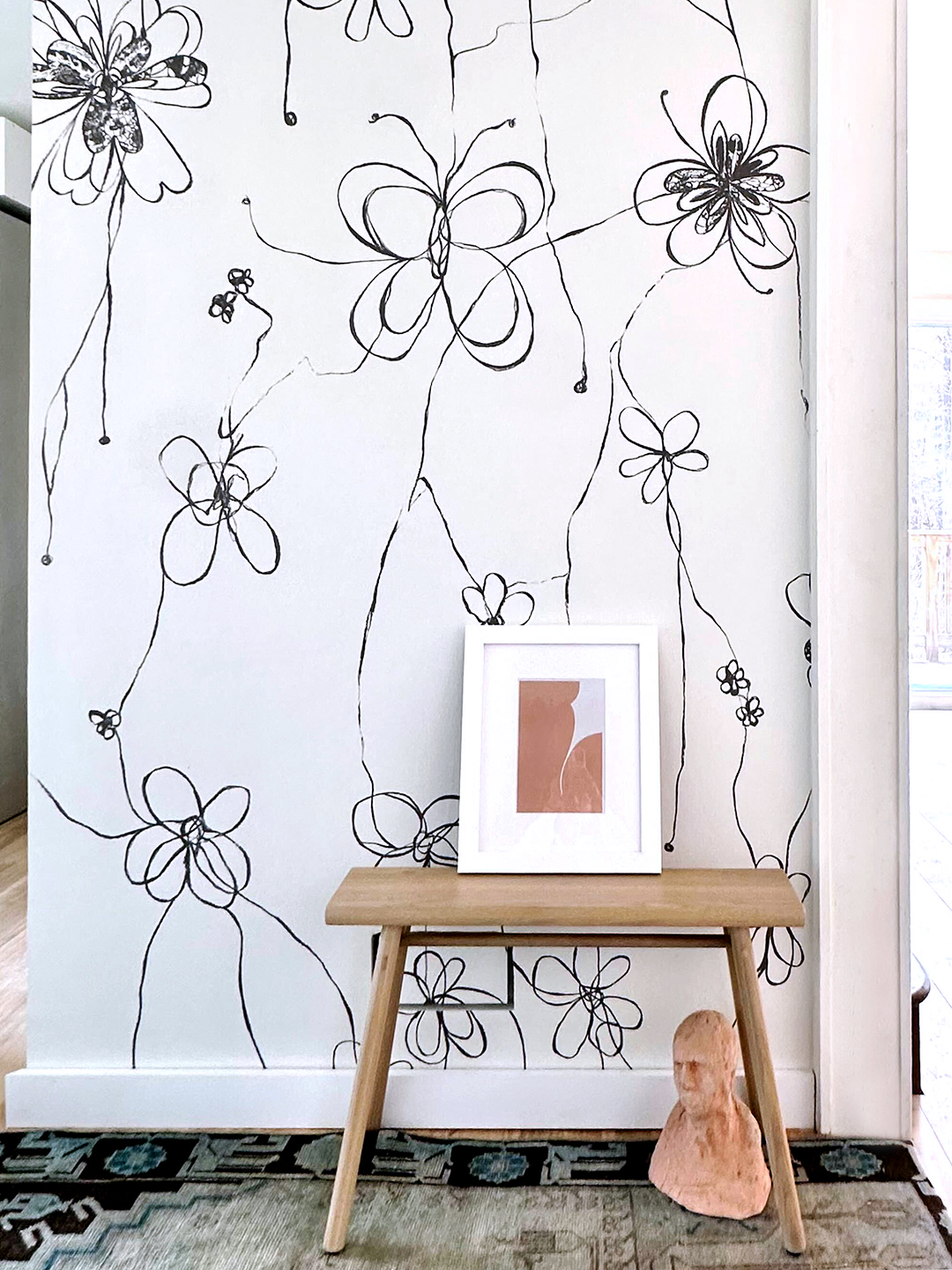
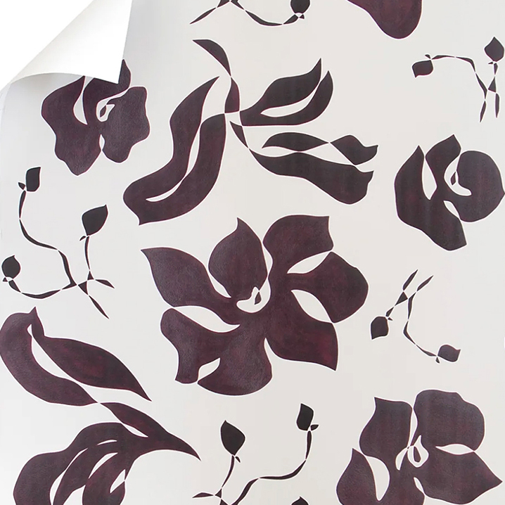
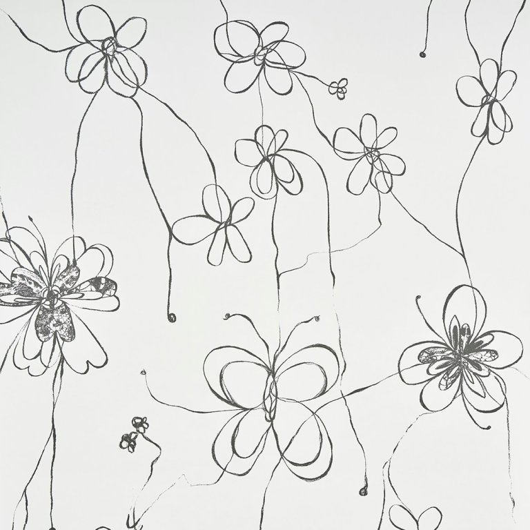
That’s where I found Come Back as a Flower, a whimsical masterpiece by artist Hera Ford. I instantly fell in love with the soulful, free-style drawing. It evoked the emotional memory of that Weinrib wall, and a younger me in turn. As I waited for the sample to arrive, I flirted with the brand’s Instagram page as if it was a new and unexpected romance—I might have even slid into their DMs; I was positive that this was the one.
The Winner: Come Back as a Flower by Backdrop
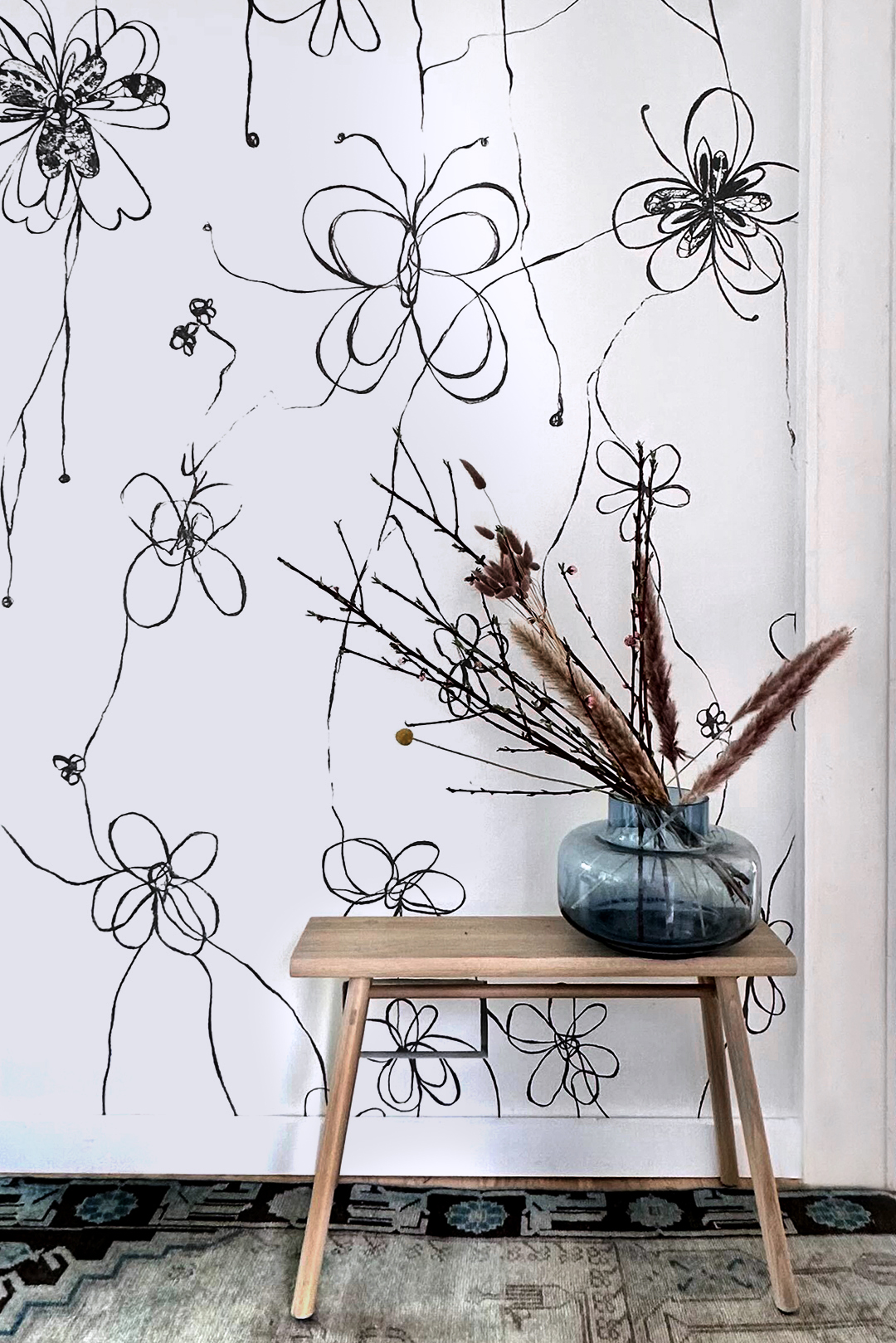
And guess what? My instinct was right. Come Back as a Flower lent our entry the relaxed, hopeful, and artistic touch that made it feel a world away from Brooklyn’s verve. It’s light, imperfect, and happy, and feels like me. Every time I open the front door, my entry tells the story of how I evolved from a young assistant helping others decorate to someone who triumphantly created her own home away from home.