We may earn revenue from the products available on this page and participate in affiliate programs.

Pulling together the perfect color combination can be troublesome. Try throwing print and pattern into the mix, and it’s downright overwhelming. Do shibori textiles and florals work well together? Yes! Is chevron still a thing? No! Is mud cloth here to stay, and can I mix it with florals? You bet! The rules are endless.
Luckily, there are talented print mixing masters all over the world who nail the look. Let their images serve as inspiration for your next bedroom makeover, as we dive into a few patterns that play well together.

Choose a star and a co-star.
Sarah Sherman Samuel mixes prints like a pro—expertly combining colorful patterns in a way that appears effortless. Take this space, for example. This insanely striking wallpaper serves as the star of the space. The co-star is clearly that amazing bench. The ochre tones play well with the blush ones on the walls, and the patterns don’t compete—they each know their role and play it well.

Pick a color palette.
The reason this space works so well is because the colors within the prints are all in the same family. These blue and green tones are rich and saturated. The leaf and overdyed prints share a similar rhythm and seem to be dancing to the same beat.
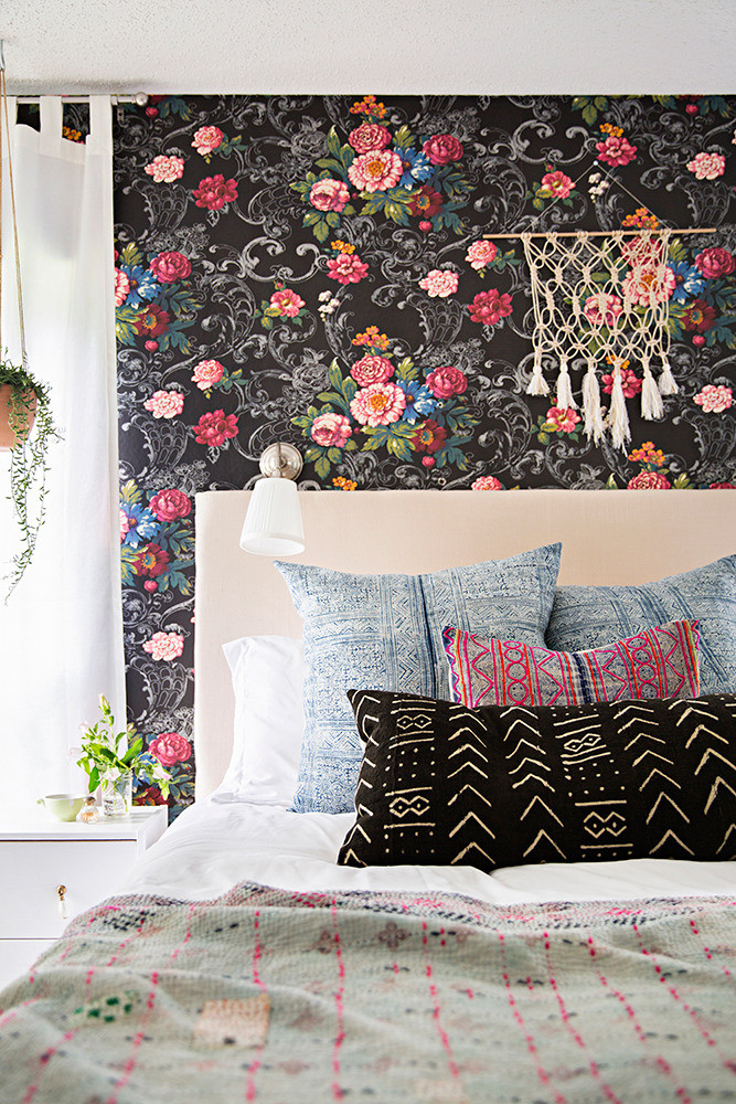
Don’t be afraid to go big.
This look may seem like a reach when you are starting out on your print mixing journey. Try combining two big prints and then carefully layering in your next two smaller ones. So, for example, here you would start with that wonderful wallpaper and mud cloth pillow. Next, you would pull out some colors from that wallpaper. (Here, they chose pinks and blues.)

How to feature an animal.
We love a good animal print—and we’re not talking cheetah or zebra. We love when prints feature birds, dogs, fish, and the like! This wallpaper features soaring sparrows—unexpectedly on the ceiling. Then, the designer takes it a step further by throwing in a subtle printed rug. A great geometric, like the one shown here, is the perfect complement to these feathered friends.

Learn from Kelly Wearstler—seriously.
Kelly Wearstler’s spaces are the ultimate in mixed print and pattern perfection. This bedroom fits right into the brand she’s created. Here, the designer kept the scale of her selected prints similar, ensuring that they all work well together.

Twist a traditional print.
These prints are somewhat traditional, but also follow a path of their own—and that path is vaguely bohemian. Two of the four prints have a larger presence while the other two are tighter and tinier. Bringing these four prints together makes for a soothing sleep space.

Add in some white for balance.
Any space that introduces too many prints and colors can easily start to become chaotic and overdone. This space chose one to make a big statement on the wall and then toned things down with the bedding. Rather than going the expected route of all white, the bedding has a bit of a kick with the mud cloth markings.

Take a page from Amber Lewis’s book.
In this bedroom, Amber Lewis pulls off the impossible: we’ve lost count of how many prints she has expertly included in this master bedroom. Obviously, your eyes go to the wallpaper and rug—but how about that bedding?