We may earn revenue from the products available on this page and participate in affiliate programs.
We can all recognize the signs of a home built in the late ’90s: yellowish walls, brown cabinetry, beige carpeting. This Georgian Colonial home in Sleepy Hollow, New York, was no exception. From the outside, it looked graceful, like it had been in the neighborhood forever. But inside, all of the finishes were mass-produced and lacking any personality.
“The hodgepodge of angles in the master bedroom was unbelievable,” remembers Lexi Tallisman of Greyscale Interiors, who was tasked with updating the home for a creative couple, their three kids, and the family goldendoodle. “It was as if someone put up a wall, realized it didn’t meet the other wall or ceiling, put up a two-inch slanted wall—which also didn’t work—added yet another one-inch wall, and so on.” Long story short: It wasn’t planned properly (if at all).
By cleaning up all the funky details and focusing almost solely on upgrading the finishes, Tallisman created an elegant retreat for the couple. Here are the tricks she had up her sleeve:
Grasscloth Wallpaper

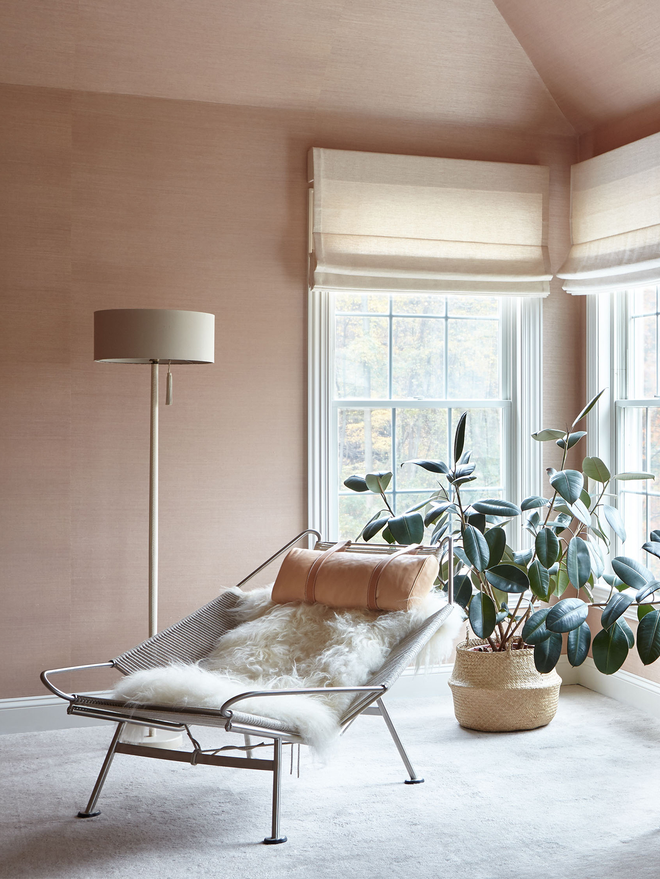
The inspiration for the blush bedroom started with a photograph of the Hollywood sign at twilight by Jesse Chehak. The owners, who had lived in California for years before relocating to the East Coast, wished to create a serene respite reminiscent of life in La-La Land.
Tallisman landed on a ballet slipper pink wall covering from Sonia’s Place: “I didn’t want to draw attention to the angled ceiling, so wrapping everything in the same mauve grasscloth achieved an enveloping feeling,” she explains. It also had the benefit of making the large space feel not quite so expansive.
Wavy Glass


Originally, the cavernous room had an extra-steep set of stairs leading to a nook with no walls and no clear direction as to what it should eventually function as. Tallisman came up with the idea of a textured, mouth-blown glass partition that would let natural light in while still giving the couple the kids-free zone (where they could retreat to read, watch TV, and relax) they’d been dreaming of. “It has a beautiful organic pattern with occasional large random bubbles known as ox eyes,” she explains.
The Goldilocks of Green Paint

To complement the blush pink, Tallisman went on a mission to find the perfect wall color for the adjacent study. “The custom hue was a labor of love,” she remembers. “I worked for hours with Janovic until I achieved the perfect shade of olive-y green I envisioned.” They landed on a high-gloss finish from Fine Paints of Europe. Since the bonus space was small, the designer opted to build an oak desk directly in the wall partition: “I didn’t want to fill it with too many pieces of loose, freestanding furniture.”
Repetition, Repetition, Repetition


To create cohesion between the rooms, Tallisman repeated the same materials throughout the master suite: the raw oak flooring in the study can also be found in the walk-in closet (but in a straight pattern instead of herringbone). A brass trifold mirror in the dressing area reflects the unlacquered brass finishes in the study and bedroom. “I searched high and low to find a metalworker who could make the perfect rounded corners, similar to those I had seen on a mirror at the Paris Marché aux Puces,” remembers the designer. These small details are easily overlooked, but they’re the essential final pieces in this puzzle of spaces.