With Some Serious Rearranging, This Texas Home’s Den Became the Kitchen
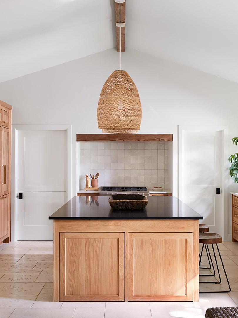
Lower oakwood cabinets make the most of the new layout.
Updated Oct 12, 2018 6:34 AM
We may earn revenue from the products available on this page and participate in affiliate programs.

To the naked eye, it might not be obvious that Brett and Kara Phillips‘ client’s den-slash-bedroom should really be the kitchen. But to the founders of High Street Homes, it was a no-brainer to do some serious rearranging on the ground floor. “Functionally, where the kitchen used to be didn’t make sense,” explains Brett. “The only way to get there from the garage was to walk all the way around to the front door or enter through the back deck.” In other words, carrying groceries inside was a whole ordeal. Carving out a hardworking layout was a top priority for the homeowners, who have their hands full with twin daughters.
Not up for a DIY? Never fear: Kick-start your project with HomeAdvisor’s directory of addition and remodeling contractors in your area.
The designers took the house back down to its foundation in order to transform the then-den and main en suite into a dining nook and kitchen. (The former bathroom became a pantry, mudroom, and laundry, too.) “We needed to keep peeling back the layers,” recalls Brett of the effort to get the plumbing in all the appropriate locations. The couple was able to bolt the roof and elevate the ceiling from 8 feet to 9 feet, which may not sound like a lot, but it’s the small tweaks that made the kitchen feel like it had always been there.
Divide Your Footprint According to Function


Situating the range on the back center wall was a natural choice by default: It couldn’t go on the right-hand side of the room, which had already been reserved for the sink (being able to look out onto the backyard while washing dishes makes the chore less of a pain). Next to the sink: an integrated dishwasher and, to the right of that, a hidden Fisher & Paykel beverage center. “We made that main wall the everyday space,” explains Brett. The opposite wall is designated for entertaining and closest to the new mudroom/dog room (the top of the Dutch door can be unlatched).
De-Rustic Your Wood Cupboards


Rift-cut white oak cabinets were a surprisingly risky move, given that wood cupboards were overplayed in Texas homes in the 1990s and 2000s. “So some people are afraid of using it,” says Brett. But in this case, the designers put a California-inspired spin on the look by pairing it with crisp white walls, Serena & Lily woven basket pendant lamps, and raised panels that make the cabinetry appear like furniture.
Don’t Knock Outdoor-Proof Materials

The budget save came in the form of concrete flooring from Peacock Pavers. The outdoor-proof slabs are primarily used around swimming pools, so they’re super-durable, but they have the look of elevated limestone. “We considered doing hardwood but thought it would be too much,” explains Brett. The material introduces a different visual element, as do the dual countertops (they used quartz on the side surfaces and black granite on the island, which has the appearance of soapstone). “We wanted timeless finishes that are pretty much maintenance- and worry-free,” he adds.
Help Midcooking Conversations Flow

Floating shelves supported by brass Rejuvenation brackets now hang where there was once a bedroom. In the corner: a roomy dining bench that was previously a closet. “When you can figure out how to have two people sitting perpendicular to each other, do it,” says Brett of avoiding the island-only arrangement (it’s not as fun to talk with your family when you have to constantly turn your head). In this space, people can be a part of the kitchen whether they’re eating or not. Another word of advice: You don’t have to always have a pendant lamp over the table—a subtle sconce or two gets the job done. “You could even add a TV in a corner and hide it,” he says. “You never have to leave.”
Photography by Lacey Land
For hands-on advice from designers and pro DIYers, plus more scrappy before-and-after transformations, subscribe to Reno. Let your in-box do all the hard work—for now.