We may earn revenue from the products available on this page and participate in affiliate programs.
Whether you’re a five-minute-shower-in-the-morning type of person or someone who prefers a candlelit tub soak with a good book, your bathroom is a sanctuary. Perhaps nothing affects the mood more than the paint color you choose. “Do you want to feel invigorated in the space?” poses London-based designer Lonika Chande. She recommends a fresh green or zingy yellow. On the flip side, if you’re looking to retreat to your bathroom after a long day, a moody blue can deliver the perfect spa vibes, while a warmer hue can feel like an inviting embrace. “For me, bathrooms are a real opportunity to have fun with wall color,” says Chande.
There are, however, a few other important factors to consider when selecting the best paint for bathrooms that go beyond the standard color wheel. If you have a small powder room, for instance, or an especially steamy space suffering from poor ventilation (think: no windows or a barely there vent fan), you’ll likely need to prioritize two things: antimicrobial additives to keep mold and mildew from dimpling your walls and ceilings, and a shinier gloss that can withstand moisture and wipe-downs come cleaning day.
To help inform your decision, we rounded up the best bathroom paint colors for any kind of water closet, according to six designers we love, taking into account shades recently used in their latest projects, as well as advice on their preferred application methods and types of paint.
Our Favorites
- Dulux Gravel Pit
- Sherwin-Williams Tricorn Black
- Benjamin Moore Winchester Sage
- Farrow & Ball Parma Gray
- Benjamin Moore Caldwell Green
- Sherwin-Williams Clary Sage
- Farrow & Ball Stone Blue
Best for a Calming Hue: Dulux Gravel Pit

Personally, I love blue and/or green in a bathroom. They can be strong colors, but they are also calm colors, which is how I want to start and end my day. My bathroom at home was a bit of a sad space, but we added wainscoting and painted all the walls Gravel by Dulux in the diamond eggshell finish. As with all paint colors, it changes dramatically depending on the light, which I love. —Lonika Chande, Lonika Chande Ltd.
Gravel Pit, Dulux
Shop NowBest for a Contrasting Accent: Sherwin-Williams Tricorn Black

We love Tricorn Black for paint in a bathroom. Most people think that painting a room black will make it dark and dreary, but by balancing the space with light tile, a natural wood vanity, and brass fixtures, it provides the perfect contrast. Don’t be afraid to add this dark color to your bathroom, as long as you even it out. —Nicole Salceda, Eye for Pretty
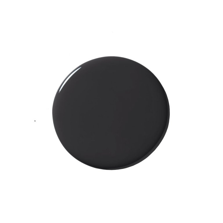
Tricorn Black, Sherwin-Williams
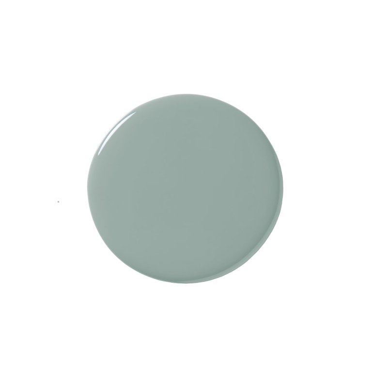
Shop NowBest for a Balancing Act: Benjamin Moore Winchester Sage

My personal preference is to paint the baseboard, casing, and millwork a uniform color to match the wall finish, especially in a small space. It’s very sophisticated and chic. Here, the Gucci wallpaper is really lovely, so we chose to lean into the green. The playful concrete tile and custom marble vanity are the contrasting elements in the room, allowing the trim and radiator to recede. —Britt Zunion, Studio DB
Winchester Sage, Benjamin Moore
Shop NowBest for a Ceiling Moment: Farrow & Ball Parma Gray

This was very much about the room not feeling too much like a bathroom. Our gingham curtains enhance that, and the blue on the bespoke corner cabinet and the wave backsplash add personality. Here I have done a sky blue ceiling, which I do a lot in bathrooms, and this one is in Parma Gray. It kind of lifts the ceiling. It works well if you want to add character to a room with white walls without going nuts on colors. —Beata Heuman, Beata Heuman Ltd.
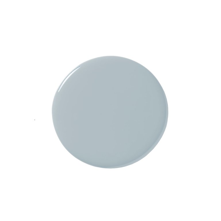
Parma Gray, Farrow & Ball
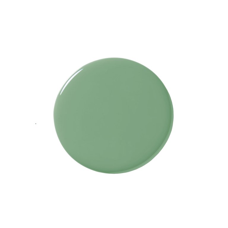
Shop NowBest for Modern Details: Benjamin Moore Caldwell Green

We reimagined the primary bath in this 1990s spec home to reverse the errors of an unfortunate and highly unsuccessful remodel from years before. The bathroom had a small, dark, oddly shaped and barely functional shower that the homeowners despised, along with dated materials and an ugly garden tub. To make it feel bright, fresh, and clean, we did a big reconfiguration of the shower area and splurged on the floor tile, which meant we had to pull back a bit in other areas. We decided to use the existing vanities and doors but repainted them this fresh and cheery green, which worked so well with the slightly cool white (Benjamin Moore Sea Pearl) and new finishes and fixtures. —Killy Scheer, Scheer & Co.
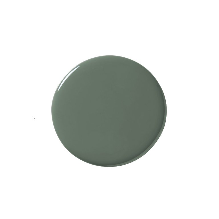
Caldwell Green, Benjamin Moore
Shop NowBest for Contemporary Softness: Sherwin-Williams Clary Sage

For this client’s lake house in rural Tennessee, I chose Sherwin-Williams’s Clary Sage for all the walls and trim. It brought in a contemporary softness with color, yet kept with the Southern feel of the home’s architecture. The starting point for this design was actually the window—I knew that the view was very important. The window needed to be as big as possible, framing out the lake while bringing tons of natural light into the bathroom. Combining the natural light with multiple sources of artificial lighting allowed me to go darker on the paint without overpowering the room with color. —Corey Morris, C. Morris Studio
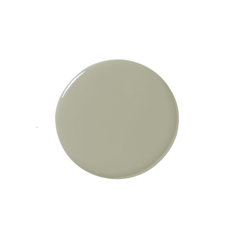
Clary Sage, Sherwin-Williams
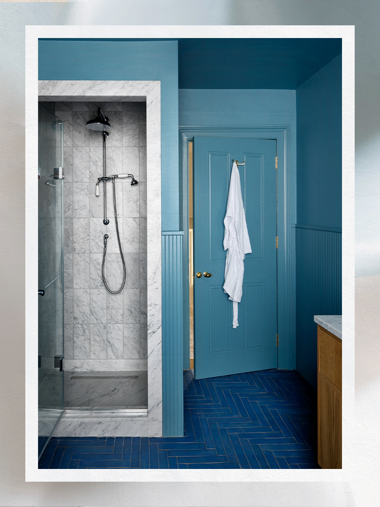
Shop NowBest for a Saturated Shade: Farrow & Ball Stone Blue

I use Stone Blue a lot. It feels fresh without lacking in depth and looks great with chrome taps, brass handles, and natural wood such as oak. This color combination is something I was inspired by from a restaurant in Sweden called Sturehof by designer Jonas Bohlin. The bathroom has a big window, so it could handle having the blue surround without feeling too dark. The natural wood and Carrara marble break the color up in a calming way. The bone mirror is quite important for the scheme—gives it the pop it needs. —Beata Heuman, Beata Heuman Ltd.
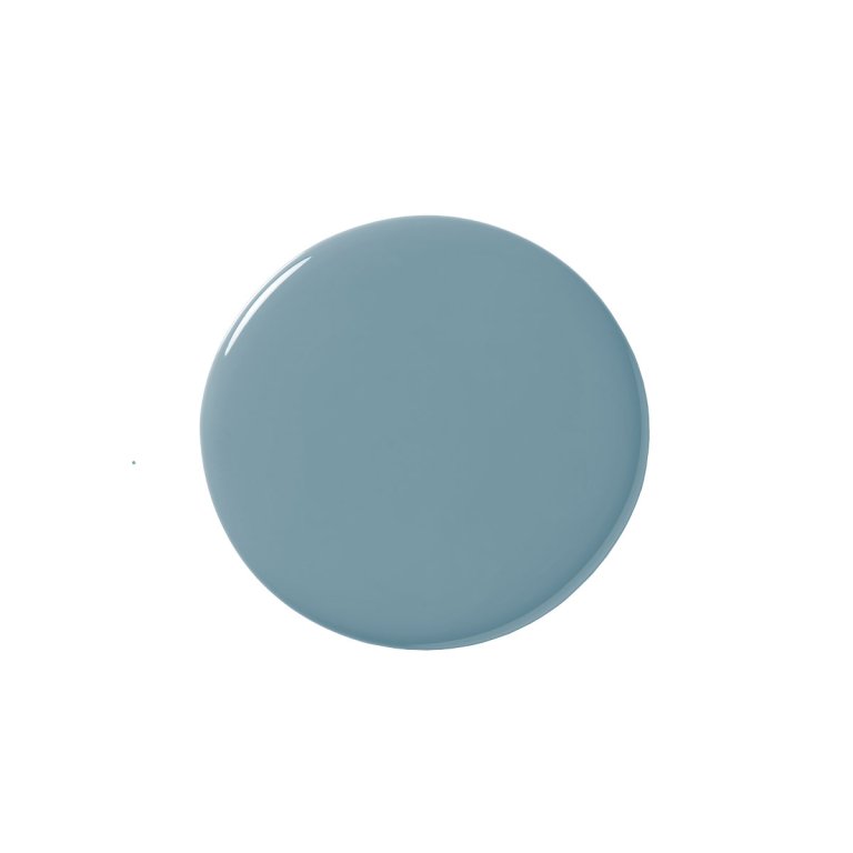
Stone Blue, Farrow & Ball
Shop NowOur Shopping Checklist
Finish
For a room constantly subjected to humidity, your safest choice is a finish that’s durable and easy to clean, like satin or semigloss. Because these finishes have a higher resin-to-pigment ratio, they’re able to withstand being wiped down with a towel or sponge more so than matte looks, which you’ll want to avoid here if you don’t want to be regularly staring at watermarks. If you’re set on eggshell, that’s fine, too. In fact, most designers—like Studio DB—save the satin for trim and millwork and go for a dependable matte, like Benjamin Moore’s Aura Bath & Spa. “A satin finish is more forgiving on millwork and doesn’t require a specialty painter or a flawless surface, like a high-gloss finish,” adds Zunion.
Color
Creating the right aesthetic is all about zeroing in on the room’s function. “In a primary bath, we tend to use soft, warmer colors, which are more flattering in general and helpful when applying makeup,” says Zunion. “For children’s baths, we tend to lean a bit crisper and brighter, often with fun pops of color. In powder rooms, anything goes—the more dramatic the better!”
For Chande, the color selection is one of the final steps in bathroom design. She prefers to analyze fabrics and mull over palettes after deciding on the layout and hard finishes, such as a cement or marble floor, brass faucets, or finer details like a heated towel rack. But according to Nicole Gibbons, CEO of Clare, it’s all about the mood you want to establish. A white will help your room always feel fresh and clean, whereas a soft blue can display as serene, bringing a sense of calm to the space, she says. And if you have a small bathroom, embrace a bold palette. “Bold colors make a big impact in a small bathroom,” she adds. “Along with bringing personality and drama to the space, with the right natural light, an eye-catching wall color like Current Mood can make a cramped bathroom feel roomier than it really is.”
At the end of the day, Heuman argues you needn’t worry too much about following any rules when it comes to bathroom paint palettes. “Go for colors that you love and give the feeling you like.”
Light
Luminosity is perhaps the most important factor to think about when choosing a color. Zunion always reviews the swatches in the actual space, taking both natural and decorative lighting into consideration. “A color you love in the store may look completely different at home, so it’s best to sample, sample, sample,” she says. And don’t forget the impact your finish can have on the room. One of Heuman’s tricks—especially if a glossy finish isn’t your style—is to bring sheen in through other surfaces like tile to help reflect light around every corner.
Ask Domino
There is no right or wrong bathroom paint color—it all depends on the mood you want to achieve. But when square footage is tight, Decorist designer Casey Hardin suggests picking a palette with a high light reflectance value (LRV). “The LRV measures the amount of light that a paint reflects or absorbs; the higher the LRV, the more light is reflected,” explains Hardin. “This translates to a light and bright feeling in your space. But small bathrooms also offer a great opportunity to create a moody moment with dark, saturated paint if you aren’t afraid to go bold. If you decide to use dark paint in a small bathroom, make sure you have good lighting to keep it as bright as possible.”
“Since paint is the finish with the most variety and has the ability to tie in all the elements, it’s definitely the last part of the selection process,” notes Shaolin Low of Studio Shaolin. “The main thing when selecting any paint is the lighting. You can never underestimate what lighting will do to a paint and its undertones.” She suggests pulling a color from the surrounding finishes, whether it’s the vanity top or the tile.
Choosing the best bathroom paint is about more than just color—this is a high-traffic space that’s always subjected to heat and moisture, making mold-resistant qualities a top priority, especially if your water closet is cramped or suffers from poor ventilation. “The best type of paint to use in the bathroom to prevent mold and mildew is a satin, semigloss, or gloss paint,” says Hardin. “These paint finishes are more mold resistant and easier to clean than flat or eggshell paint.” For extra protection, look out for keywords like mildewcides and fungicides, or other antimicrobial agents—Rust-Oleum’s Mold-and Mildew-Proof Paint is one great option.
The Last Word
“Color in bathrooms is often an afterthought,” says Chande. “We tend to think of this room purely as a utilitarian space, principally because we don’t spend large amounts of time there. But for me, bathrooms are a real opportunity to have fun with wall color and to go for something bold that you might not use elsewhere.”
Here, we saw a clear trend for varying shades of green and blue in a bathroom. And if 2022’s colors of the year are any indication, this isn’t too much of a surprise!
How We Vetted These Products
Every product in a Domino guide meets these criteria:
- They blend form and function. We believe the best-designed products reflect your personal style and are a joy to use.
- They’re expert approved. In addition to our team of editors, we tap a range of designers, makers, renovators, and all-around knowledgeable people to share their intel.
- They’re endorsed by people who actually own them. We pay close attention to real reviews to know that they pass the test IRL.