We may earn revenue from the products available on this page and participate in affiliate programs.
In Provincetown, Cape Cod’s proudly offbeat enclave where the art galleries outnumber beach towels, real estate is so precious that sometimes the only way to go is up. When Ryan Stanton of Boston’s Stanton Schwartz Design Group and his partner happened upon a new townhouse with a rare third story that looks over the rooftops of neighboring homes to the sea, the couple jumped at the chance to make all 720 square feet their own. The cherry on top? The in-progress construction was only 60 percent complete, giving them the opportunity to upgrade some of the builder-grade finishes and save on renovation costs to get the look they wanted.
For Stanton, that meant maximizing every inch of space for a custom retreat that offers all the luxuries of modern living, while also taking aesthetic inspiration from the old salt box homes of the region. But you won’t find run-of-the-mill seashells or nautical stripes here. Instead, Stanton leaned into subtle nods to the water and wooded areas that surround P-town. “My goal was to make this place look like it’s been here for a while,” he says of the moody palette, thoughtful finishes, and soothing pattern mix. Here’s how he made every corner count and every detail deliver.

The whole place feels so cohesive—what’s your secret for making it all flow?
Because it’s such a small space I didn’t want too many jarring colors or patterns. I wanted there to be a good flow, so I used the same Farrow & Ball paints in every room, I repeated wallpaper in the powder room and third-floor living room, and I used the same marble in the kitchen and primary bath. And then outside I used the same fabrics and some of the same furnishings. It gives you this sense of visual harmony and lets your eye rest a bit, which in turn also makes the space feel bigger.

How did you manage to squeeze a dining setup for ten into just 240 square feet of a combined living-dining space?
We love to entertain but the room is very narrow, so my trick is always to put a sofa against the wall to maximize seating and walking space around the other side of the table. Our friends think I’m crazy for having a Pierre Frey bouclé sofa in the kitchen but that creamy color feels expansive, and the vertical lines of the pillows (a linen stripe from Zak + Fox; a chalk stripe from Rosemary Hallgarten) makes things feel taller and longer, so it’s almost like a trick of the eye to make the space seem bigger than it really is.


Speaking of optical illusions, the marble backsplash and counters steal the show. How did you land on that stone?
I found that marble in 2020. I took some clients to a stone yard, and at the time these really busy marbles weren’t flying off the shelves as they are now. But I always remembered it and thought it was perfect for this house. The veining almost looks like the ocean—it has a lot of movement. In tiny spaces you have to get creative with making them look larger than they are, and this adds a lot of depth. And because there’s no room for artwork, this stone tells its own story. I used the same marble in the primary bath and it’s just mesmerizing. I’ve taken many long showers there.

The wallpaper in the powder room is such a moment. What made you choose that one?
I’ve had my eye on Cowtan & Tout’s Rutland for so many years. The thing that I always loved about it was how much depth there is to it. You kind of get lost in it. It transports you to another time. There are a lot of adorable places on the Cape, and I wanted it to feel a little more wooded rather than beachy. The most beautiful part of the outer Cape is its wilderness. In addition to having some of the best beaches in the world, it has really incredible nature trails. It’s so peaceful and so beautiful, and I wanted to incorporate that feeling.

You repeated the same wallpaper in the third-floor living room, but it hits differently there. Why do you think that is?
A lot of people wouldn’t have covered every slanted wall, but it lets the wallpaper shine even more because you’re seeing it from so many different angles. It makes the wallpaper come to life. And then the sconces are meant to look like a floating moon. We love to come up here after dinner and unwind. There’s a sense of harmony in this room because all of the furniture and shelving is actually built into the space. The staircase leading up to the room is a typical Cape staircase that is incredibly steep and narrow, so we could never get real furniture up there. So everything was built and installed on site.


You went fully custom in the bedroom, too, right?
Yes, that’s a custom headboard, and the idea here was to make the space feel as wide as humanly possible. The nightstands are only 20 inches, so that headboard brings some width to the space and softens it a bit. And here we really had to maximize space because we can’t fit dressers, and there are no closets. The bed has drawers underneath it, and we use the nightstands as makeshift dressers.


There are no closets in the whole house. How do you pull that off?
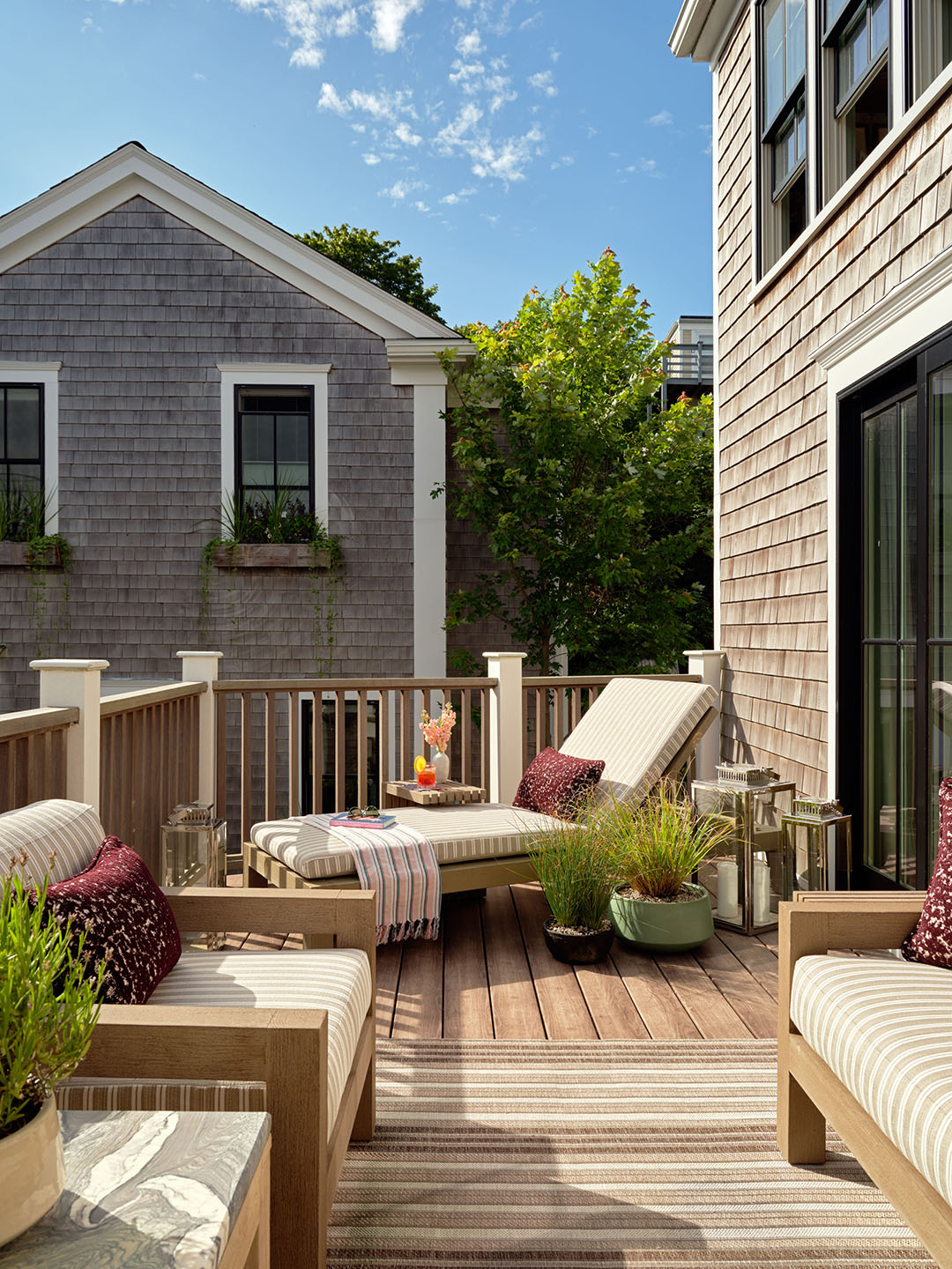
Somehow we make it work with all of the hidden storage. There’s the built-in piece in the kitchen, and the patio bench downstairs, where the seat lifts up so we can pop pillows underneath. In the end we just wanted everything to be really functional and to look really elevated at the same time. For example, that Rosemary Hallgarten fabric on the cushions outside. There’s a lot of red wine being poured out there, but if someone spills you’ll never see it. But it’s also a really beautiful fabric that, again, nods to that kind of woodland theme we had in various places inside the house.

It also pops against the black ceiling above. What made you go dark?
Well, we had the cedar ceiling, and then there’s the cedar dining bench and the cedar shingle—everything was all different tones. I was trying to remove an element and make something disappear. When you’re out here at night, now it just looks like the sky.