We may earn revenue from the products available on this page and participate in affiliate programs.
When Liz Hoekzema’s clients bought their Saugatuck, Michigan, home, they weren’t sure what the house wanted to be. “It had a cluster of different design elements happening that didn’t make any sense,” recalls Hoekzema, cofounder of KLH Custom Homes. The architecture was undeniably mid-century modern: Built in 1956, it had an Eichler vibe to it, and there were still unique details intact like a (functioning!) butter yellow washing machine. The KLH team could have leaned in. “But we didn’t want it to feel like a period piece,” says Hoekzema. Given the property is situated right on Kalamazoo Lake, her clients wondered if they should go more classic cottage style. Picture: white shiplap walls, seagrass rugs, and bobbin furniture. The designer’s advice? Embrace a totally fresh perspective.
When reimagining the home, Hoekzema and design lead Jaci Schipper knew they wanted to keep a few details that honored the structure’s roots, including a central brick fireplace column and stained glass windows. As a subtle nod to lake life, they incorporated zellige tiles in the kitchen and bathroom that mimic the shimmer of the views outside and wavy furniture that echoes the rippling of the water’s surface. On the lower level, they installed a partition and banquette out of breezeblock to emulate the 1956 architecture. “It looks like a material that could have inherently been part of the house,” says Hoekzema. “It was fun to take what might have been there and bring it into the future.”
Ahead, Hoekzema and Schipper share how they were able to merge the past and the present in this modern Michigan lake house.


The layout of the house is interesting—why are there two kitchens?
Schipper: When they have their kids and grandkids over, they want to be able to use the space but not all be on top of each other. Our goal was to make the main level a fun kid zone: it’s super easy to get in and out, the floors aren’t fussy. Then, downstairs off the entry, there is a kitchenette that the homeowners can enjoy just for themselves.


Is the main kitchen island connected to the dining table?
Hoekzema: They’re attached! It shifts from soapstone to wood. We wanted them to feel connected, like it wasn’t this separate piece of furniture. The client liked the idea of a counter height table so you get the visuals of the lake. The base of the table has this soft, wavy form that, similar to the backsplash, mimics the gentle movement of the water.

Why did you make the pantry door hardware different from the rest of the handles?
Hoekzema: That push and kick plate is a favorite because it almost feels like the sun rising up over the lake. It has this glowing natural brass hue.
There’s very little countertop clutter—you even hid the paper towel holder!
Schipper: I had personally never done that before but the client mentioned she uses paper towels often. I thought, let’s just tuck it away! I love being able to solve things like that for clients; stuff that really bugs them.


How did you reimagine the stained glass window that was original to the house?
Hoekzema: Before, the glass windows were a mishmash of a bunch of different colors and shapes with shields and crosses. I told the client to not let the contractor demo them—we might regret it. We went to a local stained glass company and they were able to take hints from the shapes and colors that were happening and create a brand-new transom window that leads to the office.

What was the biggest design challenge you faced?
Hoekzema: In the principal suite, there used to be these small square and rectangular windows facing the street. It made the room unnecessarily dark. Jaci pushed to have this clerestory architecture that would flow from the bathroom all the way into the closet. Now it’s so light and bright.
J: Building the breezeblock bench into the wall was a challenge. How are we going to support it? How are we going to communicate what we want with the contractor? We wanted to make sure it passed code—all those fun things.

What’s one meaningful design detail that no one else would be able to pick up on?
Hoekzema: There used to be these weird triangular jut-out windows on the house that felt at odds with the architecture. We cleaned up the exterior so it makes much more sense now, but these little sconces in the principal bathroom mimic those old windows in a beautiful way.
How did you rethink the bathroom layout?
Schipper: The wife wanted a separate space from her husband, so their vanities are back to back. I don’t often do that but the way we mapped it out really worked. Instead of having a long unit with two sinks, we gave her a makeup vanity and continued the mirror to reflect as much light as possible.

What are the key elements you think about when you’re designing a tiny powder bathroom?
Hoekzema: A challenge with this one was that it was under the stairs. Space was definitely at a premium. We could either celebrate the angled ceiling or close it up—we leaned into the weirdness. We maximized storage with some cubbies over the toilet and chose a wallpaper with this soft butter yellow background that felt sunny and happy. The little wave motif on the mirror is another reference to the water.

How do you make a room with twin beds look chic and not childish?
Schipper: The client’s biggest request was that she didn’t want the house to seem like she just bought everything new. We wanted the kids’ room to have a collected, cottage feel. There’s a bit of a shift in the ceiling, which we chose to celebrate by switching up the paint color from a lighter to a darker mint.

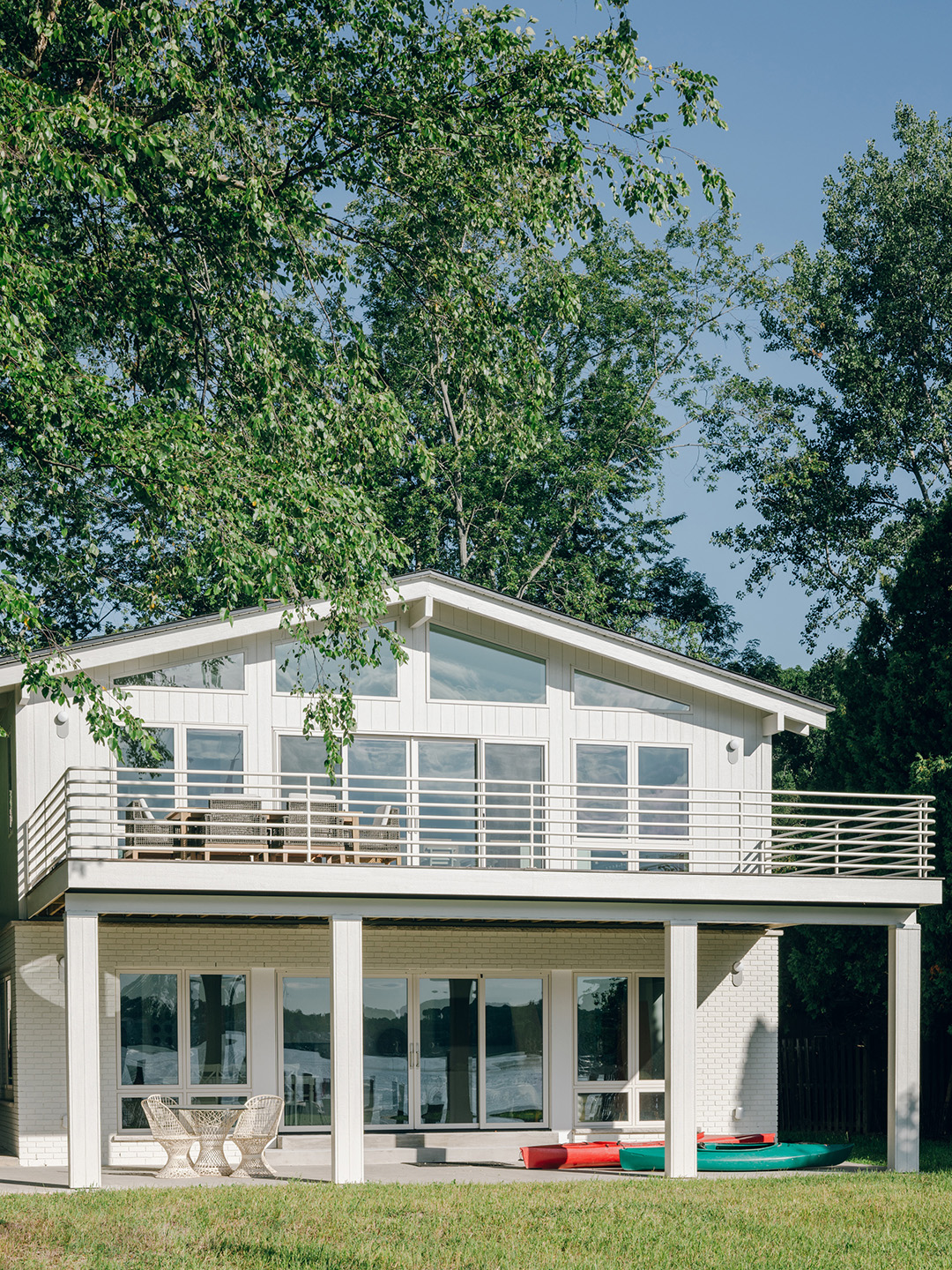
Did the exterior get a glow-up?
Schipper: The first floor had existing brick that we had to make quite a few repairs to, but we kept as much as we could. We kept the stone at the base of those windows, too. The upper level has all new LP [siding]. Everything was sprayed the same color. On the lakeside, we installed a thermally modified decking that’ll be easy for them to maintain longterm. It felt like the balcony was calling for a railing that you’d see on a boat. We wanted it to feel clean and streamlined and not cut off any visual opportunities.