We may earn revenue from the products available on this page and participate in affiliate programs.
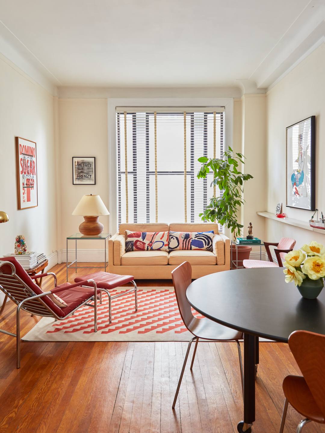
“I prefer living in color,” Los Angeles–based artist David Hockney once said. And while I too love a vibrant shade of blue, I don’t necessarily want my New York City living room saturated in it. Recently, I decided it was time for a fresh coat of paint (the faded patina on my prewar walls left me pining for something new), and so I went looking for a lift, a tint with a twist, something clean yet calm. In other words, the perfect shade of white.
After months reviewing dozens of paint chips, I realized it’s true what they say: White is not just white. Yes, it’s a neutral, a blank canvas tinged with subtle tones ranging from warm red to cool gray, but it didn’t take long to learn Benjamin Moore’s Decorator’s White (an industry favorite) isn’t the same as the company’s Super White—a perfect fit for my dim home office but not quite right for my north-facing living room.
With so many choices out there, I needed to call in an array of experts. Here’s what happened when I asked two paint brand pros, an interior designer, and an app what white paint I should use.
What the Paint Brand Experts Had to Say

“White spaces love good light, and if the light isn’t good, more nuanced neutrals are required to bring either warmth or character,” Patrick O’Donnell, the global brand ambassador for British company Farrow & Ball, shared with me when I asked him about his process. Over a Zoom call, he offered me an overview of the company’s historical-inspired palette and then, looking around my place, whittled down my options to Dimity, a pale taupe tinged with red, and Pointing, an uncomplicated white inspired by lime pointing in brickwork. “The former wants a little splash of red or yellow pigment, and the latter something just off-white to bring heightened character,” he suggested.
The lack of sun definitely posed a problem, which I conveyed to Natasha Rooney, a color consultant and showroom manager overseeing the new U.S. outpost of Little Greene, another British paint brand. I was eager for Rooney to do a home visit, and she happily made the trek from Greenwich, Connecticut, to see me. She asked me about the room’s status (was I planning to change the upholstery anytime soon), details relating to the space (do I rely mostly on lamps for lighting or will I install overhead fixtures at some point) and what kind of vibe I was after (moody or airy).
“Sometimes we need the depth to feel the warmth,” she commented while perusing various shades in the Little Greene chart. Like O’Donnell, Rooney was keen about a warmer combination for the room. She also landed on a red-spiked hue called Hollyhock and Shirting, a pure white. She even shared helpful suggestions to streamline the prep process to ensure best results, like how I should dilute my primer to 50 percent color and 50 percent water and degrease the walls with sugar soap.

While I adored all of their selections, the palettes seemed better suited for a sunny, quaint cottage than my one-window, modern-leaning room. I continued on with my search.
What an Interior Designer Had to Say
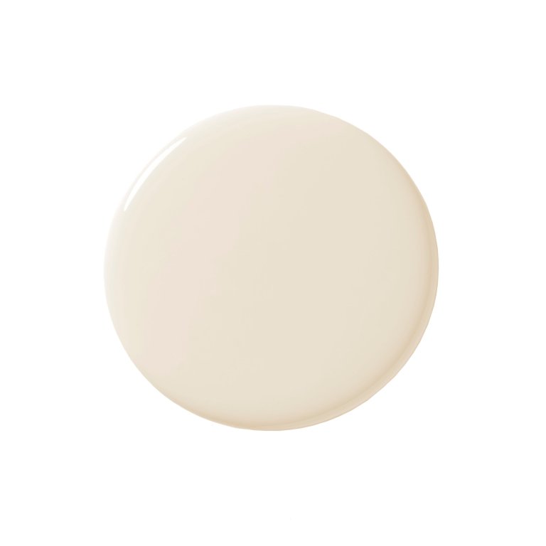
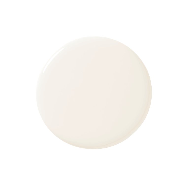
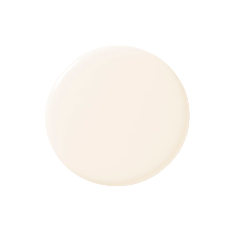
Next, I persuaded Brooklyn-based interior designer Danielle Colding to stop by after drop-off at her kids’ school. While sipping an espresso, I asked Colding, a classically trained decorator, what she would do. She discussed various projects she worked on with her former employer and mentor, Keith Irvine. Colding flipped through various paint decks and to my surprise mentioned swatches with hints of cobalt and orange as options. “I love the pops of orangey reds. I’d like to keep that alive,” she said, looking around the room at my existing decor before earmarking Benjamin Moore’s Pink Damask, then selecting White Blush to cover the walls.
She then gravitated to her go-to, the brand’s Simply White, for the ceiling, window frame, and door. She’s been a fan of its creamy tone long before it became the company’s 2016 color of the year. And while her former mentor’s strategy for trim was a mix of half linen, half white, Colding insisted I forgo painting the baseboards a different shade and use the White Blush wall color from just below the picture rail, bringing it all the way down to the floor. “Subtle, but it will make a big difference,” she exclaimed.
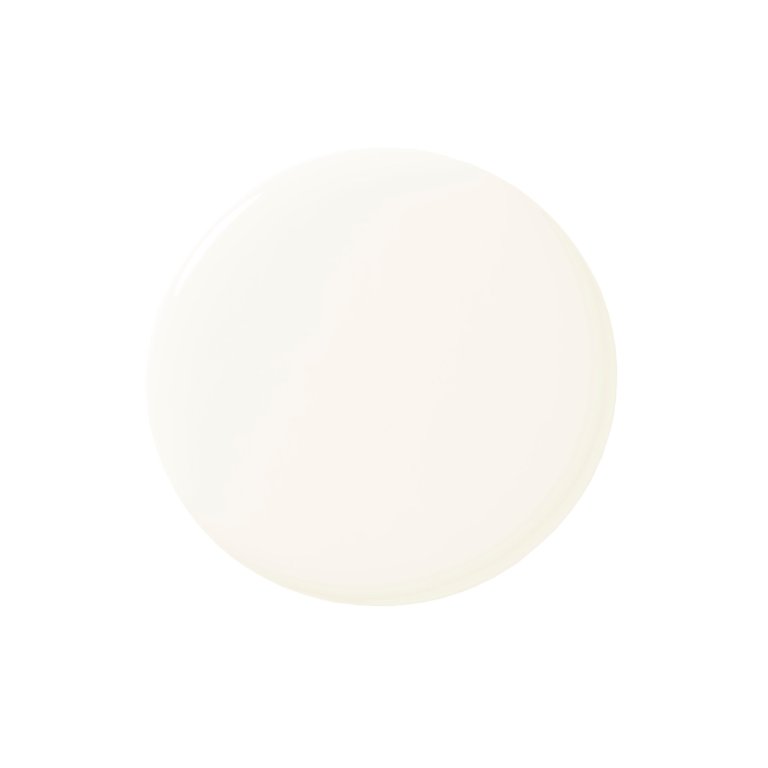
Simply White, Benjamin Moore
Shop NowWhat a Tool Had to Say
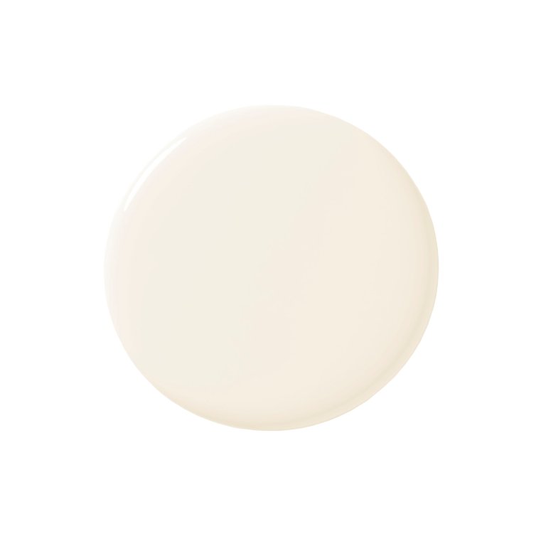
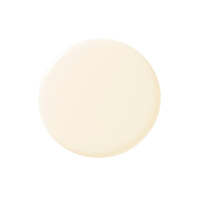
Several companies offer online assistance, with Benjamin Moore going a step further with its Color Match Tool. The pocket device lets you scan any flat surface of any color you like and then instantly finds its closest paint match out of the company’s 3,500-plus options through the Benjamin Moore app. I test-drove it using a patch of superpale pink on a Pierre Frey pillow and landed on White Zinfandel, a possible contender but a tad too pink.
White Zinfandel, Benjamin Moore
Shop NowWhat I Ultimately Chose
Drumroll, please. The samples I finally ordered were Simply White OC-117 and White Blush OC-86, per Colding’s recommendation. As with any paint job, you won’t know if you love it until you try it. On a recent rainy day in NYC, I watched the small pink-tinged swatch marks warm my space right up, confirming that I’d made the right choice for my dimly lit apartment. Now it’s off to the brush aisle.