An Expert’s Guide to Picking the Right Paint Shade for Every Space
Including the two colors to avoid in the bedroom.
Updated Oct 12, 2018 4:59 AM
We may earn revenue from the products available on this page and participate in affiliate programs.
Designer Celerie Kemble once said, “There’s a reason we don’t see the world in black and white.” Color is a powerful force: It affects our mood, our energy, and our creativity.
“With COVID-19 and people spending more time at home than ever before, they’re taking into consideration how they use certain rooms and how they want to feel within them,” says Patrick O’Donnell, brand ambassador and color expert at British paint and wallpaper company Farrow & Ball. “Your home is so personal to you. You have to live with these colors.”
Farrow & Ball’s color consultancy program pairs customers with a well-versed expert to select paint options for their home based on function, style, mood, and lighting conditions. For poorly lit rooms, O’Donnell suggests getting adventurous with dark tones—inky blues, smoky greens, saturated charcoals—to make the space feel cozy; for well-lit areas, he recommends warm dusky pinks, oaky yellows, and rich reds. After the (currently virtual) consultation, customers receive a specification sheet of the colors, finishes, primers, and undercoats they discussed.
Whether you’re looking for the confidence to try something new or are unsure where to start with a tricky space, Farrow & Ball’s bespoke service will help you craft a vision—and bring it to life. Plus they’ll show you exactly what colors work best—and which ones to avoid—for each room in your home. Here, O’Donnell shares his pro tips.
The Kitchen
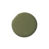
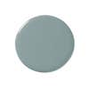
The kitchen is the biggest investment you will make in your home, so you’ll want to choose a color with integrity; you don’t want to have to change it on a regular basis, because there’s so much prep involved when you’re working with cabinetry. I always suggest really lovely blues, like De Nimes, or a classic shade, such as French Gray, which is a gray-green with a bit of a yellow to it. Another nice way to bring in more color is to use a strong accent or different finish, like full gloss, on a kitchen island.
The Bedroom
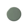
Bedrooms are all about relaxation and sleep, so greens and gentle blues are very nice. Green is the color of nature—it’s very calming. It’s the one color most people respond to that makes them feel easy. One caveat: Avoid yellows and oranges, as they can be quite energizing.
The Dining Room
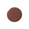
There’s a huge tradition in the United Kingdom in which dining rooms are painted in deep, rich reds because red stimulates the metabolism. Since dining rooms tend to be more formal, I think they can be baroque because they’re a bit grown-up. Brown is really sophisticated and looks great in the evening under candlelight.
The Bathroom
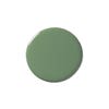
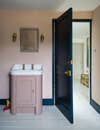
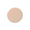
Bathrooms should be quite playful. Since most people tend to have white porcelain fixtures (sink, bathtub, toilet) and white tile, it’s fun to bring in punchy pops of color. Think: verdant greens like Bancha, a slightly acidic mid-century olive, or a beautiful brownish-pale pink called Setting Plaster—if you’re feeling a bit under the weather or had too many cocktails the night before, it’s a flattering color to see first thing in the morning.
The Home Office
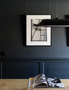
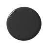
Slightly hot colors, like burnt orange and yellow-brown, are great if you work in a creative field, as they’re meant to be inspiring. Conversely if you’re detail oriented and analytic, something like dark blue or off-black acts as a color void and is not distracting.
The Living Room
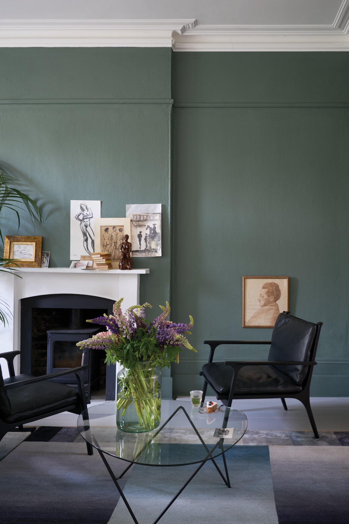
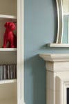
Blues and greens have a conviviality that’s not overpowering. There’s almost a neutrality to them. If your living room is really colorful with a regal purple and bright orange trim, it might be slightly uncomfortable for your guests. You don’t want anything too visually demanding that may make people feel anxious.
From now through February 28, sign up for a Farrow & Ball color consultancy and get 15 percent off your order of paint and paper.*

